Wednesday, December 31, 2014
The Solar System
Here is a fun scale model of the solar system for your computer monitor - just keep on scrolling to the right!
Cambridge (MA)
The GIS website for the City of Cambridge (MA) is about as good as it gets these days:
The Science of Snowflakes
Great video from It's Okay To Be Smart: The Science of Snowflakes (after waiting 15 seconds for the annoying ad to finish).

The Global Language Network
Here is a great project and visualization from the folks at the MIT Media Lab: The Global Language Network. The role and importance of English becomes clear immediately as a connector of people speaking different native languages.
Monday, December 22, 2014
Global View: Climate Change in Perspective
Data viz is going more and more into 3D at the global scale inside your browser: very cool visually and technologically, but not necessarily any more informative. Take Global View: Climate Change in Perspective, for example: what was the point of all this?
Sunday, December 21, 2014
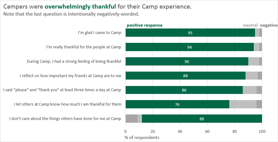
This is Statistics!
Let's be honest: statistics is considered by many of our students as about as interesting as watching C-SPAN and I don't think the current R craze in Higher Education is helping that at all...maybe this can help: This is Statistics
Friday, December 19, 2014

Solstice Streets and the Golden Hour
Two interesting websites/maps here (via Maps Mania):
- Solstice Streets shows you streets that are aligned with sunrise and sunset.
- The Golden Hour shows you day length and sun angle for the year for any location.
Mount Kenya Glaciers
Excellent photography by Simon Norfolk here: Mount Kenya’s Vanishing Glaciers (New York Times Magazine, 18 December 2014).

Thursday, December 18, 2014
Peek and Poke
What could possibly go wrong here? Peek is a gizmo that clips to your smartphone for easy and cheap eye exams. Oto Home by Cellscope turns your smartphone into an otoscope to 'see' if someone has an ear infection.
Wednesday, December 17, 2014
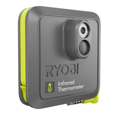
Infrared Thermometer
So you got FLIR ONE for $249.99 (iPhone 5/5s not included) or the Ryobi Phone Works Infrared Thermometer for $49.97.


Tuesday, December 16, 2014
Monday, December 15, 2014
Amherst Public Art Story Map
Amherst Public Art Story Map - a great application of this particular Story Map template (works great on mobile devices).
Living Atlas of the World
Very nice by Esri: The Living Atlas of the World. Many of these maps are accessible without a log-in and therefore quite useful for teaching.
Saturday, December 13, 2014
The World's Ecosystems
Explore the Ecological Tapestry of the World or Explore a Tapestry of World Ecosystems - either way you'll be amazed!
Friday, December 12, 2014
The Brewers
Wired has a nice article about Cindy Brewer - the person behind Color Brewer = the best tool for picking good color schemes. Color Brewer has led to a bunch more 'Brewers' for other map design choices and here's a compilation:


MindMeister
MindMeister is a popular online mind mapping app and offers a free version and reduced-cost versions for education.
Trends and Changepoints
Take the instrumental record and look for trends and changepoints yourself:

- Temperature: Trends and Significance (interactive tool)
- Changepoints in time series

Hipsters!
Young Adults Then and Now is a nice visualization of census data for the Hipster Generation (adults 18 to 34 years old). You can visualize the data as interactive charts, maps, and tables and embed those on websites (see below).
Tuesday, December 9, 2014
Datawrapper
Upload data, make a chart, and share it. Datawrapper is great and the free basic version is very useful.
Monday, December 8, 2014
Adobe After Effects
Adobe After Effects is huge in the animation / motion graphics world and here is a pretty nice basic tutorial from the folks at Video Copilot.
Sunday, December 7, 2014
The Randolph Glacier Inventory 4.0
The Randolph Glacier Inventory 4.0 (1 December 2014) is a global inventory of glacier outlines intended for the estimation of total ice volumes and glacier mass changes at global and large-regional scales.
Landline and Stateline
Landline and Stateline allows our Javascript addicts to create interactive web-based choropleth maps.

Highcharts
Highcharts is a JavaScript charting library written = an easy way of adding interactive charts to websites. Highcharts currently supports line, spline, area, areaspline, column, bar, pie, scatter, angular gauges, arearange, areasplinerange, columnrange, bubble, box plot, error bars, funnel, waterfall and polar chart types. Plus it is free for personal use, education, and non-profits!
Saturday, December 6, 2014
Tools for Web-based Data Viz
Here's a nice viz of data viz tools: Tools and Libraries for Building Web-based Data Visualisations
The History of Web Design
This is great: The History Of Web Design Explained In 9 GIFs. Personally I started with web design ca. 1995 and image maps were cutting-edge back then. Here's the first website I ever created: The Taconite Inlet Lakes Project - A Systems Approach to Paleoclimatology.


Carbon Emissions: past, present, and future
As usual...Carbon emissions: past, present and future – interactive is a great visualization by The Guardian of how CO2 emissions have changed over the last 150 years.
Friday, December 5, 2014
The most unpredictable weather
Interesting analysis by Nate Silver and Reuben Fischer-Baum: Which City Has The Most Unpredictable Weather? The title is, unfortunately, a bit misleading - this study is not really about predictability (as in how well do the weather forecasts match what actually occurred) but rather variability.

Thursday, December 4, 2014
Vertical Farms
This is pretty cool (and scary): how can we create indoor farms so we can grow enough food to feed all people?
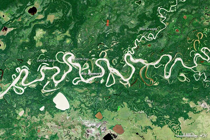
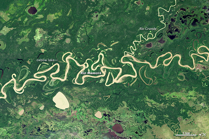
Meandering River
Here is a great image comparison by NASA showing how the course of the Rio Mamore has changed between 1985 (top) and 2014 (bottom). Be sure to look at the image comparison and full-resolution images online!


Wednesday, December 3, 2014
Digital Photography
There are some interesting things out there in terms of digital photography
- Time-Lapse Photography and the Canon Hack Development Kit.
- NIR photography using standard digital cameras using the instruction from Public Lab, Eigen Imaging, or instructables.com.
 |
| http://publiclab.org/wiki/near-infrared-camera |
Monday, December 1, 2014
Open Cities
Open Cities is a project aimed at creating an open data ecosystem for large cities / urban areas in South East Asia as part of the Open Data for Resilience Initiative (OpenDRI). (seen here on Geoawesomeness)


Sunday, November 30, 2014
Saturday, November 29, 2014
Global Weirding
This is nicely done: Global Weirding illustrates the impacts of Global Warming until 2100 and you can choose your future (do nothing, so something, or all hands on deck).
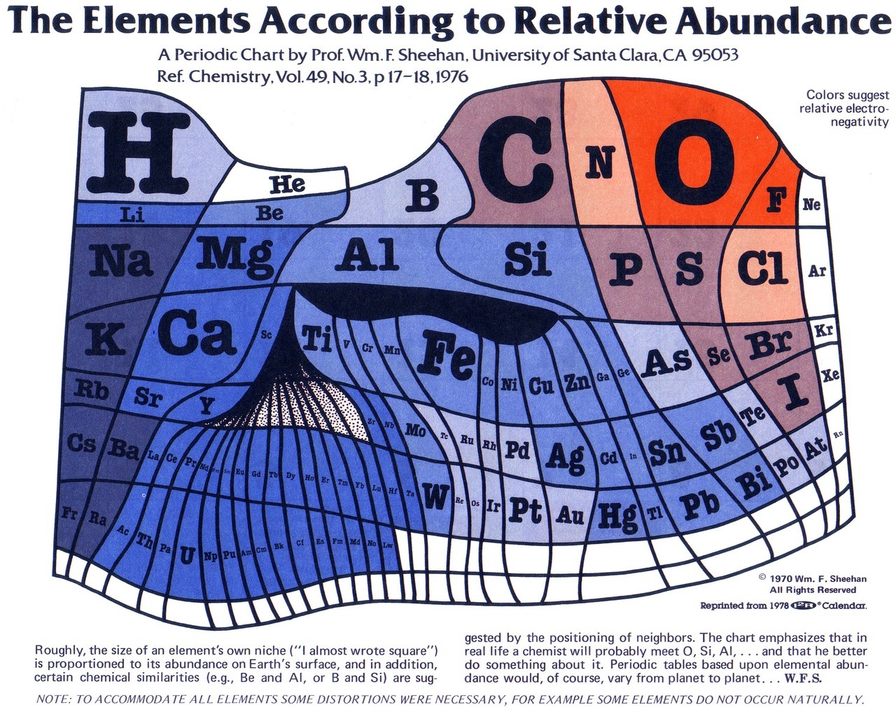
The PDE
This 'new' Periodic Table of Elements is the high-tech interactive version of the classic one below.

SimCity
Going back in time with the 'old' SimCity game in 2-D using Micropolis.JS or 3-D using 3D City - fun! (found on Maps Mania)
 |
| http://googlemapsmania.blogspot.com/2014/11/old-school-sim-city.html |
Thursday, November 27, 2014
Google Charts
Pretty cool stuff from Google - Google Charts. We all know the built-in ones that come with Google Sheets, but this goes much further and uses Javascript. Here are two examples:
- Motion Charts (the simplified version of Gapminder)
- Geochart
You just got Charted!
Quick, simple, and almost real-time: copy a weblink to a .csv file or Google Spreadsheet and Charted makes you a chart - that's all.
Thanksgiving Dinner Geography
This is a nice example of a Story Map by Esri: Where Did Your Thanksgiving Dinner Come From?
Wednesday, November 26, 2014
Monday, November 24, 2014
Frankenplace
Very fun: Frankenplace creates interactive heat maps based on geotagged Wikipedia entries, for example glacier. Somehow there is a teachable moment in all this!
Friday, November 21, 2014
Coal and Geothermal
Here are two nice interactive infographics: How the world uses coal and Mapping Geothermal Heat Flow and Existing Plants.
Thursday, November 20, 2014
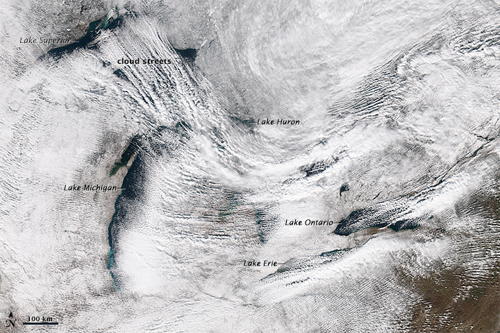
Lake Effect Snow
Buffalo and much of Upstate NY got buried by on 18 November 2014. NASA put out this great satellite image (see below) and this YouTube video shows what it looked like in Buffalo as the walls of snow were coming-in off the lake.

Wednesday, November 19, 2014
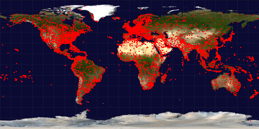
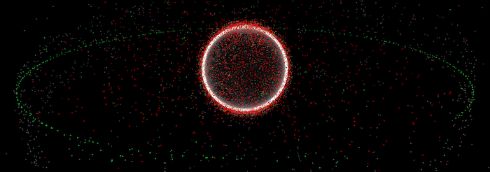
Every Satellite Out There!
This is great: This is every active satellite orbiting earth is just what is claims it is - an infographic showing the 1,200 or so active satellites in orbit around the Earth.
Saturday, November 15, 2014
Solar Path
Simple and elegant: Solar Path
This would be even better for teaching if you could enter a latitude and longitude
This would be even better for teaching if you could enter a latitude and longitude
Teaching Geology with iPads
Using iPads (or tablets in-general) for teaching 'outside' is nothing new and they are the perfect field data collection device. Crowdsourcing Digital Maps Using Citizen Geologists is just another example focused on collecting real geological data as part of a field course.
Another great example is Treworgy (In the Trenches, October 2013) and I have compiled more examples on my 'other' blog: Apps for Outdoor Labs and Fieldwork and Tablets for Outdoor Labs and Fieldwork.
Another great example is Treworgy (In the Trenches, October 2013) and I have compiled more examples on my 'other' blog: Apps for Outdoor Labs and Fieldwork and Tablets for Outdoor Labs and Fieldwork.
 |
| http://woostergeologists.scotblogs.wooster.edu/ |
Thursday, November 13, 2014
Likert-Scales
Great suggestions by Stephanie Evergreen for visualizing Likert-Scale data - typical for for what we get from online surveys.
 |
| http://stephanieevergreen.com/aggregated-stacked-bars/ |
Mýrdalsjökull (Iceland) 1986 to 2014
Excellent image comparison for Mýrdalsjökull (Iceland) 1986 (Landsat 5) to 2014 (Landsat 8).
I suspect we'll be seeing more of those...this is a classic case were data availability is driving science: there is nothing particular interesting about the time period between 1986 and 2014 except the mid- to late-1980s is when Landsat 5 became available.
I suspect we'll be seeing more of those...this is a classic case were data availability is driving science: there is nothing particular interesting about the time period between 1986 and 2014 except the mid- to late-1980s is when Landsat 5 became available.
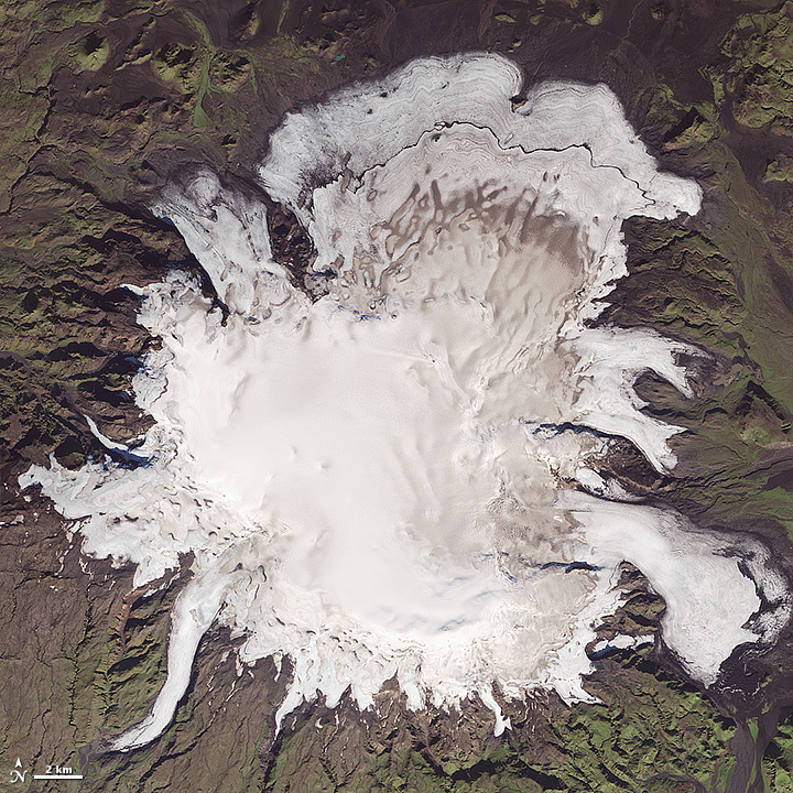 |
| 20 September 2014 |

Monday, November 10, 2014
Into Thick Air
Into Thick Air is a fun 'spoof' on what is considered by many as the ultimate mountaineering (and financial) challenge - The Seven Summits. Now, find these seven high points of the US heartland on this map: Mountains and Hills of the United States.
Sunday, November 9, 2014
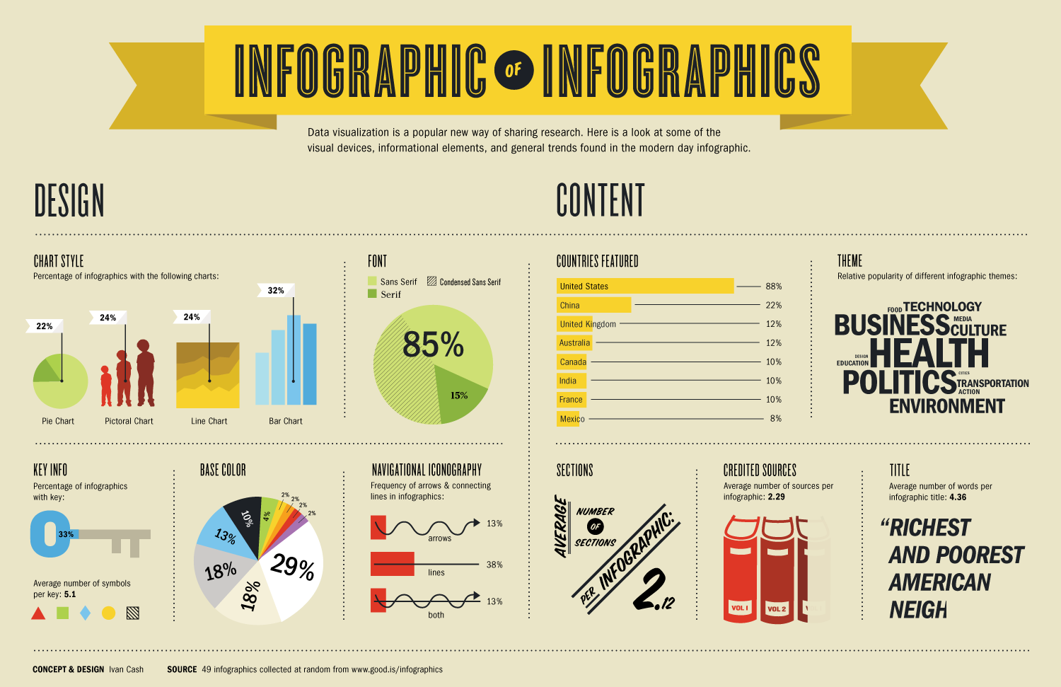
Software for Infographics
This type of compilation is hopeless, incomplete, and outdated...nevertheless...here's my compilation of Infographic Tools, Apps, and Software. Need more? How about Andy Kirk's 273 Datz Viz Resources (nicely categorized as well!). Or, Kathy Schrock's compilation of tools, links, and resources.
 |
| http://www.schrockguide.net/ |
import.io and infogr.am
This is interesting: you can use import.io to scrape data from web pages and then make infographic thereof in infogr.am - the video below shows an example.
Now they released a new tool called import.io Magic: simply paste a URL into the search box and Get Data.
More videos from Infogr.am.
Webinar: Data visualisation from A to Z with Infogr.am and Import.io from Infogr.am on Vimeo.
Now they released a new tool called import.io Magic: simply paste a URL into the search box and Get Data.
More videos from Infogr.am.
Webinar: Data visualisation from A to Z with Infogr.am and Import.io from Infogr.am on Vimeo.
/cdn2.vox-cdn.com/uploads/chorus_asset/file/2435104/same-sex_marriage_marijuana_legalization.0.png)
Saturday, November 8, 2014
Are you in Congress?
Well, not literally - but in terms of your basic demographic characteristics? Have a look at Are you reflected in the new Congress? by The Guardian.
The ACE Climate Assembly
The ACE Climate Assembly is a high school entertainment education program about climate change and sounds a bit like the Climate Reality Presentation associated with Al Gore. Still, this is a question of scale: how can you deliver the science of climate change across the country in way that is engaging and reliable?
- Request your ACE Assembly
- Flora et al. (2014): Evaluation of a national high school entertainment education program: The Alliance for Climate Education
Thursday, November 6, 2014
3D Printing to Teach Physical Geography
This sounds excessive...but how about using a 3D printer as a teaching tool in a Physical Geography lab to teach and learn about topography. That would be cool, especially if we could go from a topographic cross-section to a printed 3D model in 2 hours.
- Horowitz and Schultz (2014), Printing Space: Using 3D Printing of Digital Terrain Models in Geosciences Education and Research. Journal of Geoscience Education, 62(1), 138-145.
- Here are the MakerBot Replicators (that even sounds cool!)
- Geoscience education, meet 3D printing (Laura Guertin, 5 November 2014)
Wednesday, November 5, 2014
Clouds and Citizen Science
This is a great example of citizen science: ground-truthing NASA satellite images for clouds.
How to make an animated GIF
This seems a little complicated, but here's how to make a seamless looped GIF in Photoshop by Tabletop Whale. Below is my own attempt at an animated GIF: the Quelccaya Ice Cap in 1998.

Monday, November 3, 2014
mugs pays once
That used to be it: you either used latitude and longitude or street addresses to define the position of something (of course there are 100s other coordinate systems as well...). But now we have what3words and Google Open Location Code!
Saturday, November 1, 2014
Friday, October 31, 2014
Columbia Glacier 1986 to 2014
NASA has produced another one of their cool image comparisons: Columbia Glacier 1986 to 2014
 |
| 2 July 2014 |
Thursday, October 30, 2014
Flipping It!
The 'flipped classroom' is a bit of a hype these days - essentially going back to where content delivery (aka reading) happens before class and active learning (aka discussion) happens in the classroom. That being said, it is very much worth considering how to make the most of the precious 2.5 hours per week that we collect everyone in the same room.
Robert Talbert has been writing about his experiences with flipping on his excellent blog Casting Out Nines and now has a series of three videos on screencasting as part of a flipped course.
Robert Talbert has been writing about his experiences with flipping on his excellent blog Casting Out Nines and now has a series of three videos on screencasting as part of a flipped course.
Wednesday, October 29, 2014
How Global Warming Works!
This is a great set of videos: How Global Warming Works explains the basics in under 5, 4, 3, 2, or 1-minute.
Are global CO2 emissions still rising?
Yes they are - we know that and Are global CO2 emissions still rising? is a nice interactive story-style infographic.

Monday, October 27, 2014

Data!
International Focus
- The World Bank Open Data
- UNEP Environmental Data Explorer
- World Resources Institute: Maps and Data
- Earth Policy Institute Data Center
- WHO Data and statistics
- Gapminder World
- Worldmapper
US Focus
- Data.gov
- Social Explorer
- NREL Maps and Data
- EIA - States
- EIA - Counties
- EIA Electricity Data Browser
- 122 Data Sources
- US GHG Emissions (by state, sector, and gas)
Saturday, October 25, 2014
London and New York City
Perhaps it's not surprising that two of the world's great cities also have some of the best data portals: London Datastore and NYC Open Data.
Thursday, October 23, 2014
Who get's to decide?
Bloomberg Politics produced a nice map/infographic showing who will decide who will run the US Senate next year. The answer: only about 10.8 million people!
Missing Maps
Missing Maps is great: people who are not on the map are too easily ignored and Missing Maps is a community-based effort to change that. You can watch the progress live!
Tuesday, October 21, 2014
Atlas of Infectious Diseases
Looking for some light reading? How about the Atlas of Infectious Diseases: An interactive iBook for iPads! Or, grab the non-interactive PDF version.


OpenForis
This is not really my field, but Open Foris looks like a great open-source toolkit to monitor the state of the world's forests. Collect Mobile could be useful for many types of mobile data collection using Android-based gizmos. Read more about it here.
Sunday, October 19, 2014
ISS Live - the ultimate webcam!
This is awesome! ISS Live shows the live video feed from the ISS and its location over a 3D WebGL globe. Or view it here: ISS HD Viewing Experiment.
Saturday, October 18, 2014
What the World Eats
What the World Eats is an excellent interactive infographic - you can look at the daily diet, meat consumption, and all that since 1962 - amazing!
Compare topographic maps
This is a nice example of ArcGIS Online: a 3-panel web map showing a historical topographic map, the most current topographic map, and the Esri topographic base map. This could be great for teaching...but...viewing this requires an ArcGIS Online for Organization account.
Your Life on Earth
This is pretty cool: just enter your birth date in Your Life on Earth and see how much the world has changed since = your personal Earth history.
Wednesday, October 15, 2014
Data Viz
This is getting too much: here are 30 data viz galleries that show the best and most cutting-edge examples today. The Tableau Public or CartoDB ones, alone, would be great to follow.
Why is the sky blue?
Here's a nice 2:54 minute video by It's Okay To Be Smart: Why is the sky any color at all? Follow the link to watch the video ad-free or suffer through the first 15 seconds below.
Monday, October 13, 2014
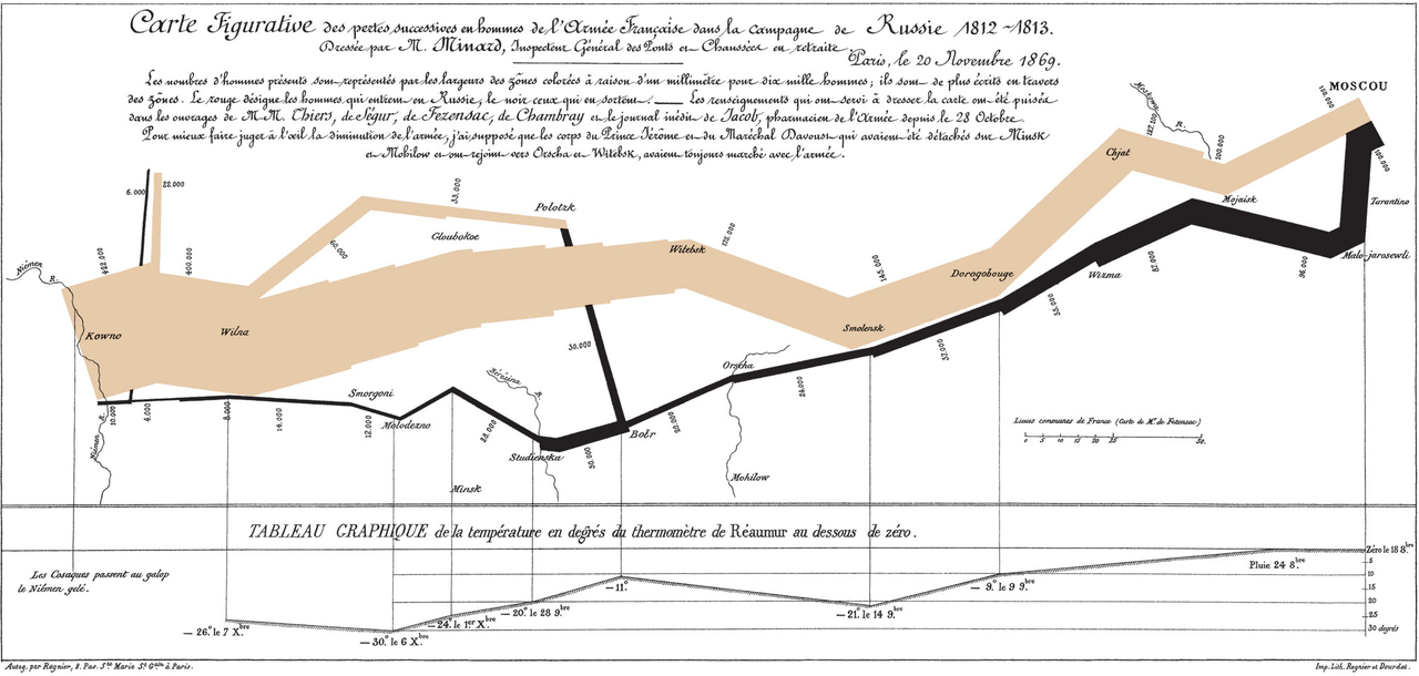
Minard and Napolean in the 21st Century
Minard's infographic of Napoleon's March to Moscow is considered by many the best statistical graphic ever drawn (although I'm not sure how many people really think that or how many simply repeat what Edward Tufte said to sound smart...). Here are two recent 21st century versions: Napoleon's March and Minard + Napoleon.

Saturday, October 11, 2014
Eight Projections
What does the world really look like? That depends on how the map was made and that's nicely illustrated by Eight Projections.
Friday, October 10, 2014

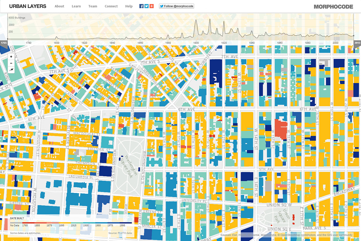
The Age of Manhattan
Urban Layers maps the age of buildings in Manhattan. It's cool, but somehow lacks a story - the map is not interactive = you cannot click on anything to see more. Plus...do we really need to see another cool visualization of urban development in NYC?

Mapping Population Density
Manifest Density is a nifty animated map: pick your region and then click anywhere in the US to map a region of about equal population. It's nice, it's simple, and tells a simple yet meaningful story.
Thursday, October 9, 2014
Drones over Mount Tom
Here's some excellent UAV footage of the 8 October 2014 microburst on Mount Tom.
Wednesday, October 8, 2014
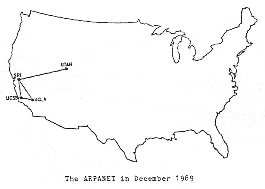
Maps that explain the Internet
This is a great map-based history: 40 maps that explain the internet
 |
| http://www.vox.com/a/internet-maps |
Tuesday, October 7, 2014
Monday, October 6, 2014
Data Viz Resources
Here's a nice Slidehare deck with tons of ideas and resources for data visualization: Data Visualization Resource Guide.
The xx, yy, zz best maps...
These compilations can be a bit tedious: the 23 maps what will blow your mind or 19 maps that show the world as never before. But, check-out these compilations for some cool maps:
- 57 maps that will challenge what you...
- 20 maps that will change the way you...
- 34 insanely detailed maps...
- 36 maps that will make you see...
- 40 maps that explain the world...
- 40 more maps that explain the world...
- 40 maps that will help you...
- 38 maps you never knew you needed...
- 22 maps and charts that will surprise you...
Saturday, October 4, 2014
Resilient Communities
Esri put together a nice ArcGIS Online site for sharing data and resources around climate change and communities = how do we plan (geodesign) for climate change resilience? Have a look at http://resilience.maps.arcgis.com/home/
Climate Science Investigations (CSI)
Here's another great teaching resource: Climate Science Investigations (CSI). Some of the modules arr still being developed, but this could form a nice framework for a Climate Change class.
Climate Change Impacts
Your contribution to climate change: see your impact on the Earth's vital signs from The Guardian is a pretty slick (and depressing) interactive infographic.
Friday, October 3, 2014
NOAA goes 2 mile!
NOAA just released their new hyper-local HRRR forecast model at 2 mile resolution. As always with NOAA their visualizations are not all that exciting, but the data are all there so I would expect to see a lot of cool data viz happening soon!
 |
| http://www.noaanews.noaa.gov/stories2014/20140930_hrrr.html |
Thursday, October 2, 2014
GIS Cloud
This looks useful (maybe): GIS Cloud - an alternative to ArcGIS Online perhaps? More information here. Also comes with a Mobile Data Collection app that's free to use on 1 device when making a public map.


Class, Education, and Income
The Geography of Class, Education, and Income in the United States is pretty simple: census tract maps of occupation, education, and income displayed as three synchronized panels via an ArcGIS Online web app.
But, combine this with The Divided City and you have a great learning activity: wealthy, educated creative types cluster around the urban core, transit hubs, knowledge institutions, and natural amenities.
(via Maps Mania)
But, combine this with The Divided City and you have a great learning activity: wealthy, educated creative types cluster around the urban core, transit hubs, knowledge institutions, and natural amenities.
(via Maps Mania)
 |
| http://www.citylab.com/work/2014/09/the-divided-city/380873 |
Tuesday, September 30, 2014
Drones...
This is increasingly a problem for science: there are so many great uses for drones / UAVs in research and teaching, but then there is the military side of things as well. Related: Don't Fly Drones Here!
Flooding
Here is an excellent interactive map / cartogram of flooding due to sea level rise produced by the NYT. It's simple, it's elegant, and does not overwhelm with the amount of interactivity or visual fireworks: Flooding Risk From Climate Change, Country by Country
More Carbon Maps!
This must be related to the UN Climate Summit and the People's Climate March in NYC!
(Via Maps Mania)
Saturday, September 27, 2014
50 States, 50 Plans
This is pretty slick: 50 States / 50 Plans is an interactive infographic that links to more infographics on renewable energy benefits - the one for Massachusetts is shown below.

Friday, September 26, 2014
Global Carbon Emissions
Must be the recent UN meetings...there are a bunch of new interactive web-based carbon emission maps. Here are two from the World Resources Institute:
Climate Change Responsibility
This is a great interactive visualization: Carbon map - which countries are responsible for climate change? (The Guardian). In some ways this is the cooler version of Worldmapper (but Worldmapper gives you the data).
 |
| 2000 carbon emissions |
Tuesday, September 23, 2014
US Census Data Viz
The US Census Bureau is creating some pretty impressive data viz - have a look at their Data Visualization Gallery and their recent swipe-style Story Maps.
Monday, September 22, 2014
NYC Street Trees
NYC Street Trees is just that: an interactive visualization of NYC street trees. And it is a great example of a 'map' that is better not being a map, Maps are great, but not always the best or most intuitive way to visualize spatial data.
Jill Hubley created the matching map: NYC Street Trees by Species
Jill Hubley created the matching map: NYC Street Trees by Species
273 Data Viz Tools
Andy Kirk compiled 273 Data Viz Tools as an interactive infograhic-like data viz, well-done! Now how do you use these great tools - how about an online course:
Or, start by watching:

Sunday, September 21, 2014
7 Things You Should Know About...
Well, at least according to Educause (keep that in mind) - otherwise 7 Things You Should Know About is a nice and quick way to learn about new academic technologies.
Friday, September 19, 2014

Thursday, September 18, 2014
Let's Doodle!
Laura Guertin has an interesting post at GeoEd Trek entitled Learning science through reading, writing… and doodling. And - why not? We already do concept mapping, mind mapping, and concept sketches - all just fancy words for doodling and there is even a YouTube channel called Doodle Science - here are some good ones:
Laura included this excellent video below:
- Non-Renewable Energy Resources
- Renewable Energy Resources: Part 1
- Renewable Energy Resources: Part 2
- Minute Earth
- Minute Physics
Laura included this excellent video below:
Google My Maps is back!
Google My Maps was around several years ago - a fun, simple, and somewhat buggy way to create and share personalized maps right out of Google Maps. I liked it so much that I even created two learning activities for it: Creating Personalized Maps with Google My Maps and Google My Maps: Simple Quantitative Analysis.
Then it went away somehow into the deeps of the Google 'ecosystem' and was reborn a year or two ago as Google Maps Engine Lite. But, by then there were much better options, for example ArcGIS Online by Esri.
Now there is Mapme - a fun and simple tool to create online interactive maps that are built-on Google My Maps. I'm not sure what Mapme does better than the basic Google My Maps interface (which is already about as easy as it can be).
Hurricanes 1851 - 2000
Hurricanes 1851 - 2000 is a nice and simple Google Map published by the USGS - you can interact with it, share it, embed it (see below), or open it in Google Earth, nice!
Boston Bike Network
This is a nice and simple web map - showing both the current bike routes and by moving the slider the ones planned for the next 30 years or so: Boston Bike Network Plan
Wednesday, September 17, 2014
Great Story Maps!
Esri compiled some great Story Maps that all include some level of actual analysis. That's always the challenge - making maps to convey beautiful information is easy, but that's a very limited application of GIS: it's about quantitative geospatial analysis...not just mash-ups.
Have a look: Speaking the “Language” of Spatial Analysis via Story Maps
Have a look: Speaking the “Language” of Spatial Analysis via Story Maps
Sunday, September 14, 2014
122 Data Sources
Not sure why this ended at 122...but this is a good list for a data viz project: 122 Data Sources
Friday, September 12, 2014
The Best Open-Source Maps!
Well, at least according to the 2014 FOSS4G Map Gallery - which is your favorite?
 |
| https://2014.foss4g.org/map-gallery/ |
Thursday, September 11, 2014
Global Migration 1990 to 2013
Origins and Destinations of the World’s Migrants, from 1990-2013 is a nice interactive map from the Pew Research Center: just pick you country, select into or out of, and you get a nice interactive map and matching data table. Only one thing is missing: a simple way to download the data!
Wednesday, September 10, 2014
NYC Data
This is impressive: any data set you can possibly imagine is available at NYC OpenData. You can map it, visualize, and export it in all kinds of formats - very cool!
Birds and Climate Change
The Audubon Society just released the Birds and Climate Change Report with incredible information, maps, and data on the future of 314 bird species. But the presentation is confusing and complex...I can't figure-out where to download the data (Nick Stockton @ WIRED did and created some great maps of the Bald Eagle and Turkey Vulture).
Tuesday, September 9, 2014
Embed YouTube Videos in Google Earth
Not sure why this is an issue...but here's what you need to do to embed YouTube videos in a Google Earth place marker:
Make sure you add http: (or https:) to the embed code you are given, for example:
<iframe width="560" height="315" src="//www.youtube.com/embed/RebX7YEn3GQ" frameborder="0" allowfullscreen></iframe> needs to be <iframe width="560" height="315" src="http://www.youtube.com/embed/RebX7YEn3GQ" frameborder="0" allowfullscreen></iframe>
Same for the old embed code.
Friday, September 5, 2014
CLEAN
CLEAN is the Climate Literacy and Energy Awareness Network with tons and tons of resources and teaching materials related to teaching climate and energy literacy.

- Informed Climate Decisions
- Teaching Resources (college, lower)
- Teaching Resources (college, higher)
- Teaching Materials
- Teaching Climate
- Teaching Energy
- Concept Maps
Tuesday, September 2, 2014
Losing Louisiana!
Here's a great web map / story map by the folks from ProPublica called Losing Ground that illustrates land losses in southeastern Louisiana due to climate change, subsidence, and oil/gas exploration.
Just Playing In The Shale!
Or: Fracking in PA for Natural Gas
 |
| http://googlemapsmania.blogspot.com/2014/09/fracking-in-pennsylvania-mapped.html |
Subscribe to:
Posts (Atom)