Here are some useful links for Arctic DEM:
Monday, December 23, 2019
Sunday, December 22, 2019
https://www.solar-estimate.org/
https://www.solar-estimate.org/ is clearly commercial, but it would be interesting to compare the results with the good old PVWatts Calculator by the NREL.
R, RStudio, RStudio Cloud
R is a programming language or a software environment for statistical analysis, scientific computing, and graphics. RStudio is an IDE for using R. In other words: You can use R without using RStudio, but you can't use RStudio without using R. Finally, there is RStudio Cloud.
Now, just be aware: R is open-source, but RStudio is not.
Now, just be aware: R is open-source, but RStudio is not.
Friday, December 20, 2019
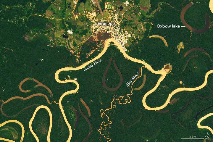
Tracking Amazon Deforestation from Above
 |
| https://earthobservatory.nasa.gov/images/145988/tracking-amazon-deforestation-from-above |
Tracking Amazon Deforestation from Above
Tracking Amazon Deforestation from Above has some great animated GIFs and charts. Here's one of them:


Wednesday, December 18, 2019
Climate Change In the American Mind
Climate Change In the American Mind is a great resource.
- Great reports, for example Climate Change In the American Mind (November 2019).
- Global Warming’s Six America’s Screening Tools = the survey and instructions.
- The CCAM Explorer: interactive charts (using Tableau), survey questions, and data.
Tuesday, December 17, 2019
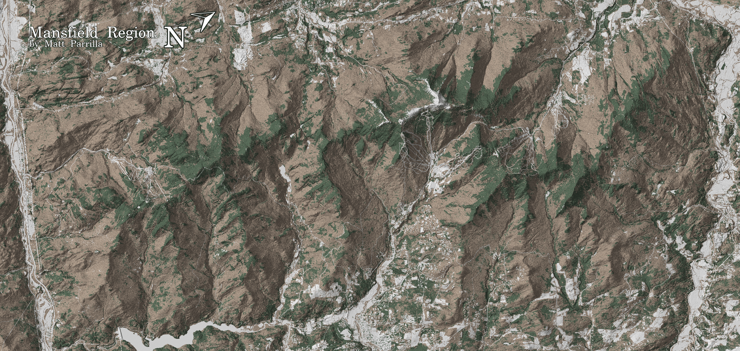
Green Mountain Maps
Nothing really 'fancy' here, but Green Mountain Maps is a nice use of open-source data for a specific purpose (here tree skiing in Vermont).
Colors
Here are two great apps for better color choices:
- Happy Hues (works great for website colors)
- Viz Palette
Of course there's always the good old ColorBrewer 2.0.
Sunday, December 15, 2019
McKibben (after Humboldt)
“We can register what is happening with satellites and scientific instruments, but can we register it in our imaginations, the most sensitive of all our devices?”
Bill McKibben (http://grist.org/article/mckibben-imagine/)
Bill McKibben (http://grist.org/article/mckibben-imagine/)
Saturday, December 14, 2019
Friday, December 13, 2019
Weather Time Machine
The title is somewhat misleading, but the Weather Time Machine is a great data viz / story map of how we can use old ships logs to estimate past weather and climate.
Thursday, December 12, 2019
_Page_35.jpg)


Wednesday, December 11, 2019
The Teacher-Friendly Guide™ to Climate Change
The Teacher-Friendly Guide™ to Climate Change looks like a great resource.
Tuesday, December 10, 2019
Sunday, December 8, 2019
Awning Design
Here's a nifty little modeling tool for your passive solar house: Awning Design (from Science Pickle, just scroll-down).


Saturday, December 7, 2019
Thursday, December 5, 2019
ERA5 Explorer
The ERA5 Explorer is pretty fancy: click on the map and get a bunch of interactive charts.
Wednesday, December 4, 2019
DataWrapper
DataWrapper recently changed their pricing structure and their new free plan is really appealing now: unlimited charts, export as PNGs, and collaboration. Nice.
Sunday, December 1, 2019
Google Earth Projects
I almost forgot about this, but Google Earth Projects are a quick and easy way to fly around the earth from place-to-place. More here or have a look at the Help Content or watch below.
Saturday, November 30, 2019
NetCDF into ArcGIS Pro
The lesson Explore Future Climate Projections is pretty good and nicely-shows how to import and map NetCDF files (and convert to tables).
Friday, November 29, 2019

Thursday, November 28, 2019
En-ROADS and C-ROADS
Wednesday, November 27, 2019
Common Online Data Analysis Platform (CODAP)
This looks great: Common Online Data Analysis Platform (CODAP): a web-based and free data exploration and analysis tool.
Using R with 7th-grade science students
Using R with 7th-grade science students does not seem like a good idea to me (based on my experience teaching undergraduates at a public 4-year college in Massachusetts), but take a look yourself.
Tuesday, November 26, 2019
Superfund Sites and Climate Change
Superfund Sites and Climate Change (from the GAO!) is just a simple interactive web map and the data are provided as an MS Excel spreadsheet.
Saturday, November 23, 2019
Docker, Binder, Colaboratory, and more
If you are interested in any of these: Make code accessible with these cloud services (Nature 7 November 2019). Try Binder @ https://mybinder.org/.
Friday, November 22, 2019

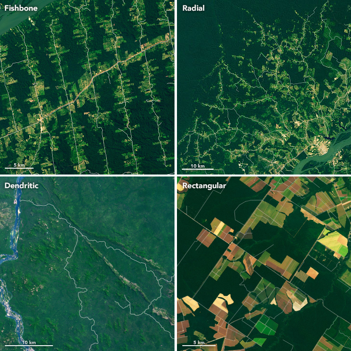
Making Sense of Amazon Deforestation Patterns
Making Sense of Amazon Deforestation Patterns shows some great examples of - well - spatial patterns of deforestation in the Amazon as seen from satellite images.
Thursday, November 21, 2019
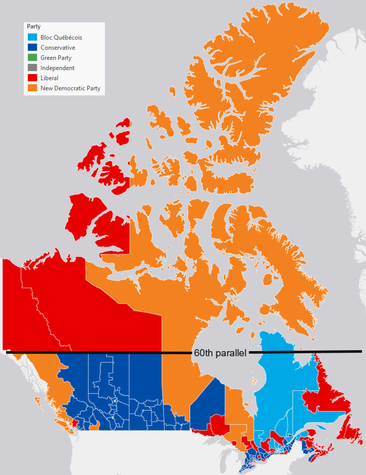
Mercator, it's not hip to be square
Good stuff from Ken Field: Mercator, it's not hip to be square. Quote: "Simply put, Web Mercator kills thematic maps." Perfect example: 2019 Canadian election maps.
Saturday, November 16, 2019
Wednesday, November 13, 2019
Tuesday, November 5, 2019
Infrared Radiation
The first 15 seconds (and the rest) show a nice example of infrared vs. visible radiation (aka light).
SLR Maps
There are a bunch of web-based interactive tools to visualize the impacts of sea-level rise - here are a few of them:
- Sea Level Rise and Coastal Flood Web Tools Comparison Matrix - National (by Climate Central)
- Coastal Risk Screening Tool - Global (by Climate Central)
Sunday, November 3, 2019
Python and ArcGIS Pro
Nice 4-part series about using Python in ArcGIS Pro by Olivia Iannone (Esri). Plus good courses offered by Esri:
Street Orientation
This is not all that new, but interesting: Road Orientations Map. Read more about it here: Visualizing street orientations on an interactive map. I always find these 'gridded' cities a little weird (being from Europe), especially those 'forcing' the grid over significant topography (e.g. San Francisco).
Saturday, October 26, 2019
ParkScore and ParkView
Thursday, October 24, 2019
Wednesday, October 23, 2019
City Streets
The direction of streets in cities can tell you a lot about its geography and history: Urban Street Network Orientation is a nice data viz of that.
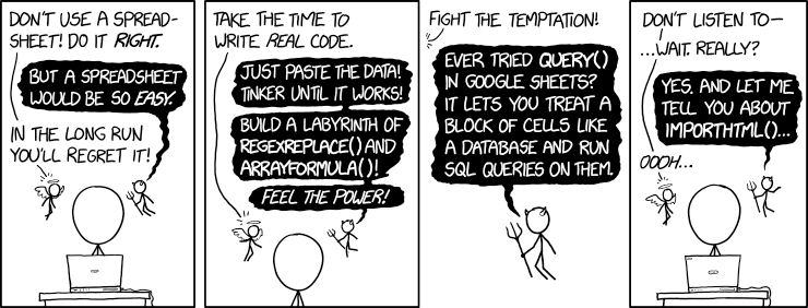
MS Excel and Google Sheets on Steroids!
I admit: I use MS Excel a lot and I'm still amazed how much more there is 'under the hood' in terms of functions, analysis options, and charting tricks - here are a few good ones I came across recently:
- An Empty Bar (Ann K. Emery)
- Removing the Double Y Axis (Ann K. Emery)
- VLookup (Ann K. Emery)
- From Data to Charts in 5 minutes (Ann K. Emery)
- Excel Elbow Grease (great tricks by Ann K. Emery)
- Muted Grid Lines and Area Charts (Ann K. Emery)
- Number Formatting / Conditional Formatting (Ann K. Emery)
- Formatting Months, Days, and Years in Excel (Ann K. Emery)
- Label Axis and/or Data? (Ann K. Emery)
- Formatting Names (Ann K. Emery)
- Sorting and Filtering your Spreadsheets (Ann K. Emery)
- Place Labels Directly On Line Graph (Ann K. Emery)
- Custom Color Codes in Excel (Anne K. Emery)
- Categorize values with =IF() and =VLOOKUP() (Ann K. Emery)
- How to Use Vlookup in MS Excel (Anne K. Emery)
- How to match data with VLOOKUP in Excel & Google Sheets (Lisa Charlotte Muth)
- Sparklines and Data Bars (Ann K. Emery)
- Add Dotted Lines to Line Graphs (Ann K. Emery)
- Direct Labeling in Excel (Stephanie Evergreen)
- Make a Pictogram in Excel (Stephanie Evergreen)
- Fast Small Multiple Graphs (Stephanie Evergreen)
- Easy Dot Plots in MS Excel (Stephanie Evergreen)
- Dumbbell Dot Plots in MS Excel I (Stephanie Evergreen)
- Dumbbell Dot Plots in MS Excel II (Stephanie Evergreen)
- Dumbbell Dot Plots Way Easier (Stephanie Evergreen)
- Make a Slopegraph in Excel (Stephanie Evergreen)
- How to make a scatter plot in Excel (Storytelling with Data)
- Adding a Benchmark Line (Stephanie Evergreen)
- Customizing Colors (Stephanie Evergreen)
- Showing Standard Deviation (Stephanie Evergreen)
- Confidence Intervals to Dot Plots (Stephanie Evergreen)
- Margin of Error in Excel with “Slider Plots” (Andrew Forsman)
- Directly Labeling Excel Charts (Jonathan Schwabish)
- Edit a ledgend in Excel (Storytelling with Data)
- Swimmer Plots (Jon Peltier)
- Pivot Tables (Jon Peltier)
- Interactive data dashboards (Ben Collins)
- Supercategory axis labels (Cole Nussbaumer Knaflic)
- Plotting value within range (Cole Nussbaumer Knaflic)
- Embedding a vertical reference line in Excel (Elizabeth Ricks)
- How to do it in Excel: a shaded range (Elizabeth Ricks)
- How to do it in Excel: adding data labels (Elizabeth Ricks)
- Data prep for MS Excel / Google Sheets (Chartable)
- Extract Text from Data Columns (Chartable)
- Create a dot plot (Storytelling with Data)
- Save As Template (Stephanie Evergreen)
Tuesday, October 22, 2019
Mer de Glace: 1919 to 2019
More details here: Misusing the Georeference Tool for Historic Image Alignment
 |
| https://www.esri.com/arcgis-blog/products/arcgis-pro/mapping/misusing-the-georeference-tool-for-historic-image-alignment/ |
Friday, October 18, 2019
Atmosphere, Oceans, and Continents
The EarthWindMap (https://earth.nullschool.net/) is awesome, especially the ability to visualize different atmospheric levels and weather variables. Now we have KCM-earth to compare ocean and wind currents between today and the Early Cretaceous.
Tuesday, October 15, 2019
1-Minute Map Hacks
John Nelson put together a series of quick videos called 1-Minute Map Hacks with some neat tips and tricks. My favs: 1) How to Fix Overly-Busy Coastlines, 2) How to Tweak a Projection, and 3) Georeference Images.
Saturday, October 12, 2019
How years compare with the 20th Century average
I really like this animated chart: How years compare with the 20th Century average. It would be great as a Youtube video or animated GIF.
Thursday, October 10, 2019
Remote Pixel
Remote Pixel lets you view Landsat and Sentinel-2 images, perform basic analysis, and download the raw tif files. All that in a simple interface!
Wednesday, October 9, 2019
Mapping Photographs
This is nothing new, but here are a few nice examples:
Here's the How-To from Maps Mania.
Thursday, October 3, 2019
Saturday, September 28, 2019
Based On Science
Based on Science = Answers to Everyday Science and Health Questions from the National Academies
Tuesday, September 24, 2019
Saturday, September 21, 2019
Tuesday, September 17, 2019
Inclusive Teaching
This is a pretty good read: Want to Reach All of Your Students? Here’s How to Make Your Teaching More Inclusive. The authors emphasize the importance of structure and offer a nice analogy: "For example, say you threw a party to bring together your single friends. They are far more likely to meet a variety of people if you plan icebreakers and activities (high structure) than if you simply provide space and time for the event (low structure). The same is true of learning: More structure means more students will engage and learn from you and their peers...the extroverted party lover is going to mingle and meet people in either a low- or high-structure event. But the introverts (like us) who aren’t comfortable with random mingling won’t. Helping those who need the structure doesn’t harm those who don’t."
Air Bubbles in Ice
Great photograph by @ lakewoodhiker:
 |
| https://twitter.com/lakewoodhiker/status/1173978513247879168 |
Sunday, September 15, 2019
IBM Watson Studio Desktop
IBM Watson Studio Desktop does it all: data viz, Big Data, AI, gives back rubs, etc. Way too expensive @ $199/month, but there is a free student edition.
Saturday, September 14, 2019
Extreme climate change has arrived in America
2°C: BEYOND THE LIMIT is a nice scroll-able data viz from the Washington Post. Be patient, keep on scrolling, and you will eventually find an interactive chart showing temperature changes between 1895 and 2018 for a U.S. County of your choice.
LabScrum
Scrum for academic labs = LabScrum. I like it: sprints, stand-ups, etc. could make the way we operate so much more effective. Nice article in Nature: A project-management tool from the tech industry could benefit your lab.
Wednesday, September 11, 2019

Tuesday, September 10, 2019
Mercator (again)
Mercator - It's flat, flat world is a nice immersive story map that nicely describes and illustrates the history of this map and map projection.
Monday, September 9, 2019

Sunday, September 8, 2019
Snow Depth Mapping using SfM and more
Goetz and Brenning (2019): Quantifying uncertainties in snow depth mapping from structure from motion photogrammetry in an alpine area. Water Resources Research, doi: 10.1029/2019WR025251.
Filhol et al. (2019): Time-lapse Photogrammetry of Distributed Snowdepth During Snowmelt. Water Resources Research, doi: 10.1029/2018WR024530. Ground-based, oblique with 3 cameras - easy in concept, but the details are complex. They make a good point: usually we either have high-frequency time series from point measurements or sporadic spatial data from satellites, UAVs, etc. Their approach tries to bridge that gap.
Filhol et al. (2019): Time-lapse Photogrammetry of Distributed Snowdepth During Snowmelt. Water Resources Research, doi: 10.1029/2018WR024530. Ground-based, oblique with 3 cameras - easy in concept, but the details are complex. They make a good point: usually we either have high-frequency time series from point measurements or sporadic spatial data from satellites, UAVs, etc. Their approach tries to bridge that gap.
Friday, September 6, 2019
Monday, September 2, 2019
More About Colors
Your Friendly Guide to Colors in Data Visualisation is a nice compilation with some nice resources, for example CARTOColors and Colorpicker.
Friday, August 30, 2019
uHandy Mobile Microscope Duet
The uHandy Mobile Microscope Duet looks really fun and a great way to use a smartphone for science teaching. It's a little pricey at $129.95, but there's the uHandy Lite for $34.95. Read a review here.
Monday, August 26, 2019
Saturday, August 24, 2019
Slavery in the USA
Great story map from USA Today and a nice examples of the so-called digital humanities (DH): Slavery's explosive growth, in charts: How '20 and odd' became millions.
Thursday, August 22, 2019
Anchor Phenomena in Science Teaching
Anchor phenomena is one of the buzz words today in STEM teaching and learning: something that connects a specific activity or learning sequence to something that students find compelling. Here are some resources:
Wednesday, August 21, 2019
Cyber Agriculture
Cyber Agriculture: read more about it The future of agriculture is computerized (MIT News). That's all fine - now please show me that this works for growing something useful such as potatoes, cassava, tubers, etc. - then I may get excited.
Educational Attainment in America
Educational Attainment in America is a nice dot map. I find these maps a little tricky to interpret due to the uneven distribution of population across the country. This one, however, has a nice feature in that you can generate a simple bar chart for the current view.
Monday, August 19, 2019
Sunday, August 18, 2019
Julia
Julia = the speed of C with the convenience of Python. If you don't know what any of this means...have a look at Julia: come for the syntax, stay for the speed, download Julia, and start your coding with Juno.

Saturday, August 17, 2019
Machine Learning / AI
Or as we also call it: voodoo. Something that some people do somehow using this thing called Big Data that is out there, but nobody can see (= dark matter). Here are a couple of days to do this voodoo yourself and makes a lot of money.
Wednesday, August 14, 2019
Wind Speed, Wind Direction, and Temperature
Wind Speed, Wind Direction, and Temperature across the USA in one animation? Have a look at US Wind Patterns. Cool? Yes! Useful? No.
Thursday, August 8, 2019
Mapping Segregation
Nothing new here, but two nice interactive visualizations using two different approaches: one is a classic dot map, the other a census polygon map.
- Segregation Map (Washington Post)
- Segregated, really segregated, or ultra-segregated?
Tuesday, August 6, 2019
Better Research Posters
Great stuff here from Mike Morrison and this really highlights the issues we have in scientific communication in-general.
- To Save The Science Poster, Researchers Want To Kill It And Start Over
- #betterposter Template
- Example 1
- Example 2
Monday, August 5, 2019
The Top 12 Landsat Image Sites
The Top 12 Landsat Image Sites is pretty obvious. I'm still using the good old USGS GloVIS viewer (works great, also for the Sentinel images).
Saturday, August 3, 2019
Runways and Wind
Obviously, runways are oriented to match the most common wind direction, so therefore a map of runways should be able to tell us a lot about the most common wind direction. Have a look at Trails of the Wind for just that.
Explore the Solar System with Tabletop Whale

The Daily Selfie
Pretty cool animation showing how Planet's fleet of satellites image the entire Earth, daily.
Poverty USA
Poverty USA offers demographic data viz at the US county level for different years in a nice and clean interface. Now, what would be better:
- Add the US cities level.
- Add a comparison function that let's you compare two cities or counties.
- Add a image export.
- Add a data export.
The Humanitarian Data Exchange
The Humanitarian Data Exchange looks great and Joe Kerski tried it here.
Wednesday, July 31, 2019
#ShowYourStripes
- #ShowYourStripes is pretty cool: simple and elegant!
- Similar, but works at the US Counties level: Annual United States Climate Stripes: Temperature and Precipitation
 |
| Massachusetts |
Monday, July 29, 2019
The National Map
The National Map (USGS) is one of the most underrated sources of GIS (and other) data, for example the USGS 3D Elevation Program data.
Sunday, July 28, 2019
WorldClim Data
WorldClim is a set of global climate layers (gridded climate data) with a spatial resolution of about 1 km2. These data can be used for mapping and spatial modeling. Best of all: you can get past, current, and future climates. And: all as geoTIFFs and not some cryptic NetCDF...
Saturday, June 8, 2019
Timeline JS and Storyline JS
Storyline JS is a fun tool: take a simple Google Sheet with time series data and annotate dates/times of interest with interactive cards. That's it. Simple.
Timeline JS is similar, but offers more features with embedded media to illustrate events over time.
Both are in a sense story maps, but here the main organizational frame is time, not space.
Timeline JS is similar, but offers more features with embedded media to illustrate events over time.
Both are in a sense story maps, but here the main organizational frame is time, not space.
Wednesday, June 5, 2019
First You Make the Maps
First You Make the Maps is just awesome - a great visual narrative of how maps enabled and shaped global trade using an immersive Story Map.
The Geographies of Innovation
Seen on Maps Mania: The Geographies of Innovation
And, I agree: these maps are beautiful, artistic, and technologically very high-end. But, they are also confusing, too dense, and just 'too much' data viz wizardry. Thus, they fail that what is perhaps the most-important reason for data viz: telling a data-driven story that your audience finds compelling enough to take action.
And, I agree: these maps are beautiful, artistic, and technologically very high-end. But, they are also confusing, too dense, and just 'too much' data viz wizardry. Thus, they fail that what is perhaps the most-important reason for data viz: telling a data-driven story that your audience finds compelling enough to take action.
Tuesday, June 4, 2019
Travel Times to US State Capitals
I guess it all started with Rome and now they have extended the basic analysis to US state capitals:


Friday, May 31, 2019
Geography and Poetry
Or: poetry about place and places - a great DH example.
- Places of Poetry
- Poems about Places: The Poetry Atlas
Thursday, May 30, 2019
The JPEG
Yep, the JPEG: Read Unraveling the JPEG and you will learn more than you ever wanted about this image file format - excellent!
Wednesday, May 29, 2019
Microsoft Power BI
Microsoft Power BI looks interesting - a fancy 'enterprise' version of Tableau maybe (dashboards are certainly hip these days).
Monday, May 27, 2019
Blockly
Blockly is a visual programming 'interface' that uses interlocking blocks to create a programming 'workflow'. Then, on the right, the underlying code is displayed in JavaScript, Python, etc. Looks interesting - I wish they would provide clearer instructions (= without the jargon) on how to install and setup Blockly.
Deforestation: Guatemala vs. Belize
Pretty clear differences in environmental policies highlighted here in Google Earth Timelapse along the Guatemala / Belize border.
Friday, May 24, 2019
Thursday, May 23, 2019
Flourish
Flourish is great: a web-based interactive data viz tool with all the usual features - all very similar to the other players in this field such as Datawrapper. The free public version is great, anything beyond that is outside of what a 'normal' person in higher education would want to pay.
Wednesday, May 22, 2019
Tuesday, May 21, 2019
Monday, May 20, 2019
China's Belt and Road Initiative
China's Belt and Road Initiative (BRI) is a massive infrastructure project (aka. the New Silk Road). The goal is obvious: extend China's power by facilitating trade and opening new markets for goods and services - westward and southward.
Here's the catch: these projects are funded via loans from China to the participating countries. And of course China expects a return on that investment. If the countries cannot repay the loan, then China takes over the project (e.g. Sri Lanka's Hambantota port) and thus establishes its presence. Thus, some view the BRI as a 'Trojan Horse' to dominate the rest of Asia.
There is also a scientific side of the BRI as described here: How China is redrawing the map of world science (Nature, 2 May 2019).
Saturday, May 18, 2019
Sunday, May 12, 2019
How Does Your State Make Electricity?
How Does Your State Make Electricity? is a great data viz presentation from the NYT. However, I'm not a fan of these 'turd charts' as they imply that huge changes have occurred when the 'turds' cross each other.


Saturday, May 4, 2019
Chart chooser based on data format
A Chart chooser based on data format seems like an obvious idea (seen on FlowingData based on Multiple views on how to choose a visualization). Here's the Chart Chooser.
Saturday, April 27, 2019

Friday, April 26, 2019
The State of Glaciers in 2019
Two recent papers presented global assessments of glaciers outside of the two major ice sheets:
- Farinotti et al. (March 2019, Nature Geoscience)
- Zemp et al. (18 April 2019, Nature)
In summary: the about 215,000 glaciers (outside of the Greenland and Antarctic Ice Sheets) represent about 0.4 m SLR equivalent and glacier mass balances are negative everywhere. Caveat: of these about 215,000 glaciers we only have direct mass balance observations from 450, ice thickness data from about 1,000, and geodetic mass balance data from 19,130.
I'm not so sure that these specific numbers are all that useful - here's the summary: there are a lot of glaciers on Earth and they are all losing mass due to global warming. The details are interesting, but not all that important.
 |
| Zemp et al. (2019, Figure 2) |
Thursday, April 11, 2019
Urban CO2 Data
Here you can have it all: an interactive map, the data as text files, and the gridded model output as GeoTIFFs: Global Gridded Model of Carbon Footprints (GGMCF)
Tuesday, April 9, 2019
Glaciers and Climate
A few resources that I came across recently:
- Glaciers & Ice Ages (nice pictures and diagrams, useful as teaching materials).
- How Do Glaciers Move? by It's Okay To Be Smart.
- 97% of Climate Scientists Really Do Agree by It's Okay To Be Smart.
Wednesday, April 3, 2019
Why Do Compressed Air Cans Get Cold?
Good stuff here that is applicable to what happens in the atmosphere.
Tuesday, April 2, 2019
Renewables since 2010
This is nicely-done: explore by region, country, and technology: How much electricity is generated from renewable energy sources?

Bears Ears National Monument
Impressive immersive 'scrolly-style story map about the Bears Ears National Monument from the Washington Post.
Saturday, March 30, 2019
Tuesday, March 26, 2019
The Story of The US Told In 141 Maps
The Story of The US (March 1789 to August 1959) Told In 141 Maps is great - have a look!
Saturday, March 16, 2019
Citizen Science
It's been a while since I read anything about that and so the paper Engagement in science through citizen science: Moving beyond data collection (Phillips et al. 2018) was interesting: yes, tell me how we can move beyond just running around outside to collect data. That's fun and important, but that's not science.
Well, turns out that we may want the CS participants to get involved more in the data analysis and project design, but they don't. They are happy collecting data and leaving the rest to the scientists.
Well, that makes sense - we simply cannot engage with everything. There are some things that we just want to do and support but not think about too deeply.
Firefox Send
Firefox Send is a simple and easy way to share files that are too large for Email attachments. I really would like to use Firefox...but Google Drive/Docs works so much better in Google and my Outlook for Web works so much better in IE.
FastCharts
Add your data and chart it using FastCharts. That's it. Quick and easy and not many options for customization. Download as PNG or SVG.
Saturday, March 2, 2019
Friday, March 1, 2019
Permafrost and Methane
The positive feedback associated with methane release from melting permafrost may very well be the greatest threat that nobody talks about. The South China Morning Post put together a nice scroll-able Story Map in What is permafrost and why might it be the climate change time bomb? with excellent maps and visuals.
Mapping Power Plants
Maps Mania has compiled four interactive websites that map - well - power plants: Mapping the World's Power Plants. Here's one of them:
Wednesday, February 27, 2019
The Lifespan of News Stories
The Lifespan of News Stories is pretty cool with an animated timeline of 2018 and a matching interactive map below. I wonder if one could 'classify' the shapes of these 'curves' and create a model to predict the level, intensity, and duration (= lifespan) of future news stories.
Monday, February 25, 2019

Saturday, February 23, 2019
Earth's Topography
Earth Elevation is a nice data-viz, slicing the Earth's topography and bathymetry along lines of latitude.
Wednesday, February 20, 2019
What We Could Do.
Great data viz from the NYT - what we could do in terms of emission reductions if we would adopt policies in-place around the world: How to Cut U.S. Emissions Faster? Do What These Countries Are Doing.
Tuesday, February 19, 2019
Monday, February 18, 2019
Cyber GIScience Literacy
Yep, that's a term - read more about it here: Cyber Literacy for GIScience: Toward Formalizing Geospatial Computing Education (Shook et al., 2019).
Interesting read, but it is difficult not to get a little disillusioned when you are actually teaching Introduction to GIS to undergraduates in 2019. I like the inspirational ideas, but let's start with some basic computer literacy (where's my file and why does it matter?) - that's especially a problem for Mac users.
Interesting read, but it is difficult not to get a little disillusioned when you are actually teaching Introduction to GIS to undergraduates in 2019. I like the inspirational ideas, but let's start with some basic computer literacy (where's my file and why does it matter?) - that's especially a problem for Mac users.
 |
| https://blogs.agu.org/onthejob/files/2019/02/Forrest-blog.jpg |
Saturday, February 16, 2019
Katharine Hayhoe @ TEDWoman 2018
Katharine Hayhoe is getting a little overexposed these days, but her message is important in this TED Talk. Even better is her Global Weirding with Katharine Hayhoe YouTube channel.
3D Printing
Noting new to see here, but some useful links related to 3D printing:
- https://www.myminifactory.com/
- https://www.thingiverse.com/
- OpenSCAD (3D modelling software)
Thursday, February 14, 2019
Shifting Cities Due To Climate Change
Simple and powerful!
- What will summers be like in 2100 for 1001 cities in the USA?
- What will winters be like in 2100 for 1001 cities in the USA?
- What will summers be like in 2100 for cities around the world?
- What will climate feel like in 60 years? (paper)
Wednesday, February 13, 2019
Tuesday, February 12, 2019

Sunday, February 10, 2019
Where Batteries Begin
Where Batteries Begin has great pictures and information on how and where we get the lithium we need for all these batteries that will solve global warming.
Climate Change in 10 Words
After John Cook: It’s real. It’s us. It’s bad. Experts agree. There’s hope.
Thursday, February 7, 2019

Sunday, February 3, 2019
Urban Footprint
Urban Footprint sounds cool, but even after exploring their website I'm not sure what it really is...they claim that Urban Footprint will allows us to "Teach basic and advanced planning methods without the hassle of traditional GIS systems".
Thursday, January 24, 2019
How we make electricity
Here are interactive web resources related to electricity generation in the US:
- U.S. Power Plants, 2016 allows you to compare electricity generation in 2007 and in 2016.
- An Atlas of Electricity is a fully-immersive Esri Story Map
MOL: The Map of Life
MOL Map of Life has it all: interactive web map, data, and an app to contribute to biodiversity observations.
Wednesday, January 23, 2019
Average Cloud Cover in 2018
This is great: Average Earth from Space 2018
More details here.
More details here.
 |
| https://hannes.enjoys.it/blog/2019/01/average-earth-from-space-2018/ |
Monday, January 21, 2019

Thursday, January 10, 2019
Climate Disasters 2018
Deadly weather: the human cost of 2018's climate disasters – visual guide from The Guardian is intense. Maybe too intense - too much visual fireworks that distract from the story.
Tuesday, January 8, 2019
2018 Winds
This is super-cool: 2018 Winds
This animation nicely shows the main large-scale wind systems and, superimposed, the travels of mid-latitude cyclones in the Westerlies and tropical cyclones ('hurricane pearls') in the Trade Winds.
Embedded below is a similar effort by nullschool (hurricane season starts ~1:15).
This animation nicely shows the main large-scale wind systems and, superimposed, the travels of mid-latitude cyclones in the Westerlies and tropical cyclones ('hurricane pearls') in the Trade Winds.
Embedded below is a similar effort by nullschool (hurricane season starts ~1:15).
Monday, January 7, 2019
Gilbert Plass (1956 and 1959)
Gilbert Plass had this all figured-out 50 years ago.

- Plass (1956): The Carbon Dioxide Theory of Climatic Change
- Plass (1959): Carbon Dioxide and Climate

Google Tour Creator
Google Tour Creator is basically a quick and simple way to build tours using Google Street View imagery. Here's a quick video: How to Use Google's VR Tour Creator.
Nice tool, especially for urbanized and developed areas with good Street View imagery.
Nice tool, especially for urbanized and developed areas with good Street View imagery.
Tuesday, January 1, 2019
ArcGIS Hub Open Data Portal
The ArcGIS Hub Open Data Portal is great.
- Finding Data on ArcGIS Hub Open Data Portal helps you with finding data.
- Hubs Around the World lets you explore open data hubs as a Story Map.
The Distressed Communities Index
Read more about it here: From Great Recession to Great Reshuffling and explore the interactive map. Now overlay that on the 2016 election map and tell me what you see (Elizabeth Warren!).
Subscribe to:
Posts (Atom)