Wednesday, December 30, 2020
Thursday, December 24, 2020


Sunday, December 20, 2020
Land Below Sealevel
Nothing new here, but a nice map: Land projected to be below the annual flood level in 2050 (here: Boston). Zoom, pan, and change the settings: our choices matter!
Saturday, December 19, 2020
Data Organization in Spreadsheets
Data Organization in Spreadsheets is a great little (open-access, thanks!) paper with all kinds of useful tips - perfect for helping students get better with MS Excel.
Thursday, December 17, 2020
Science Games
- The Climate Trail (https://www.theclimatetrail.com/) has gotten good reviews from fellow educators.
- The Cranky Uncle Game (https://crankyuncle.com/game/) looks great and I like John Cook's work.
- Plague Inc: The Cure lets you save the world from a global pandemic.
The Best Projection?
Choropleth maps (also called thematic maps) visualize data as a function of geographic areas and, as with every map, you need a projection to convert the 3D shape of the earth to the 2D shape of your screen or piece of paper. This is not really an issue when mapping a small area (say census tracts in Massachusetts), but becomes an issue when mapping at the scale of the plant.
Designing choropleth maps: What projection to choose? tries to figure-out what map projection is the best. Obviously it has to be an equal-area projection, but which one?
For me: Equal Earth or Mollweide.

Monday, December 14, 2020
Esri Field Maps
Tuesday, December 8, 2020
Reconstructing Land Use LiDAR
Reconstructing Land Use LiDAR is a great example of using an Esri Story Map to create a tutorial.
Sunday, December 6, 2020
Living Nations, Living Words
Living Nations, Living Words is a nice Story Map of First Peoples Poetry.
Clean Energy
- Electrify Everything Basics - How to run your life on clean energy (especially your home)
- How a Heat Pump Works (This Old House)
- What Is Green Hydrogen And Will It Power The Future? (CNBC)
Tuesday, December 1, 2020
The Datafication of Society
Friday, November 27, 2020
Political sectarianism in America
Great article: Political sectarianism in America
This really explains a lot about what we are seeing the US these days. Political sectarianism really accelerated after the fall of the Soviet Union that eliminated the shared nemesis. On the other, our current nemesis COVID-19 seems to have only increased our sectarianism.
Wednesday, November 25, 2020
Mappy Gifts
This is a great holiday shopping / gift list: https://somethingaboutmaps.wordpress.com/2020/11/23/a-holiday-shopping-list/
Smartphones Kill Spatial Thinking
This is a great article: Smartphones and the Uncertain Future of 'Spatial Thinking'. Smartphones and the associated navigation apps prevent you from creating a mental map of your environment by giving you the perfect path on a tiny screen. But, perfect for whom? How you get from A to B is of great interest to someone!
So, basically, precisely what we think of generating this renewed interest spatial 'things' may ultimately kill spatial thinking and awareness.
Great quote: "Isn't it ironic: the easier it is for me to get where I'm going, the less I remember how I got there. As a conscious consumer of geographic information, should I be rationing my access to navigation tools—the mental equivalent of taking the stairs instead of taking the elevator?"
Great quote: "With their small screens and egocentric perspectives, mobile navigation systems function like blinders, reducing the landscape to the width of a street. They narrow the world."
Sunday, November 22, 2020
Virtual Labs
Friday, November 20, 2020
Mapipedia
Mapipedia is a new interactive map which can help you map and share your geotagged photos. That's all: funs and even a little useful. Here's a demo: https://mapipedia.com/s/u/drdave/demo.html
Wednesday, November 18, 2020
Saturday, November 14, 2020
Geothermal Energy
- Geothermal energy is poised for a big breakout (great piece on Vox)
- Eavor (let's make money with geothermal!)

Wednesday, November 11, 2020
Teaching and Learning with Green Screens
Monday, November 9, 2020
Scientific Color Maps
- The misuse of colour in science communication (Crameri et al. 2020)
- Scientific Colour Maps (website)
- Colour Maps (YouTube)
Thursday, October 29, 2020
The Climate Explorer
Monday, October 26, 2020
The PYPL
The PYPL Index is the PopularitY of Programming Language Index and comes with a cool interactive chart and the data are visualized here in a video: https://youtu.be/DL37toLMCJ8.
Sunday, October 25, 2020
The Blame Pie
Area vs Population

Saturday, October 24, 2020
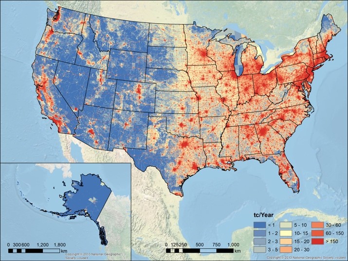
Vulcan 3.0
The Vulcan Version 3.0 High‐Resolution Fossil Fuel CO2 Emissions for the United States is now available as an open-access paper and for download.
The figure below shows total CO2 emissions which are of course to a large extent a function of population. The per-capita CO2 emissions would probably show an almost inverted spatial pattern across the USA.
Thursday, October 22, 2020
Birds-Eye View from Mount Washington
This Birds-eye view from summit of Mt. Washington, White Mountains, New-Hampshire was pretty cool already and the Library of Congress makes it accessible in a variety of formats.
But now there's a online version that you can rotate like you are standing on the summit: https://vannizhang.github.io/birdeye-view/dist/

Wednesday, October 21, 2020
The Climate Issue
The Climate Issue (by Parametric Press) includes five interactive data-driven stories. Here's what they are trying to do (in their own words):
The Parametric Press is an experiment, a born-digital magazine dedicated to showcasing the expository power that’s possible when the audio, visual, and interactive capabilities of dynamic media are effectively combined.
This is very-well done. Here's my one issue: We are already looking too much into too many screens and all this slick interactivity is just too much for our brains to deal with. Sorry. Give me an analog book.
CAD and GIS
CAD and GIS: Everything you need to know is a nice overview of the fundamental differences between CAD and GIS.
Monday, October 19, 2020
Learning ArcGIS Pro 2: A beginner's guide to creating 2D and 3D maps and editing geospatial data with ArcGIS Pro, 2nd Edition
Learning ArcGIS Pro 2: A beginner's guide to creating 2D and 3D maps and editing geospatial data with ArcGIS Pro, 2nd Edition seems like a great book to use for teaching and learning.
And, yes, it may sound weird to use a traditional tutorial book when there are 100s of digital options, videos, etc. But, trust me, there is just a comfort and convenience of having a book open next to you to serve as a trusted tour guide / travel guide.
This may be useful!
Not that I do this a lot, but the Optimal Social Media Image Sizes for 2020: The Complete Guide may be useful some day.
Wednesday, October 14, 2020
Eruptions, Earthquakes, and Emissions
Eruptions, Earthquakes, and Emissions checks all the 'coolness' boxes:
- Animated over time vs. static.
- 2D map vs. 3D earth.
- Interactive.
- Data available for easy download.
Tuesday, October 13, 2020
Monday, October 12, 2020

Saturday, October 10, 2020
Face masks: what the data say
Face masks: what the data say is a great summary article about face masks and the pandemic. Read and also watch this great video: Why Masks Work BETTER Than You'd Think. That about covers it.
Friday, October 9, 2020
Colour Controversy
Colour Controversy is fun and a good way to find-out which colors are better to use than others - try it!
Friday, October 2, 2020
Wednesday, September 30, 2020
Landsat8.earth
Landsat8.earth is basically a Landsat 8 viewer that can do 'normal' (2D), but also 3D - pretty cool.
Monday, September 28, 2020
Saturday, September 26, 2020
Everybody Is Dead!
Cool data viz from the Washington Post: What if all covid‑19 deaths in the United States had happened in your neighborhood? The result is basically a circle around your location in which everybody is dead assuming 202,329 deaths - a sobering way to help us 'see' what 202,239 deaths actually would look like.
Friday, September 25, 2020
Data Viz Tools
Here are some useful resources.
MySQL.
- SQL Tutorial / SQL Zoo
- Using MAMP and Sequel Pro (8:26 minutes)
Thursday, September 24, 2020
Rewiring America
Rewiring America is a good study and a good read: yet another reasonable approach to solve climate change via clean energy. I especially like the call for a shift in mindset from 1970s thinking (efficiency, scarcity, sacrifices) to 2020 thinking (abundance, prosperity). This may be what is really standing in our way (and the special interests of the fossil fuel world).
Tuesday, September 22, 2020
Five maps you (and your team) should see
These compilations are always tricky, but these are solid choices: Five maps you (and your team) should see.
Saturday, September 19, 2020
Tesla Supercharger Network
The Tesla Supercharger Network is a nice interactive map rendered in Tableau Public. Yep, Tableau Public can do interactive maps and spatial analysis and this may be a good option in certain situations. For all else: use a proper Web GIS!
Friday, September 18, 2020
MS Excel / Google Sheets Tutorial Videos
There are 1,000s of such videos, but I like Vertex42 a lot.
- They are short and complete.
- They often use the same data set for both MS Excel and Google Sheets so it's easy to compare how these two different tools work.
- The data sets are available for download or just require some quick tying and you can follow along step-by-step.
Thursday, September 17, 2020
Earth Now!
This is pretty cool: Earth Now (by NASA). Shows the most-current satellite images and the path of the earth-orbiting satellites, all in 3D.

Wednesday, September 16, 2020


Tuesday, September 15, 2020
How America can leave fossil fuels behind, in one chart
Well - here's yet a third plan to get us away from fossil fuels (in addition to The Solutions Project and the recent UC Berkeley Study):
- Rewiring America (book)
- The Chart (Energy Literacy)
Saturday, September 12, 2020
The Math of Masks
This is great: https://aatishb.com/maskmath/. Watch the video, then play around with the simulations.
90 Percent By 2035
The Solutions Project is a plan to get to 100 percent carbon-free energy by 2050 and now we have a new study out of UC Berkeley with a pathway to 90 percent carbon-free by 2035. Cool, let's do it!
Friday, September 11, 2020
THE TERRAINATOR
THE TERRAINATOR gives you 3D-printable terrain models. Well, you can have them 3D printed for a price or buy the STL file for yourself.
Historic Streetview
Streetview is great, but what about the past? Here are two options:
- Chronobook is great - make sure that you zoom-in enough as photographs and entire collections may pop-up.
- Historypin is a similar approach.
Thursday, September 10, 2020
Thunderstorms over Lake Victoria
Nice example of convection within the Trade Winds: Watching Thunderstorms March Across Lake Victoria.
Saturday, September 5, 2020
Wakelet
So Wakelet is pretty hip: basically an easy and fun way to curate things that you find on the Internet. Nothing that you could not do with a blog or a Google Doc, but with a fun and intuitive interface. Here are a couple of good resources:
- Wakelet (UMass Educ Class review)
- Using Wakelet In The Classroom For Curation And Research
The Four Laws of Learning
All the usual caveats apply, but the 4 Laws of Learning (and How to Follow Them) is very helpful, for example for new college/university faculty who may have never had any training in pedagogy.
University COVID Models
Yep - common sense seems to be missing from many of these 'Safe' Opening Plans...
Friday, September 4, 2020
Turnitin = Evil
That's the synopsis - more details here: A Guide for Resisting Edtech: the Case against Turnitin
Would you upload your paper to a commercial website with these terms of service:
"Any communications or material of any kind that you e-mail, post, or transmit through the Site (excluding personally identifiable information of students and any papers submitted to the Site), including, questions, comments, suggestions, and other data and information (your “Communications”) will be treated as non-confidential and nonproprietary. You grant Turnitin a non-exclusive, royalty-free, perpetual, world-wide, irrevocable license to reproduce, transmit, display, disclose, and otherwise use your Communications on the Site or elsewhere for our business purposes. We are free to use any ideas, concepts, techniques, know-how in your Communications for any purpose, including, but not limited to, the development and use of products and services based on the Communications."
Thursday, September 3, 2020
NASA EO Explorer
Very cool: NASA's new EO Explorer has a simple and intuitive interface - just pick a spot and zoom in to find great images. Noting fancy, but it works.
Tuesday, September 1, 2020
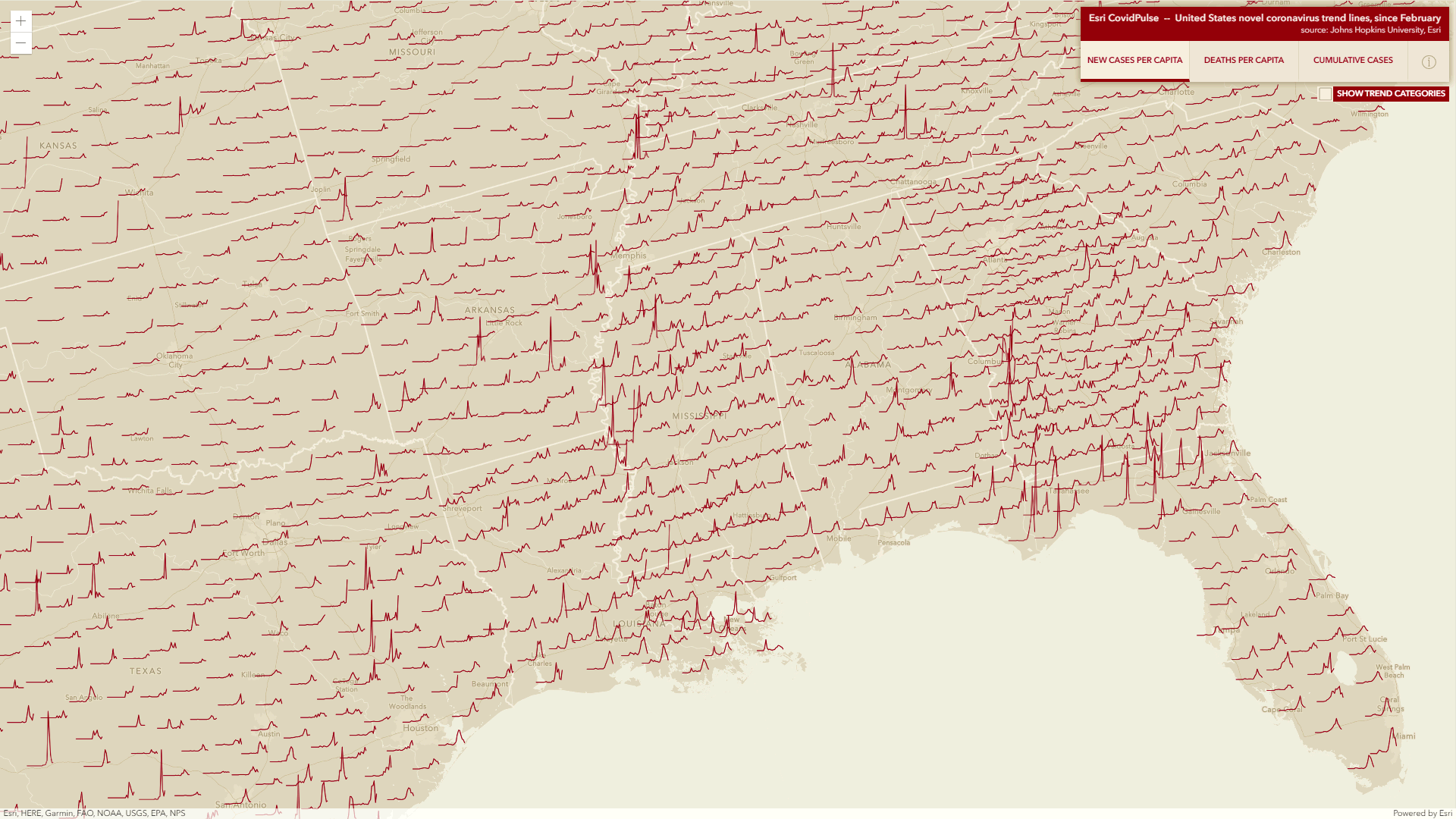
COVID Pulses
Great idea: let's make sparklines for each county in an interactive web map. Read more about it here and see it here: Esri COVIDPulse. Or: watch the CovidPulse Video and take a narrated tour!
The Mirror Cam
This is cool: a simple 'mirror cam' to act as a doc cam: IPEVO Mirror-Cam. Read more about it here. $40 for 6 of them, so the idea is to buy them / mail them to all your students.

Sunday, August 30, 2020
Saturday, August 29, 2020
IPCC Communication Fail
This is a great example of communication fail in the world of climate change:
- Take a look at the IPCC AR5 WG1 SPM with its 10 figures - can you figure-out what is going on?
- Try ranking them in terms of their visual complexity and ease of comprehension.
- Then compare your thoughts with this recent paper: Communication of IPCC visuals: IPCC authors’ views and assessments of visual complexity (Harold et al. 2020, Climatic Change).
Friday, August 28, 2020
Jeopardy
https://jeopardylabs.com/ is awesome - a great way to create a simple and quick way to test facts and specific knowledge.
Wednesday, August 26, 2020
Climate Insights 2020
Climate Insights 2020 is (yet another) survey of the usual: what Americans think about climate change. The report is available as a PDF, but they also offer a cool interactive Data Tool to view the responses to specific questions. It would be great to be able to a) grab the charts as JPGs and b) grab the underlying data.
Tuesday, August 25, 2020
Texas A&M GeoServices
I forgot about the Texas A&M GeoServices, but they offer free and excellent geocoding / reverse geocoding services - a great alternative to Esri with their cumbersome credit-charging system.
Saturday, August 15, 2020
Glacier Collapse in Switzerland
I'm not sure I would call this a glacier collapse, but the video is cool:
How to prepare your data for analysis and charting in Excel & Google Sheets
Good stuff: How to prepare your data for analysis and charting in Excel & Google Sheets. Too often I find that students have no sense of basic data formatting in a table and this is a nice and concise tutorial. And that's our problem: our students tend to be incapable of the basics and therefore we never get to the 'advanced' = the dumbing-down on higher education. Thanks K-12!
Add this: How to split and extract text from data columns in Excel & Google Sheets
Smart Cities & ArcGIS Urban
This sounds like a great course to add to any GIS curriculum: Geodesign for Smart Cities. This class covers all the current buzz-words and hot topics.
Tuesday, August 11, 2020
URCA
Nice post and figure by Laura Guertin on her GeoEd Trek blog: Revisiting the continua of undergraduate research. I remember reading the Beckman and Hensel (2009) paper several years ago when I was more engaged in URCA and I created this figure back then:

The Landsat Explorer Web Mapping Application
The Landsat Explorer Web Mapping Application is not new, but a great tool to explore and analyze satellite data. This would work well with students. First they can try some of these tools 'on-the-fly' and then download the actual data for processing in a specialized software package. Or, in ArcGIS Pro.
Here's a quick summary of the app by Joe Kerski.
Monday, August 10, 2020
Critical Digital Pedagogy
This book looks great: Critical Digital Pedagogy. Yep, online teaching and learning is NOT just Blackboard, Zoom, etc.
Saturday, August 8, 2020
Esri BAO, Demographics, and COVID-19
Esri BAO is a pretty neat tool: simply define a site and then access all kinds of demographic information formatted either as reports or as infographics. You can design your own, or just use the existing templates (e.g. Coronavirus Impact Planning).
Here's the workflow: Creating a Coronavirus Impact Planning Infographic in the ArcGIS Business Analyst Mobile App
Thursday, August 6, 2020
USGS Topographic Maps
Still one of the best sources for that: https://ngmdb.usgs.gov/topoview/ I especially like the various formats (high-res JPG, GeoTIFF, PDF, and KMZ).
Energy by State

Saturday, August 1, 2020
Republicans hate science!
Friday, July 31, 2020

Thursday, July 30, 2020
How risky do you like it?
Wednesday, July 29, 2020
13,000 years or earlier?
Below a map from Source 1 below showing the current evidence - interesting!
- Evidence grows that peopling of the Americas began more than 20,000 years ago (Nature, 222 July 2020).
- Tools suggest people reached Americas early (Science, 24 July 2020)

Tuesday, July 28, 2020
The USA: Locals vs Tourists
Monday, July 27, 2020
ArcGIS Experience Builder
NCSE Climate Change Summits
Sunday, July 26, 2020
Two good videos on nuclear energy
Thursday, July 23, 2020
UN FAO Data Portal
I'm just not into these map-based (or now 3D) search interfaces: too complicated, too slow, too much. Give me a nice scrollable list and a well-developed text-based search tool.
Wednesday, July 22, 2020

Monday, July 20, 2020
Thursday, July 16, 2020
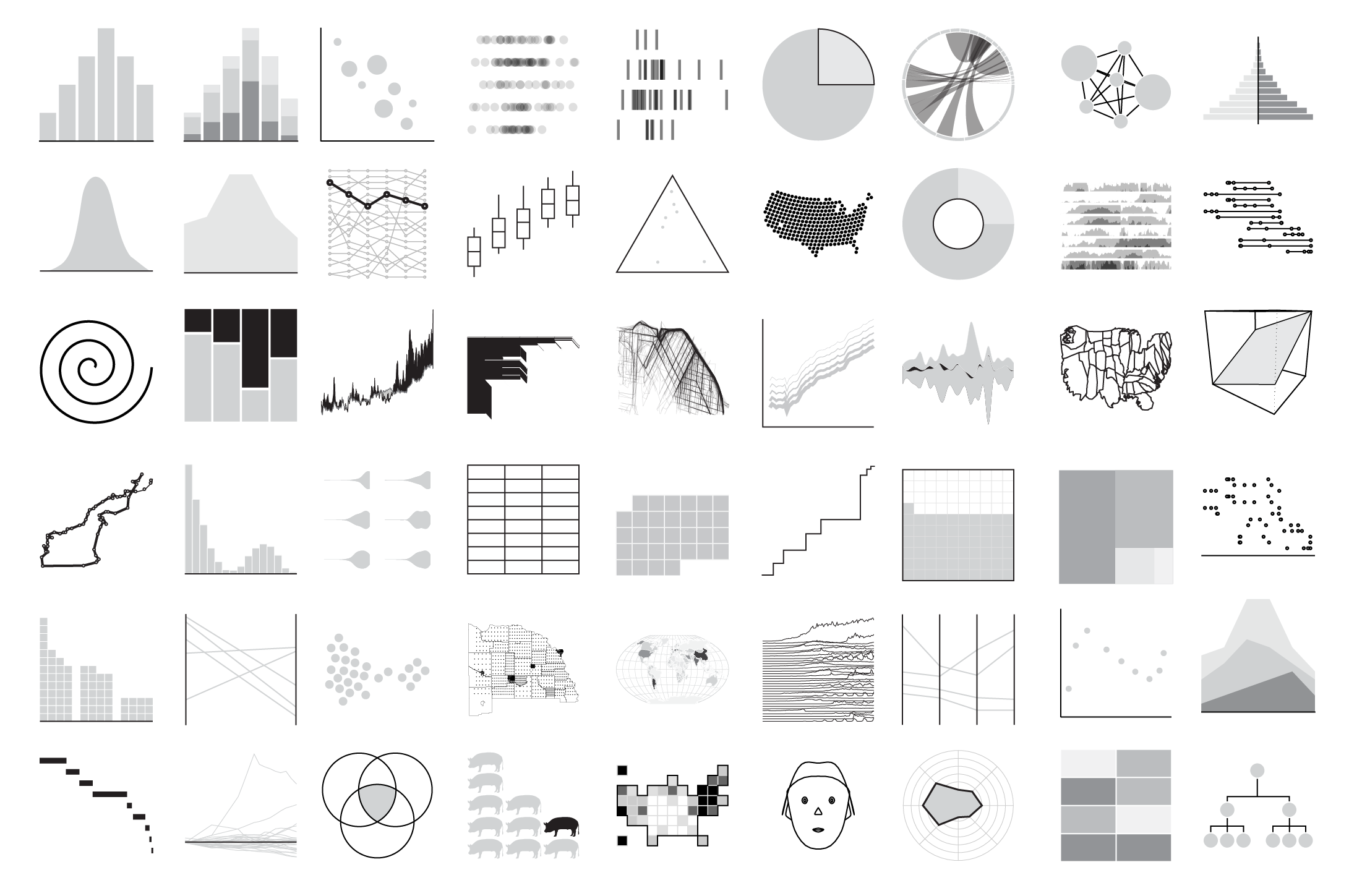
Chart Chooser / Chart Types
Flooding
- How is flooding affecting your community? gives all kinds of cool embedded maps comparing flood risk in 2020, 2035, and 2050. Many you can embed in your website or create an animated GIF (see below).
- Flood Factor is simple: just enter your address and see your flood risk.

Land Cover: Yesterday, Today, and Tomorrow
- 1992 - 2018 (measured)
- 2050 (predicted)
The SDGs Today
Related to that: Esri also compiled the ArcGIS Living Atlas Indicators of the Planet (same basic idea).
Wednesday, July 15, 2020
Monday, July 13, 2020
Risky Business!
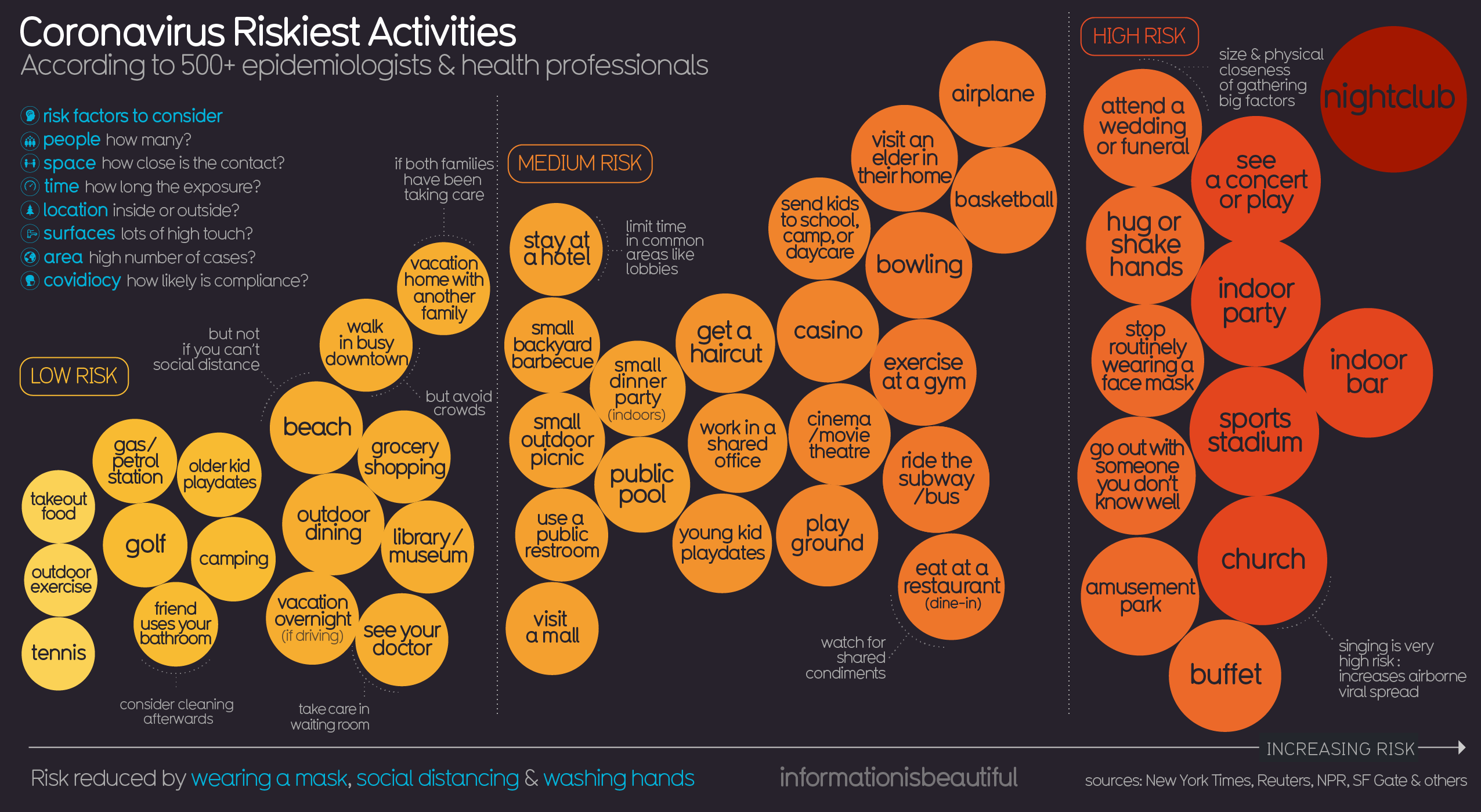 |
| https://informationisbeautiful.net/ |
Saturday, July 11, 2020
Wishful Thinking vs Science
Anti-Racism Pedagogy
- Robin DiAngelo: How 'white fragility' supports racism and how whites can stop it. At the end of this interview she gives white people five specific tasks.
- Take the 21-Day Racial Equity Habit Building Challenge
- Read the Me and White Supremacy Workbook
- Why White Students Need Multicultural and Social Justice Education
Geography Games
Honestly, Guess Where? is just dumb and not useful in any way: recognizing a capital city based on a Google Maps close-up is just silly and has nothing to do with geographic knowledge or insights. This is in-essence the 21st-century version of memorizing river names and has nothing to do with what we think of as the 'geographic perspective'. At least show the satellite image and scale bar - that way you can begin to use deductive reasoning and practice 'thinking like a geographer'.
Friday, July 10, 2020
Boston's Black Heritage Trail
But, I'm torn. On one hand it shows-off what you can do with Tableau in terms of geography-based mapping and data viz, but on the other hand this would look so much better, especially on smartphones, using a tool such as Esri Story Maps that is specifically-designed for such a purpose.
21 Arguments
 |
| https://www.lavision.de/en/news/2020/4302/ |
Thursday, July 9, 2020
The 2020 Environmental Performance Index
Got it? Like any global metric, this is not perfect, but rather offers a general view on which countries are best dealing with environmental issues.
Wednesday, July 8, 2020
This really says it all
Tuesday, July 7, 2020
Cranky Uncle vs. Climate Change
 |
| https://crankyuncle.com/book/ |
 |
| https://crankyuncle.com/book/ |
Monday, July 6, 2020
Friday, July 3, 2020
Wednesday, July 1, 2020
Thursday, June 25, 2020

Wednesday, June 24, 2020
Kilembe Flooding (May 2020)
Tuesday, June 23, 2020
The WebPlotDigitizer
Monday, June 22, 2020


Saturday, June 20, 2020

Thursday, June 18, 2020
Wednesday, June 17, 2020
(Glacier) Timelines
Getting to Know Web GIS, fourth edition
Saturday, June 13, 2020
Morphcode Explorer
Tuesday, June 9, 2020
The Rise and Fall of Coronavirus Cases

The Conspiracy Theory Handbook

Monday, June 8, 2020
May 2020


Friday, June 5, 2020
Thursday, June 4, 2020
Python Scripting and ArcGIS Pro
Mapping under the forest canopy
Monday, June 1, 2020
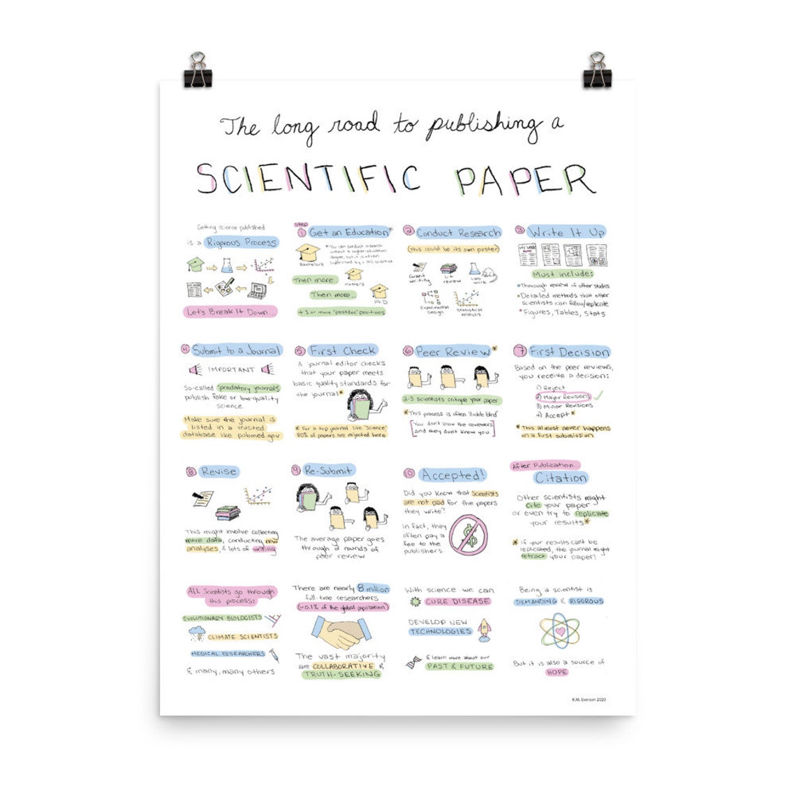
Publishing a Scientific Paper
 |
| DataWorthSeeing on Etsy |
Sunday, May 31, 2020
Friday, May 29, 2020
Bending Lines
Tuesday, May 26, 2020
The Past Climate Explorer
Online Talking
Monday, May 25, 2020
Collaborative Scientific Writing
More here: Synchronized editing: the future of collaborative writing
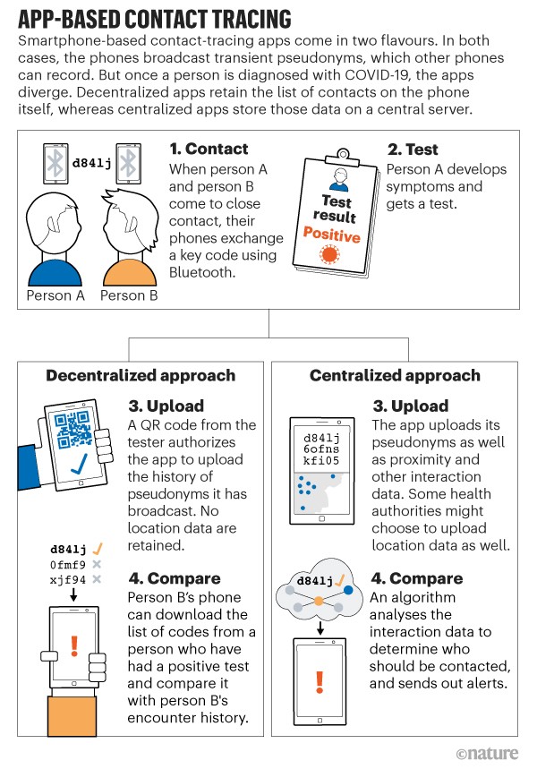
Corona Virus Tracing Apps
- Coronavirus contact-tracing apps: can they slow the spread of COVID-19?
- COVID-19 contact tracing apps are coming to a phone near you. How will we know whether they work?
Friday, May 22, 2020
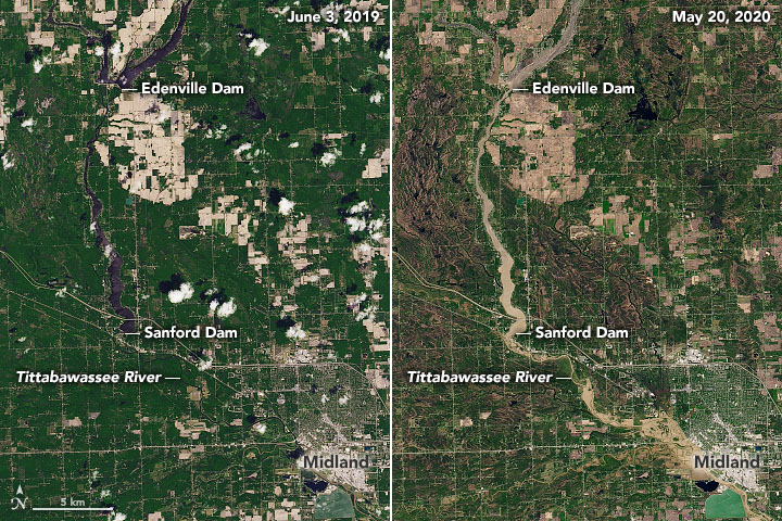
Michigan Dam Failure
- Great work as usual by NASA: Muddy Flooding in Michigan
- Good video analyzing the dam failure: Michigan Dam(s) Fail! Tittabawassee River
- More footage: https://youtu.be/SF0c1eyuiJs
Thursday, May 21, 2020
Wednesday, May 20, 2020
Deforestation

Tuesday, May 19, 2020

Monday, May 18, 2020
Boston Coastline: Future Past
 |
| http://www.kanarinka.com/project/boston-coastline-future-past/ |

Saturday, May 16, 2020
Beer vs Food

Friday, May 15, 2020
EJ Atlas
This reminds of these great Code Green cartoons by Stephanie McMillan. And this one:

Infographics in BAO/CAO

10 New ArcGIS Pro Lesson Activities, Learn Paths, and Migration Reflections
- Introduction Video
- Solving problems with GIS and Public Domain Geospatial Data 1
- Solving problems with GIS and Public Domain Geospatial Data 2
- The GIS Guide to Public Domain Data Learn Path 3