Thursday, December 21, 2017
How Machines Learn
Some interesting and scary similarities to the trends we see in Higher Education right now!
Monday, December 18, 2017
Multivariate Maps
Maps are great, but usually only 'map' one variable. And for good reason: mapping multivariate data is difficult and the resultant maps are often too confusing and complex to read. Jim Vallandingham offers a nice compilation of different styles of such maps in his Multivariate Map Collection.
Thursday, December 14, 2017
Monday, December 11, 2017
Sunday, December 10, 2017
Tuesday, December 5, 2017
Interactive Geologic Map of the World
This is super-cool: Macrostrat's Geologic Map of the World (seen on Maps Mania).
Saturday, December 2, 2017
The Global Solar Atlas
The Global Solar Atlas maps-out solar energy resources around the globe and allows you to calculate how much electricity you could generate with typical PV installations, for example in Boston.
Now we have the matching Global Wind Atlas.
Now we have the matching Global Wind Atlas.
Thursday, November 30, 2017
Sunday, November 26, 2017
Here's an oldie!
Street Tours
Seen on Maps Mania: Street Tours is a quick way to combine Google Street View and Maps into an interactive and annotated tour. It's not the most elegant of interfaces, but it is simple, quick, and does what it is supposed to do.
Friday, November 24, 2017
Instructional Moves (IM)
Instructional Moves (IM) is pretty cool, especially the videos that show the 'moves' in-action.
Sunday, November 19, 2017
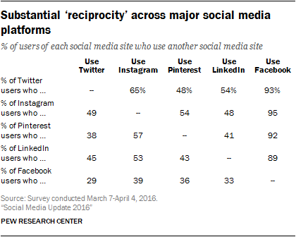
Social Media Update 2016
Here's the 2016 Pew Research Center survey of social media use in the USA: Social Media Update 2016. It is interesting to see some of the difference between 'perceived' importance (aka. noise) and 'real' importance of social media platforms, for example: only 25 percent of Americans use Twitter and only 10 percent of those use it on a daily basis.
Here's an interesting table:
Here's an interesting table:

Friday, November 17, 2017
Cape Cod 1984 to 2017
This is nice: changes to the beaches, spits, and barrier island location at southeastern tip of Cape Cod between 1984 and 2017.
Thursday, November 16, 2017
Monday, November 13, 2017
Saturday, November 11, 2017
Spatial Analysis via Story Maps
Look: Story Maps are great, but perhaps not the best way to visualize and perform spatial analysis. Still, it can be done and Speaking the “Language” of Spatial Analysis via Story Maps provides a nice and updated list of such examples.
Thursday, November 9, 2017
Monday, November 6, 2017
2017 NMC Horizon Report
The 2017 NMC Horizon Report is out. From their website: "...an ongoing research project designed to identify and describe emerging technologies likely to have an impact on learning, teaching, and creative inquiry in education".
Laura Guertin has a nice summary of the key trends, significant challenges, and important developments as identified in the report.
Here's what I took away from it after reading the summary preview:
Laura Guertin has a nice summary of the key trends, significant challenges, and important developments as identified in the report.
Here's what I took away from it after reading the summary preview:
- University classrooms should look like real-world work and social environments to "facilitate organic interactions and cross-disciplinary problem solving" - that's considered a mid-term trend (3 to 5 years adoption). I have a suggestion: have a look at an elementary school classroom...it's not that difficult.
- It's all about measured and and personalized adaptive learning with learning analytics in an online setting - this is supposed to empower the student to take-charge of their learning. Here the online platform (aka Big Brother) adapts itself to the student and aggregates the data across a large student sample to adapt the broader curriculum. All this is controlled by the Next-Generation LMS or Next-Generation Digital Learning Environments (NGDLE).
- Engage in teaching and learning beyond the traditional school day = a Trojan Horse for online education.
- Mobile learning - good: pen and paper are mobile.
This is so trite and obvious...
Friday, November 3, 2017
2017 Survey of Faculty Attitudes on Technology
In case you are interested: 2017 Survey of Faculty Attitudes on Technology.
Thursday, November 2, 2017
WXshift
This is pretty nice: WXshift allows you to select your region, state, or zip code of interest and then plot climatic trends (similar to the NOAA Climate Explorer).
Mapping Oral Histories
Placing Oral Histories - A Visualization of Four Syrian Refugees' Narratives of Displacement is a nice application of a Story Map and Oral History Mapping with ArcGIS Online explains the mapping and design process.
Saturday, October 28, 2017
USGS Global Mountain Explorer
The USGS Global Mountain Explorer sounds pretty neat, but I'm not clear what it is...but there is a Tutorial Video.
Storyboarder
Storyboarder makes it easy to visualize a story as fast you can draw stick figures. Quickly draw to test if a story idea works. Create and show animatics to others. Express your story idea without making a movie. (straight from their website)
Wednesday, October 25, 2017

Wednesday, October 18, 2017
The RAMMB Slider
Seen on Maps Mania: The RAMMB Slider uses the latest available imagery from both satellites to allow you to create small animated movies of the Earth.
Sunday, October 15, 2017
Saturday, October 14, 2017
The History of Infographics
The History of Infographics is a super-cool interactive infographic on its own and they include a great summary of their project and design choices.


Minard and Napoleon
Here's a great interactive overlay of Minard's map combined with a matching interactive chart: Minard and Napoleon
Friday, October 13, 2017
Santa Rosa: Before and After
This is incredible: Santa Rosa: Before and After - try http://bit.ly/2hDEccy to see an image comparison.
Thursday, October 12, 2017
Gerrymandering
Found on FlowingData: Changing the Math on Gerrymandering (brilliant illustrations) and District - A Game about Representation & Redistricting.
Mapped: How the US generates electricity
Mapped: How the US generates electricity (by CarbonBrief) is a nice interactive map, zoomable to different states. This would go well with The Solutions Project and their 100 percent renewable energy portfolios for the different states.
Then there is the North American Power Plants map with a nice feature: it updates the summary legend as you zoom-in, zoom-out, or pan.
Then there is the North American Power Plants map with a nice feature: it updates the summary legend as you zoom-in, zoom-out, or pan.
Friday, October 6, 2017

Wednesday, October 4, 2017
Get Started with Story Maps
Get Started with Story Maps is a nice 2-hour introduction to Esri Story Maps, including the Story Map Tour, the Story Map Cascade, and the Story Map Journal.
Friday, September 29, 2017
Thursday, September 28, 2017
Monday, September 25, 2017
Climate Ready Boston Map Explorer
Climate Ready Boston Map Explorer is a new way to look at the same data - here using the Esri ArcGIS Online platform. Coastlines of Boston is a nice supplement! (found on Maps Mania)
Alternatives to Google Docs
Here are two alternatives to Google Docs.
I'm not sure any of those fundamentally address the issues and concerns that one might have with Google Docs.
Nukemap and Misslemap
Tuesday, September 19, 2017
StorylineJS
StorylineJS looks great - a simple way to create an annotated and interactive chart (just point to your data in Google Sheets).
Kilauea: Fountains of Fire
Kilauea: Fountains of Fire is a pretty neat Esri Story Map and the creator explains the process of making here at The Making of Kilauea: Fountains of Fire. Here's a pretty cool animated GIF:
 |
| https://blogs.esri.com/esri/arcgis/2017/09/13/the-making-of-kilauea-fountains-of-fire/ |
Wednesday, September 13, 2017
Rising Seas
Here we have a web map with the actual sea level measurement station data: Rising Seas. This shows the actual measured values, not predicted ones say for the 21st century.
Tuesday, September 12, 2017
Irma and the Islands
Pretty impressive images of the Caribbean Islands before and after Irma:
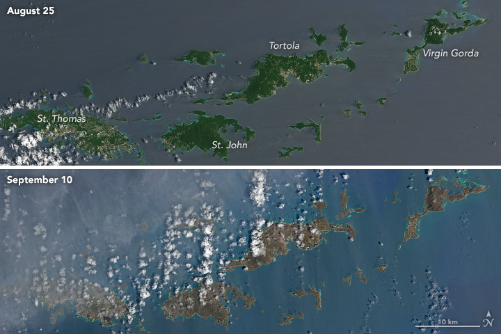 |
| https://earthobservatory.nasa.gov/IOTD/view.php?id=90952&src=iotdrss |
Saturday, September 9, 2017
Monday, September 4, 2017
ArduPilot Autopilot Suite
The ArduPilot Autopilot Suite is everything and more you need for any kind of autonomous vehicle. More also here.
Sunday, September 3, 2017

Harvey Before and After
This is a great use of the Swipe Story Map: Hurricane Harvey Post Event Imagery - Houston.
Friday, September 1, 2017
The Last Glacier of Venezuela
Matthew Wills actually read the paper and wrote a nice summary for JSTOR Daily (29 August 2017): The Last Glacier of Venezuela.
Pipeline Spills
Here's an interesting interactive map showing pipelines, pipeline operators, and spills. That's about it. The map is not very professional, for example: use aliases for the field names and include a link to the data. This would have been better in Tableau in my opinion.
Sunday, August 27, 2017
Saturday, August 26, 2017

Friday, August 25, 2017

Thursday, August 24, 2017
Every Road in North America
 |
| https://www.reddit.com/r/dataisbeautiful/comments/6vpnkp/all_the_roads_and_nothing_but_the_roads_oc/ |
Estimating economic damage from climate change in the United States
Or: How Much Climate Change Will Cost Each U.S. County. Now you can see the numbers in a few ways:
- Read the scientific paper and get the data directly from Science.
- Read a summary by Paul Voosen in Science with a large non-interactive map.
- Read a longer article about the study in The Atlantic.
- Explore this interactive map.
 |
| http://www.sciencemag.org/news/2017/06/here-s-how-much-climate-change-going-cost-your-county |

Wednesday, August 23, 2017
C’est la vis: Visualization Literacy at Elementary School
C’est la vis: Visualization Literacy at Elementary School is super-cute an online platform to teach and learn data viz in grades K and 2. The video explains it nicely.
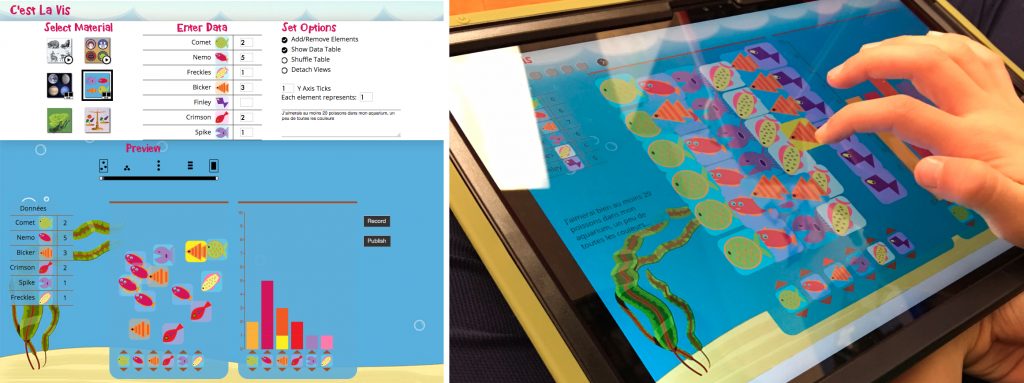 |
| https://www.microsoft.com/en-us/research/project/cest-la-vis-visualization-literacy-elementary-school/ |
Sunday, August 20, 2017
AMOS
Need a webcam images? AMOS, the Archive of Many Outdoor Scenes, can help with that. AMOS is a collection of long-term time lapse imagery from publicly accessible outdoor webcams around the world. Images like that are increasingly used, in combination with AI/machine learning, to derive quantitative data.
Tiles for Zoom Levels
MapTiler includes a nice demo to give you the coordinates, tile bounds, and IDs for all tiles for all zoom levels. Nice.
Smart Mapping
Or is it Artificial Intelligence? First Draft GIS creates a draft map for you - all you need to do is provide the data. That does not sound all that impressive, but it can map from news articles, Word Documents, PDFs, Excel Spreadsheets, or any type of webpage - just copy/paste the URL. Try this data set for example.
NYC in 1609, Today, and Tomorrow
This has been around for a while, but the reconstruction of Mannahatta (Manhattan in 1609) is always worth exploring. Visionmaker nyc lets you now go into the future and create quantitative visions for a sustainable city.
Mars over the last 3.8 Billion Years
Rewind the Red Planet (by National Geographic) is a great scrollable story map of the history of Mars over the last 3.8 billion years. If you are really interested have a read at How We Made “Rewind the Red Planet”.
Planet.com
Planet.com offers a bunch of high-resolution satellite data from several satellite constellations that they own. I'm not sure what the free account actually gets you, but their Education/Research Programs seems quite generous. Certainly much higher-resolution than Landsat/ASTER and more accessible than the other commercial products.
OpenAerialMap
OpenAerialMap is an open service to provide access to a commons of openly licensed imagery and map layer services. Download or contribute imagery to the growing commons of openly licensed imagery.
Seems like the available imagery is either standard satellite images that you could get from many sites or UAV images for specific places around the world.
Seems like the available imagery is either standard satellite images that you could get from many sites or UAV images for specific places around the world.
Saturday, August 19, 2017
The Choropleth Sandbox
The Choropleth Sandbox is pretty useful to 'test' how various classification settings have a big impact on the story that your map is telling.
Thursday, August 10, 2017
Between Two Cities
Between Two Cities sounds like a fun and useful game to learn about urban planning.
Tuesday, August 8, 2017
Sunday, July 30, 2017
Game On!
Here is a nice article in Nature (Game on, 20 July 2017) summarizing some of the available games that teach scientific concepts.
- XTRONAUT let's you explore space.
- Go Extinct! is a simple card game about, well, extinctions.
- Keep Cool let's you 'gamble' with climate change. There is also a multi-player online version Keep Cool mobil (sadly only in German at this time).
Friday, July 28, 2017
Campus Technology 2017
Here's their annual survey: 2017 Teaching With Technology Survey. Now, these surveys are a bit biased from the start and so its is important to parse the results keeping that in mind. Still, a few things are interesting:
- Faculty and students agree: ed-tech is good for teaching and learning (Page 29). This result is not surprising given the biased source.
- Students do not have/use tablets (Page 29).
- Faculty feel confident in their ed-tech abilities (Page 34). Again, not a surprise result given the biased source.
- Top-10 Technologies that will be dead and gone within 10 years (Page 36), for example clickers, non-interactive projectors, traditional LMS, and computer labs.
- Top-10 Technologies that will become important over the next 10 years (Page 37), for example VR/AR, 3D everything, next-get LMS (?), and the Internet of Things.
Population.io
Population.io is an interactive data viz by the World Data Lab: just enter your birthday, country of birth, and sex at birth to see how you fit (statistically) into everybody on the planet.
The ArcGIS Book
Esri released a new version (I think) The ArcGIS Book in-time for the annual Esri UC in San Diego. It contains 10 chapters organized around 10 'big ideas' related to spatial science (aka. Geography!).
Mapping Cities with AI
Here are three interesting examples of using Google Street View and crowdsourcing to train AI algorithms to 'map' conditions in cities.
- Seen on Maps Mania: Project Sidewalk is a classic example of crowdsourcing, now used for training machine learning algorithms. Cool and also somewhat scary.
- Place Pulse has been around for a while and aims to quantitatively recognize which areas of a city are perceived as wealthy, modern, safe, lively, active, unique, central, adaptable or family friendly.
- StreetChange takes a similar approach, albeit focused to detecting urban change from Street View photos taken several years part.
Histograms
Histograms are easy...in-theory. But things can easily get a lot more complex and all that is nicely illustrated and discussed in What's so hard about histograms?
Need a Chart? Need a Tool?
The Chartmaker Directory is an attempt to connect types of charts with the most appropriate tools to make them. More about the effort here.
Wednesday, July 26, 2017
Sea Level Rise: Hard Choices Ahead
When Rising Seas Hit Home: Hard Choices Ahead for Hundreds of US Coastal Communities (2017) is a comprehensive report from the UCS that you can explore in different ways: as a traditional report, as an interactive story map, as the underlying data (as MS Excel files), or a podcast. Or, just view the fact sheet for the affected states.
Tuesday, July 18, 2017
Monday, July 17, 2017
But, what can I do?
That's the question: what can I do as an individual to slow/stop global warming? Well, the infographic below can help with that. This is based on a recent paper in Environmental Research Letters (summary here).


Why Python is the Future of Web GIS?
Well, there you have it: some arguments as to Why Python is the Future of Web GIS?
Drone Resources
A simple compilation of papers and other resources related to drones and their applications.
- Rossini et al. (2018): Rapid melting dynamics of an alpine glacier with repeated UAV photogrammetry. Geomorphology, 304, 159-172. UAVs and SfM.
- 8 tips that will let you achieve survey-grade accuracy of your drone survey.
- Wigmore and Mark (2017): Monitoring tropical debris-covered glacier dynamics from high-resolution unmanned aerial vehicle photogrammetry, Cordillera Blanca, Peru. The Cryosphere, 11, 2463-2480.
- Ryan et al. (2017): Derivation of High Spatial Resolution Albedo from UAV Digital Imagery: Application over the Greenland Ice Sheet. Frontiers in Earth Science, May 2017. Using a basic consumer grade camera to measure albedo. Not quite as simple as it sounds, but very cool!
- Dabski et al. (2017): UAV-based detection and spatial analysis of periglacial landforms on Demay Point (King George Island, South Shetland Islands, Antarctica. Geomorphology, 290, 29-38. Home-made professional fixed-wing drone paired with a Canon 700D DSLR.
- O'Connor et al. (2017): Cameras and settings for aerial surveys in the geosciences: Optimising image data. Progress in Physical Geography, 41(3), 325-344. Lot's of details about cameras and lenses.
- Krsak et al. (2016): Use of low-cost UAV photogrammetry to analyze the accuracy of a digital elevation model in a case study. Measurement, 91, 276-287. Using a DJI Phantom 2 Vision+ to create a high-quality DEM.
Sunday, July 16, 2017
Prezi is better than PPT
Prezi offers a so-called zoomable interface = an infinite canvas that is navigated = animated by zooming and panning. And that's the key - it forces you the presenter and the audience to process information spatially (in addition to sequentially). The linear slide decks of PPT cannot do that.
That's at least the theory. A linear sequence is at least one thing: simple. Prezis can easily get messy and confusing in my experience.
But, Prezis are cool and the coolness translates to a cooler and more knowledgeable presenter in the minds of the audience.
More here: Scientifically Speaking, Your PowerPoint Sucks
Friday, July 14, 2017
Must have Drone Apps for every Drone Pilot
There are plenty of these compilations out there, so here's one of them: Must have Drone Apps for every Drone Pilot.
Thursday, July 13, 2017
Mapping Extreme Weather
The folks at Carbon Brief created a nice interactive web map attributing weather extremes to climate change - here's their conclusion: "Carbon Brief's analysis suggests 63% of all extreme weather events studied to date were made more likely or more severe by human-caused climate change. Heatwaves account for nearly half of such events (46%), droughts make up 21% and heavy rainfall or floods account for 14%."
Monday, July 10, 2017
C-ROADS World Climate
The C-ROADS World Climate Simulator has been around for a while, but now comes with a new and nice-looking interface.
Our World in Data
Our World in Data produces some of the best data viz I have seen, for example Life expectancy:
- As an interactive map (with time-animation)
- As a customizable chart
- As various graphics formats
- As link and embed code (see below)
- As the underlying data
Can You Draw The States?
Give it a try at Quiz: See How Well You Can Draw All 50 States and see what 'your' USA would look like!
Google Blocks
I don't know anything about it, but Google Blocks seems to be the thing to do for the VR/AR 'world' - see more at Google Is Becoming The Adobe Of VR.
Wednesday, June 21, 2017
Geography = The Macroscope
Geography = a macroscope for dealing with complex human and natural systems. Read more about it here: http://www.appreciatingsystems.com/wp-content/uploads/2011/05/The-Macroscope.pdf


Sunday, June 18, 2017
The Animated GIF
What Makes The GIF Great is a nice history of the GIF, invented 30 years ago!
 |
| https://www.fastcodesign.com/90129895/what-makes-the-gif-great |
Worldmap Generator
Choose your projection, zoom, center, etc. with Worldmap Generator and see that indeed the world in 2D can look however you want it to look!
Friday, June 16, 2017
Making Air Visible!
Excellent video by Veritasium: Seeing the Invisible (embedded below). The NPR Skunk Bear showed something similar a couple of years ago: Seeing Thin Air (showing work by RIT students).
Thursday, June 15, 2017
One Year In The Life of Earth
One Year In The Life of Earth (by NASA) offers some nice videos from the EPIC camera on NOAA's DSCOVR satellite. Below is the simple animated GIF.


2016 Election by Precinct
Below is the MA map: this would be so much better with town lines as context! And: as an interactive map. Maps of the other states and the USA as a whole are at 2016 Presidential General Election Maps.
 |
| http://rynerohla.com/wp-content/uploads/2016/12/16-MA-Inverted.png |
Thursday, June 8, 2017
Tuesday, June 6, 2017
What Do Your Country's Emissions Look Like?
Here's nice (albeit complicated) interactive infographic breaking-down GHG emissions in 2012: Global Top 10 Greenhouse Gas Emitters (here are the data).
Friday, June 2, 2017

SLR by NOAA
NOAA has a nice SLR Viewer with all the usual features, including an easy download link to the underlying data.
Thursday, June 1, 2017
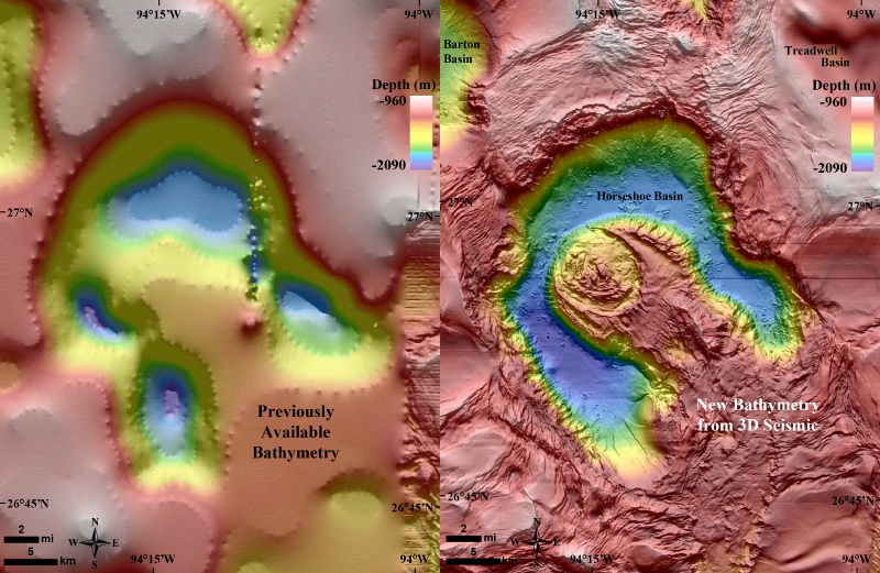
A 1.4-Billion-Pixel Map of the Gulf of Mexico Seafloor
Who knew that we have a federal agency called the U.S. Bureau of Ocean Energy Management? I'm not quite sure what they do, but they just released a stunning bathymetry grid for the Gulf of Mexico. Read more about in EOS: A 1.4-Billion-Pixel Map of the Gulf of Mexico Seafloor.
Thursday, May 25, 2017
Tsunami Travel Times
NOAA's Tsunami Travel Times to Coastal Locations is pretty simple, but does what it is supposed to do.
Wednesday, May 24, 2017
Reality vs. Perception
Here's the Boston MBTA map vs. the actual geography:
 |
| https://imgur.com/gallery/e2CTc |

Monday, May 22, 2017
Libra and landsat-util
Seen on Spatial Reserves: Libra work really well - a quick and effective 'browser' and 'downloader' for Landsat 8 images. Landsat-util is a command line utility to search, download, and process Landsat imagery.
Sunday, May 21, 2017
Tripline and ArcGIS Online
Tripline is one thing: simple and uncluttered. Here an example: Road Trip to Yosemite (also embedded below). And here's Tripline embedded into a Story Map Journal.
400 Million Years
Source: https://www.axios.com/supercontinent-breakup-drove-evolution-2407903317.html


Saturday, May 20, 2017
Iceflow in Antarctica
Very nice animated iceflow map of Antarctica as part of Antarctic Dispatches - Part 1 (NYT).
Wednesday, May 17, 2017
Mapjunction
Mapjunction lets you swipe between all kinds of maps, aerials, and atlas images for Boston (MA). Plus you can export and download.
The Hitchhiker’s Guide to d3.js
The Hitchhiker’s Guide to d3.js is a pretty nice compilation of all things d3.js.
Sunday, May 14, 2017
Why You Don't Believe In Facts, And How To Fix It
Why You Don't Believe In Facts, And How To Fix It is a talk by Lisa Charlotte Rost. There is nothing terribly new here, but her illustrations are brilliant.
Op-Ed: If you want to BREW, you should not study abroad
The Op-Ed: If you want to BREW, you should not study abroad spells is out rather nicely: study abroad trips perpetuate imperialism and classism.
This is the best section:
"The argument about getting outside one’s comfort zone is directly rooted in classism. I have been uncomfortable here because Bangalore, India is different than Moorhead, Minn. However, to suggest that discomfort is necessary for learning is something only comfortable people can afford to say. For those who have grown up facing class inequality, this claim would be considered incomprehensible. But those who have never faced significant difficulties in life can make this claim because they will eventually return to comfort with a fake story of overcoming adversity."
And:
"The last two reasons, traveling and fun, are often dismissed by those solely concerned about education, but to deny these as motivating factors is naïve. Plenty of students study abroad at least in part to experience popular tourist destinations, natural landmarks, partying and other privileged activities that most people (including exploited workers in tourist industries) will never have the opportunity to do."
Thursday, May 11, 2017
PrecisionMapper, DroneDeploy, and Pix4D
PrecisionMapper is online software to process UAV imagery into 2D or 3D maps. Apparently it is now available for free and here is the step-by-step workflow.
DroneDeploy also offers a free version of their mapping solution.
Pix4D not yet, but that may change.
For a free and open-source alternative, consider OpenDroneMap.
DroneDeploy also offers a free version of their mapping solution.
Pix4D not yet, but that may change.
For a free and open-source alternative, consider OpenDroneMap.
Tuesday, May 9, 2017
Food Insecurity in The United States
Map The Meal Gap offers a nice interactive map of food insecurity across the U.S. at the county level. The data are available as PDF tables.
Tuesday, May 2, 2017
Global Trade
Resourcetrade.Earth is a pretty slick interactive data viz of global trade flows with all the cool cutting-edge data viz gadgets. However, the best part of this 'map' is also the simplest: a simple data download as MS Excel.
Deforestation in Borneo
There is a lot going on in the ATLAS OF DEFORESTATION AND INDUSTRIAL PLANTATIONS IN BORNEO - maybe too much. I do like the sliders for forest, palm oil, and pulpwood.
Sunday, April 30, 2017
Wolfram|Alpha
I will admit: Wolfram|Alpha is cool, but I'm not sure what I would do with it. Wolfram|Alpha comes as mobile apps, course-assistant apps (even for geography), reference apps, and (of course) as Wolfram|Alpha Pro for a monthly fee.
Saturday, April 29, 2017
Comparing SfM and LiDAR
Nice paper by Cawood et al. (2017) comparing the accuracy of outcrop mapping using traditional methods, terrestrial LiDAR, terrestrial SfM, and airborne SfM.
- Terrestrial SfM: 446 images from 20 camera positions, issues with occlusion = parts of the outcrop are not visible
- Airborne SfM: 202 images, 6.24 mm resolution, no issues with occlusion.
Overall, SfM worked better than LiDAR (and of course does not require any specialized hardware). Issues arise from occlusion, different lighting, and low-contrast surfaces.
Thursday, April 27, 2017
Tuesday, April 25, 2017
SocScape
The SocScape Racial Diversity map is visually not all that exciting, but has a few interesting features: 1) it's a 30 by 30 m raster, 2) it's interactive, c) you can compare 1990, 2000, 2010 and d) you can download the data as GeoTIFFs.
Sunday, April 23, 2017
Drones at High-Altitude
Drones are being used extensively for scientific research these days, but there are only a few examples from high-elevation areas (e.g. 4,000 m and higher). The main challenge seems to be dilemma of battery power, flight time, and the thin air. This seems to more of an issues for multi-rotor drones as opposed to fixed-wing drones. The thinner air means that the UAV has to fly faster and is therefore less stable. In addition it can be difficult for a fixed-wing UAV to get enough lift for take-off - thus a stronger engine and/or larger wings would be helpful.
The basic workflow is simple: the UAV takes overlapping images that include their location based on internal GPS. Those are then converted in combination with GCPs into high-resolution DEMs (via SFM) and ortho-mosaics.
The basic workflow is simple: the UAV takes overlapping images that include their location based on internal GPS. Those are then converted in combination with GCPs into high-resolution DEMs (via SFM) and ortho-mosaics.
- Monitoring Tropical Debris Covered Glacier Dynamics from High Resolution Unmanned Aerial Vehicle Photogrammetry, Cordillera Blanca, Peru (Wigmore and Mark, 2017).
- Seasonal surface velocities of a Himalayan glacier derived by automated correlation of unmanned aerial vehicle imagery (Kraaijenbrink et al. 2016). Some of their flights reached 5,900 m.
- USING UNMANNED AERIAL VEHICLES FOR GLACIER MONITORING IN THE HIMALAYAS (Immerzeel et al. 2016).
- High-resolution monitoring of Himalayan glacier dynamics using unmanned aerial vehicles (Immerzeel et al. 2014).
Saturday, April 22, 2017
Fieldwork and Mobile Technology
Enhancing Fieldwork Learning Using Mobile Technologies is a new book that shows you how mobile technology can enhance fieldwork. I have to say: a book is probably the least-suitable medium for such a topic as the technology is changing so rapidly that the printed book will always be outdated.
EpiCollect is one example of an app you can use for smartphone data collection
EpiCollect is one example of an app you can use for smartphone data collection
Snow and Climate Model Data
Here are two nice sources for data:
- The CCAFS provides down-scaled global climate model data in convenient GIS grid formats.
- The Global Snow Lab at Rutgers University provides, well, snow extent data.
Model My Watershed
I'll have to try this and maybe create a student project around it: Model My Watershed by the Stroud Water Research Center.
Walk [Your] City
I like this: Walk [Your] City lets you create simple signage to promote walking and biking in your city.
Its not too hard... from Walk [Your City] on Vimeo.
Kinght Lab Storytelling Tools
Northwestern University Knight Lab has created a series of simple web-based tools for storytelling, including timelines, story maps, simple image comparisons, and more. Below is an example of their Juxtapose tool:
Thursday, April 20, 2017
Georeferencer V4
Seen on Maps Mania: Comparing Old Maps using Georeferencer Compare, used nicely here at the David Rumsey Map Collection.
UAV Mapping of Greenland Glacier
Here's another great example of a UAV used in glaciological research - all for under $2,000 and the authors provide a detailed description of their methods.
- Ryan et al. (2015): UAV photogrammetry and structure from motion to assess calving dynamics at Store Glacier, a large outlet draining the Greenland Ice Sheet.
- Skywalker X8 UAV airframe
- Ardupilot APM autopilot (open-source)
- Agisoft Photoscan Pro (for the 3D generation)
Jouvet et al. (2017) provided a more recent example using the same system and workflow to generate 10 cm orthoimages of the Bowdoin Glacier in Greenland.
 |
| Ryan et al. (2014, their Figure 2) |
Tuesday, April 18, 2017
Alice, the Zeta Cat and Climate Change
This sounds cute: Alice, the Zeta Cat and Climate Change is a fairy tale written by a scientists about climate change and (ultimately) truth (available here).
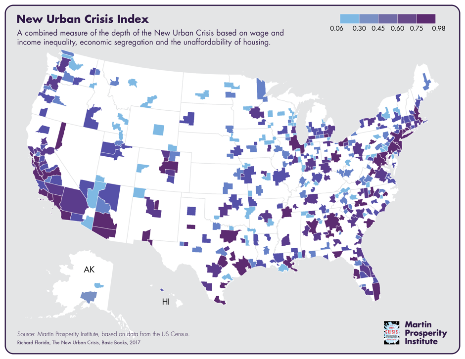
The New Urban Crisis
Mapping the New Urban Crisis maps-out the 'back-to-the-city' movement and resultant issues around inequality, economic segregation, and unaffordable housing.
Monday, April 17, 2017
NASA Earth @ Night 2016
NASA Earth @ Night 2016
Lights On Lights Out is a nice zoomable version showing changes in light between 2012 and 2016 and then there is the matching Esri Story Map LIGHTS ON | LIGHTS OUT.

Lights On Lights Out is a nice zoomable version showing changes in light between 2012 and 2016 and then there is the matching Esri Story Map LIGHTS ON | LIGHTS OUT.

Sunday, April 16, 2017
Map Projections
Two useful websites to learn more about map projections and how they impact what we 'think' the Earth looks like:
- Select two projections in Compare Map Projections and do just that. There is also a Single View option.
- Need a suitable projection for a given area and scale? Try the Projection Wizard!
Need a short summary? Try: Which is the best map projection?
Tuesday, April 11, 2017

Saturday, April 8, 2017
Dam Nation
Dam Nation is an impressive data viz / infographic showing, well, the almost 80,000 dams across the USA based on their hazard potential and the author provides a nice discussion on how he created it on his blog DustyData.
I think the top map with all the 80,000 points and clickable information would be better realized in an environment specifically designed to handle spatial data such as ArcGIS Online, Leaflet, Carto, etc. Scroll-down a little for the awesome pie chart cartogram.
I think the top map with all the 80,000 points and clickable information would be better realized in an environment specifically designed to handle spatial data such as ArcGIS Online, Leaflet, Carto, etc. Scroll-down a little for the awesome pie chart cartogram.
Peaks and Valleys
Peaks and Valleys is an impressive new Esri Story map with 3D scenes of the world's highest and lowest locations.
Wednesday, April 5, 2017
Cartographies of Disease: Maps, Mapping, and Medicine
Now for a happy topic: Cartographies of Disease: Maps, Mapping, and Medicine (now available in the 2nd edition). Still, it could be argued that John Snow's disease mapping in 1854 was the start of modern quantitative cartography and ultimately of GIS. This book, combined with the GIS Tutorial for Health, fifth edition, would make a applied GIS course.


Saturday, April 1, 2017
Snagit
Snagit (by TechSmith) is a great screen capture and screen recording software and will make your life as an educator so much easier (especially if you teach online or flipped classes). $29.95 for educators.
Daniel’s XL Toolbox
Daniel’s XL Toolbox is a free, open-source add-in for the Microsoft® Excel® spreadsheet software that helps you to analyze and present data and increases your productivity. Its primary target audience are life scientists, but it has proven useful for humanities and industry as well.
For example: you can export MS Excel into PNGs or TIFFs (awesome!).
For example: you can export MS Excel into PNGs or TIFFs (awesome!).
Timeline Creation
Timelines can be useful visualization tools and can make useful teaching and learning projects (similar to infographics, etc.). A recent ProfHacker post introduced TimeLineCurator and also includes links to other overviews and tools such as TimelineJS.
TimeLineCuractor video or slide deck.
TimeLineCuractor video or slide deck.
Thursday, March 30, 2017
Old Weather
Old Weather is a classic citizen-science effort - transcribing reams of old ship logs to better quantify past environmental conditions. And: the past is the key to the future! More about it on over on FiveThirtyEight.
Tuesday, March 28, 2017
ArcticDEM
ArcticDEM is an NGA-NSF public-private initiative to automatically produce a high-resolution, high quality, digital surface model (DSM) of the Arctic using optical stereo imagery, high-performance computing, and open source photogrammetry software.
So, if you a) work in the Arctic and b) need a DEM, this may be a great option for you.
Very cool: the Arctic DEM Explorer (running on Esri ArcGIS Online).
So, if you a) work in the Arctic and b) need a DEM, this may be a great option for you.
Very cool: the Arctic DEM Explorer (running on Esri ArcGIS Online).
The Paleobiology Database
The Paleobiology Database (PBDB) is a great effort: interactive web maps and all the data available for download.
Saturday, March 25, 2017

How about an artificial sun?
Seems crazy at first, but makes sense: to best use the real Sun to make sustainable energy it is beneficial to have a fake sun in the controlled environment of the lab. More here.
Highlights of Global Climate 2016
Highlights of Global Climate 2016 (by the WMO) presents, well, the climate of 2016 as an Esri Story Map.
Friday, March 24, 2017

Thursday, March 23, 2017
Yale Climate Opinion Maps – U.S. 2016
The Yale Climate Opinion Maps – U.S. 2016 show what people think across the country (by county) about aspects of climate change. The map for 'Global Warming is happening' gives some hope, but then the map 'Global Warming is caused mostly by human activities' is much more sobering.
National Transportation Noise Map
The National Transportation Noise Map shows, well, noise levels from roads and aviation. It's neat to see the takeoff and landing noise patterns around airports.
Esri’s new Landsat Explorer web app
Esri’s new Landsat Explorer web app is great and adds some nice new features: you can compare different dates, you can download the layer as raster file, and you define your band indexes.

Tuesday, March 21, 2017
The Hemispheres, Toilet Swirls, and the Coriolis Force
Smarter Every Day and Veritasium combine to find the definitive answer.
- The Truth About Toilet Swirl - Northern Hemisphere
- The Truth About Toilet Swirl - Southern Hemisphere
- Watch both videos synchronized!
- The whole story in one video
Sunday, March 19, 2017
Worldpop
From their website: The WorldPop project was initiated in October 2013 to combine the AfriPop, AsiaPop and AmeriPop population mapping projects. It aims to provide an open access archive of spatial demographic data sets for Central and South America, Africa and Asia to support development, disaster response and health applications.
Friday, March 17, 2017
Drone Delivery and what3words
what3words is a new global addressing system that divides the world into a grid of 3m x 3m squares and assigns each one a unique 3-word address. In other words it is much more consistent than street addresses and much easier to remember than latitude and longitude.
Drones use what3words addresses system to deliver packages gives examples how emerging drone delivery services are using what3words for navigation to customers and their landing sites.
Drones use what3words addresses system to deliver packages gives examples how emerging drone delivery services are using what3words for navigation to customers and their landing sites.
Using Esri Business Analyst
Learn How To Use Business Analyst More Effectively compiles three nice and quick videos showing you what you can do with Esri's Business Analyst. The one about suitability analysis is embedded below.
Tuesday, March 14, 2017
Land Viewer
Land Viewer is great: select your Landsat or Sentinal image and then run you analysis on it - all online and fast - and you can even specify your own band combinations / band ratios.
Here's a great example: Quelccaya Ice Cap 10 May 2016
Here's a great example: Quelccaya Ice Cap 10 May 2016
Climate Change Facts from NASA
Climate Change Facts from NASA: evidence, causes, effects, scientific consensus, vital signs, and FAQ.
Planet Explorer
Planet Explorer lets you explore images from a fleet of 149 satellites - across the globe and back in time.
Thursday, March 9, 2017
Hivemapper
Share your drone videos as 3D maps via https://hivemapper.com/. Or, explore some really cool drone footage.
Monday, March 6, 2017
NSIDC GoLIVE App
The Global Land Ice Velocity Extraction from Landsat 8 (GoLIVE) Map Application allows users to spatially search for and download land ice velocities derived from panchromatic imagery collected from May 2013 to present.
- Here's the data set.
- Here's the web app.
- Here's the User Guide.
Wednesday, March 1, 2017
How to make a globe!
This is interesting: Globe Making (1955). Makes you realize how easy is today to access free 3D maps from anywhere on any device and how special a globe was back in the days.
Saturday, February 25, 2017
Let's Drone a Map
Step by step guide to complete your first drone mapping project is exactly what it says - give it a try!
Friday, February 24, 2017

Web Literacy for Students (and Everybody)
Web Literacy for Student Fact-Checkers is a great OER 'textbook' on - well - how to be a responsible consumer of web information.
Saturday, February 18, 2017
Climate Change Board Games
Okay, I admit: I'm a little skeptical when it comes to the use of games or role-playing in science education. Still, Game changers (Science, 10 February 2017) reviews two new board games that could be useful:
Global Land Ice Measurements from Space
The book Global Land Ice Measurements from Space is now available for free download - nice!
Friday, February 17, 2017
ChartAccent
ChartAccent is very cool: simply upload your data as a CSV file, chart it, annotate it, and export it - even as an animated GIF. Here's an example:
Thursday, February 16, 2017
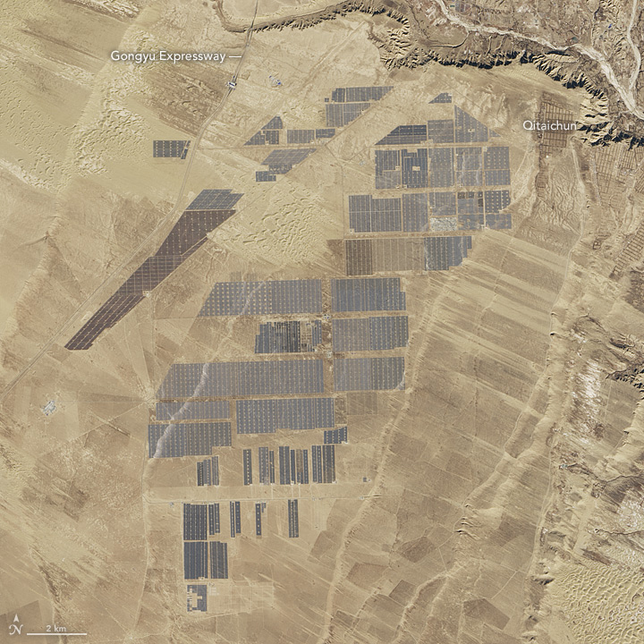
The World's Largest Solar Plant
Here is a nice image comparison by NASA showing the expansion of the Longyangxia Dam Solar Park in China using a Landsat 8 image from 2013 and 2017.

Saturday, February 11, 2017
Friday, February 10, 2017
Thursday, February 9, 2017
Cmap Tools
Cmap Tools have been around for a while now - they provide a nice concept map-based itinerary to get started with concept mapping. Also availble for iPad and cloud-based.
Wednesday, February 8, 2017
Intermediate Python
Here's a review of ArcGIS Blueprints - seems like a great choice for ArcGIS users as the next step beyond learning the basics of Pyhton.
Tuesday, February 7, 2017
Information Visualization
Enrico Bertini's course materials for his Information Visualization class are all available online. Thanks!
Sunday, February 5, 2017
Census Reporter
Census Reporter provides easy, fast tools to search for Census data about a place along with advanced tools for mapping, charting and comparing data at the state, county, and city levels.
Data Journalism: finding the stories inside the census. from NPR Training on Vimeo.
Saturday, February 4, 2017
A Short History of Humans and Germs
A Short History of Humans and Germs (by Skunk Bear) is great (here's the video) - looking forward to the continuation.

- Episode 2
- Episode 3

Subscribe to:
Posts (Atom)