Wednesday, September 30, 2015
Wikipedia's Climate Data on an Interactive Map
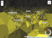
This map/visualization was quite popular this week: Wikipedia's Climate Data on an Interactive Map. I still think these Voronoi maps are ugly and the map seems a bit wonky - I can't figure-out the month wheel. The animated GIFs are fun:

Arctic Ocean Sea Ice 1979 to 2014
Here's another nice animated map with embedded chart: Arctic Ocean Sea Ice 1979 to 2014
Sunday, September 27, 2015
Naomi and Francis
Naomi Oreskes always has interesting things to say about the nexus between climate science and its political, social, and economic implications. Have a look at the recent piece As Pope Francis Meets America, a Climate Science Scholar Offers a Fresh View of the Encyclical for her thoughts on that.
Friday, September 25, 2015
Years You Have Left to Live, Probably
Very cool from FlowingData: Years You Have Left to Live, Probably is a life-expectancy simulator.
Thursday, September 24, 2015

Tuesday, September 22, 2015
Sustainable Growth and Resilience Data Gateway
Talk about packing buzz words into a title: Gateway Supports Sustainable Growth and Resilience. Unfortunately, the actual data gateway is far less impressive in terms of design, functionality, and available data.
Monday, September 21, 2015
Saturday, September 19, 2015

Friday, September 18, 2015
AIDSVu
AIDSVu is impressive: interactive mapping of HIV/AIDS data at the city, county, and state level. Plus, all the data are available for download and you can even create your own maps as PDFs or PPTs.
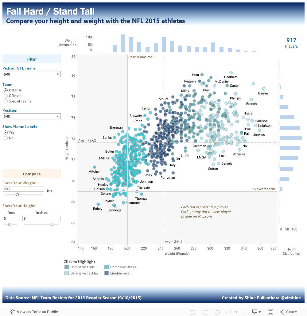
Fall Hard / Stand Tall
Here we have the total opposite: Fall Hard / Stand Tall is a rich and interactive data viz of NFL player height and weight created with Tableau.
How Your State Generates Power
Subtle, clean, and simple: Coal, Gas, Nuclear, Hydro? How Your State Generates Power
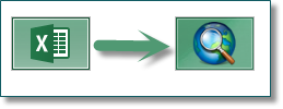
MS Excel and ArcGIS
The source of many frustrations - how do you best take data from MS Excel into ArcGIS? Formatting a table for use in ArcGIS includes useful tips and tricks!

Thursday, September 17, 2015
Atomic
Atomic is a brand-new web-based interactive and collaborative design tool - read a review by John Brownlee over at Co.DESIGN. According to him Atomic is free for education and academic use, although their pricing information is pretty vague at this point.
Overview of Atomic from Atomic on Vimeo.
And - But - Therefore
Houston, We Have A Narrative is a new book by Randy Olson that helps scientists tell their stories in a compelling way using the _____ and ______, but ______, therefore _____ framework. Andy Revkin offers his review over at Dot Earth and you can listen to a Randy Olson podcast over at The Prism.
Other books by Randy Olson include Don't Be Such A Scientist and Connection: Hollywood Storytelling meets Critical Thinking (also available as an app for Android and iOS).
Other books by Randy Olson include Don't Be Such A Scientist and Connection: Hollywood Storytelling meets Critical Thinking (also available as an app for Android and iOS).
Wednesday, September 16, 2015
Satellite Surfer
Seen on Maps Mania: The Satellite Surfer tracks 88 satellites live and in real-time. Plus, the pass predication option allows you to - well - predict satellite overpasses based on a location and time. It loads a bit slow, but is worth the wait.
The Living Wage Map
Nothing super-special here: The Living Wage Map is simply a nice and clean implementation of a story map.
Tableau Public 9.1
Tableau Public 9.1 was just launched - a great way to tell web-based data stories.
Tuesday, September 15, 2015
The Carbon Map
Simple and clean: The Carbon Map is a series of cartograms telling the story of global climate change
Smart Charting
This is super-hip right now: smart mapping or smart charting where the software looks at your data and automatically suggests appropriate visualizations and analytical steps. Convenient? Yes! But also scary for a teacher...students have to think even less now.
Anyways, here is what Nathan Yau had to say about Google's new Explore option: Automatic charts and insights in Google Sheets.
Anyways, here is what Nathan Yau had to say about Google's new Explore option: Automatic charts and insights in Google Sheets.
Sunday, September 13, 2015
Saturday, September 12, 2015
Green Roofs
Green roofs are pretty hip these days and the GRITLAB at the University of Toronto is clearly the place to learn about them (and green walls).
Friday, September 11, 2015
Need MS Excel?
Let's be honest: all the cool stuff is nice, but in reality we all still need to use (and understand) a basic spreadsheet software, for example MS Excel. Here are some great links in case you need a refresher or want to see some more advanced applications:

- The Absolute Beginner's Guide to Spreadsheets (Ann K. Emery)
- Learn Excel: An In-Depth, Thorough Tutorial (With GIFs) (Ann K. Emery)
- MS Excel on Steroids!
- Excel Map Hack (John Nelson)
- More assorted good stuff
- Excel Mini Tutorials on YouTube (Barb Henderson)

EarthViewer
How about using 3D virtual globes to look at the Earth millions of years ago? EarthViewer (by HHMI) is great, especially as you can download and run it locally (great for schools with slow Internet). HHMI also offers great resources, classroom activities, and more for EarthViewer.
What Did the World Look Like is a simpler, fully-online implementation.
What Did the World Look Like is a simpler, fully-online implementation.
Tuesday, September 8, 2015
Monday, September 7, 2015
Sunday, September 6, 2015
The Everything Machine
Super-cool from the folks at Tinybop: The Everything Machine allows to to program your own apps that use all the components of an iPhone or iPad (e.g. camera, microphone, etc.) in a fun, lego-style interface. Here's a review on Co.DESIGN.
Also really cool: Simple Machines and Robot Factory.
Also really cool: Simple Machines and Robot Factory.
Piktochart
Piktochart has been around for a while as a web-based tool for designing infographics. Julie Platt on ProfHacker recently provided a review and discussion of how she uses Piktochart for creating visually-appealing course materials such as course syllabi, etc.
I agree with her basic argument: we live in a visual world and therefore the visual design of our course materials is important and sets an example for what we expect from our students.
I agree with her basic argument: we live in a visual world and therefore the visual design of our course materials is important and sets an example for what we expect from our students.
Statistical Jargon
Good tips and explanations here: Plain Languaging Statistical Jargon. Her main argument: don't add confidence intervals, etc. to your charts unless you can explain them in a concise text box or sub-title.
Saturday, September 5, 2015
Dot Maps
Dot maps are pretty cool - you use 1 dot to represent say 1 job or 1 person or 25 renters/owners or 20 immigrants. The problem is really performance...these maps tend to take a long time to load.
Thursday, September 3, 2015
Pixel Map Generator
Via Maps Mania: The Pixel Map Generator enables you to create highly-stylized (i.e. pixelated) maps which may be useful for illustrative purposes or as base layers.

Arctic Ocean Sea Ice 2006 to Current
Arctic Sea Ice by mastermaps is a really nice and subtle viz of Arctic Ocean sea ice conditions - combining daily and annual data as a line graph and a polar-projection map.
Wednesday, September 2, 2015
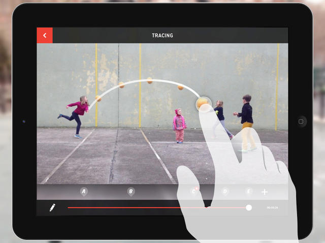
Playground Physics
And other fun and educational apps for the iPad - introducing Noticing Tools by the New York Hall of Science. Read more over at Co.DESIGN or risk $9.99 to try them.

Tuesday, September 1, 2015
Subscribe to:
Posts (Atom)