Try it here: https://www.napkin.ai/
Showing posts with label Infographics. Show all posts
Showing posts with label Infographics. Show all posts
Thursday, January 8, 2026
Napkin.ai
From the website: "Napkin turns your text into visuals so sharing your ideas is quick and effective." Sounds interesting and there is a free version.

Friday, December 19, 2025
Times New Roman vs Calibri
This argument is old and the facts are clear, but of course this is back in news recently with the State Department switching back to Times New Roman because Calibri is too woke for them.
The NYT has a nice article: Is Times New Roman Better Than Calibri for the State Department?
Personally, I have been using Calibri for my slidedecks for a long time: it is simple, looks good, and is easy to read. But...maybe a little boring. For text I prefer Garamond - I think it looks elegant & sophisticated. But...Arial is Google Docs default & thus most of my text is now in Arial.
Tuesday, November 18, 2025
The Periodic Table Of Data Viz
Pretty cool, but uesless: https://www.visual-literacy.org/periodic_table/periodic_table.html
Saturday, September 6, 2025
How To Make Animated GIFs
Great video: How to Make Dataviz GIFs (4 Steps with Free Software)
- Assemble the frames as slides in MS PPT.
- Save each frame as an image (use JPG as it creates a white background).
- Upload the JPGs to a free GIF website (e.g. Ezgif).
- Share the animated GIF!
Or, make it natively in MS PPT = save as animated GIF! But this does not allow you to adjust the timings between the frames and transitions.
Tuesday, August 12, 2025
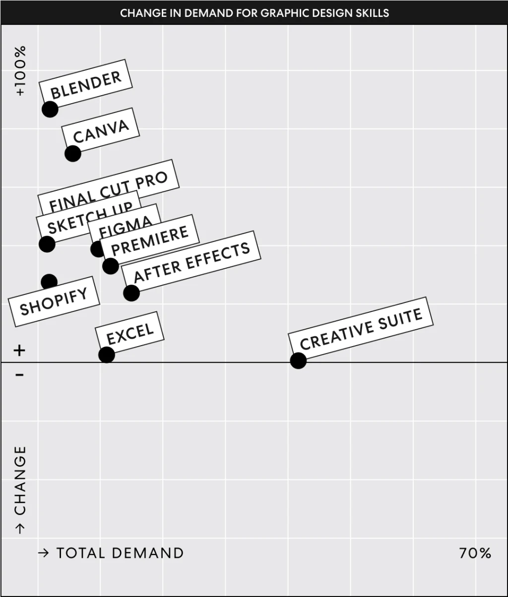
Blender & Canva
Sounds like Blender & Canva are taking over the 3D & 2D graphic design world - interesting! I'm not surprised to see Blender here, but Canva used to be considered an amateur tool. Read more about it here.
Saturday, February 1, 2025

Sunday, October 20, 2024
Color Buddy
Color Buddy looks a little complicated, but may help you build better color palettes for use in data viz.
Tuesday, September 24, 2024
Thursday, September 19, 2024
Five ways to improve your chart axes
Five ways to improve your chart axes is not particularly new or original, but the R crowd will appreciate the code examples provided.
Saturday, August 24, 2024
Data GIF Maker
Cool: the Data GIF Maker (by Google) is a super-simple animated GIF maker for data / charts.
Wednesday, August 7, 2024
Friday, June 7, 2024
Become a data viz SUPERSTAR
This loks promising: Become a data viz SUPERSTAR is a 5-part YouTube series from the folks @ storytelling with data to become, well, a data viz superstar. Could be usefuf for teaching data analysis and data viz.
Thursday, July 6, 2023
What's the best font?
Here's an issues best avoided: stressing-out over fonts! The best advice for most of us is simpe: use a serif font for text and a sans-serif font for data, tables, chart labels, etc.
That being said: What’s your type? Try these tests to pick the perfect font for you from the Washington Post is a nice demonstration how changing the font impacts the way you read and write.
Monday, June 26, 2023
Color & Contrast
An interactive guide to color & contrast (by Nate Baldwin) is just that - a comprehensive guide for exploring and learning about the theory, science, and perception of color and contrast. The details get a little wonky, but the section on UI & Data Visualization offers sound practical advice.
Monday, February 13, 2023
The World Data Viz Prize (2023)
Explore & get inspired @ https://informationisbeautiful.net/visualizations/world-dataviz-prize-2023-shortlist/. I like the distinction between static & interactive.
Wednesday, August 31, 2022
The New Way To Publish!
This is great! First, you have an allroud excellent paper, published OPEN in Nature Medicine. Second, you get a cool animated data viz where you can drill into the data and results yourself. Now all you need to add is a simple Data Download button and this would be perfect. Have a look:
Kephart, J.L., Sánchez, B.N., Moore, J. et al. City-level impact of extreme temperatures and mortality in Latin America. Natire Medicine (2022).
Wednesday, June 1, 2022
Wednesday, December 22, 2021
The Best Maps/Charts/Data Viz of 2021
It's that time of the year when the Top-10, 20, 30, 40, 50, etc. lists of 2021 come-out:
- Maps Mania Maps of the Year
- Favourite maps of 2021 (Ken Field)
- Data Viz Projects (Nathan Yau)
Sunday, December 12, 2021
Climate Change Solutions
Here ar a bunch of reasonable & robust plans out there to get to netzero carbon emissions by 2050 - here's one visualization of some of those plans: How to Get the World to Netzero Carbon Emissions by 2050 – A Graphical Guide.
I especially appreciate thaat the data are included as a shared Google Sheet - that's the way to do it!
Wednesday, April 28, 2021
Sections in MS PPT
I'm not using MS PPT all that much these days, but here's a nice example of why MS PPT is still better than Google Slides: How to Organize PowerPoint Slides with "Sections"
Subscribe to:
Posts (Atom)