Thursday, October 31, 2013
Google 'Earth' of the Human Body
This is a great Google Chrome app: The BioDigital Human. It does feel like flying around in Google Earth, except here you are flying in and around the human body. See NCS EdTech News for more education-related Chrome apps.
Map Tips
Great tips from John Nelson for making better maps. I especially like #3: Defaults are evil! and #4: Legends are like collateral damage.
Also excellent: Jerry's Top 10 Crime Mapping Tips
CCAPS
Or: Climate Change and African Political Stability. I'm not sure what to do with this: great data and excellent interactive visualizations, but also proof that there can be too much of a good thing: I can't figure-out what is what and how it is all related. Maybe provide a road map!
Sunday, October 27, 2013
Virtual Fieldwork
Reality is overrated! Plus, it is expensive to take students off-campus and into the field - plus consider the liability. Even better: don't build actual lab facilities - implement a Bring-Your-Own-Device policy on your campus and use virtual labs. And - the Millenials love gaming - so why not use that in teaching? Finally - who needs a campus - let's go fully virtual! Here are some options:
- Virtual Fieldwork
- Virtual Labs: Chemistry and Biology
- Educational Gaming: SIMCITY
- Virtual Campus: Second Life
I'm sure there are many more...
Friday, October 25, 2013
What's Your Mood?
Time Magazine published a map of the moods across the U.S. mapped at the state level. Take the test yourself to see what state best matches your personality!
Thursday, October 24, 2013
Viewshed and Drive-Time Buffers
Here are two quick and simple web maps to determine viewshed and drive-time buffers. No real options (other than the obvious), but a nice way to introduce these concepts to students before digging deeper into the actual geoprocessing tools.
Smartphone = Microscope!
This sounds like a great thing to try: convert your smartphone into a digital microscope!

- Here's the YouTube video

Doctopus and Goobric
Sounds weird, but if it works in the real teaching world of K-12 it should also work in higher education. So here are two tools for better managing student assignments shared via Google Drive: Doctopus and Goobric. How can you use them? Have a read over at NCS EdTech News.
And then, let's debate if it is really a good idea to farm-out educational technology to a commercial company such as Google offering 'free' things.
And then, let's debate if it is really a good idea to farm-out educational technology to a commercial company such as Google offering 'free' things.
Green Cities
Interesting interactive infographic / web map brought to us by Siemens: The Green City Index. I'm not sure about the connection between Siemens and Green Cities (energy supply maybe?), but a great resource. Below is a nice infographic with the Top-10 greenest cities around.


Animated Twisters
Here is an excellent interactive web map of tornadoes: click on a state and the summary information below the map changes accordingly. Now there are three great twister visualizations out there:
Tuesday, October 22, 2013
Adding a KMZ File
Here's a KMZ file hosted on ArcGIS Online...Hello - Google! Why can't I add a KMZ file to Blogger and instead have to use the rival Esri?
Tilton Farm KMZ
Tilton Farm KMZ
Sunday, October 20, 2013

Thursday, October 17, 2013
The Future of Education (and Technology)
This video is worth watching (also available via YouTube) - a nice summary of what is wrong with the way we teach and learn today. Predictably, MOOCs are presented as one solution...I still don't see that until I get an answer to the fundamental question: who pays for the MOOC and the associated overhead?
Monday, October 14, 2013
Wingnuts!
Rather: crazy people doing crazy things!
- How about a wingsuit flyer landing on a lake (= jumping without a parachute!).
- Or, this guy flying through a hole in a cliff.
Trends and Variations
These two graphics and animations have been around for a couple of years - but they are worth to remember in light of all the noise about the 'stopping' of global warming.
Andy Revkin at Dot Earth presents a nice discussion and explanation.

Same data, different interpretation: see here and here for a discussion.
Andy Revkin at Dot Earth presents a nice discussion and explanation.
Same data, different interpretation: see here and here for a discussion.
Saturday, October 12, 2013
Leaflet
Just what we needed...another open-source JavaScript library for mobile-friendly interactive maps...yet another alternative to the big bad Esri...back to the stone age with geeky command-line coding...all in the name of flexibility. Check it out: Leaflet and how you can use it to create a Story Map.
Drones and the Law
UAVs (aka drones) are generating quite the hype these days - but what are they? Just high-tech remote-controlled toys, model aircraft, or something else entirely as they (often) are used to record aerial imagery or video. Here's an interesting article in Popular Science.
Adventures in Mapping
Have a look at this slide deck by John Nelson for some impressive examples of maps and data visualization in general.
Two Energy Futures
Two Energy Futures is a well-designed interactive infographic. Navigate with the stylized map in the upper-right and energy sources and the toolbox by clicking-on the stylized list in the upper-left.
Thursday, October 10, 2013
Trust the Realtor!
Well - maybe - but here's a great web map by Trulia: zoom-in to see home prices and more down to the census block level. Be sure to try the Commute slider! Also included are schools and crimes. The link drops you into Springfield (MA), but you can explore the entire U.S.
Wednesday, October 9, 2013
The World Hunger Map
Sad to say, but that's pretty much the pattern I would have expected (brought to you by the U.N. World Food Program).
Tuesday, October 8, 2013
What's a MOOC anyways?
The answer is pretty simple: a MOOC has to be massive = have so many students taking it that it becomes impossible, as an instructor, to actually interact with students in a meaningful way. In other words: a MOOC that's not actually massive is just an online course with bad pedagogy. I'm therefore not surprised to see the Big-3 LMS providers trying to get into the MOOC game. What does that mean? Just another excuse for college and university administrators to raise the enrollment numbers for online courses by claiming they are MOOCs.
Student Technology Habits
Here is the 2013 ECAR survey of 112,000+ undergraduates and their technology habits and expectations. It is worth remembering the source - EDUCAUSE - a special interest group promoting the use of information technology in education...keep that in mind when reading the recommendations and 'actionable results'.
Real-Time Media Map
Who reads/listens to/watches what and where across the USA? Have a look at the Bitly Real-Time Media Map, but also read the methods and data limitations described here.
Life and Gender in NYC
One person = one dot, telling a story of getting older and moving around in New York City. Be sure to read John Nelson's explanation of the data and patterns.


Monday, October 7, 2013
Apple Cider Pressing
This is a little different: my home-made video of apple cider pressing with friends in Vermont. Nothing fancy here: the videos were recorded on an iPhone 4 and then cut/spliced without anything in Microsoft Movie Maker. Next time: shot in landscape mode!
Sunday, October 6, 2013
Urban Observatory
Urban Observatory is a new high-end Web GIS produced by Esri and others - watch the video to get an idea what this is all about and how you can use it. Then, click on Start Comparing and compare whatever cities and whatever variables you are interested in. Now...this would be even better if the underlying data were available for convenient download!
Mars Panorama
This Mars Panorama is very cool as is on a computer screen - but even better when you view it on smart phone or tablet with the built-in accelerometers: it feels like you are standing on Mars!
Mars Panorama - Curiosity rover: Martian solar day 177 in Out of this World
Mars Panorama - Curiosity rover: Martian solar day 177 in Out of this World
Friday, October 4, 2013
Thursday, October 3, 2013

Wednesday, October 2, 2013
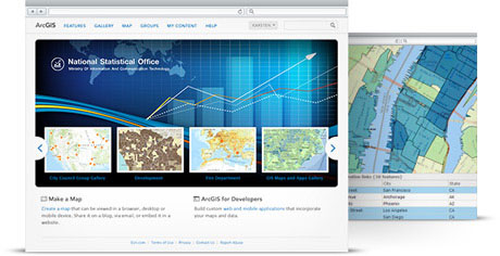
ArcGIS Online: Help and Tutorials
Here's comprehensive listing of all resources related to ArcGIS Online, including free web courses and training seminars, technical workshops, tutorial videos, and more.

Subscribe to:
Posts (Atom)