Thursday, June 30, 2016
World Births and Deaths, Simulated in Real-Time (Beta)
World Births and Deaths, Simulated in Real-Time (Beta) is pretty neat and nicely illustrates that more people are born than die...hence world population is rising. What's missing is a clear description of the data sources and methods/assumptions underlying this simulation.
Wednesday, June 29, 2016
How to Extract Media from Slide Decks
Who knew - here's how to 'hack' MS PowerPoint: How to Quickly Extract Media from Slide Decks
Tuesday, June 28, 2016
Blistering Future Summers
Blistering Future Summers (embedded below) is a nice way to better understand what global warming will 'feel like' for us. The basic approach is not new, see, for example The Changing Northeast Climate Our Choices, Our Legacy by the Union of Concerned Scientists.
Wednesday, June 22, 2016
Yeah Science!
Good read: Science Education, Millennial Workers, and the Mad Skillz Gap
My favorite quote: The paradox of students feeling confidence but lacking skills may be partly the result of our toxic culture of unearned self-esteem, where effusive praise for mediocre achievements mixes with the haunting dread that some child, somewhere, might not feel like a champion all the time.
My favorite quote: The paradox of students feeling confidence but lacking skills may be partly the result of our toxic culture of unearned self-esteem, where effusive praise for mediocre achievements mixes with the haunting dread that some child, somewhere, might not feel like a champion all the time.
Tuesday, June 21, 2016
The Ultimate Spreadsheet Dashboard
So you have a bunch of spreadsheets in whatever format (MS Excel, Google Sheets, CSV) and now can connect them all and make pretty charts using Spreadsheet Dashboards by Datadeck. See The Ultimate Spreadsheet Dashboard for more information.
60 Years of Urban Change
60 Years of Urban Change is simple and elegant: 1) take the earliest available aerial of a city, 2) take a recent aerial of the same area, and 3) and combine them in a cool slider window - done.
Monday, June 20, 2016
Mapping Cities
Reba et al. (2016) Spatializing 6,000 years of global urbanization from 3700 BC to AD 2000 is great, but even better when mapped in a variety of ways at Watch as the world’s cities are born one-by-one over 6000 years.
Sunday, June 19, 2016
Thursday, June 16, 2016
How Tax Brackets Work
How do tax brackets work? is a great interactive graph: select your state, use the slider to set your total income, and see what happens. Well-done!
Earth From Space
Via Maps Mania: here are three nice ArcGIS Online web maps of photographs taken from the ISS.
Wednesday, June 15, 2016
Global Warming Since 1850
Less 'cool' than the Temperature Spiral, but nicely done (using the same data):
 |
| https://www.reddit.com/user/cavedave |

Monday, June 13, 2016
Sankey Diagram
Acquire’s Sankey Diagram Generator is a fun and useful online tool for creating Sankey Diagrams. I found it helpful to Load an example data set to figure-out some of the terms and nomenclature. How to make a Sankey Diagram explains what they are and how to make them.
Light Pollution Mapping
Here we have a new paper by Falchi et al. (2016) The new world atlas of artificial night sky brightness and the associated 2D map and 3D globe.


Friday, June 10, 2016
Geological CCS
This idea has been around for a while: can we inject CO2 into the ground and wait for it to turn into calcium carbonate? In other words: mineral carbonization. Of course we can, but this geological process is considered far too slow to be useful for operation CCS as a mitigation strategy.
But, maybe not - at least for localities with suitable geology: Rapid carbon mineralization for permanent disposal of anthropogenic carbon dioxide emissions (Science, 10 June 2016).
Here's the science news version GEO-INJECTION SYSTEM CAN TURN CARBON DIOXIDE INTO STONE and the video.
But, maybe not - at least for localities with suitable geology: Rapid carbon mineralization for permanent disposal of anthropogenic carbon dioxide emissions (Science, 10 June 2016).
Here's the science news version GEO-INJECTION SYSTEM CAN TURN CARBON DIOXIDE INTO STONE and the video.
Turning Carbon Emissions to Stone from Earth Institute on Vimeo.
Who lives where?
'Raw' demographic data does not really tell the story of who actually lives in a particular area. Now we have Esri and CartoDB essentially competing for your attention (and business):
Thursday, June 9, 2016
Learning R
Natan Yau of FlowingData has some of the best tutorials/courses on using R for data visualization. You'll need to become a member, but that should be a very worthwhile investment.


Wednesday, June 8, 2016
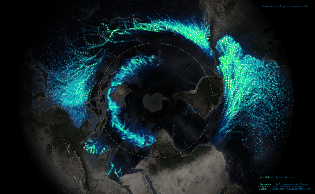
How-To: Hurricane Map
How-To: Hurricane Map is a great little tutorial (complete with all the needed data) to make the map below using ArcGIS. Try it!
Tuesday, June 7, 2016

Smarter Every Day
Smarter Every Day is yet another great YouTube channel devoted to exploring science and technology.
Monday, June 6, 2016
The Cat in the Hat Knows a lot about Data Visualization
Brilliant video by Cole Nussbaumer Knaflic. This one is good as well: Declutter Your Data Visualizations
Sunday, June 5, 2016
Khan Academy and the Effectiveness of Science Videos
Khan Academy and the Effectiveness of Science Videos (embedded below, start at 07:00 minutes if you are in a hurry) makes some well-known points regarding learning in-general: it's our misconceptions and preconceptions that get in the way of learning.
The author (Derek Alexander Mueller) also runs a YouTube Channel called Veritasium with great science learning videos, for example:
The author (Derek Alexander Mueller) also runs a YouTube Channel called Veritasium with great science learning videos, for example:
- 13 Misconceptions About Global Warming
- Climate Change is Boring
- Scientific Notation - Explained!
- Scientific Notation - Example
- The Truth About Toilet Swirl - Southern Hemisphere
- The Truth About Toilet Swirl - Northern Hemisphere
- The Truth About Toilet Swirl - Both Hemispheres
- This Will Revolutionize Education
Friday, June 3, 2016
What if we burned all the fossil fuels we have?
This is not a 'new' question and here are some studies and answers:

- The climate response to five trillion tonnes of carbon (Nature Climate Change, May 2016).
- If We Dig Out All Our Fossil Fuels... (New York Times, 8 April 2015).
- The Alberta oil sands and climate (Nature Climate Change, February 2012).

Datamaps.co
Datamaps.co is simple and easy: upload a CSV file (with regional data), generate a map, and save it as an image file.
Terrapatten
Terrapattern got people pretty exited: you can search satellite images for patterns. In essence this is similar to a supervised classification used in remote sensing analysis where you define training areas and the software analyzes the satellite images for areas with similar spectral characteristics.
Smartphone GPS Accuracy inside an Urban Jungle
You can read the entire post How accurate is your smartphone’s GPS in an urban jungle? or even the underlying study, but all you really need to know is about 90 feet (on average).
Esri Geoinquiries
GeoInquiries (by Esri) are short, standards-based inquiry activities for teaching map-based concepts found in commonly used textbooks. Collections include:
- Earth Science (Middle School)
- US History (High School)
- Advanced Human Geography (High School)
- Advanced Environmental Science (High School)
- Grade 4 Interdisciplinary
Subscribe to:
Posts (Atom)