Sunday, November 29, 2015
The Pledge Gap
The Climate Change Pledges Are In. Will They Fix Anything? is a nice data viz by the New York Times of CO2 emission reduction pledges in the context of the Paris Climate Change Conference. Scroll-down all the way for the take-home message: what future do you want?
Friday, November 27, 2015
Learn QGIS
Five free QGIS courses (self-taught at your own pace) - more information about the curriculum and content at the FOSS4G Geoacademy Curriculum.
Open-Source Interactive Web Mapping
And it all happens inside your browser = no software to download and to install. From Paper Maps to the Web: A DIY Digital Maps Primer is a great tutorial and you will be using all the cool tools, for example:
Thursday, November 26, 2015
Wednesday, November 25, 2015

Web Scraper and Data Scraper
Two Chrome extensions / apps to 'scrape' data off websites: Web Scraper and Data Scraper.
Tuesday, November 24, 2015
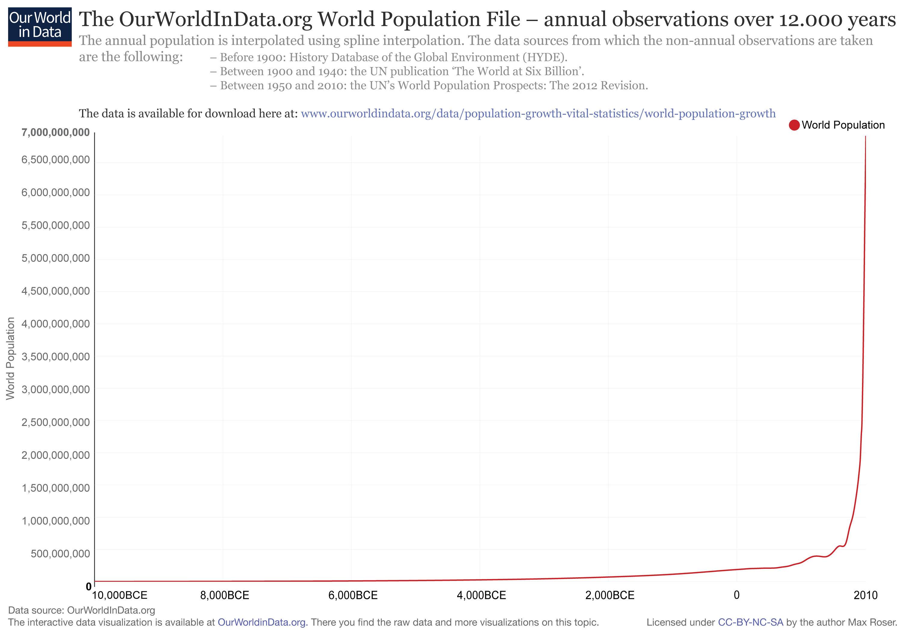
World Population Growth
World Population Growth by Max Roser is intense: lot's of text, lot's of charts, lot's of maps, and lot's of data. Speaking of the data - all are available for download as CSV files.

Saturday, November 21, 2015
Mapping History!
These visualization of history are just cool!
- Histography provides an interactive timeline of history (based on Wikipedia) for the last 13.8 Billion years.
- The Museum of the World is an interactive experience mapping time, continents, and cultures.
Tornado Tracks 1950 to 2014
Tornado Tracks 1950 to 2014 is a nice interactive web map (using Esri ArcGIS Online) showing tornado tracks between 1950 and 2014: clean, simple, and useful.
Thursday, November 19, 2015
Drought Mapping using CartoDB
This is a great tutorial: Make a Thematic Map of Current Drought Conditions (using CartoDB)
D3.js and R
Better Data Visualization with Python, D3.js, MapReduce and R has some nice information and links related to those four data analysis and visualization tools, for example:
- D3 Tutorials (by Scott Murray)
- 20 D3 Video Tutorials (by d3Vienno)
- Introduction to Data Science with R - Part 1 (David Langer)
- Introduction to Data Science with R - Part 2 (David Langer)
- Data Visualization Using R (23:45 minutes)
- Combing R and D3.js
Tuesday, November 17, 2015
Cole Nussbaumer Knaflic
Cole Nussbaumer Knaflic is the person behind the awesome blog Storytelling with data, the new book storytelling with data.

Saturday, November 14, 2015
ThingLink
ThingLink is fun and basically a simpler version of StoryMap JS: upload an image and make it interactive by adding tags and linking to multimedia. In other words: make a story map from an image - be that of some natural feature, art, or whatever.
Here's a fun example: GPS Survey of the Quelccaya Ice Cap
Here's a fun example: GPS Survey of the Quelccaya Ice Cap
Now That's A Map!
Well-written: Equal Area Cartograms and Multivariate Labels with several great examples, including this one:

Geocaching, GPS, and More
New webinar by JoeKerski on Geocaching, GPS, and Related Geo-Activities - should be fun and useful!
Windyty Weather Forecast
These types of visualizations have been around, but Windyty now includes the wind, temperature, pressure, cloud, and humidity forecast for the next few days. Plus, you can change the altitude to see how the winds change as you go up in the atmosphere. And you can change between 2D and 3D modes, plus choose different base maps.
Deforestation in Brazil
NPR Look At This has a powerful photographic journal of rain forest deforestation in Brazil (which includes a few maps). This is a nice example of story mapping without really any maps.
Wednesday, November 11, 2015
ArcGIS 10 Tutorial
This is pretty great: a hyper-texted and illustrated tutorial for ArcGIS 10 by the folks from Amherst College.
SHOW by Mapping Worlds
SHOW by Mapping Worlds makes interactive cartograms of countries, US states, or Japan prefectures and you can get the data as MS Excel spreadsheets - nice!
TeachGIS.org
Teach GIS is a venue where expert and novice instructors of geographic information systems (GIS), and related geospatial technologies, could feel comfortable sharing ideas, asking and answering questions, and learning from one another. We are software neutral and very open-minded towards open source tools. We welcome any and all fellow GIS instructors from our wider global community to join the conversation.
The Lab Activities section hosts a nice searchable version of Esri's Spatial Labs.
The Lab Activities section hosts a nice searchable version of Esri's Spatial Labs.
Esri Spatial Labs
Esri Spatial Labs are standalone activities designed to promote spatial reasoning and analysis skills. In other words: they are boring. But, together with authentic place-based question they can serve as intellectual stimuli as well as opportunities to practice tools and techniques. Download the entire package as a 2.3 GB zipped ISO file.
Ecological Land Units
Or: a new map of the global ecosystem - explore:

- Explore a Tapestry of World Ecosystems (Esri Story Map).
- Or, as an interactive and searchable web app as called Explore the Ecological Tapestry of the Word.
- Or, use as part of the Landscape Layers in ArcGIS.
- Or, download the original data from the USGS (2.4 GB zipped).

Africa Map
Africa Map is a comprehensive mash-up of many data layers from Africa (using Harvard's WorldMap web mapping tool).
The American Time Use Survey
I had no idea such a thing existed until I saw the The American Time Use Survey visualized at Counting the Hours on FlowingData. And there is even ATUS-X, a website by the University of Minnesota where you can easily download the data.
Evernote
I used to be an Evernote user and then switch to Trello for task management and Google Docs/Drive for everything else. Still, the speech-to-text feature in Evernote is appealing: in theory it transcribes your voice notes.
Esri Survey 123
Survey 123 for ArcGIS looks useful - a tool/app to facilitate field surveys and field data collection using tablets. There is more about it in the Survey123Community on GitHub and in ArcNews (Fall 2015).
Fun with GIS 191: Survey 123 helps you to get started and Charlie Fitzpatrick also created a nice sample activity with a sample spreadsheet.
Fun with GIS 191: Survey 123 helps you to get started and Charlie Fitzpatrick also created a nice sample activity with a sample spreadsheet.
SIGMA
The System for Integrated Geoscience MApping (SIGMA) by the British Geological Survey is a tool for field data collection, mapping, and visualization running on Windows and using ArcGIS 10 and MS Access 2007.
ASTER GEDv3
The ASTER GEDv3 offers TIR data from 2000 to 2008 at 3 arc sec (~100 m) resolution - cool!
Monday, November 9, 2015
NOAA Solar Calculator
Fun and useful: the NOAA Solar Calculator gives you sunrise, sunset, and solar noon.
Saturday, November 7, 2015
Commons Lab
Commons Lab is (as they state on the website) a database of federal crowdsourcing and citizen science projects. Somehow I'm not impressed...am I missing something here?
Friday, November 6, 2015
Greenland Melting!
Greenland Is Melting Away is an incredible viz by the NYT, combining awesome drone footage and photographs with cool interactive annotated satellite images.
Sunny Cities
Sunshine on my Shoulders is a great data viz using Tableau, basically the book end to the great Why does it always rain on me?

Thursday, November 5, 2015
Mapping the Uninsured
Another nice interactive map by the TheUpshot: We Mapped the Uninsured. You'll Notice a Pattern.
The Growth of the US
Seen on FlowingData: the territorial evolution of the US between 1629 and 2000 as a YouTube video. Even better: the data files are available for download!
Subscribe to:
Posts (Atom)