Thursday, December 22, 2022
Urban vs Suburban
Tuesday, December 6, 2022
Saturday, December 3, 2022
Carbon Footprint Map
Nothing new here @ https://footprintmap.org/map, but a nice interactive data viz. Two things to improve: 1) add the total carbon emission as an option and 2) provide the data for easy download.
Simple Writer
Monday, November 28, 2022
The Climate and Economic Justice Screening Tool (Version 1.0 & 2.0)
Monday, November 21, 2022
Global Watersheds
Sunday, November 13, 2022
River Runner
River Runner is fun - follow a drop of water as it travels downstream from whereever it falls.
Monday, November 7, 2022
Monday, October 24, 2022
Data Science Illustrations by Allison Horst
Sunday, October 23, 2022
Friday, October 21, 2022
Climate & Conflict
Tuesday, October 18, 2022
The 15 Minute City
Friday, October 14, 2022
Linear Regression
Open-Source Book: Introduction to Data Science
It does not get better than this: Introduction to Data Science - Data Analysis and Prediction Algorithms with R.
Thursday, October 13, 2022
Wednesday, October 12, 2022
The Global Ecosystem Typology
The Global Ecosystem Typology visualizes the IUCN Global Ecosystem Typology (v2.1) - very cool!
How to Lie with Maps
How to Lie with Maps is a fun exploration of how changing the sizes of symbols can dramatically change the message that a map conveys.
Monday, October 10, 2022
Dashboards in MS Excel
Sunday, October 9, 2022
Tuesday, October 4, 2022
Tuesday, September 13, 2022
Thursday, September 8, 2022
Smart Charging for EVs
- Adjust the timing of when the EV charges to match supply and demand of the grid.
- Bidirectional charing where the EV sends electricity back to the grid when needed.
Tuesday, September 6, 2022
Saturday, September 3, 2022
Data Design in ArcGIS Pro
Data Design in ArcGIS Pro shows an excellent case study that explains the differences and uses for attribute domains, subtypes, contingent values, and attribute rules. Plus a nice example of using a Story Map without any maps!
Wednesday, August 31, 2022
The New Way To Publish!
Sunday, August 28, 2022
City Planning Games
Here are a few city planning games:
Saturday, August 27, 2022
Free Stats Book!
Awesome: Introduction to Probability for Data Science (read online, watch the videos, exercises, solutions, and a PDF download).
Thursday, August 25, 2022
Deforestation in Bolivia
Nothing new here, but a) the patterns are wild and b) the change between 1986 and 2022 is incredible: Patterns of Forest Change in Bolivia
ArcGIS StoryMaps Collections
That opens-up all kinds of good options: Recreate the classic Story Map Series template in ArcGIS StoryMaps with collections.
Now, if you could only add a basic and simple text 'tile' as part of your collection!
Survey123 inside a Story Map
This is pretty cool: How to add a self-check quiz into ArcGIS StoryMaps using Survey123
For example, you can create a Story Map to present an issue to your stakeholders (e.g. different development options for an empty parcel of land) and then embed a Survey123 survey to get feedback, preferences, and comments.
Wednesday, August 24, 2022
Carbon Offsets
Carbon offsets and the issues associated with them are old news, but here are two great recent videos about them:
- Carbon Offsets: Last Week Tonight with John Oliver
- The Carbon Offset Problem (Wendover Productions)
Tuesday, August 23, 2022
Dangerous Heat
Good maps & you can enter your own zip code to see what will happen in your town: More dangerous heat waves are on the way: See the impact by Zip code
The Health Effects of Climate Change
The Wellcome Trust has mapped out 120 years of climate data in order to explore the health effects of climate change: Tracking the health effects of climate change around the world
It's cool and technically-sophisticated, but lacks any kind of storytelling - it present the data, but does not illicite any emotions.
Meltsville
LiDAR Data Portal for Indiana
Data Basin
Data Basin is a great geoportal for free and open geospatial data with an emphasize of ecosystem data. Read more about it here: Data Basin as a source for free and open geospatial data
And - why not?
Thursday, June 16, 2022
Saturday, June 11, 2022
Friday, June 10, 2022
Landsat 9 & ArcGIS Pro
Nice little tutorial: Easy Landsat 9 Color-Combo and Pansharpening...with Blend Modes!
Thursday, June 9, 2022
Wednesday, June 8, 2022
Six Thousand Years of Forests
Six Thousand Years of Forests is a cool 'scrolly map' and starts with a series of world-wide maps of so-called Anthromes over time before detailing forest changes in Great Britain over time with beautiful art work.
Las Vegas & Lake Mead
Friday, June 3, 2022
Wind Direction & Airports
This all makes sense: you want to align your airport runways with the prevailing wind directions. In-general, that would be (from a) westerly direction, but there are interesting local and regional wind direction patterns across the USA.
- Wind History shows the classic wind roses for weather stations across the country - many of which are of course located at airports.
- Trails of Wind shows the direction of airport runways.
Wednesday, June 1, 2022
Tuesday, May 31, 2022
GIS Helps!
Friday, May 27, 2022
Microsoft's Building Footprints
Microsoft's Building Footprints is a huge data set - read more about it and download options here: Downloading Microsoft's Building Footprints.
Tuesday, May 3, 2022
Compare Map Projections
Compare Map Projections is fun: here's the classic Gall-Peters vs. Mercator comparison.
Sunday, April 10, 2022
Energy Use by US States
Tuesday, April 5, 2022
Mapping where the earth will become uninhabitable
Mapping where the earth will become uninhabitable is a cool 3D Data Viz / 'Scrolly' Map - scroll all the way down & you can select the interactive mode.
Cool? Yes! Fancy? Yes! Effective? No! This is a classic case of visual and technical fireworks that distract from the data and the message.
Sunday, April 3, 2022
Need Contours?
What precision do you need?
Friday, April 1, 2022
SAR Satellites
Everything you ever wanted to know about SAR satellite data and the ecosystem but were afraid to ask is worth a read if you are into that kind of stuff, especially the commercial side of SAR satellites.
Here's something I did not know: the current 'best' available optical satellite image data comes from the European Space Agencies Sentinel-2A and Sentinel-2B satellites and I always wondered what happend to 1A and 1B? Turns out, Sentinel-1A and Sentinel-1B are C-band SAR satellites.
Monday, March 28, 2022
Sea Level Rise: It's not that simple
Well, it is at the basic level: global warming = less glaciers & warmer oceans ==> sea level rise. But, there's more to that story.
- Sea level rise is so much more than melting ice (6:08 minutes)
- What is sea level? (3:25 minutes)
Saturday, March 26, 2022
The Temperature Spiral (1880 - 2021)
Friday, March 18, 2022
Dollar Street
Zonal Climate Anomalies
Nice animation by NASA, showing the so-called 'Arctic Amplification' of global warming: Zonal Climate Anomalies. However, this is a classic case of something that's too fancy, too complicated, and uses too much visual fireworks. It's cool from a technical point-of-view, but not effective in terms of communicating 'zonal climate anomalies' to the public.
Saturday, March 12, 2022
The Legacy of Redlining
Friday, March 11, 2022
1895 to 2021 Warming - US Counties
Nice & simple map by The Guardian: compare 1985 to 2021 and see if the warming in a given county has exceeded the 1.5 C warming: A third of Americans are already facing above-average warming.
Pumped Storage Hydropower
- Pumped Storage Hydropower (great video!)
- Blakers et al. (2021): A review of pumped hydro energy storage
- Blakers et al. (2022): Forget batteries. This 100-year-old technique provides cheap energy storage for wind and solar power
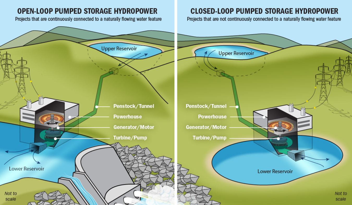 |
| https://www.energy.gov/eere/water/pumped-storage-hydropower |
Thursday, March 3, 2022
Friday, February 25, 2022
Monday, February 21, 2022
The Lasting Legacy Of Redlining
The Black Elevation Map
Sunday, February 20, 2022
Friday, February 4, 2022
Optica
Wednesday, February 2, 2022
MA Lidar Data
Here are some ways to get Lidar data for MA:
Tuesday, February 1, 2022
Mentimeter
LandsatLook 2.0
Monday, January 31, 2022
Climate Impacts in Africa
Klimawandel in Afrika is a nice 'scrolly map' with embedded interactive maps and 3D globes by the German newspaper Der Tagesspiegel. Unfortunately, it is in German and therefore not all that accessible - how about an English translation? (happy to help with that!)
Common Sense Education
Common Sense Education is a large non-profit 'dedicated to improving the lives of all kids and families by providing the trustworthy information, education, and independent voice they need to thrive in the 21st century.'
There are lot's of players in that space directly or indirectly promoting some kind of agenda, so be careful! That being said, they seem to offer good educational materials related to digital citizenship and Edtech.
Friday, January 28, 2022
EO Toolkit for Sustainable Cities and Human Settlements
Mapping Textbooks / Libraries
These two 'maps' are pretty cool:
- Open Syllabus Galaxy: This interactive 'map' shows the 1,138,841 most frequently assigned texts in the Open Syllabus corpus, a database of 7,292,573 college course syllabi.
- HathiTrust Digital Library
Tuesday, January 25, 2022
How big was the Tonga eruption?
By now we all have seen the eruption, but what's missing in all these cool animations is a scale - how big was this eruption? Well, have a look at How big was the Tonga eruption? to see the eruption superimposed on different parts of the world (e.g. Florida, Egypt, Iberian Peninsula, etc.). One thing: Reuters, please, make these animations available as GIFs - that way we could actually use them for teaching. Thanks.
Friday, January 21, 2022
Thursday, January 20, 2022
Wednesday, January 19, 2022
Tuesday, January 18, 2022
Sunday, January 16, 2022
Saturday, January 15, 2022
The Mendenhall Couloir
Nice video of a route we climbed/hiked/scrambled last summer: https://youtu.be/xlGJFqfKu98. The techical crux @ ~5.2 is right down at the start & certainly a little spicey when wearing trail running shoes. The rest of the route never felt sketchy: mainly 3rd class with some short 5th sections here & there. We traversed right onto a ridge rather than slogging through the scree to the top - that probably is the better way to finish the route.
Wednesday, January 12, 2022
Tuesday, January 11, 2022
Monday, January 10, 2022
Population Forecasts with ArcGIS Pro
Here's nice tutorial introducing some of the time-series forecasting cools combined with space-time cubes using NetCDF data: Looking to the future: Using GIS to model and predict population. This example uses county-based population data, could be used just as well for grid-based climate model outputs or other gridded data.
Historical OSM
This is cool: OpenHistoricalMap. Let's put South America on this map!
Sunday, January 9, 2022
Saturday, January 8, 2022
Friday, January 7, 2022
Mapping Power Plants and Transmission Lines
Here are two great web maps showing the locations of power pants and the transmission lines (electricity, natural gas, oil, etc.) across the USA - interesting spatial patterns!
