Sunday, April 30, 2017
Wolfram|Alpha
I will admit: Wolfram|Alpha is cool, but I'm not sure what I would do with it. Wolfram|Alpha comes as mobile apps, course-assistant apps (even for geography), reference apps, and (of course) as Wolfram|Alpha Pro for a monthly fee.
Saturday, April 29, 2017
Comparing SfM and LiDAR
Nice paper by Cawood et al. (2017) comparing the accuracy of outcrop mapping using traditional methods, terrestrial LiDAR, terrestrial SfM, and airborne SfM.
- Terrestrial SfM: 446 images from 20 camera positions, issues with occlusion = parts of the outcrop are not visible
- Airborne SfM: 202 images, 6.24 mm resolution, no issues with occlusion.
Overall, SfM worked better than LiDAR (and of course does not require any specialized hardware). Issues arise from occlusion, different lighting, and low-contrast surfaces.
Thursday, April 27, 2017
Tuesday, April 25, 2017
SocScape
The SocScape Racial Diversity map is visually not all that exciting, but has a few interesting features: 1) it's a 30 by 30 m raster, 2) it's interactive, c) you can compare 1990, 2000, 2010 and d) you can download the data as GeoTIFFs.
Sunday, April 23, 2017
Drones at High-Altitude
Drones are being used extensively for scientific research these days, but there are only a few examples from high-elevation areas (e.g. 4,000 m and higher). The main challenge seems to be dilemma of battery power, flight time, and the thin air. This seems to more of an issues for multi-rotor drones as opposed to fixed-wing drones. The thinner air means that the UAV has to fly faster and is therefore less stable. In addition it can be difficult for a fixed-wing UAV to get enough lift for take-off - thus a stronger engine and/or larger wings would be helpful.
The basic workflow is simple: the UAV takes overlapping images that include their location based on internal GPS. Those are then converted in combination with GCPs into high-resolution DEMs (via SFM) and ortho-mosaics.
The basic workflow is simple: the UAV takes overlapping images that include their location based on internal GPS. Those are then converted in combination with GCPs into high-resolution DEMs (via SFM) and ortho-mosaics.
- Monitoring Tropical Debris Covered Glacier Dynamics from High Resolution Unmanned Aerial Vehicle Photogrammetry, Cordillera Blanca, Peru (Wigmore and Mark, 2017).
- Seasonal surface velocities of a Himalayan glacier derived by automated correlation of unmanned aerial vehicle imagery (Kraaijenbrink et al. 2016). Some of their flights reached 5,900 m.
- USING UNMANNED AERIAL VEHICLES FOR GLACIER MONITORING IN THE HIMALAYAS (Immerzeel et al. 2016).
- High-resolution monitoring of Himalayan glacier dynamics using unmanned aerial vehicles (Immerzeel et al. 2014).
Saturday, April 22, 2017
Fieldwork and Mobile Technology
Enhancing Fieldwork Learning Using Mobile Technologies is a new book that shows you how mobile technology can enhance fieldwork. I have to say: a book is probably the least-suitable medium for such a topic as the technology is changing so rapidly that the printed book will always be outdated.
EpiCollect is one example of an app you can use for smartphone data collection
EpiCollect is one example of an app you can use for smartphone data collection
Snow and Climate Model Data
Here are two nice sources for data:
- The CCAFS provides down-scaled global climate model data in convenient GIS grid formats.
- The Global Snow Lab at Rutgers University provides, well, snow extent data.
Model My Watershed
I'll have to try this and maybe create a student project around it: Model My Watershed by the Stroud Water Research Center.
Walk [Your] City
I like this: Walk [Your] City lets you create simple signage to promote walking and biking in your city.
Its not too hard... from Walk [Your City] on Vimeo.
Kinght Lab Storytelling Tools
Northwestern University Knight Lab has created a series of simple web-based tools for storytelling, including timelines, story maps, simple image comparisons, and more. Below is an example of their Juxtapose tool:
Thursday, April 20, 2017
Georeferencer V4
Seen on Maps Mania: Comparing Old Maps using Georeferencer Compare, used nicely here at the David Rumsey Map Collection.
UAV Mapping of Greenland Glacier
Here's another great example of a UAV used in glaciological research - all for under $2,000 and the authors provide a detailed description of their methods.
- Ryan et al. (2015): UAV photogrammetry and structure from motion to assess calving dynamics at Store Glacier, a large outlet draining the Greenland Ice Sheet.
- Skywalker X8 UAV airframe
- Ardupilot APM autopilot (open-source)
- Agisoft Photoscan Pro (for the 3D generation)
Jouvet et al. (2017) provided a more recent example using the same system and workflow to generate 10 cm orthoimages of the Bowdoin Glacier in Greenland.
 |
| Ryan et al. (2014, their Figure 2) |
Tuesday, April 18, 2017
Alice, the Zeta Cat and Climate Change
This sounds cute: Alice, the Zeta Cat and Climate Change is a fairy tale written by a scientists about climate change and (ultimately) truth (available here).
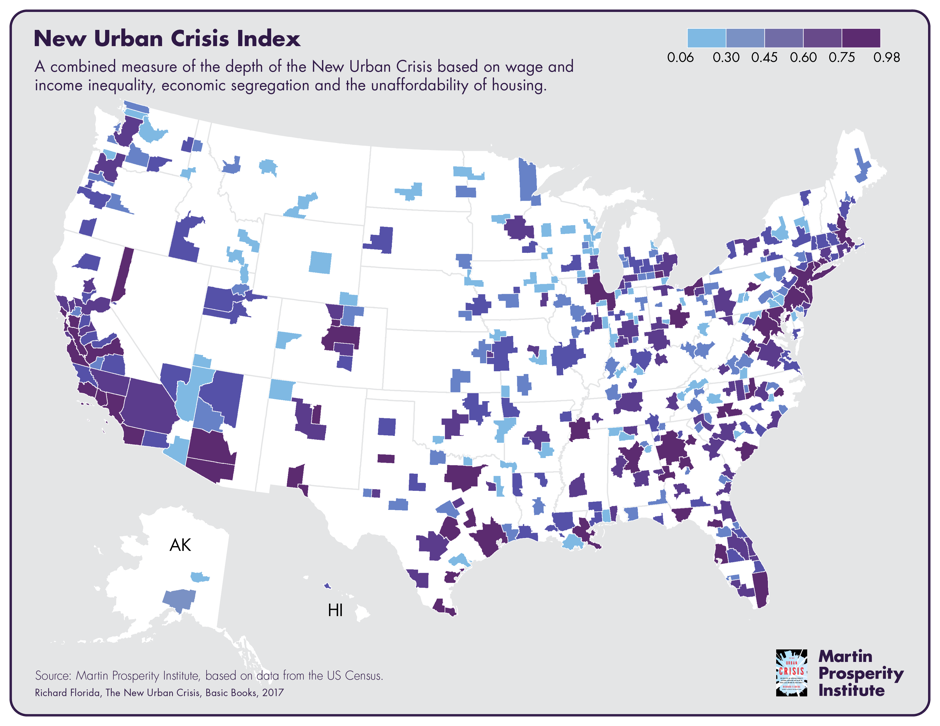
The New Urban Crisis
Mapping the New Urban Crisis maps-out the 'back-to-the-city' movement and resultant issues around inequality, economic segregation, and unaffordable housing.
Monday, April 17, 2017
NASA Earth @ Night 2016
NASA Earth @ Night 2016
Lights On Lights Out is a nice zoomable version showing changes in light between 2012 and 2016 and then there is the matching Esri Story Map LIGHTS ON | LIGHTS OUT.

Lights On Lights Out is a nice zoomable version showing changes in light between 2012 and 2016 and then there is the matching Esri Story Map LIGHTS ON | LIGHTS OUT.

Sunday, April 16, 2017
Map Projections
Two useful websites to learn more about map projections and how they impact what we 'think' the Earth looks like:
- Select two projections in Compare Map Projections and do just that. There is also a Single View option.
- Need a suitable projection for a given area and scale? Try the Projection Wizard!
Need a short summary? Try: Which is the best map projection?
Tuesday, April 11, 2017

Saturday, April 8, 2017
Dam Nation
Dam Nation is an impressive data viz / infographic showing, well, the almost 80,000 dams across the USA based on their hazard potential and the author provides a nice discussion on how he created it on his blog DustyData.
I think the top map with all the 80,000 points and clickable information would be better realized in an environment specifically designed to handle spatial data such as ArcGIS Online, Leaflet, Carto, etc. Scroll-down a little for the awesome pie chart cartogram.
I think the top map with all the 80,000 points and clickable information would be better realized in an environment specifically designed to handle spatial data such as ArcGIS Online, Leaflet, Carto, etc. Scroll-down a little for the awesome pie chart cartogram.
Peaks and Valleys
Peaks and Valleys is an impressive new Esri Story map with 3D scenes of the world's highest and lowest locations.
Wednesday, April 5, 2017
Cartographies of Disease: Maps, Mapping, and Medicine
Now for a happy topic: Cartographies of Disease: Maps, Mapping, and Medicine (now available in the 2nd edition). Still, it could be argued that John Snow's disease mapping in 1854 was the start of modern quantitative cartography and ultimately of GIS. This book, combined with the GIS Tutorial for Health, fifth edition, would make a applied GIS course.


Saturday, April 1, 2017
Snagit
Snagit (by TechSmith) is a great screen capture and screen recording software and will make your life as an educator so much easier (especially if you teach online or flipped classes). $29.95 for educators.
Daniel’s XL Toolbox
Daniel’s XL Toolbox is a free, open-source add-in for the Microsoft® Excel® spreadsheet software that helps you to analyze and present data and increases your productivity. Its primary target audience are life scientists, but it has proven useful for humanities and industry as well.
For example: you can export MS Excel into PNGs or TIFFs (awesome!).
For example: you can export MS Excel into PNGs or TIFFs (awesome!).
Timeline Creation
Timelines can be useful visualization tools and can make useful teaching and learning projects (similar to infographics, etc.). A recent ProfHacker post introduced TimeLineCurator and also includes links to other overviews and tools such as TimelineJS.
TimeLineCuractor video or slide deck.
TimeLineCuractor video or slide deck.
Subscribe to:
Posts (Atom)