- Earth's Climate: Back to the Future (1 hour 27 minutes) by Daniel Schrag. This is crazy long...but the online video includes a nice clickable table of content so you can pick-out selected sections and themes.
- Climate Change: How Do We Know We're Not Wrong? (58:29 minutes) by Naomi Oreskes. Also quite long, but also with a nifty interactive table of content.
- Building Scientific Knowledge: The Story of Plate Tectonics (57:59 minutes) by Naomi Oreskes. As before - the first 7-minutes nicely discuss the role and process of science.
- Paleoclimate: A History of Change. This is an excellent 27-slide presentation with linked videos to offer additional context.
- 200 Million Years of Continental Movement (1:01 minutes, narrated animation).
- Plate Tectonics (1:16 minutes, narrated animation)
Monday, June 30, 2014
BioInteractive by HHMI
So I finally looked at BioInteractive by HHMI which is a compilation of free resources for science education. As the name implies most of the resources focus on biology and medicine, but there are several lectures, videos, and animations quite useful for teaching and learning about climate change in their Changing Planet: Past, Present, Future series from 2012 (mobile-friendly site).
Sunday, June 29, 2014
A GIS Career!
What is a GIS career and what are the Top-5 skills you need to be successful in a GIS career? Have a look at the webinar GIS Career: The Top 5 Skills. Topics include: how GIS is changing, how and why to be a part of this ever-evolving career field, and why these skills will be even more important as the “geospatial revolution” continues to have a growing impact on our society.
"Managing GIS" is a related (and short!) article about GIS jobs by Jennifer Egan in ArcNews (Summer 2014).
Want a third opinion? Joe Kerski from Esri discusses his Top-5 Skills (plus additonal skills) in three YouTube videos.
"Managing GIS" is a related (and short!) article about GIS jobs by Jennifer Egan in ArcNews (Summer 2014).
Want a third opinion? Joe Kerski from Esri discusses his Top-5 Skills (plus additonal skills) in three YouTube videos.
Thursday, June 26, 2014
SchoolDigger
Need information about a school - any school? Checkout SchoolDigger.com. The interactive data and graphs for every school are pretty impressive and even includes private schools. Here, for example, is Greenfield High School.
Why we should trust scientists!
Naomi Oreskes - truly one of the smartest people out there - explains in this TED video in under 20 minutes Why we should trust scientists (transcript). Here are some more of her publications, lectures, and interviews:
- Merchants of Doubt
- The Scientific Consensus on Climate Change
- The American Denial of Global Warming (58:36 minutes)
- Interview with Naomi Oreskes (4:30 minutes)
- Climate Change: How Do We Know We're Not Wrong? (58:29 minutes)
The Arctic in the Anthropocene
I hate that term 'anthropocene' - that's another example of science-babble that only serves to further alienate the broader public. Let's use some direct and common language: Global Warming and the Disappearing Arctic. Here's a new report from the National Academy of Science
- The Arctic in the Anthropocene: Emerging Research Questions (2014) - Full Report
- The Arctic in the Anthropocene: Emerging Research Questions (2014) - Report in Brief
- The Arctic in the Anthropocene: Emerging Research Questions (2014) - YouTube video (4:54 minutes)
Blitzortung
This is another one of these great German words to mess with non-native speakers - go ahead...try pronouncing it correctly! In English: lightning locator and Blitzortung.org is global, real-time, community-based lightning detection network - fun! Check-out LightningMaps.org for a fancier web map. You can get involved yourself and they'll send you everything you need at-cost (not sure how much that is).
Wednesday, June 25, 2014
10 Important Programming Concepts
There you have it: Coding for journalists: 10 programming concepts it helps to understand. Now head over to Codeacademy and teach yourself some Python or Javascript!

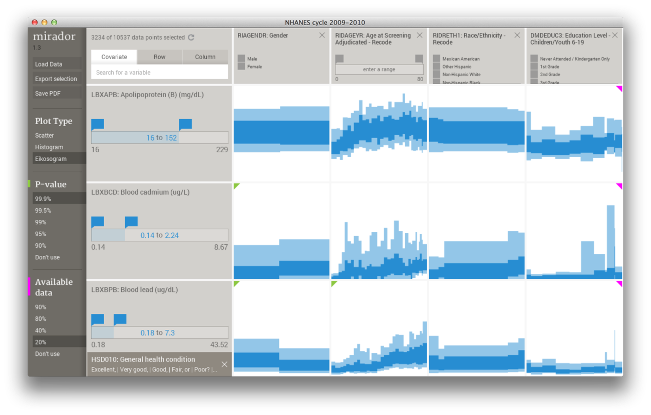
Mirador
As seen on FlowingData and copied straight from their website: Mirador is a tool for visual exploration of complex data sets which enables users to infer new hypotheses from the data and discover correlation patterns. This reminds me a bit of a brilliant piece of software called TableCurve that I used ca. 1996 to quantify streamflow rating curves.
Sounds intriguing, but scientific purists will object: you don't poke around in data for any correlations to later explain...you are supposed to collect data to test a hypothesis!

Sounds intriguing, but scientific purists will object: you don't poke around in data for any correlations to later explain...you are supposed to collect data to test a hypothesis!
mooc.org
mooc.org is (was?) a collaboration between Google and edX and was billed a platform for anyone to create MOOCs. Not much has happened since September 2013 and the mooc.org website remains basically a shell for the press release.
I wonder what's going on there...is the MOOC wave over as folks realized that you cannot make money offering free courses?
I wonder what's going on there...is the MOOC wave over as folks realized that you cannot make money offering free courses?
USGS Topo Maps
Adena Schutzberg posted a simple tutorial on how to easily download USGS topographic maps without dealing with the annoying USGS Store.


Tuesday, June 24, 2014
3D is the 'new' map
This is not really new...we created 3D campus building models using Google's (now defunct) SketchUp and 3D Warehouse back in February 2009. But, the push is on now more than ever with more and more high-resolution commercial LiDAR, UAV, and satellite data becoming available (if you are able/willing to pay for it...).
Google Maps Mania has nice compilation: Mapzen Vector Tiles, OSM Buildings, and F4Map (here the shadows change as the sun angle changes over the course of the day).
For know I'm not impressed: this is cool and fun, but for now this remains the realm of specialized (i.e. expensive) consultants and inaccessible for normal people or normal students at normal institutions. Wake me up once this is a) affordable, b) accessible, and c) usable for quantitative geospatial analysis.
Saturday, June 21, 2014
Gapminder and Worldmapper
These are not 'new', but pretty close to being the best thing since sliced bread in my opinion.
Gapminder makes interactive 'maps' from data - maps that are in Cartesian coordinates (as opposed to geographic coordinates). The online version of Gapminder World is amazing, but you can also download the data and the offline version of Gapminder World. Nature (15 December 2016) has a nice article about Hans Rosling, the man behing Gapminder.
Worldmapper is a similar approach, but here the data are visualized as cartograms. Recently they extended that approach to visualize 'gridded' population cartograms for individual countries. Best of all: all data are available as MS Excel files - awesome.
 |
| World Population Map |
Cycles (of oxygen and carbon)
Here is a great video / animated infographic by It's Okay To Be Smart - make sure you watch 100 seconds of it, then go here for an explainer.
Friday, June 20, 2014
Mudslide in Colorado
On 25 May 2014 a large mudslide occurred near Collbran (Colorado) and provides a great examples of remote sensing mapping from various platforms: satellites, fixed-wing airplane, and UAVs - each with their strengths and weaknesses.

- Landsat 8 satellite image comparison (from NASA)
- Video from a 'regular' fixed-wing aircraft
- Video and mapping using UAVs
- The science of this particular landslide
Mapping Green and White
In other words: mapping the seasons across the Earth.
John Nelson did that brilliantly with his Breathing Earth and he recently provided a detailed tutorial of his mapping approach. NASA did something similar for the continental US and the full Earth.

John Nelson did that brilliantly with his Breathing Earth and he recently provided a detailed tutorial of his mapping approach. NASA did something similar for the continental US and the full Earth.
Thursday, June 19, 2014
EarthExplorer for Landsat 8
This is a nice Quick Guide on how to easily and effectively download Landsat 8 images from the USGS via Earth Explorer.
Place Pulse and StreetScore
Place Pulse by MIT is a crowd-sourced assessment based on Google Street View of how people perceive urban environments in terms of safety, liveliness, and more. Now you can map those data and you get StreetScore (currently for New York City, Boston, Detroit, and Chicago). But that just the first step - now we need mash-ups with demographic data!
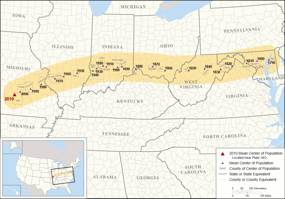
Where is the center of the USA?
Not an easy answer - center of what: land area? The US Census Bureau has a nice animation of the mean population center of the USA as it drifts westward between 1790 and 2010.

Historical Hurricane Tracks
Great website, visualization, and data from NOAA: Historical Hurricane Tracks. Here is Charley in 2004, the one that almost messed with my wedding. This site is also a nice source for position, pressure, and wind speed data for teaching about hurricanes, pressure gradients, etc.


Global Warming Curriculum
Here is a very good eight-lesson curriculum out of Ithaca Collgege useful for teaching a class on global warming / climate change from high school to college. This curriculum is less about the underlying science, but more about how these issues are framed in the media. Have a look at the other material and resources provided by Project Look Sharp and follow them on Facebook!

- Media Construction of Global Warming (curriculum and materials)
- YouTube Channel and associated playlist
- Project Look Sharp (website)
- Project Look Sharp (Facebook)

Wednesday, June 18, 2014
Spherical Voronoi Diagrams
Jason Davis has some great examples of these on his website at http://www.jasondavies.com/maps/voronoi/ and Chris Zetter provides nice instructions on how to create a Voronoi map with D3 and Leaflet. Now even you can create an advanced rocket science visualization with advanced rocket science tools!

Tuesday, June 17, 2014
Arctic Ocean Sea Ice
Nothing new here...the sea ice on the Arctic Ocean is disappearing fast. Still, here is a new report called The Arctic in the Anthropocene: Emerging Research Questions that came with a nice animated GIF.
 |
| NASA/Goddard Scientific Visualization Studio |


Monday, June 16, 2014
Colors (in maps, graphs, etc.)
Colors are great when used properly in maps or graphs, but how do you decide what colors 'work'? A good place to start would be the Data Visualization Checklist created by Stephanie Evergreen and Ann Emery (plus, follow their excellent blogs!). Ann has a recent post called Please: Don't Use Default Colors In Your Chart with a series of specific suggestions - here's a good one for color palettes:
Go to design seeds, decide which color palette you like, hover over the color patches, and use the HEX codes - easy!
Visit my GIS Resources for more links, websites, and resources related to map design, font, and colors.
Go to design seeds, decide which color palette you like, hover over the color patches, and use the HEX codes - easy!
Visit my GIS Resources for more links, websites, and resources related to map design, font, and colors.
Saturday, June 14, 2014
U.S. Daily Temperature Anomalies (1964-2013)
This is about as slick and high-tech as interactive visualizations come these days: U.S. Daily Temperature Anomalies (1964-2013) by enigma. You have the map controlled, if you want, with the time slider showing the anomaly time series, you have the interactive chart, you have the methods explained, and you have a link to the underlying data.
Thursday, June 12, 2014
Historical Topographic Maps on ArcGIS Online
Finally - I have been waiting for that! We can get all kinds of historical aerial photographs and satellite images, but often the earliest (and best) depictions of the land were topographic maps. The historical topo maps for New England have been available for years as high-resolution image files from the UNH Library, but not georeferenced for easy GIS use. Now Esri finally made them available via ArcGIS Online.
- An Introduction to the USGS Historical Topographic Map Collection
- Nice Story Map about topographic maps and the USGS
- USA Historical Topo Maps AGO Layer
This would make a great use for the Swipe App: the most recent topographic map and the earliest topographic map!

Projection vs. Transformation
The details are complicated...but Mike Olkin's advice is simple: don't rely on Project-On-The-Fly...transform your data deliberately. Two observations here:

- In some/many cases an offset of a couple of feet won't be noticeable, for example when working with uncorrected GPS data.
- Other times, for example when working with geoprocessing tools or Select by Location, any offset between two data sets can be fatal.
Monday, June 9, 2014
The Power of Ten - sort of...
For something less annoying have a look at:

- The Scale of the Universe 2 (or here from NASA)
- Cell Size and Scale
- Universcale
- Powers on Ten (classic!)

Saturday, June 7, 2014
The War on Climate Scientists
Bill Moyers recently did an entire show in this issue featuring David Suzucki. Not sure he was really the best choice here, but it's worth watching. They also prepared a nice list debunking the eight most common pseudoscientific climate / climate change claims.
Friday, June 6, 2014
The Interactive Histomap
The histomap by John Sparks is one of these legendary infographics created long before the term infographic became the thing. Now there is an interactive version: Histomap Revisited. Read more about it on MapCarte.
Thursday, June 5, 2014
Maps Compare
I saw this on Google Maps Mania: tools for comparing online maps, for example: Compare Maps, Map Compare (by Geofabrik), and Buncha Maps.
Tuesday, June 3, 2014
Vidbolt and VideoANT
Vidbolt is what I have always been looking for - a way to annotate YouTube videos. This has great potential for teaching, for example:
- The instructor can annotate a video to ask questions, provide context, or offer additional explanation.
- Students can find, annotate, and share videos as part of class projects or exercises.
- This should work well for flipped classes: students can watch and annotate the videos in preparation for class.
- ProfHacker has nice review and Jonathan Senchyne explains how to use Vidbolt in teaching.
VideoANT is another excellent video annotation tool by the University of Minnesota: just authenticate or enter as a guest, copy/paste the URL of the video, and annotate!
Subscribe to:
Posts (Atom)