The interactive web app is nice, but also an example of how much more data viz and data storytelling you can do with an Esri Story Map.
Showing posts with label CartoDB. Show all posts
Thursday, July 11, 2024
The John Snow Map
The first 'modern' map perhaps, depicting the spatial relationship between cholera cases & drinking water supply in 1854 in London. Here are two great ways to explore it:
Friday, September 1, 2017
Pipeline Spills
Here's an interesting interactive map showing pipelines, pipeline operators, and spills. That's about it. The map is not very professional, for example: use aliases for the field names and include a link to the data. This would have been better in Tableau in my opinion.
Friday, December 16, 2016
World Population Density
This World Population Density map is nicely-done and interactive, displaying population statistics in a pop-up window that adjust to your zoom level.
Wednesday, September 21, 2016
Germany's Power Sources
Well, here it is: Power sources in Germany (not all that impressive I think).
Wednesday, September 7, 2016
Boom to Bust
Boom to Bust by Enigma Labs is a well-designed Story Map showing the rise and fall of oil and gas exploration in North Dakota.
Friday, June 10, 2016
Who lives where?
'Raw' demographic data does not really tell the story of who actually lives in a particular area. Now we have Esri and CartoDB essentially competing for your attention (and business):
Sunday, April 10, 2016
Spies in the Skies
Nice map by BuzzFeed: Spies in the Skies
Tuesday, March 15, 2016
The Global Nuke Map
Mapped: The world’s nuclear power plants by CarbonBrief - simple and interactive.
Saturday, February 27, 2016
Sexism in Location and Education: The Gender Income Gap
This is pretty incredible: the gender income gap of college graduates. Apparently, the data are from the U.S. Department of Education College Scorecard.
Compare that to - for example - The Best and Worst Places to Grow Up: How Your Area Compares.
Thursday, December 10, 2015
World City Population 1950 - 2030
World City Population 1950 - 2030 is a nicely-done interactive map using stacked graduated symbols - and that actually works in this case. Also nice: a Map Guide and Analysis pop-up window is included.
Thursday, November 19, 2015
Drought Mapping using CartoDB
This is a great tutorial: Make a Thematic Map of Current Drought Conditions (using CartoDB)
Saturday, November 7, 2015
Commons Lab
Commons Lab is (as they state on the website) a database of federal crowdsourcing and citizen science projects. Somehow I'm not impressed...am I missing something here?
Saturday, October 31, 2015
Using CartoDB
CartoDB is one of these hip new online mapping environments and here is a selection of useful resources:
- Using different projections (i.e. no Web Mercator)
- More about projections
- Visualize 2015 Urban Populations with Proportional Symbols (tutorial)
Wednesday, September 30, 2015
Wikipedia's Climate Data on an Interactive Map
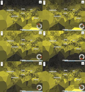
This map/visualization was quite popular this week: Wikipedia's Climate Data on an Interactive Map. I still think these Voronoi maps are ugly and the map seems a bit wonky - I can't figure-out the month wheel. The animated GIFs are fun:
Monday, August 10, 2015
Global Air Pollution
Global air pollution mapped by Yale University between 2000 and 2012 for countries and cities using CartoDB. Visually not all that impressive in my opinion, but they provide a nice description of the mapping process.
A slightly-different version can display cities, satellite data, and dirty power plants.
Friday, July 17, 2015
Volcanoes!
Here is a nice interactive map of all known volcanic eruptions of the last 2,000 years. Even better: Richard Husdon published a great tutorial on how to create this map using public data and CartoDB. (via Map Mania)
Tuesday, June 30, 2015
Earthquakes!
Visualizing earthquakes is pretty satisfying: they happen at a specific location and time, the global database extends back 100+ years, and they occur in a distinct spatial pattern that tells us a lot about the inner working of our planet. Here are three great visualizations:
- As an animated map (1915 to 2015)
- As a heatmap (1915 to 2015)
- As a beautiful static map
Now...which data viz is the 'best'?
How about tremors over the past day, week, or month?
Or Understanding Earthquakes (based on 10 years of data)?
How about tremors over the past day, week, or month?
Or Understanding Earthquakes (based on 10 years of data)?
Friday, April 24, 2015
Odyssey.js by CartoDB
Odyssey.js by CartoDB is a nice way to create story maps - an alternative if you will to Esri Story Maps - give it a try using this tutorial.
Saturday, March 28, 2015
Rivers Dams 1800 to 2002
This is a very nice presentation by the folks from CartoDB: Mapping the spread of dams in the US. Also included is a map of dams per state, maps in major watersheds, and a risk assessment map for all dams.
Sunday, March 22, 2015
Landsat 8 on AWS and more
Landsat and Amazon were in the mapping news this week as the USGS and NASA are now making Landsat 8 data freely-available to anyone via the Amazon Cloud. Here's more from Jill Clark at Spatial Reserves: Landsat 8 Data Now Available on Amazon AWS - looks like the actual spectral bands are available, plus the metadata.
Here are two interesting Landsat 8 maps (via Maps Mania):
- Landsat 8 creates a complete mosaic of the Earth every 16 days. Of course that does not mean that the image that your are interested in is actually usable - clouds are always an issue.
- Landsat live is as close as you can get to a real-time picture of the entire Earth. Again, as before, your place of interest may be under clouds...just wait 16 days!
Subscribe to:
Posts (Atom)