Very cool: NASA's new EO Explorer has a simple and intuitive interface - just pick a spot and zoom in to find great images. Noting fancy, but it works.
Thursday, September 3, 2020

Tuesday, September 1, 2020
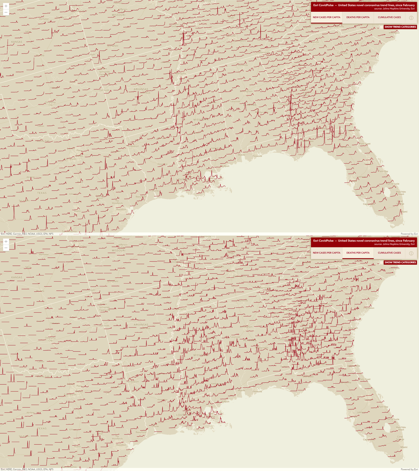
COVID Pulses
Great idea: let's make sparklines for each county in an interactive web map. Read more about it here and see it here: Esri COVIDPulse. Or: watch the CovidPulse Video and take a narrated tour!
The Mirror Cam
This is cool: a simple 'mirror cam' to act as a doc cam: IPEVO Mirror-Cam. Read more about it here. $40 for 6 of them, so the idea is to buy them / mail them to all your students.

Sunday, August 30, 2020
Saturday, August 29, 2020
IPCC Communication Fail
This is a great example of communication fail in the world of climate change:
- Take a look at the IPCC AR5 WG1 SPM with its 10 figures - can you figure-out what is going on?
- Try ranking them in terms of their visual complexity and ease of comprehension.
- Then compare your thoughts with this recent paper: Communication of IPCC visuals: IPCC authors’ views and assessments of visual complexity (Harold et al. 2020, Climatic Change).
This is a striking demonstration of a real problem: how can we (the scientific experts) anyone to care about what we are saying if we are giving them charts like that?
Friday, August 28, 2020
Jeopardy
https://jeopardylabs.com/ is awesome - a great way to create a simple and quick way to test facts and specific knowledge.
Wednesday, August 26, 2020
Climate Insights 2020
Climate Insights 2020 is (yet another) survey of the usual: what Americans think about climate change. The report is available as a PDF, but they also offer a cool interactive Data Tool to view the responses to specific questions. It would be great to be able to a) grab the charts as JPGs and b) grab the underlying data.
Subscribe to:
Posts (Atom)