Thursday, November 21, 2019
Mercator, it's not hip to be square
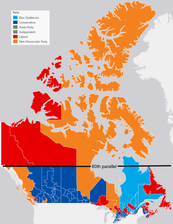
Good stuff from Ken Field: Mercator, it's not hip to be square. Quote: "Simply put, Web Mercator kills thematic maps." Perfect example: 2019 Canadian election maps.

Saturday, November 16, 2019
Wednesday, November 13, 2019
Tuesday, November 5, 2019
Infrared Radiation
The first 15 seconds (and the rest) show a nice example of infrared vs. visible radiation (aka light).
SLR Maps
There are a bunch of web-based interactive tools to visualize the impacts of sea-level rise - here are a few of them:
- Sea Level Rise and Coastal Flood Web Tools Comparison Matrix - National (by Climate Central)
- Coastal Risk Screening Tool - Global (by Climate Central)
Sunday, November 3, 2019
Python and ArcGIS Pro
Nice 4-part series about using Python in ArcGIS Pro by Olivia Iannone (Esri). Plus good courses offered by Esri:
Street Orientation
This is not all that new, but interesting: Road Orientations Map. Read more about it here: Visualizing street orientations on an interactive map. I always find these 'gridded' cities a little weird (being from Europe), especially those 'forcing' the grid over significant topography (e.g. San Francisco).
Subscribe to:
Posts (Atom)