America’s Chain and Independent Restaurants maps out all restaurents across the USA coded by their degree of 'chainness' from the 310,000 or so single-location restaurants to the 24,333 Subways. Now if they only would make the underlying restauranr address data available!
Saturday, December 21, 2024
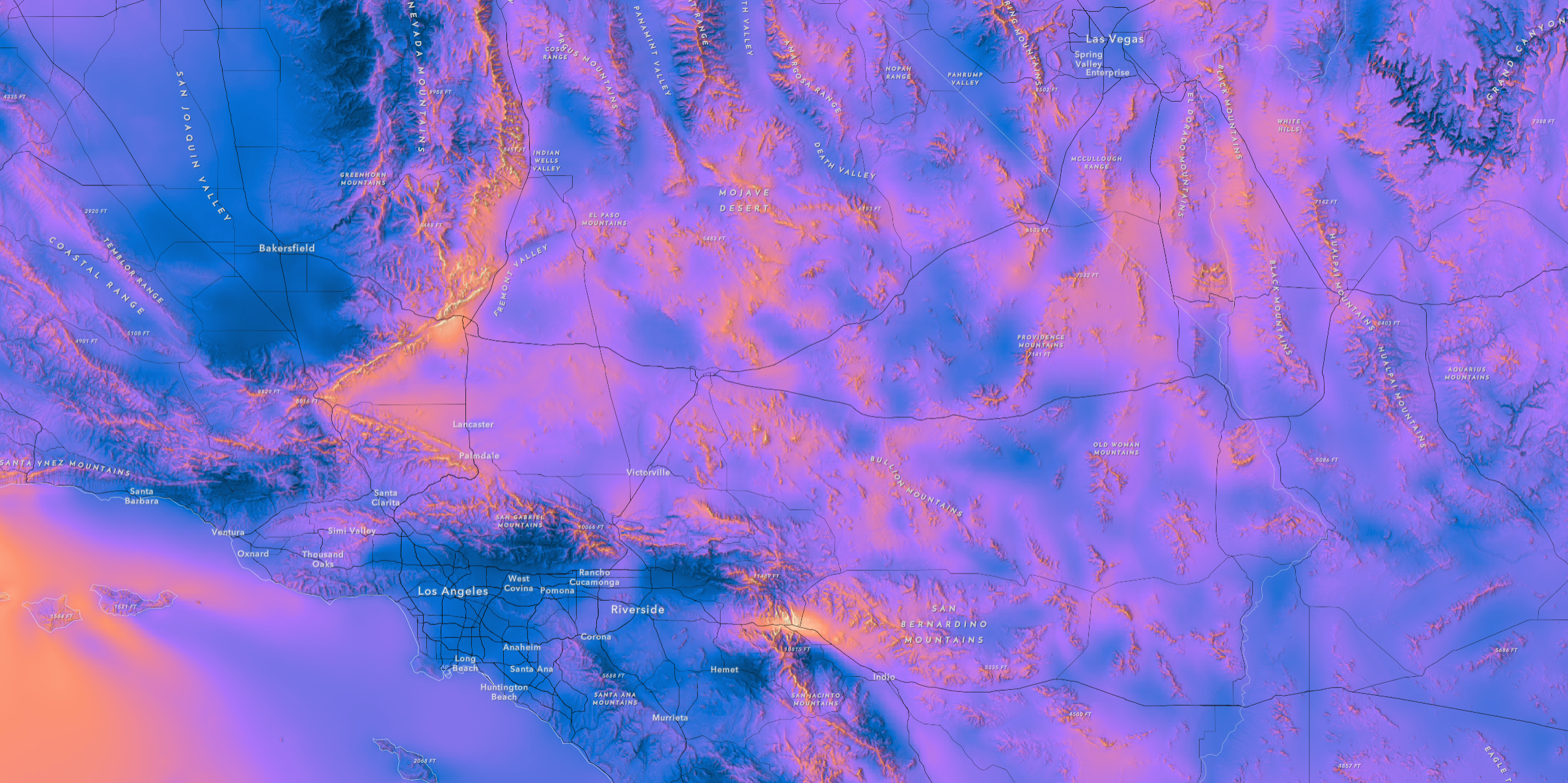
The Global Wind Atlas
Friday, December 20, 2024
The Coldest Day of the Year
- The western parts of the USA reaches its climatological coldest day in December (matching the seasonal cycle of insolation). because of the moderating influence of the Pacific Ocean (clouds, precipitation, etc.).
- The eastern parts of the USA (especially New England) reaches its seasonal minimum in later January because of the influence of cold air masses from Canada and the presense of snow cover that reflects solar radiation.
- Noticeable 'cold pockets' in the Rockies, Casades, and Sierra Nevada represent locations in deeper valleys with frequent temperature inversions.
Monday, December 16, 2024
Climate Change Resources: Teaching & Learning
- Science
- Mitigation
- Adaptation
- Policy
- Energy
- Geoengineering
- Lesson Plans (highscholl & higher education)
- Simulations
Tuesday, December 10, 2024
The 15-Minute City
Thursday, December 5, 2024
Camp Century Found (again!)
Wednesday, November 20, 2024
The New Normal: Changing Climate Zones
Tuesday, November 12, 2024
The Nuclear Energy Emergence
Friday, November 1, 2024
Overture Maps Explorer (Beta)
Thursday, October 31, 2024
Destination Earth
Destination Earth is a lot of world salad at this time, but it seems to be EU version of an AI-based Digital Twin currently called DestinE. Very clever!
QC Your Story Maps!
Sunday, October 27, 2024
GeoAI by Esri
Friday, October 25, 2024
Mapping Historical New York: A Digital Atlas
Mapping Historical New York: A Digital Atlas visualizes Manhattan’s and Brooklyn’s transformations during the late-nineteenth and early-twentieth centuries. Drawing on 1850, 1880, and 1910 census data, it shows how migration, residential, and occupational patterns shaped the city.
Awesome!
Landsat Explorer & Sentinel-1 Explorer.
Sunday, October 20, 2024
Color Buddy
Thursday, October 17, 2024
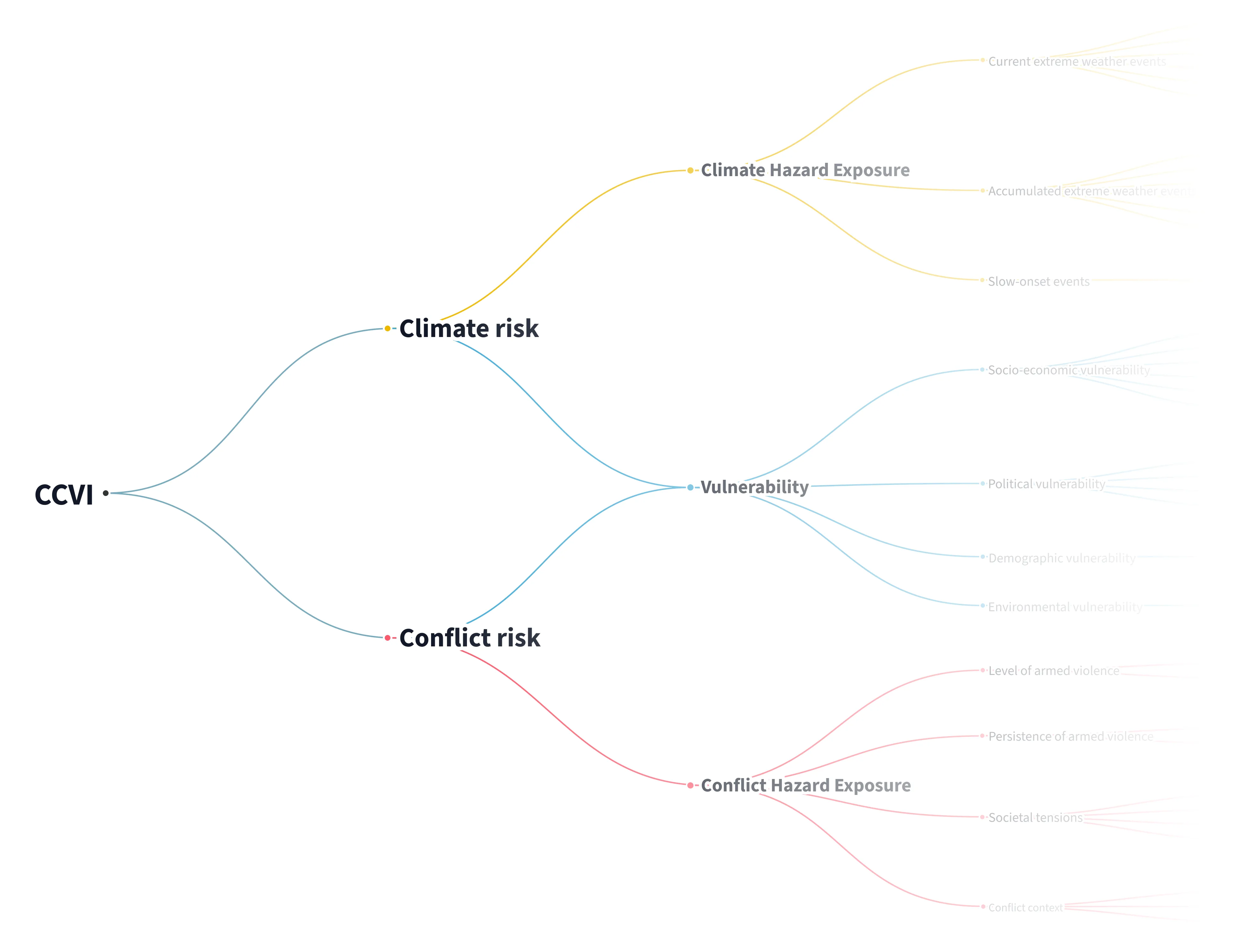
Climate—Conflict—Vulnerability Index
Thursday, October 10, 2024
Monday, October 7, 2024
Guess Where You Are
Guess Where You Are is just a fun geography game using Street View images to let you explore the world - great fun!
Thursday, October 3, 2024
The 15-Minute City Platform
Wednesday, September 25, 2024
Tuesday, September 24, 2024
Thursday, September 19, 2024
Five ways to improve your chart axes
Five ways to improve your chart axes is not particularly new or original, but the R crowd will appreciate the code examples provided.
Tuesday, September 17, 2024
Monday, September 16, 2024
Thursday, September 12, 2024
The Spheres
- Biosphere = all living things.
- Ecosphere = all living things + their physical environments (that's basically the definition of an ecosystem). The term 'ecosphere' is now used with respect to regions of space where living things could exist.
- Geo-ecosphere = an alternative for the term 'Earth System'.
- Anthropsphere = the part of Earth inhabited and/or influenced and/or modified by humans. Also called: the humanosphere. This could the considered the fifth sphere in addition to atmosphere, hydrosphere, lithosphere, and biosphere.
- Technosphere = all the human artifacts on Earth and in space. especially those connected to the extraction and transport of energy sources.
- Builtsphere = everything that has been built.
Wednesday, September 4, 2024
The Massive Interactive Energy Flow Chart
- The simple 'static' versions from LLNL: https://flowcharts.llnl.gov/commodities/energy
- The massive interactive version: http://energyliteracy.com/
Image Maps in Esri Story Maps
Friday, August 30, 2024
Climatopias
Nate Silver: The River
Thursday, August 29, 2024
Wednesday, August 28, 2024
Superblocks
Superblocks could be a way to create more pedestrian-friendly urban environments while still allowing for effiecient vehicle access. More here: https://www.cnu.org/publicsquare/2024/03/05/are-superblocks-future-urban-living
A.I. ‐ Humanity's Final Invention?
Great video - basically the story/history of intelligence & artificial intelligence.
- The general trend: narrow to general.
- Key step: self-learning by combining the power of super computers & Big Data.
- Then came ChatGPT, but that is still narrow AI: it can write and write well, but does not understand what it is writing.
- This is now referred to AGI.
- AGI = humans, but much faster.
- AGI is not limited by the physical & biological limits of humans.
- AGI can be copied millions of times at an instant.
Monday, August 26, 2024
How Smooth Is The Earth, Really?
Saturday, August 24, 2024
Data GIF Maker
Friday, August 23, 2024
Mapping Tipping Points
Monday, August 19, 2024
NASA Earthdata
NASA Earthdata appears to be the (new) data portal for accessing all kinds of NASA data.
- NASA Worldview offers full-resolution, global satellite imagery from over 1000 data products from NASA’s Land, Atmosphere Near real-time Capability for EO (LANCE) and other NASA data providers.
- NASA Earthdata Search gives access to everything.
Sunday, August 18, 2024
Friday, August 9, 2024
NCSE's Climate Change Story Shorts
Climate Change Story Shorts lookl useful - here's some information from the NCSE:
NCSE's Climate Change Story Shorts provide a new, teacher-friendly take on Next Generation Science Standards storylines. These shorter instructional units with modular activities and optional sidequests engage students in the three dimensions to resolve one or more common misconceptions within one to two weeks of instructional time.
- More information here.
- Climate Change Story Shorts
Jack's Book
The Power of Where: A Geographic Approach to the World's Greatest Challenges by Jack Dangermond sounds like a great read & could possibly be used as modern geography 'textbook' for a modern geography class. But $59.99 seems like an odd price: too much to make it accessible and too little to make decent money.
Wednesday, August 7, 2024
Tuesday, August 6, 2024
Open-Source Streetview
US Immigration since 1850
Evolution vs Creationism
Thursday, August 1, 2024
Tuesday, July 16, 2024
Climate Twins (again)
UHI + Global Warming Map
- Urban Heat Hot Spots in 65 Cities.
- Details and more information (+ the data) here: https://www.climatecentral.org/climate-matters/urban-heat-islands-2024
Friday, July 12, 2024
Thursday, July 11, 2024
The John Snow Map
SAR Imagery from Sentinel-1
Tuesday, July 9, 2024
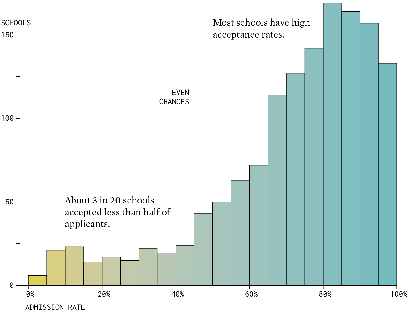
College Admission Rates
2050 Ecosystems Projections
Thursday, July 4, 2024
The National Risk Map (by FEMA)
- Show the different types of risks and their associated costs.
- Show by country or by census tract.
- Show vulerabilty & resilience.
- Nice data download option @ https://hazards.fema.gov/nri/data-resources
Wednesday, July 3, 2024
Monday, July 1, 2024
Saturday, June 29, 2024
Tuesday, June 25, 2024
Baseball Network Analysis
Sunday, June 23, 2024
Urban Planning: Yesterday & Today
Saturday, June 22, 2024
New Climate Zones & Climate Twins
Tuesday, June 18, 2024
Sunday, June 16, 2024
The Dumbest Idea Ever!
Seriously: who is funding this nonsense & why give them any journalistic attention?
Friday, June 7, 2024
Humboldt Glacier’s Demise
The latest from NASA: The Humboldt Glacier's Demise
Now please stop asking me about it...the Humboldt Glacier was already stagnant back when I mapped it in 2015 and nothing really has changed - it just shrinks and shrinks. I supposed someone at some point has to declare it 'gone', but much of this latest fanfare and 'reclassification' seems more like an attention grab than a relevant scientific discovery to me.
Become a data viz SUPERSTAR
Hannah Ritchie Data Projects
Hannah Ritchie has put together some really nice interactive charts and data on her website @ https://hannahritchie.com/slides-charts-explorers/.
- US States: electricity prices
- US States: electricity sources
- EV sales, charging, etc.
- EV ranges over time
Wednesday, June 5, 2024
Need an old topographic map?
Monday, June 3, 2024
Hurricanes & You
Here are two nice web apps to explore hurricanes that impacted your particular area:
Saturday, May 18, 2024
Visualize This: The FlowingData Guide to Design, Visualization, and Statistics (2nd Edition)
Thursday, May 16, 2024
Probability of Success
Probability of Success is a nicely-done interactive animation/explanation of an important statistical concept: If there’s a chance, with enough tries, you approach near certainty. Or: the house always wins!
The Stripes Map
Thursday, May 9, 2024
The Great American Road Trip
Wednesday, May 8, 2024
climatearchive.org
climatearchive.org is an amazing 3D visualization of climate model data across time and space.
- Explore the last 545 million years.
- Explore the next 80 years.
- Explore the next million years.
AI Safety for Fleshy Humans
Tuesday, April 30, 2024
The Coding Train
Tuesday, April 23, 2024
Climate Colors
"How has the planet evolved throughout our lifetimes? Or more specifically, how does our current world compare to the world when we were born? Human existence may be short in the grand scheme of things, but our impact has accelerated the pace of global warming. Looking ahead, it's important to consider how our decisions today shape the future—not only for ourselves but also for future generations."
Climate Colors lets you compare your own experience of climate change to that of other born at different times.
Saturday, April 20, 2024
Saturday, April 13, 2024
Amitav Ghosh
The 2024 Submarine Cable Map
- The 2024 Submarine Cable Map (interactive story map)
- The 2024 Submarine Cable Map (global, static image)
Thursday, April 11, 2024
Friday, April 5, 2024
easystats: An R Framework for Easy Statistical Modeling, Visualization, and Reporting
Friday, March 29, 2024
Wednesday, March 27, 2024
Saturday, March 23, 2024
AI, Images, & Stereotypes
Sunday, March 10, 2024
How People Commute
Probable Futures
The Distressed Community Index
Tuesday, February 27, 2024
PalmWatch
PalmWatch: Tracking the impact of big brands' palm oil use seems really cool & slick, but may take you a while to figure-out what's going on & how to use it.
Sunday, February 18, 2024
The Culture War @ US Universities
Friday, February 9, 2024
Lovejoy's Nuclear War (1975)
On George Washington's Birthday, 1974, Sam Lovejoy--a 27-year-old farmer--toppled a 500-foot weather tower in Montague, Massachusetts. The tower had been erected by the local utility as part of their attempt to build one of the largest nuclear power plants ever planned.
Leaving 349 feet of twisted wreckage behind, Lovejoy hitched a ride to the local police station, where he turned himself in along with a four-page statement decrying the dangers of nuclear power and accusing the government and utilities of "conspiracy and despotism."
Six months later, Lovejoy stood trial for "willful and malicious destruction of personal property," a five-year felony. He insisted on conducting his own case, and told the jury he had acted in self-defense. After a dramatic seven-day trial, Lovejoy went free.
More about this story here: https://www.zinnedproject.org/news/tdih/lovejoys-nuclear-plant-civil-disobedience/
Tuesday, January 30, 2024
Earth Transit - Major World Passenger Rails
Earth Transit - Major World Passenger Rails is awsome: just a giant map as JPG or PDF.
Monday, January 29, 2024
The McCheapest
Thursday, January 25, 2024
Coldest day of the year across the United States
The Coldest day of the year across the United States shows a really interesting east-to-west pattern!
Ful-screen app here.
Tuesday, January 23, 2024
Octopus ==> Ice Sheet History ==> Climate
Very cool: Genetic insight on ice sheet history
Nothing fundamentally new, but a great new independent line of evidence that supports what Mercer already told us 50+ years ago: The West Antarctic Ice Sheet collapsed during the last Interglacial (~129,000 to ~116,000 years ago) and sea levels rose by 5 m.
Tuesday, January 16, 2024
GPX to 3D Storymap
- No sure why it is not possible to add a GPX file directly to ArcGIS Online - that used to work just fine with the 'classic' Map Viewer.
- Maybe there's a way to do it, but when I import a GPX file into ArcGIS Pro I get the thousands of indiviudal points, not a nice polyline. Sure, I can convert that, but that's another step.
- Seems like you really should edit the GPX points first to remove any weird ones - that's tedious.

