Monday, April 27, 2020
Saturday, April 25, 2020
City Generator
This is fun: http://www.oskarstalberg.com/game/CityGenerator/ (and maybe even useful for teaching?)
Friday, April 24, 2020
Corona Virus in MA
Not all that exciting from MassLive: Coronavirus in Mass.: Cases, maps, charts and resources. But, at least the data seem to be accessible in the Datawrapper charts. It would be nice to include the date of the data used in the charts, table, and map.
Thursday, April 23, 2020
Choices matter!
People of the Pandemic is a 'game' - an online visualization that models the impacts of social distancing of the spread of a global pandemic in your backyard. It is NOT a full and accurate model of COVID-19.
That's a key thing to realize before starting to play and then it becomes a nice tool to visualize that your choices actually do matter!
That's a key thing to realize before starting to play and then it becomes a nice tool to visualize that your choices actually do matter!
Wednesday, April 22, 2020
Using Images
Good explanation and advise here about the use of photos and images in Story Maps (and other types of presentations): Stick to the rules: How to properly find and use images in your stories.
Monday, April 20, 2020
Saturday, April 18, 2020

Friday, April 17, 2020
Wednesday, April 15, 2020
"An Illustrated Guide"
These are pretty cool: An Illustrated Guide to Biology and An Illustrated Guide to Chemistry (by Jeff Grant) - now available for free @ https://ncse.ngo/freely-available-illustrated-guide-biology.
Tuesday, April 14, 2020
Saturday, April 11, 2020
Climate Change and COVID-19
- Climate Change and Coronavirus (Katharine Hayhoe)
- The Pandemic's Effects on Climate Change (Katharine Hayhoe)
- 'The broad shape of the story is the same' (Yale Climate Connections)


Friday, April 10, 2020
Du Bois Wrapped Bar Charts
Nice article: Visualizing Categorical Data with Disproportionate Values Using Du Bois Wrapped Bar Charts.

- The book is great: W. E. B. Du Bois's Data Portraits: Visualizing Black America
- And here is the 'modern' rendition using Tableau: Analysis & Recreation of W.E.B. Du Bois' 1900 Data Portraits
Learn AI with MIT
Mark Wilson writes about a new MIT Media Lab website for K-12 students to learn about AI: Innovating Learning and Education in the Era of AI.
From Maps Mania: The Ocean Navigator is an interactive map for visualizing and exploring scientific data about the world's oceans. The map allows you to browse and visualize a number of different ocean variables such as water temperature and ocean currents.
Great - have at it! TMI in my opinion...I'm not interested to start digging into this.
Great - have at it! TMI in my opinion...I'm not interested to start digging into this.
Thursday, April 9, 2020
Lewis and Clark Story Map
Here's a Lewis and Clark story map created in Tableau. Meh - looks okay, but Tableau is just not a great tool for this type of data viz.
Kubernetes
Kubernetes (K8s) is an open-source system for automating deployment, scaling, and management of containerized applications.
Mapping Photos in ArcGIS Online
This is clearly the simplest way to do it: From photos to features: Publishing photos with locations in ArcGIS Online. Additional context is here:
- Show Attachments in Pop-ups with Arcade Expressions
- Using the Photos with Locations Tool in Education (YouTube video)
So I did this with students: we went outside, walked around campus, and took several photographs. Now came the unexpected challenge: transferring the photos from their phones to a computer: blank stares. So I suggested the quick and simple approach: email the photos to yourself as an email attachment. Well...I can't do that because I'm out of data and the Wifi here in the lab always kicks me off.
Seriously - what should have taken seconds turned into an epic - maybe this is different at more-fancy schools, but my 'digital natives' are remarkably incompetent.
Tuesday, April 7, 2020

Virtual Globes
Okay - so I confess: I'm not all that into these virtual 3D globes (or 3D in-general). Yes, it's cool and looks impressive. But it is also slow on the hardware and difficult to visualize well.
And then there is this: VGM 2.0 - Virtual Globes Museum
Friday, April 3, 2020
Thursday, April 2, 2020
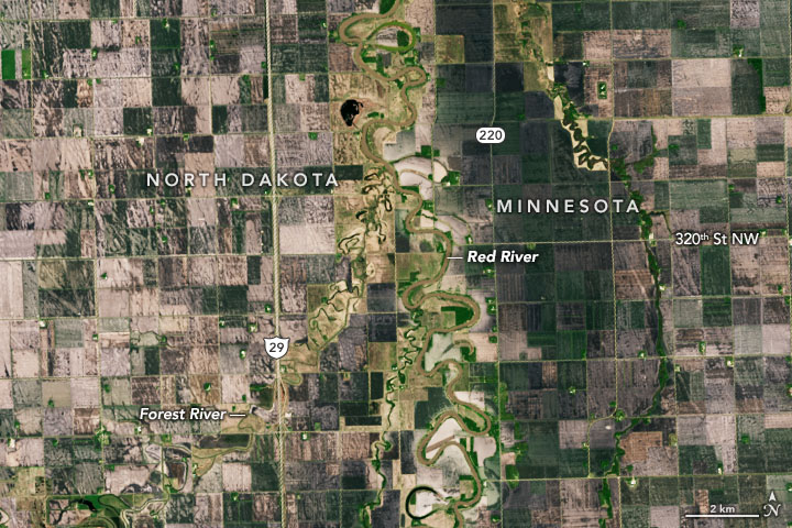
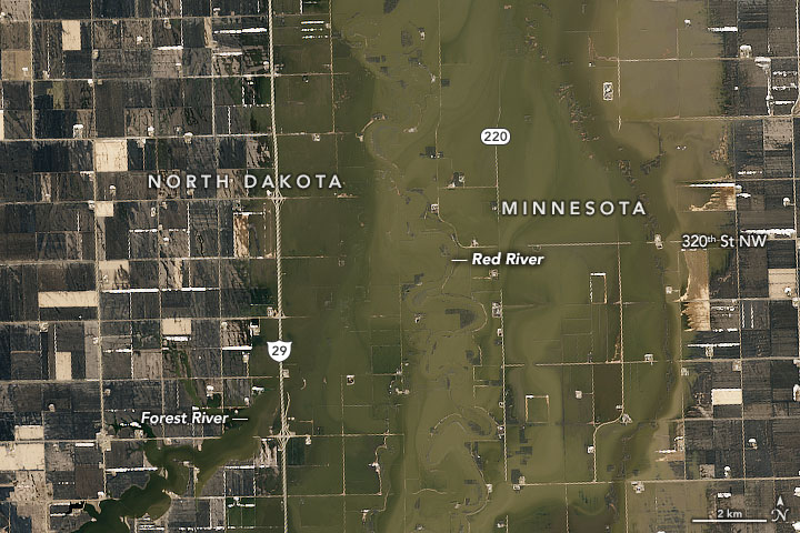
Meandering Rivers
Here are some great maps of meandering rivers:
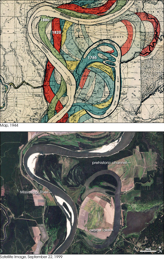
- 1944 Army Corps of Engineers maps of the Mississippi River (zoomable)
- Meander Maps (aka jQuery Slider GIS)
- Mississippi Meanders
Wednesday, April 1, 2020
Geography Treasure Hunts and Quizzes
Not a big fan myself, but many people seem to enjoy these: try Geography Treasure Hunts (by Esri) and Quizzity.
Subscribe to:
Posts (Atom)