Friday, October 31, 2014
Columbia Glacier 1986 to 2014
NASA has produced another one of their cool image comparisons: Columbia Glacier 1986 to 2014
 |
| 2 July 2014 |
Thursday, October 30, 2014
Flipping It!
The 'flipped classroom' is a bit of a hype these days - essentially going back to where content delivery (aka reading) happens before class and active learning (aka discussion) happens in the classroom. That being said, it is very much worth considering how to make the most of the precious 2.5 hours per week that we collect everyone in the same room.
Robert Talbert has been writing about his experiences with flipping on his excellent blog Casting Out Nines and now has a series of three videos on screencasting as part of a flipped course.
Robert Talbert has been writing about his experiences with flipping on his excellent blog Casting Out Nines and now has a series of three videos on screencasting as part of a flipped course.
Wednesday, October 29, 2014
How Global Warming Works!
This is a great set of videos: How Global Warming Works explains the basics in under 5, 4, 3, 2, or 1-minute.
Are global CO2 emissions still rising?
Yes they are - we know that and Are global CO2 emissions still rising? is a nice interactive story-style infographic.

Monday, October 27, 2014

Data!
International Focus
- The World Bank Open Data
- UNEP Environmental Data Explorer
- World Resources Institute: Maps and Data
- Earth Policy Institute Data Center
- WHO Data and statistics
- Gapminder World
- Worldmapper
US Focus
- Data.gov
- Social Explorer
- NREL Maps and Data
- EIA - States
- EIA - Counties
- EIA Electricity Data Browser
- 122 Data Sources
- US GHG Emissions (by state, sector, and gas)
Saturday, October 25, 2014
London and New York City
Perhaps it's not surprising that two of the world's great cities also have some of the best data portals: London Datastore and NYC Open Data.
Thursday, October 23, 2014
Who get's to decide?
Bloomberg Politics produced a nice map/infographic showing who will decide who will run the US Senate next year. The answer: only about 10.8 million people!
Missing Maps
Missing Maps is great: people who are not on the map are too easily ignored and Missing Maps is a community-based effort to change that. You can watch the progress live!
Tuesday, October 21, 2014
Atlas of Infectious Diseases
Looking for some light reading? How about the Atlas of Infectious Diseases: An interactive iBook for iPads! Or, grab the non-interactive PDF version.

OpenForis
This is not really my field, but Open Foris looks like a great open-source toolkit to monitor the state of the world's forests. Collect Mobile could be useful for many types of mobile data collection using Android-based gizmos. Read more about it here.
Sunday, October 19, 2014
ISS Live - the ultimate webcam!
This is awesome! ISS Live shows the live video feed from the ISS and its location over a 3D WebGL globe. Or view it here: ISS HD Viewing Experiment.
Saturday, October 18, 2014
What the World Eats
What the World Eats is an excellent interactive infographic - you can look at the daily diet, meat consumption, and all that since 1962 - amazing!
Compare topographic maps
This is a nice example of ArcGIS Online: a 3-panel web map showing a historical topographic map, the most current topographic map, and the Esri topographic base map. This could be great for teaching...but...viewing this requires an ArcGIS Online for Organization account.
Your Life on Earth
This is pretty cool: just enter your birth date in Your Life on Earth and see how much the world has changed since = your personal Earth history.
Wednesday, October 15, 2014
Data Viz
This is getting too much: here are 30 data viz galleries that show the best and most cutting-edge examples today. The Tableau Public or CartoDB ones, alone, would be great to follow.
Why is the sky blue?
Here's a nice 2:54 minute video by It's Okay To Be Smart: Why is the sky any color at all? Follow the link to watch the video ad-free or suffer through the first 15 seconds below.
Monday, October 13, 2014
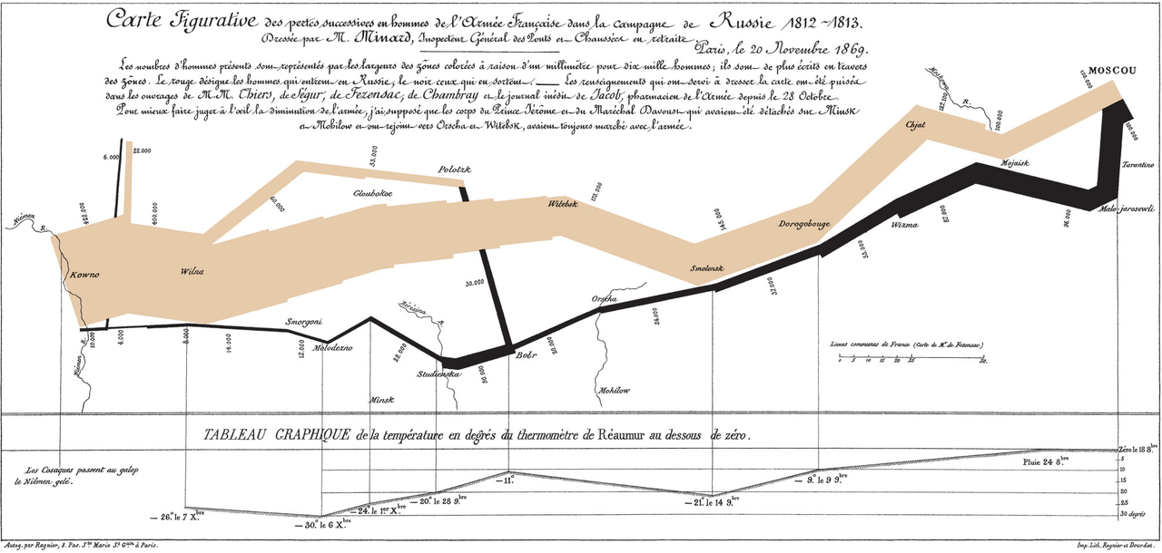
Minard and Napolean in the 21st Century
Minard's infographic of Napoleon's March to Moscow is considered by many the best statistical graphic ever drawn (although I'm not sure how many people really think that or how many simply repeat what Edward Tufte said to sound smart...). Here are two recent 21st century versions: Napoleon's March and Minard + Napoleon.
Saturday, October 11, 2014
Eight Projections
What does the world really look like? That depends on how the map was made and that's nicely illustrated by Eight Projections.
Friday, October 10, 2014

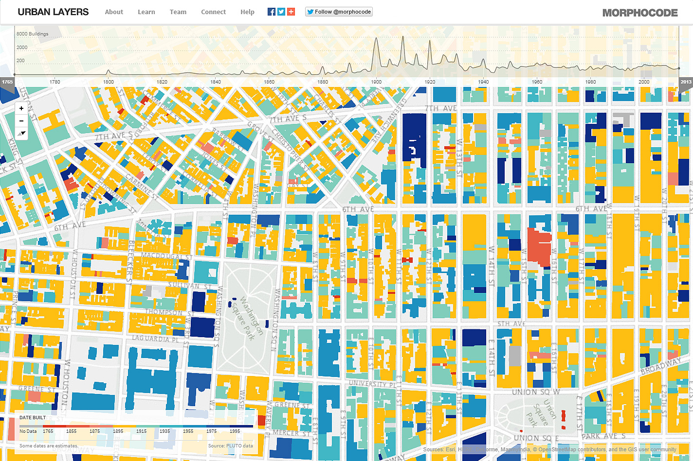
The Age of Manhattan
Urban Layers maps the age of buildings in Manhattan. It's cool, but somehow lacks a story - the map is not interactive = you cannot click on anything to see more. Plus...do we really need to see another cool visualization of urban development in NYC?
Mapping Population Density
Manifest Density is a nifty animated map: pick your region and then click anywhere in the US to map a region of about equal population. It's nice, it's simple, and tells a simple yet meaningful story.
Thursday, October 9, 2014
Drones over Mount Tom
Here's some excellent UAV footage of the 8 October 2014 microburst on Mount Tom.
Wednesday, October 8, 2014
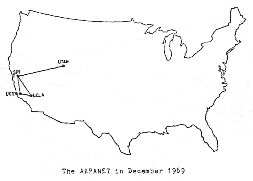
Maps that explain the Internet
This is a great map-based history: 40 maps that explain the internet
 |
| http://www.vox.com/a/internet-maps |
Tuesday, October 7, 2014
Monday, October 6, 2014
Data Viz Resources
Here's a nice Slidehare deck with tons of ideas and resources for data visualization: Data Visualization Resource Guide.
The xx, yy, zz best maps...
These compilations can be a bit tedious: the 23 maps what will blow your mind or 19 maps that show the world as never before. But, check-out these compilations for some cool maps:
- 57 maps that will challenge what you...
- 20 maps that will change the way you...
- 34 insanely detailed maps...
- 36 maps that will make you see...
- 40 maps that explain the world...
- 40 more maps that explain the world...
- 40 maps that will help you...
- 38 maps you never knew you needed...
- 22 maps and charts that will surprise you...
Saturday, October 4, 2014
Resilient Communities
Esri put together a nice ArcGIS Online site for sharing data and resources around climate change and communities = how do we plan (geodesign) for climate change resilience? Have a look at http://resilience.maps.arcgis.com/home/
Climate Science Investigations (CSI)
Here's another great teaching resource: Climate Science Investigations (CSI). Some of the modules arr still being developed, but this could form a nice framework for a Climate Change class.
Climate Change Impacts
Your contribution to climate change: see your impact on the Earth's vital signs from The Guardian is a pretty slick (and depressing) interactive infographic.
Friday, October 3, 2014
NOAA goes 2 mile!
NOAA just released their new hyper-local HRRR forecast model at 2 mile resolution. As always with NOAA their visualizations are not all that exciting, but the data are all there so I would expect to see a lot of cool data viz happening soon!
 |
| http://www.noaanews.noaa.gov/stories2014/20140930_hrrr.html |
Thursday, October 2, 2014
GIS Cloud
This looks useful (maybe): GIS Cloud - an alternative to ArcGIS Online perhaps? More information here. Also comes with a Mobile Data Collection app that's free to use on 1 device when making a public map.

Class, Education, and Income
The Geography of Class, Education, and Income in the United States is pretty simple: census tract maps of occupation, education, and income displayed as three synchronized panels via an ArcGIS Online web app.
But, combine this with The Divided City and you have a great learning activity: wealthy, educated creative types cluster around the urban core, transit hubs, knowledge institutions, and natural amenities.
(via Maps Mania)
But, combine this with The Divided City and you have a great learning activity: wealthy, educated creative types cluster around the urban core, transit hubs, knowledge institutions, and natural amenities.
(via Maps Mania)
 |
| http://www.citylab.com/work/2014/09/the-divided-city/380873 |
Subscribe to:
Comments (Atom)