Sunday, May 31, 2020
Friday, May 29, 2020
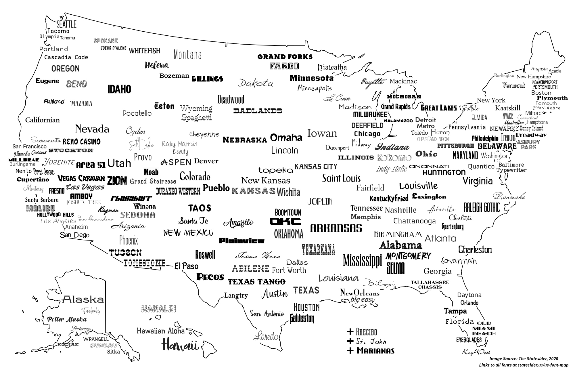
Bending Lines
Bending Lines is a great exhibit by the Boston Public Library about maps and the stories they are telling. Here's the description: Because they seem to show the world how it “really is,” maps produce a powerful sense of trust and belief. But maps and data visualizations can never communicate a truth without any perspective at all. They are social objects whose meaning and power are produced by written and symbolic language and whose authority is determined by the institutions and contexts in which they circulate.
Tuesday, May 26, 2020
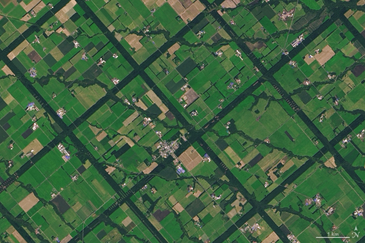
The Past Climate Explorer
The Past Climate Explorer is a great way to explore, well, the 'normal' climate (1981-2010). Now...if you could only download the data that are being displayed!
Online Talking
Here are some good tips and resources on how to give an online talk. Or simply an online lecture:
Monday, May 25, 2020
Collaborative Scientific Writing
Think Google Docs and add features such as citation management, embed/run code, interactive charts, and line-by-line text contribution tracing and you get apps such as Manubot, Overleaf, Authorea, Fidus Writer, and Manuscripts.io.
More here: Synchronized editing: the future of collaborative writing
More here: Synchronized editing: the future of collaborative writing
Corona Virus Tracing Apps
Interesting: these apps are using the Bluetooth signals between two smartphones (similar to indoor 'GPS'). More here:
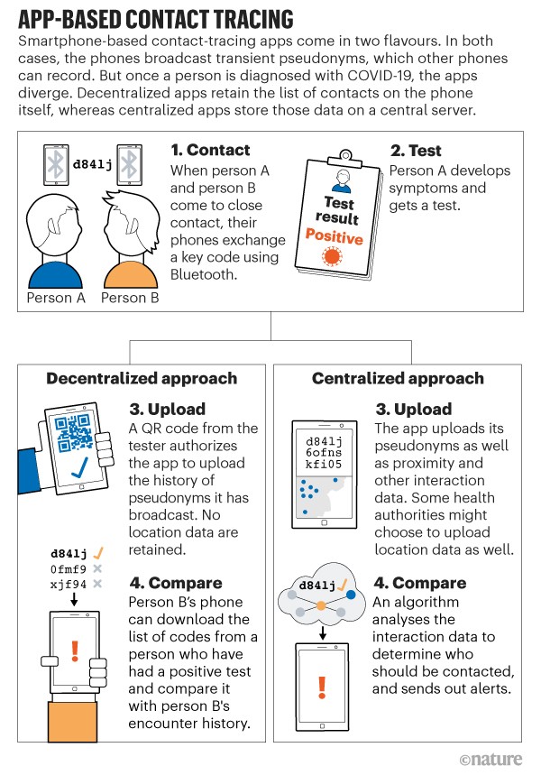
- Coronavirus contact-tracing apps: can they slow the spread of COVID-19?
- COVID-19 contact tracing apps are coming to a phone near you. How will we know whether they work?
Friday, May 22, 2020
Michigan Dam Failure
Here some useful resources:
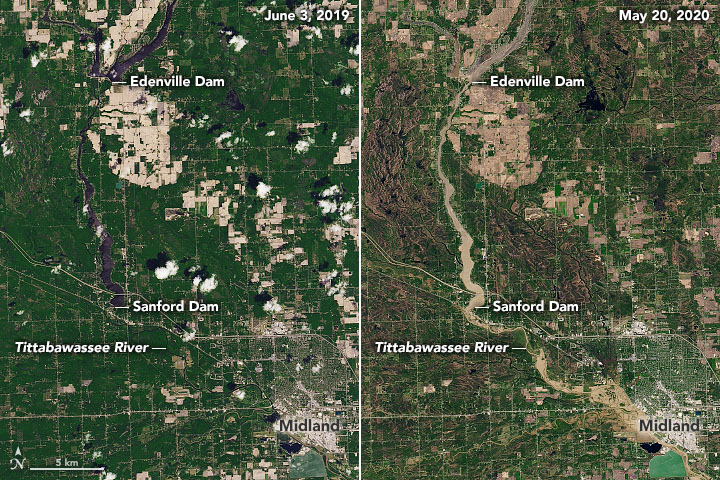
- Great work as usual by NASA: Muddy Flooding in Michigan
- Good video analyzing the dam failure: Michigan Dam(s) Fail! Tittabawassee River
- More footage: https://youtu.be/SF0c1eyuiJs
Thursday, May 21, 2020
Wednesday, May 20, 2020
Deforestation
Yet another example of deforestation in the Amazon: Deforestation in Argentina’s Gran Chaco

Tuesday, May 19, 2020

Monday, May 18, 2020
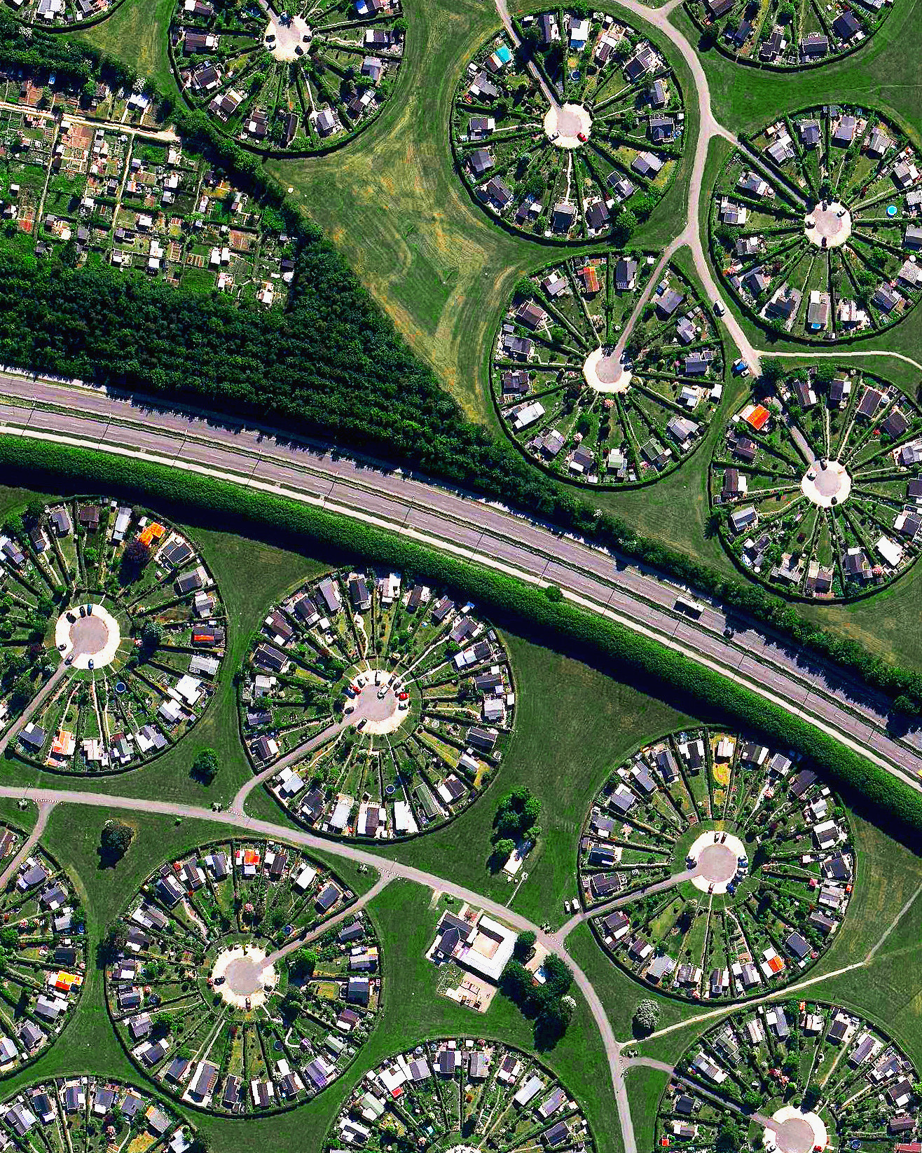
Boston Coastline: Future Past
Boston Coastline: Future Past is a great art-science project = a walking data visualization (nice video as well!). But, what's really neat are the comparisons between past and future coastlines:
 |
| http://www.kanarinka.com/project/boston-coastline-future-past/ |

Saturday, May 16, 2020
Beer vs Food
Or, is beer a food? Regardless, Where Bars Outnumber Grocery Stores is a great mapping effort. The pattern in the US is obvious, but what does it mean? Some of the other countries are interesting too: the UK, France, and Spain seem to have a lot of bars, whereas grocery stores dominate in Poland and Germany. I should 'test' this for my hometown!

Friday, May 15, 2020
EJ Atlas
The EJAtlas - Global Atlas of Environmental Justice - check it out!
This reminds of these great Code Green cartoons by Stephanie McMillan. And this one:

This reminds of these great Code Green cartoons by Stephanie McMillan. And this one:

Infographics in BAO/CAO
Infographics in BAO and CAO are nothing new, but the Coronavirus template is more here: Using the Coronavirus Infographic Template in Business/Community Analyst Web. The example for MA is below, exported as a static PNG.


10 New ArcGIS Pro Lesson Activities, Learn Paths, and Migration Reflections
Good stuff from Joe Kerski: 10 New ArcGIS Pro Lesson Activities, Learn Paths, and Migration Reflections.
- Introduction Video
- Solving problems with GIS and Public Domain Geospatial Data 1
- Solving problems with GIS and Public Domain Geospatial Data 2
- The GIS Guide to Public Domain Data Learn Path 3
That being said: we need a different approach to these types of things (and I don't know what that should be). First, these lessons are immediately outdated: software changes, data sources change, etc. and yes, those things should not be a problem, but they are. Second, we all have our own priorities and circumstances as GIS educators which makes adopting such a structure tempting (because it is easy), but ultimately not effective.
I don't know the solution, but a series of 50+ pages PDF docs is not it.
How a melting glacier could redefine the Alberta–B.C. border
Honestly: who cares? Go to any mountainous area between two countries and the actual 'demarcation line' is not always clear and obvious. But, How a melting glacier could redefine the Alberta–B.C. border is a cool 3D Story Map.
Thursday, May 14, 2020
Tuesday, May 12, 2020
Saturday, May 9, 2020
The bioed people have all the cool tools!
I have never heard of it, but BioRender seems like a great tool. More here: The software that powers scientific illustration. I wish that there was an equivalent in the Geosciences world.
Contour Lines
Drawing contour lines used to be part of every Physical Geography lab course (#boring), but maybe it is something to occupy the kids these days - have a look at: Take Your Work To Kids Day, Challenge 7: Connect-the-Dots.
Still - there may still be a place for this type of manual activity in GIS education if it is appropriately integrated in a unit on spatial analysis/statistics.
Still - there may still be a place for this type of manual activity in GIS education if it is appropriately integrated in a unit on spatial analysis/statistics.
Friday, May 8, 2020
COVID-19 Charts
Here are three great charts:
- States Are Reopening: See How Coronavirus Cases Rise or Fall (ProPublica)
- Coronavirus tracked: has your country’s epidemic peaked? by the Financial Times.
- This chart below found on Reddit. Looks promising, right? Well, I wondering where is India and the countries in Africa and South America on this? I would imagine the virus would spread 'like wildfire' in some of these mega-cities such as Sao Paulo, Mumbai, or New Dehli?
The Corporate Basemap
This is great: a simple and professional (aka. corporate-themed) Esri basemap. I'm a big fan of their light-grey canvas basemap for the same reason: it is there, but does not get in the way. Most of my students never grasp that concept and typically do this:
- Keep the default basemap because that requires the least amount of effort from them.
- They chose the dark basemap because it looks cool.
- They use the imagery basemap because it looks 'sciencey'.
Wednesday, May 6, 2020
Monday, May 4, 2020
Storyline JS
Storyline JS is an open-source tool to build an annotated, interactive time series chart. Think Datawrapper or Flourish, but with annotated cards. Try it - they provide a demo data set so you can see what the tool can do.
Not sure what I would be using it for, but if you have (a) temporal data and (b) notable changes that you can annotate, then this may be a fun way to data viz it.
Not sure what I would be using it for, but if you have (a) temporal data and (b) notable changes that you can annotate, then this may be a fun way to data viz it.
What Happens Next?
What Happens Next? is great and you can explore different (COVID-19) futures using different simulations = now we call can be infectious disease specialists!
Friday, May 1, 2020
White Mountain NF is closed
Or is it? The Forest Service shared this nice ArcGIS Online web app called White Mountain NF Closed Recreation with their 24 April 2020 press release.
The press release also states: "Trails would remain open, but only accessible by foot traffic in order to discourage long distance travel and to adhere to the State’s Stay Safe at Home orders. If you are able to walk to the trail head without driving, you can access the trail."
I predict that the locals are very much using the trails, accessing them by bike, car shuttle, or by parking somewhere secret close by.
Subscribe to:
Posts (Atom)