Thursday, October 29, 2020
The Climate Explorer
The Climate Explorer is nothing new, but the interactive map with slider is I think.
Monday, October 26, 2020
The PYPL
The PYPL Index is the PopularitY of Programming Language Index and comes with a cool interactive chart and the data are visualized here in a video: https://youtu.be/DL37toLMCJ8.
What does all that mean? Well, in my opinion, if you have a choice: learn on of the Top-10 languages (unless you have a very specific reason to learn Lua or Haskell or Dart.
Sunday, October 25, 2020
The Blame Pie
We talk a lot about carbon emission today (total vs per-capita) in terms of 'assigning blame' to global warming. But what really matters there are not the current emissions, but the cumulative emissions since the start of the Industrial Revolution. This simple pie chart shows it well, but here are two interactive options:
Area vs Population
This is one of these maps that will help (hopefully) the upcoming election results: 50 percent of the US population lives in only 4.6 percent of all counties (see below). County counting to specified proportion let's you adjust the percentage of population - nice!


Saturday, October 24, 2020
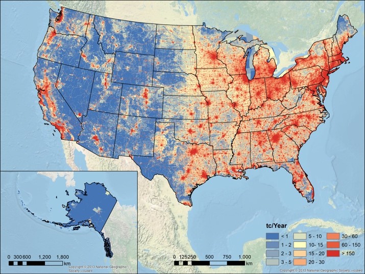
Vulcan 3.0
The Vulcan Version 3.0 High‐Resolution Fossil Fuel CO2 Emissions for the United States is now available as an open-access paper and for download.
The figure below shows total CO2 emissions which are of course to a large extent a function of population. The per-capita CO2 emissions would probably show an almost inverted spatial pattern across the USA.
Thursday, October 22, 2020
Birds-Eye View from Mount Washington
This Birds-eye view from summit of Mt. Washington, White Mountains, New-Hampshire was pretty cool already and the Library of Congress makes it accessible in a variety of formats.
But now there's a online version that you can rotate like you are standing on the summit: https://vannizhang.github.io/birdeye-view/dist/

Wednesday, October 21, 2020
The Climate Issue
The Climate Issue (by Parametric Press) includes five interactive data-driven stories. Here's what they are trying to do (in their own words):
The Parametric Press is an experiment, a born-digital magazine dedicated to showcasing the expository power that’s possible when the audio, visual, and interactive capabilities of dynamic media are effectively combined.
This is very-well done. Here's my one issue: We are already looking too much into too many screens and all this slick interactivity is just too much for our brains to deal with. Sorry. Give me an analog book.
CAD and GIS
CAD and GIS: Everything you need to know is a nice overview of the fundamental differences between CAD and GIS.
Monday, October 19, 2020
Learning ArcGIS Pro 2: A beginner's guide to creating 2D and 3D maps and editing geospatial data with ArcGIS Pro, 2nd Edition
Learning ArcGIS Pro 2: A beginner's guide to creating 2D and 3D maps and editing geospatial data with ArcGIS Pro, 2nd Edition seems like a great book to use for teaching and learning.
And, yes, it may sound weird to use a traditional tutorial book when there are 100s of digital options, videos, etc. But, trust me, there is just a comfort and convenience of having a book open next to you to serve as a trusted tour guide / travel guide.
This may be useful!
Not that I do this a lot, but the Optimal Social Media Image Sizes for 2020: The Complete Guide may be useful some day.
Wednesday, October 14, 2020
Eruptions, Earthquakes, and Emissions
Eruptions, Earthquakes, and Emissions checks all the 'coolness' boxes:
- Animated over time vs. static.
- 2D map vs. 3D earth.
- Interactive.
- Data available for easy download.
Tuesday, October 13, 2020
Monday, October 12, 2020

Saturday, October 10, 2020
Face masks: what the data say
Face masks: what the data say is a great summary article about face masks and the pandemic. Read and also watch this great video: Why Masks Work BETTER Than You'd Think. That about covers it.
Friday, October 9, 2020
Colour Controversy
Colour Controversy is fun and a good way to find-out which colors are better to use than others - try it!
Friday, October 2, 2020
Subscribe to:
Posts (Atom)