Tuesday, January 28, 2020
3 New GIS-Based Lessons
Here are three nice GIS-based lessons created by Joe Kerski that you can use to introduce newbies to the word and power of GIS: 3 New GIS-Based Lessons: Change over Space and Time, GIS for Beginners, and Teaching and Learning with the Esri Living Atlas of the World.
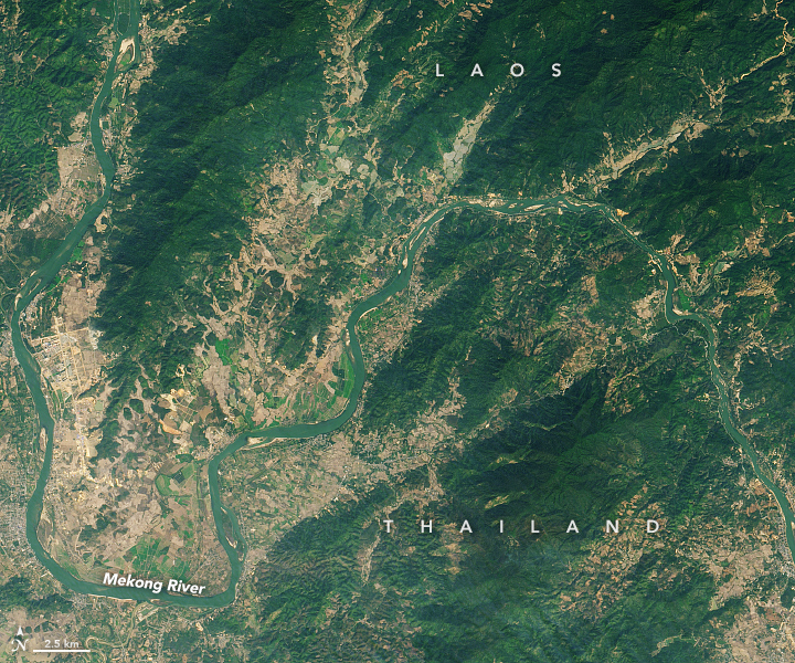
Mekong Turns from Brown to Blue-Green
Nice example of fluvial sediment transport processes and how they are impacted by streamflow and upstream sediment trapping: Mekong Turns from Brown to Blue-Green.
Saturday, January 25, 2020
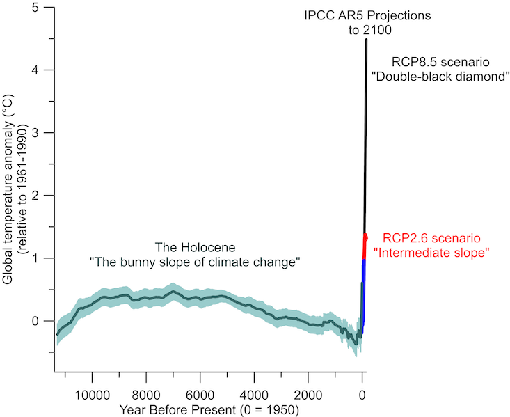
The Climate Trail
The Climate Trail game sounds a little sketchy to me, but have a read at The Climate Trail – making a game of the climate apocalypse for an example of using the game in a college classroom.
Friday, January 24, 2020
Mapcreator
Mapcreator looks like a great tool - here's a review and below is a nice tutorial video. Unfortunately there is no free version.
Monday, January 20, 2020
Draw All Roads
Fun: city roads. Enter the name of a city and get a map of every single road in that city (based on OSM). Then: style it and download as PNG or print on a mug.
Sunday, January 19, 2020
Live Amtrak Train Map
This map https://asm.transitdocs.com/map really tells you all you need to know about the state of passenger rail in the USA.
Saturday, January 18, 2020
Inductive Learning
Or IBL or whatever you want to call it, either way: this 'forces' students to work at a higher cognitive level as they have to analyze information and determine what information is relevant vs non-relevant.
Friday, January 17, 2020
The Teacher's Guide to Tech 2020
The Teacher's Guide to Tech 2020 is, well, just that. Get it here for $25.
Thursday, January 16, 2020
Global Warming in 2019
2019 Was the Second Warmest Year on Record. Pretty impressive Arctic Amplification! As an aside: these measurements started sometime in the 19th century as part of the Brits interest in mapping the warm-water ocean currents to support their colonial aspirations.


The Best Esri StoryMaps of 2019
Why we love the StoryMaps competition finalists is a Story Map about their Top-15 submissions.
ArcGIS QuickCapture
Now we have a third option for mobile data collection via ArcGIS Online: ArcGIS QuickCapture. The basic workflow is well-explained in this step-by-step tutorial: Create a project from scratch.
Tuesday, January 14, 2020
Floating Solar Farm
Seen on Daily Overview: solar panels floating on a man-made lake in China. Interesting approach and I suppose an efficient use of space if you have a lot of lakes that are otherwise useless - maybe too contaminated? I wonder if these panels just float horizontally (which would be very inefficient) or are mounted on floating racks that give them the proper tilt for their latitude.


SketchUp - ArcGIS Pro - ArcGIS Online - ArcGIS Urban
Try it using these instructions: Visualizing SketchUp Models in ArcGIS Urban. I'm still not clear what ArcGIS Urban is...
Graphics/Icons for Story Maps
Using graphics to enhance your storytelling nicely-explained why and how to use graphical elements such as icons in Esri Story Maps and at the end offers a whole bunch of them that you can use. Nice. Here's the direct link.
Saturday, January 11, 2020
ACS from AGO
In other words: accessing and downloading ACS data from ArcGIS Online. See Access the Newest American Community Survey (ACS) Data in Minutes for details. This is nothing really new, but a few things are noteworthy. First, you can export the data: just do a Select and then save as a new feature class. The data are already joined to the correct geography and finally: this is all free and thus not require a login or credits.
Climate Stripes for Germany
Viel zu warm hier lets you create climate stripe diagrams for the last 137 years in Germany. Included is also this great map series of Germany as a whole.


Climate Twins
What will global warming actually feel like? Here are a few data viz that try to get at that:
- Shifting Cities: How Hot Will Summers Be By 2100?
- How much warmer is your city? (BBC News).
- What will climate feel like in 60 years? Gives you your climate 'twin' in 60 years in the USA.
- Global Climate 'Twin'
- Blistering Future Summers for 1,001 U.S. Cities
- Winter Is Losing Its Cool
- Shifting Cities
- Klimazwillinge
These type of visualization are nothing new - see my compilation here.
Friday, January 10, 2020
Thursday, January 9, 2020
Recruitment and Retention
Fewer Students Are Going To College. Here's Why That Matters is a nice and concise summary of the issues that we are dealing with in Higher Ed right now. My take-away: adults are the key and we (= Westfield State) are not doing a good job making things easy and effective for them.


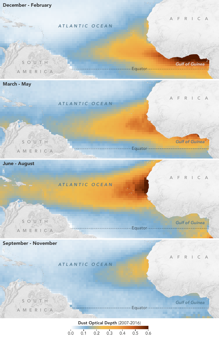
Dust and the Trade Winds
This is a great example of the Trade Winds blowing dust, hurricanes, etc. from Africa to the Americas: A Dusty Journey
Historic Topographic Maps
The USGS topographic maps have been available via ArcGIS Online for while now - see Historical Topographic Maps on ArcGIS Online for more information. Here are some more recent resources:
- USGS Historical Topographic Map Explorer (= an app based on the Living Atlas).
- Bring Historical Topographic Maps Back to Life in Web Maps
- Using Historical USGS Topographic Maps in ArcGIS Pro
Wednesday, January 8, 2020
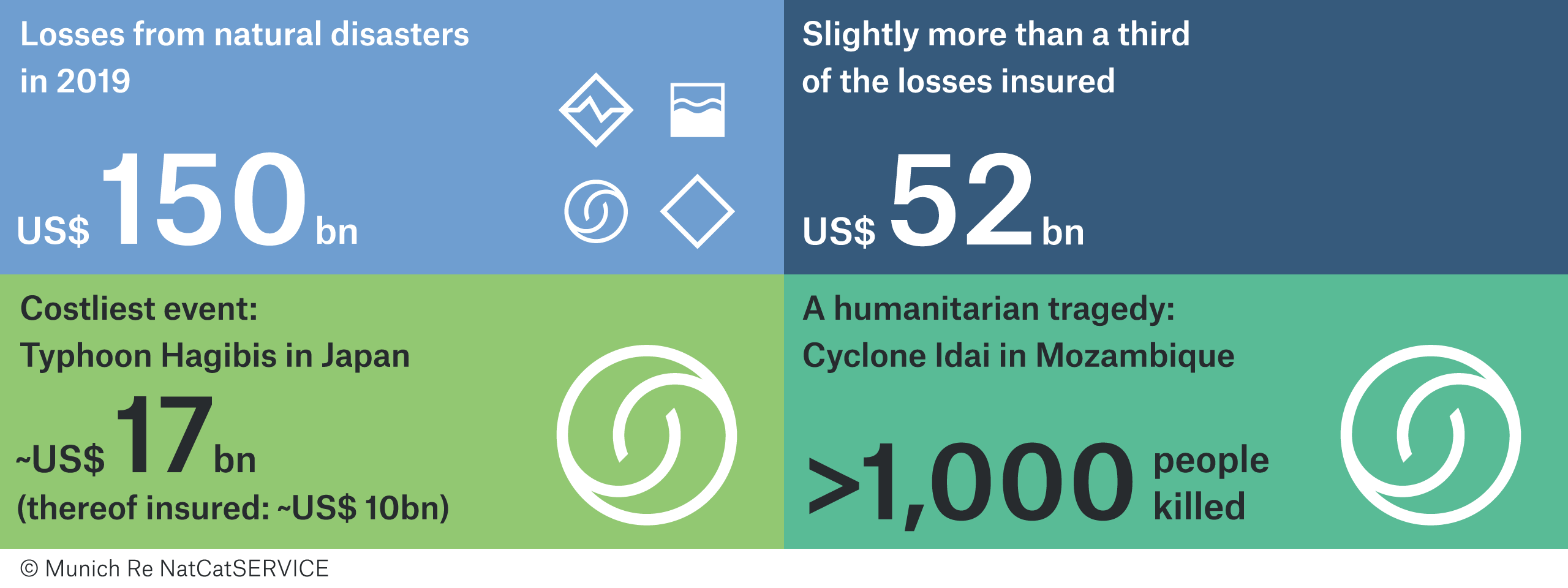
2019 Natural Disasters Costs
Tropical cyclones causing billions in losses dominate nat cat picture of 2019 by Munich RE is a concise overview of the 2019 natural disasters and their associated costs.
Mineral Extraction
Great and sobering article by Sovacool et al. (Science 9 January 2020) about sustainable energy, the associated mineral extraction/processing, and resultant ethical conundrum (see one of their figures below). Key examples / case studies that the article did not mention: Venezuela and Bolivia.


Sunday, January 5, 2020
Drones vs Laser!
Eker et al. (2019) Monitoring of Snow Cover Ablation Using Very High Spatial Resolution Remote Sensing Datasets is a great paper comparing super-detailed snow cover mapping using drones and terrestrial laser scanning and includes detailed methods and processing information.
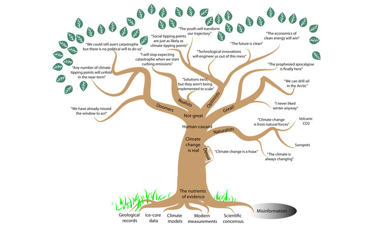
The Climate Learning Tree
The Climate Learning Tree (by Summer Praetorius) is a good read and includes two nice figures (see below).
Saturday, January 4, 2020
NCSE Climate Change Lesson Plans
The six NCSE Climate Change Lesson Plans look pretty good and can be adapted easily to different grade-levels.
The 2019 Global Multidimensional Poverty Index (MPI)
The 2019 Global Multidimensional Poverty Index (MPI) is a great data set to map using a GIS.
Ecoregions: North America and Global
Ecoregions of North America and Global as simple interactive maps:
Friday, January 3, 2020
Urban Sprawl
Great analysis from The Upshot (NYT): A Decade of Urban Transformation, Seen From Above. This includes the map below and some great examples showing urban sprawl using satellite images. Too bad these are not available as animated GIFs!


Thursday, January 2, 2020
Poverty By County
Powered by Microsoft Power BI: Poverty by State and County. Nothing new here - basic ACS data that have been visualized many times before and better...


The Mercator Map of the Arctic
Seen on Maps Mania: The Mercator Map of the Arctic. Nice interactive overlay - make sure you adjust the opacity!


Subscribe to:
Comments (Atom)