Sunday, March 30, 2014
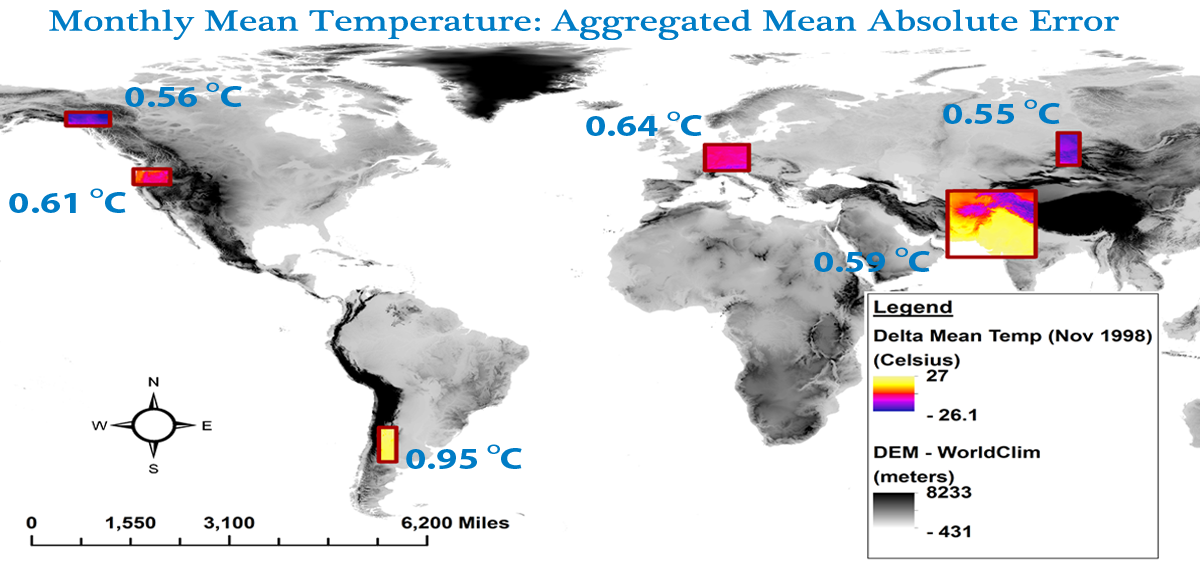
30-Arcsecond Global Climate Data
Very nice - have a look at Global Climate Data (Oregon State University) - they provide the data, script, methods, and a peer-reviewed paper. 30-arcseconds is about 1 km at the equator and obviously less as you travel towards the poles.
Friday, March 28, 2014

Thursday, March 27, 2014
StoryMap JS
StoryMap JS is similar to Google Tours or Esri Story Maps, expect you can create your story based on a large and high-resolution image of something, be that a gigapixel panorama, satellite image, or scanned historical map. Below is a quick proof-of-concept using a 4000 by 3000 pixel image. Obviously this would be a lot cooler with a real gigapixel image, but you get the idea.
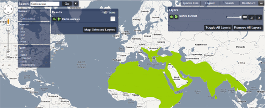
Mapping Life!
The folks at Google Maps Mania posted-up a nice compilation of maps showing where stuff lives, why, and how. I guess I'm getting bored with these well-designed, data-rich, and very complex ways to show information - that's all they do: collate and show information, really no better than the old dictionary. We still have not gotten to the 'Web Map 2.0' level that allows for true analytics and is tied to action!
Wednesday, March 26, 2014
What We Know
Not to be outdone by the US National Academy of Science and The Royal Society...now we have the AAAS and What We Know (about the reality, risks, and response to climate change).
Consensus Sense from What We Know on Vimeo.
Consensus Sense from What We Know on Vimeo.
Tuesday, March 25, 2014
The 6th Extinction: An Unnatural History
The 6th Extinction: An Unnatural History is a great book by Elizabeth Kolbert, one of the great non-fiction writers of today - read it!
- On the Daily Show (after the annoying ad)
- On NPR's All Things Considered
Monday, March 24, 2014
Go Take A Drive!
Well - at least virtually using this cool Bing 3D demo. Click over to Google Maps Mania for some information and instructions. Locally, try 'driving' from Lincoln to North Conway (NH) along the Kancamagus Highway).

Sunday, March 23, 2014
Mapping Drought 1896 to 2012

Thursday, March 20, 2014
Mapping the Moon
Here is a GigaPan mosaic of the Moon - all you need is a camera (in this case mounted on a satellite) and the software. Just a few years ago this was pretty high-tech and impressive....now every smartphone can do it (it does get a but more complex if you want a very high-quality mosaic at very high-resolution).

Wednesday, March 19, 2014

Tuesday, March 18, 2014
GIS Maps with MS Excel
Heat maps to be specific - have a look at Polczynski and Polczynski (2014) A Microsoft VBA Application for Generating Heat Maps. Or, download everything you need here.
The same authors also have another paper and Microsoft Excel VBA application for creating KML maps from spreadsheet data.
The same authors also have another paper and Microsoft Excel VBA application for creating KML maps from spreadsheet data.
Monday, March 17, 2014
Live from the ISS
Live From Space is another example of TMJ = too much junk (on a map). All I had hoped for was a simple and fast map showing the ISS moving along...on this one I can't even figure-out how to zoom-out.
Population Division
Population Division = a map showing, well, population across the Earth, has received a lot of attention lately...not sure why. Sure, it's cool, different, and hip (using D3), but I don't find it particularly useful and informative.
Sunday, March 16, 2014
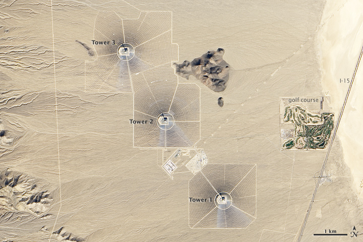
Solar Power
The folks at NASA provided a great Landsat 8 satellite image of the Ivanpah Solar Power Facility in California.
Saturday, March 15, 2014
Forecast.io
Forecast is without a doubt the coolest weather forecasting app out there - the maps and animations are stunning. They also provide very high-resolution temperature maps via their Project Quicksilver and Dark Sky, the matching iOS app. But, is any of that actually a better forecast than forecast.weather.gov?

Shale Gas/Oil and Light Pollution
Seen on Google Maps Mania: an interactive map of shale gas and oil drilling across the USA and the already well-known Earth at Night 2012 map - put them side-by-side and see the light pollution created by shale gas exploration.
 |
| North Dakota shale gas |
Tornado Outbreaks
This 'web map' of tornado outbreaks by Brenden Heberton is incredibly-well done - it's really not a map, but an interactive multimedia visualization that happens to include maps. I'm not sure what you would do with it other than admire the design?
Friday, March 14, 2014
Matterport
This is the indoor (and commercial) version of Structure-from-Motion to create 3D models of the inside of a room, house, whatever.
Thursday, March 13, 2014
Sunday, March 9, 2014
UAV and Structure-from Motion
There is more high-tech in this paper than I can handle: Lucieer et al. (2014) Mapping landslide displacements using Structure from Motion (SfM) and image correlation of multi-temporal UAV photography. Progress in Physical Geography 38(1), 97-116.
- Here's the Mikrocopter UAV they used.
- Structure-from-Motion was implemented using Agisoft (see also this previous post about Structure-from-Motion).
- The displacement was determined using COSI-Corr from CalTech.
Saturday, March 8, 2014
80 Maps that explain the world
Well, at least according to Mark Fisher from the Washington Post. He provides a few sentences of context for each map. This could make for a nice learning activity in a GIS course.

Thursday, March 6, 2014
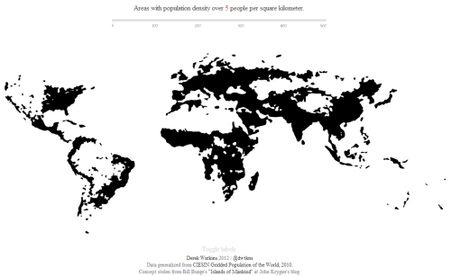
Population Density Map
This is about as good as it gets: Population Density by Derek Watkins, highlighted recently by MapCarte 64/365.
Historic Maps
Here are three very similar web maps: historic maps were scanned, georeferenced, combined into mosaics, and are shared with the world using ArcGIS Server.
This would be a good project for local cities and towns using the Historic USGS Maps of New England and New York available from the UNH Library.
This would be a good project for local cities and towns using the Historic USGS Maps of New England and New York available from the UNH Library.
Wednesday, March 5, 2014
Mapping Migration
Here are four excellent web maps / infographics showing international and national migration. The underlying technologies are also quite interesting and the different approaches to data visualization.
- MigrationsMap.Net is a classic web map, nicely executed in HTML5.
- Immigration Explorer combines space and time data from the U.S. Census in a classic NYT style.
- Restless America is not a 'map' but instead an interactive infographic.
- Origins and Destinations of the World’s Migrants, from 1990-2015 shows the flows of people in and out of countries.
Tuesday, March 4, 2014
Google and World Domination
Excellent read in the NYT Magazine (11 December 2013): Google's Road Map to Global Domination
Some interesting points:
Some interesting points:
- It's all about the data - more specifically finding the data inside the data, such as the locations of fast food restaurants that can then become part of 'augmented reality'. Apparently Google employs over 2,000 human operators as well pattern-detection bots to add value to their Street View images.
- The open-source alternative Open Street Map gained once Google started charging large users for location-based services through Google Maps.
- Turn-by-turn driving directions are convenient, but essential for self-driving cars. In essence they can operate in the real world because they can follow the directions of the virtual world.
MOOC: Skills for the Digital Earth
4-weeks and free - not a bad deal - maybe worth trying: Skills for the Digital Earth by Elmhurst College on the Desire2Learn platform.
Ocean Currents
Here are a few excellent visualizations of ocean currents.

- NASA Perpetual Ocean (July 2005 to December 2007)
- Ocean currents around the USA (real-time)
- Ocean currents global (real-time)
Sunday, March 2, 2014
Subscribe to:
Posts (Atom)