The new FAA rules are making more and more 'illegal' for folks at colleges and universities to fly UAVs even as basic teaching tools...but these restrictions do not (yet...) apply to private citizens, so go big! Here are two great websites for ideas and resources:
Sunday, August 31, 2014
Saturday, August 30, 2014
Why Does It Always Rain In Seattle?

Bloomberg and NYC
This is very cool (and just another example of just how full of themselves New Yorkers are...): Reshaping New York
Climate Change in California
That's nothing new, but this Story Map Geographic Impacts of Global Change: Mapping the Stories of Californians by students from Stanford maps narratives of change across California, in addition to visualizing all the standard climate parameters.

Mine is bigger than yours!
Really? Now we have a quick way to test that with Compera = a fun web tool to compare the size of different countries, states, or cities.

Friday, August 29, 2014

Friday, August 22, 2014
March 2014 Oso Landslide
Here are three ways to explore the March 2014 Oso Landslide:
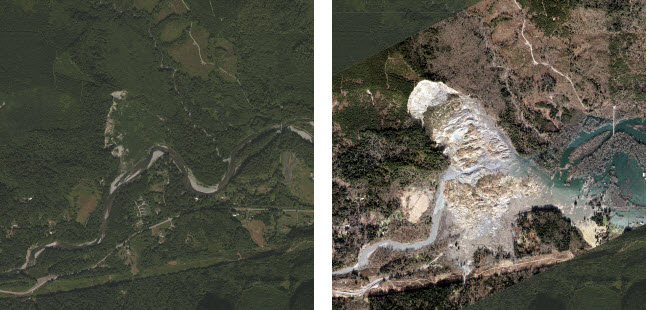
- Rendered as a 3D swipe-app inside Esri's CityEngine (more about it here)
- Rendered as an oblique swipe-app (Seattle Times)
- As a Story Map
- Before and after (with houses)
Zoning for Drones?
I suppose this may be needed at some point: Zoning For Drones
Until then: consult AIRMAP to see where you can fly.
Until then: consult AIRMAP to see where you can fly.
Thursday, August 21, 2014
The Economic Risks of Climate Change
Paulson, Bloomberg, Steyer and bunch more 'crazy liberal hippies', have a look: Risky Business - The The Economic Risks of Climate Change.
Lava On Ice!
Here is some context from Popular Science: What Happens When A Volcano Erupts Under A Glacier?
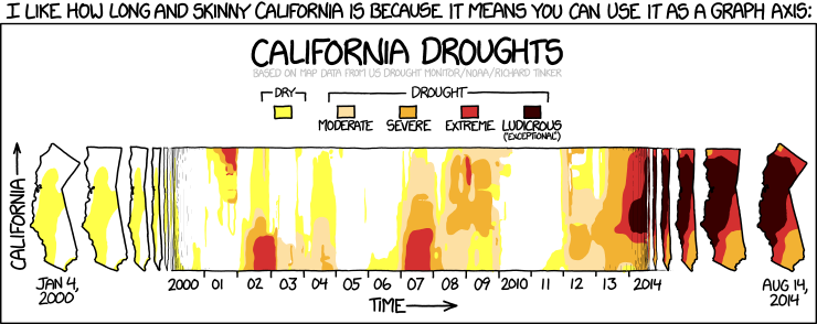
Mapping Drought in CA and across the USA
Here some great maps / visualizations of drought in California and across the US:
- April 2014 - Today, weekly, across the USA (from the NYT)
- 2011 - Today, weekly, California (from the LA Times)
 |
| http://www.latimes.com/la-me-g-california-drought-map-gif-htmlstory.html |
Nuclear Power Infographic
See for yourself: A Shift in Nuclear Powers
In general - if you need a graphic to explain how to read a graphic - reconsider your design!
Wednesday, August 20, 2014
Wind Over Time!
Who knew that the US Department of Energy makes nice maps - how about Wind Farms Through The Years. They even have an entire collection of maps and infographics related to energy.
 |
| http://googlemapsmania.blogspot.com/2014/08/wind-farm-mapping.html |
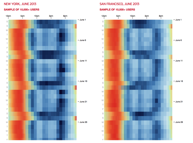
Now I'm sleepy!
The WSJ has a great analysis of sleeping patterns for major cities using Jawbone data at Which Cities Get the Most Sleep? This would be great to duplicate on college campuses around the world!
 |
| http://www.fastcodesign.com/3034540/infographic-of-the-day/how-cities-sleep-around-the-world? |
Monday, August 18, 2014
I want this!
This looks great: the FLIR ONE gizmo clips onto your iPhone and turns it into an infrared camera! And with this Pyranometer App you can measure solar radiation for the full radiation balance! Add some iCelsius sensors and you have a weather station!
Sunday, August 17, 2014
GeoMapApp
GeoMapApp by the folks from Lamont-Doherty Earth Observatory is a GIS-Lite particularly suited for simple marine science applications. GeoMapApp runs inside a Java-enabled browser and the tutorials and video tutorials are great!

EPS-HDT
That's a really unfortunate name for something that is actually quite useful: EPS-HDT by Headwater Economics aggregates tons and tons of socio-economic data into MS Excel workbooks. It currently runs as a MS Excel Add-In, but a web-based version should be available soon. Another option is Social Explorer, especially if you have access to the professional edition.
 |
| http://headwaterseconomics.org/tools/eps-hdt |
Saturday, August 16, 2014
Mapbox GL JS API
Well, if you know what that means you are probably very exciting - the initial reviews are extremely positive. If you do not know what that means: no worries...and keep on using Google Earth, Google Map Engine, ArcGIS Online, or whatever.
Where We Came From, State by State
Where We Came From, State by State is a great new visualization by the NYT: where were the people living in a given state born? In essence this indicates the 'popularity' of each state in terms of attracting immigrants from within and outside the United States.
Poverty and Race, 1980 to 2010
Where do poor people live, now and then? The Poverty and Race in America, Then and Now visualization works best of lager metropolitan areas and when you zoom-in - that way you can see changes at the neighborhood level.
Wednesday, August 6, 2014
The Collapse...
This is a great and somewhat controversial book - have a look join the debate (only 79 pages):
The Collapse of Western Civilization - A View From the Future (by Naomi Oreskes and Erik
Conway)

The Collapse of Western Civilization - A View From the Future (by Naomi Oreskes and Erik
Conway)
Sunday, August 3, 2014
Climate CoLab
This is an interesting initiative from the folks at MIT: can we crowd-source solutions to climate change using our collective intelligence? It's about time! Too many reports or websites focus on telling us - once again - what is happening to the world and that we are responsible. That's important, but does not lead to action...and action is what we need = what can we do, together? Consider getting involved in the Climate CoLab!

The Largest Satellite Image - Ever!
This has been around for a while, but how often do you get to see a satellite image that is 120 miles wide and 6,000 miles (!) long: Come Fly With Landsat 8

Friday, August 1, 2014
CMS or LMS?
On one side you have the big-boys: Vista, Blackboard, Moodle, etc. - those are great if you want to run an online course and need all the tracking and assessment tools they provide. But what if all you want is a fun, easy-to-use, and intuitive shared space to exchange ideas, sources, and maybe some files with and among your students? You could go Facebook or Google+, but that creates a weird mixing between your private and professional life. Here are several options for light-weight course managements systems:
- Yammer. The basic version is free, the interface looks almost identical to Facebook, and everything is hosted somewhere in the cloud - no downloads or configurations.
- Podio. The Lite version for up to 5 people is free, above that it's $9 per person per month.
- Basecamp. Commercial, web-based product similar to Yammer. No free option!
- Commons In A Box. This is a great option, but requires a WordPress installation on your own server.
- Wordpress. Use as-is or with plug-ins (see Commons In A Box).
- Drupal. Very popular, but requires your own server to run (real or virtual).
- Entrada. Also very popular, but as with Drupal needs its own server.
- Google Classroom. Part of Google's Apps for Education - looks promising and here are the first impressions from ProfHacker.
- Schoology. This looks like a great option as well.
Subscribe to:
Posts (Atom)