- Isocope - lot's of options for travel day, time, and mode (car vs. pedestrian). The link drops you into London by default, but Isocope works globally.
- HERE.com's Isoline Routing Example - very similar, but starts you in Berlin.
Wednesday, April 30, 2014
Service Area Analysis
That's what we call this in Esri world - travel time or travel distance analysis may make more sense to normal folks. Here you are traveling on a road network - how far can you get over some time period? Two great examples via Google Maps Mania:
Tuesday, April 29, 2014
Kartograph
Just what we needed: Kartograph is a both a Python and a JavaScript library to make awesome interactive web maps. I don't know anything about it, but it sounds similar to Leaflet and some of the other graphics tools compiled here.
Urban Tree Maps
Google Maps Mania has a nice compilation of urban tree maps:
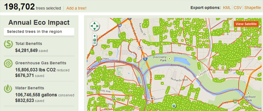
- National Geographic - Nine Cities That Love Their Trees
- OpenTreeMap - Map your own trees (seems pretty pricey!)
- Urban Forest Map for San Francisco
- Greenprint Maps for Sacramento
Monday, April 28, 2014
Plotagon and Stripcreater
Plotagon has great potential for teaching: a software that creates an animated video directly from some written text. So, for example, instead of making students presents their arguments as yet another boring MS PowerPoint - let's make movies!
- More from Mark Wilson at Co.Design
- How it works (YouTube)
- My first Plotagon movie!
Useful Websites
These compilations come around occasionally - 33 websites you never knew about (and maybe that's okay!). Of course I looked and here are a few goodies:
- Mathway looks to be nice and simple online math equation solver and grapher.
- Screenr lets you create up to 5-minute screencasts without installing any software.
- Stripcreator lets you make comic strips - a nice teaching tool!
- Printfriendly somehow re-formats web pages so they print nicely.
Saturday, April 26, 2014
Online Lab Notebooks
This is interesting: online lab notebooks = places to document anything and everything you are doing in terms of research.
- IPython may be most useful for people coding in Python as part of their research.
- knitr is a notebook-like tool for R
- Projects looks more useful for 'generic' research projects.
- Beaker is a code notebook that works with many of the hip programming languages.
It's not really clear to me what Projects would do better than say Google Drive/Docs or a regular wiki. IPython looks great, but presumably only works if you code in Python.
 |
| www.nature.com |
Thursday, April 24, 2014

Wednesday, April 23, 2014
Mapping with Google Fusion Tables
Here are two nice tools to make mapping with Google Fusion Tables even easier!
Read more about it on Google Maps Mania
Neo-Environmentalism
This is an excellent read: Dark Ecology - Searching for truth in a post-green world by Paul Kingsnorth. Here's a great paragraph:
Neo-environmentalists also tend to exhibit an excitable enthusiasm for markets. They like to put a price on things like trees, lakes, mist, crocodiles, rainforests, and watersheds, all of which can deliver “ecosystem services,” which can be bought and sold, measured and totted up. Tied in with this is an almost religious attitude toward the scientific method. Everything that matters can be measured by science and priced by markets, and any claims without numbers attached can be easily dismissed. This is presented as “pragmatism” but is actually something rather different: an attempt to exclude from the green debate any interventions based on morality, emotion, intuition, spiritual connection, or simple human feeling.
Neo-environmentalists also tend to exhibit an excitable enthusiasm for markets. They like to put a price on things like trees, lakes, mist, crocodiles, rainforests, and watersheds, all of which can deliver “ecosystem services,” which can be bought and sold, measured and totted up. Tied in with this is an almost religious attitude toward the scientific method. Everything that matters can be measured by science and priced by markets, and any claims without numbers attached can be easily dismissed. This is presented as “pragmatism” but is actually something rather different: an attempt to exclude from the green debate any interventions based on morality, emotion, intuition, spiritual connection, or simple human feeling.
Monday, April 21, 2014
Online Climate Models
Here is a collection of online climate models - some easier, some fancier.
More fun and useful simulations from NCAR/UCAR
Sunday, April 20, 2014
Inkscape
Inkscape is an open-source vector graphics editor and a perfectly good alternative to Adobe Illustrator. Inkscape is a great way to make your ArcGIS maps look good and here is a quick tutorial about how that works from Gretchen Peterson. Now all you need is to ditch Photoshop for GIMP or Pixlr and you can free yourself from Adobe. I never understood this weird double standard: the love affair with Adobe and the hate towards Microsoft.
Saturday, April 19, 2014
You Are Here!
You Are Here is a beautiful and creative initiative from the folks at the Social Computing Group at the MIT Media Lab. Their goal is to create 1 map every day for 1 year - maps that tell stories of place and places that have meaning to normal people.
Thursday, April 17, 2014
Interactive Climate Change Booklet
Climate Change - Evidence & Causes by the National Academy of Sciences and the Royal Society is now available as an interactive online booklet - nice!

University of Southampton
Not that I really care about the University of Southampton, but they have a really cool Google Street View tour of their campus.

Wednesday, April 16, 2014
USGS Streamer
This is fun: USGS Streamer lets you explore major streams by automatic tracing either upstream (to the source) or downstream (to their end). Plus, you can generate all kinds of reports, load in layers, etc.
Tuesday, April 15, 2014
Informal Science Education
Climate Matters is a nice series from a local TV station in South Carolina: short clips featuring interesting questions around the connections between weather and climate change. This was written-up as a paper in the January 2014 Bulletin of the American Meteorological Society.
CO2 Pollution
There are a bunch of web maps out there showing CO2 emissions in all kinds of ways - here are some of them:
- Global CO2 Emissions (by country)
- CARMA (CO2 emissions from large facilities around the world)
- EPA Large Facilities CO2 Emissions
- Hestia and Vulcan (CO2 emission for the US down to the county and building level).
High-Speed Internet and Inner Cities
This is an interesting article: The Most Revealing Broadband Adoption Maps We've Ever Seen looking at high-speed Internet adoption in inner-city neighborhoods vs. the suburbs. For us out here in the hills of Western Massachusetts is almost the inverse: many of the small towns in Berkshires do not have access to high-speed Internet = a map of availability (not adoption!) would look inverse going away from the population centers in the Connecticut River Valley.

Monday, April 14, 2014
Winds and Aerosols
This is a great animation of 'stuff' in the air: blue = sea salt, green = organics, red/brown = dust, and white = sulfates. What these things are and how they become aerosols is an interesting story, but even without that this animation beautifully illustrates the main wind bands around the planet.
There is the high-resolution video.
There is the high-resolution video.
 |
| Found at https://www.youtube.com/user/itsokaytobesmart |
Saturday, April 12, 2014
22 March 2014 Landslide in Washington State
Well, I'm not that impressed USGS - your animation looks 'cool', but how about telling us what these colors mean? The colors appear to indicate thickness of deposit - somehow.
Thursday, April 10, 2014
Making the Invisible Visible!
What does sound look like? Or, even better: let's actually see warm air rising!
Tuesday, April 8, 2014
Esri Demographics
Esri Demographics is a nice interactive web map showing you what demographic data Esri has available for you for different countries around the world. It's not quite clear how you would access those data, but the little Map image in the pop-up is nice as a short-cut to available ArcGIS Online map layers.
The live MBTA Map
This is cool (in theory): The Live Boston Train Map.
Lot's of content and lot's of customization, but somehow the look and the feel of this web map don't work for me.
Lot's of content and lot's of customization, but somehow the look and the feel of this web map don't work for me.
How far is the nuke plant?
This is a pretty simple GIS analysis and here are two simple online maps to show you exactly how far away you are from a nuclear power plant:
The Geography of Beer
How about that for a new geography course - the textbook is already available: The Geography of Beer. Read more about the book on Popular Science.


Sunday, April 6, 2014
Tuesday, April 1, 2014
Climate Change Impacts (IPCC)
Here is the long-awaited IPCC Working Group II Report: Climate Change 2014: Impacts, Adaptation, and Vulnerability. Andy Revkin provides a nice 11-Question FAQ on Dot Earth.


Urban Jungle and Hyperlapse
More 3-D using Google (hmm...is this maybe a trend?)
- Urban Jungle has been around now for a while. Personally I could do without the fake greenery, but the 3-D Google Street View is fun.
- Hyperlapse uses some voodoo to create smooth animated 'drives' using Google Street View.
VeloViewer
Seen on MapBox Mania - this is really cool (albeit pretty useless): VeloViewert
But, the orientation of streets and roads does tell a story about topography and the development of cities.

But, the orientation of streets and roads does tell a story about topography and the development of cities.
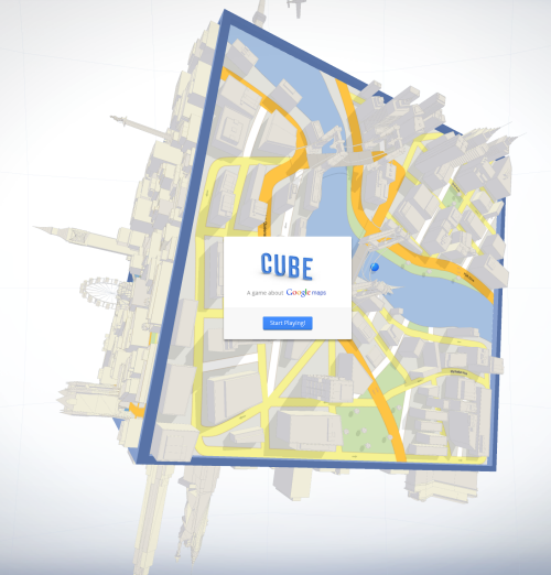
Google Cube
Google Cube = Google Maps in 3-D! This is only a game right now, but who knows a few years from now we might be the blue rolling balls.
Subscribe to:
Posts (Atom)