Tuesday, July 21, 2015
Interactive Cartograms
How We Share The World is a series of 'dynamic' cartograms - this would be great to add to Worldmapper.
Friday, July 17, 2015
Volcanoes!
Here is a nice interactive map of all known volcanic eruptions of the last 2,000 years. Even better: Richard Husdon published a great tutorial on how to create this map using public data and CartoDB. (via Map Mania)
Thursday, July 16, 2015
LiDAR and SFM
Everything you always wanted to know about LiDAR and SFM: Analyzing high resolution topography for advancing the understanding of mass and energy transfer through landscapes: A review (by Passalacqua et al., 2015, Earth-Science Reviews).
The title is a bit misleading...the focus is very much on airborne LiDAR. Plus, the term 'transfer' implies a process (or processes), but LiDAR and SFM can only give you 'states' at high spatial resolution, but (in-practice) not high enough temporal resolution to get at actual processes, transfers, and rates thereof.
The title is a bit misleading...the focus is very much on airborne LiDAR. Plus, the term 'transfer' implies a process (or processes), but LiDAR and SFM can only give you 'states' at high spatial resolution, but (in-practice) not high enough temporal resolution to get at actual processes, transfers, and rates thereof.
 |
| Passalacqua et al. (2015, Figure 2) |
Science 360
Science 360 (by the National Science Foundation) is a great source for science news in a variety of useful formats: web posts, videos, radio programs, etc.

Wednesday, July 15, 2015
Tuesday, July 14, 2015
Global Top-10 GHG Emissions
A 4-tiered interative donut chart - cool! Global Top 10 Greenhouse Gas Emitters

Canva
Canva is a simple cloud-based (and mostly) free design / layout program. It provides layouts, templates, text options, frames, backgrounds and you can upload your own images - pretty much all you need for simple design projects. You can download your work as PNGs or PDFs. However, some of their premium content such as images cost $1 each, but you can always upload your own.

- Canva for iOS
- Reviews by PCWorld and FastCompany
When Maps Lie
When Maps Lie is a summary and discussion on how to avoid being fooled by maps. There is nothing particularly new about it, but the author provides a series of nice examples to illustrate his points.
 |
| http://xkcd.com/1138/ |
Monday, July 13, 2015
Are you living in the past, present, or future?
At least in terms of your state demographics compared to the demographics of the country: Find out if your state is America's past or future!
IPUMS USA
Integrated Public Use Microdata Series or IPUMS USA is a way to access U.S. census data - an alternative if you will to American FactFinder. Even better (in my opinion) is Social Explorer, but you need a Pro License to get access to all the good stuff.
Sunday, July 12, 2015
The OpenGeoportal
These open geoportals have been around for a while - basically led by the folks at Tufts, MIT, and Harvard. The idea is to create an open 'clearing house' for authoritative geospatial data that are scattered all over cyberspace as part of state/local/federal agencies, colleges/universities, museums, libraries, etc. I'm not sure this has really taken-off - and may never will - but have a look at Opengeoportal.org, Open Geoportal 2.0, and a recent review by Esri's Joe Kerski.
NASA Mars Trek
NASA Mars Trek is an interactive story map of - you guessed it - Mars exploration. It comes in 2D and 3D and includes all the standard bells and whistles we have come to expect from these things.
Saturday, July 11, 2015
Climate Central Surging Seas
Climate Central Surging Seas has been around for a while and a great tool to 'see' how the U.S. will look like under different sea level rise scenarios - for example 2°C warming and sea level rise. Or, explore by location - for example Boston.
Landsat Story Map
This is pretty fun - the Landsat Thematic Bands Web Mapping Application gives you on-the-fly image processing so you can explore the world in different Landsat 8 band combinations.
Confused? Have a read! More about it here via Spatial Reserves.
Now if they could just add-in a band-ratio or band-index for simple snow and ice mapping!
Confused? Have a read! More about it here via Spatial Reserves.
Now if they could just add-in a band-ratio or band-index for simple snow and ice mapping!
Friday, July 10, 2015
Time Zones explained!
A brief history of time zones by the BBC is a nice interactive visualization of how time is organized on Earth.
Thursday, July 9, 2015
Google Street View Hyperlapse
This has been around for a while now, but Hyperlapse somehow merges Google Street View frames into cool mini movies. The web version has some limitations, but the source code is available on Gitub.

Wednesday, July 8, 2015
Solar Windows
The Future is Clear shows that we can convert regular windows into photovoltaic cells and thus create solar skyscrapers and solar cities!
Population Change in Europe
This is quite impressive: Where the population of Europe is growing - and where it's declining by the Berliner Morgenpost. I would love to see an interpretation / explanation for some of these very obvious spatial patterns - some appear to be related to urbanization, others perhaps to immigration? For the techno-geeks: here's a tutorial that describes how this map was created.
Via Map Mania
Via Map Mania
Wave Energy
I cannot imagine wave energy will ever amount to anything significant, but there seems to be some progress with Hawaii actually connecting a wave energy device to its power grid.
Tuesday, July 7, 2015
Saturday, July 4, 2015
Time-Lapse Mining
The concept is simple: let's crowd-source pictures of popular landmarks and stitch them together in-time to create a time-lapse video. The details are of course much more complex and explained in Time-lapse Mining from Internet Photos by Ricardo Martin-Brualla and others.
A 3D Body Scanner
This is cool: all you need is 50 Raspberry Pis, 50 digital cameras, a bunch of PVC piping, and some other stuff and you can build yourself a 3D scanner: A very low-cost 3D scanning system for whole-body imaging
Friday, July 3, 2015
Social Media for Scientists
Facebook, Twitter, Google+, Instagram, SnapChat, WhatsApp, Pinterest, Myspace (gasp!) - it is not easy to choose your social media identities! A similar problem nowadays exists for scientists with at least three competing academic social networks: ResearchGate, Academia.edu, and Mendeley. The article Scientists and the social network (Nature, 14 August 2014) explores the issue.

Thursday, July 2, 2015
GradeCraft
GradeCraft is an LMS to support 'gameful' courses - read more about it over at the Wired Campus. The basic idea is to mimic a video game where mistakes don't come with any real consequences - you can simply start over and repeat the level. In contrast, most college courses are structured around several high-stakes tests and/or papers and any mistakes on those typically have a real negative impact on the final grade.
The Planetary Dashboard
This has been around for a while - but updated as of January 2015: The Planetary Dashboard showing the Great Acceleration (since 1950). What I like about this is that you can access this study in a variety of ways: a) the aforelinked website, b) the peer-reviewed paper, c) the detailed slide show, and d) the underlying data (as a MS Excel table).

Wednesday, July 1, 2015
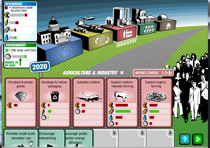
The BBC Climate Challenge
If learning about climate policy options and consequences as you play a game sounds good to you: try the BBC Climate Challenge game or first read the review by Kate Heffernan on the NCSE blog.
Personally I always feel a bit ambivalent about using educational games in the context of serious issues such as climate change - framing it as a game to me sends the wrong message and trivializes the very real consequences of climate change. Yet I also realize that games can be a good way to explore complex issues in a way that is structured, fun, and engaging.
Personally I always feel a bit ambivalent about using educational games in the context of serious issues such as climate change - framing it as a game to me sends the wrong message and trivializes the very real consequences of climate change. Yet I also realize that games can be a good way to explore complex issues in a way that is structured, fun, and engaging.
 |
| http://ncse.com/files/bbc2.0_0.png |
Subscribe to:
Posts (Atom)