Perfect use of a story map: #minivanlife 2021
Sunday, December 26, 2021
Saturday, December 25, 2021

Why no action on climate change?
Well, this well-written paper provides the answers: Three Decades of Climate Mitigation: Why Haven't We Bent the Global Emissions Curve? (Stoddard et al., 2021).
It's a long read, but worth it, and would make a great framwork for an upper-level course on climate change. My favorite section is on Page 672: "...any dicussion of emissions reductions is based on a percentage of reduction below current emissions. This presumption establishes deviation from the status quo as the burden to be divided rather than the burdens of the statuts quo themselves."
The rest of the papers in this volume also sound interesing - have a look: https://www.annualreviews.org/toc/energy/46/1
Friday, December 24, 2021

Thursday, December 23, 2021
The Memex
In his essay 'As We May Think' (from July 1945!), Vannevar Bush describes a future device called 'the memex' and thereby (conceptually) invented Google and smart gizmos. Here, humans create their own associative joins bewteen items of information to build associative trails that can be shared from one memex to another.
Great read, especially Sections 6 and 7.
Wednesday, December 22, 2021
The Best Maps/Charts/Data Viz of 2021
It's that time of the year when the Top-10, 20, 30, 40, 50, etc. lists of 2021 come-out:
- Maps Mania Maps of the Year
- Favourite maps of 2021 (Ken Field)
- Data Viz Projects (Nathan Yau)
Tuesday, December 21, 2021
Exercises for GIS Guide to Public Domain Data book
Exercises for GIS Guide to Public Domain Data book presented as a story map - fun!
Monday, December 20, 2021
15 tips for cartographers in ArcGIS Pro
15 tips for cartographers in ArcGIS Pro is a beautiful story map (embedded below) with 15 tips for making better maps using specifically ArcGIS Pro.
GraphSnow
GraphSnow is a nice and simple way to visualize snow depth measurements from the National Snow Analyses database.
Communities in Crisis
Communities in Crisis shows the impacts of climate change on communities around the world. I like it: simple and effective.
Weather Disasters 2021
It's the time of the year when these types of compilations show-up - first-up is the Washington Post with Cold, heat, fires, hurricanes and tornadoes: The year in weather disasters. One wish: please make these animations available as GIFs so we can share and use them.
Sunday, December 19, 2021
Wednesday, December 15, 2021
The Nile Delta’s Disappearing Farmland
Great example of urban sprawl / urbanization at the expense of farmland: The Nile Delta’s Disappearing Farmland.
Tuesday, December 14, 2021
Climate Change & Conflict
How Climate Change Fuels Deadly Conflict is a nice map-based scrolly-map highlighting the connections between climate change and conflict around the world.
Geology with RICHARD D. LITTLE
Great YouTube channel Richard Little about the geology here in the Pioneer Valley of Massachusetts: Geology with RICHARD D. LITTLE.
Monday, December 13, 2021
Sunday, December 12, 2021
Climate Change Solutions
Here ar a bunch of reasonable & robust plans out there to get to netzero carbon emissions by 2050 - here's one visualization of some of those plans: How to Get the World to Netzero Carbon Emissions by 2050 – A Graphical Guide.
I especially appreciate thaat the data are included as a shared Google Sheet - that's the way to do it!
Palm Oil, Deforestation, and Climate Change
The World's Addiction to Palm Oil Is Only Getting Worse is a nice 'scrolly-map' by Bloomberg News.
Calculating where you should live
This could be cool: https://flowingdata.com/2021/11/24/calculating-where-you-should-live/ (if you can make it past the paywall).
Compare the Climate and Weather Between Two+ Cities Worldwide
Compare the Climate and Weather Between Two+ Cities Worldwide is very nice (just ignore the annoying ads). Take two or more cities & compare their climate, using the classic seasonality 'climographs' and interesting time-of-year vs time-of-day 'surface' charts.
This could be a great teaching tool if it were not for the overwhelming and distracting ads.
Cities In Africa
AFRICA’S RISING CITIES: How Africa will become the center of the world’s urban future is a great 'scrolly-map' showing how the centers of urbanization are shifting towards Africa.
Monday, November 29, 2021
Monday, November 22, 2021
ELI Videos
The Earth Learning Ideas Video Collection is useful for teaching and learning all things related to geography and geology.
The Analog Atlas
The Analog Atlas is nothing new: find the climate 'analog' for your location under either a 2 or 2 deg C warming.
Friday, November 19, 2021
Scientific Visualization: Python + Matplotlib
Scientific Visualization: Python + Matplotlib (by Nicolas Rougier) is a free open-source book about, well, scientific data viz using these two tools. Read as a PDF, order a printed copy, and dig around on the GitHub for sources and code examples.
PDF Map Maker
PDF Map Maker is a fun little tool in case you just need basic map in PDF format. Plus you can overlay geoJSON files. It would be great if you could add simple annotions (circles, lines, etc.).
Wednesday, November 17, 2021
Census Mapper
Census Mapper is a great tool to visualize demographic changes across the USA between 2010 and 2020 and you can export/embed the visualizations.
Tuesday, November 16, 2021
iPhone LiDAR
Hmm, maybe the excuse I need to upgrade my iPhone: Evaluation of the Apple iPhone 12 Pro LiDAR for an Application in Geosciences.
Tuesday, October 12, 2021
Monday, October 11, 2021
The Climate Accountability Institute
The Climate Accountability Institute has been around for a while: checkout their work on the so-called 'Carbon Majors'. What they really could use is some help with their data viz...here's one of their key tables: Top-20 1965-2018 Carbon Majors
Wednesday, October 6, 2021
The Human Ecological Niche
Turns-out that humans (like any other species) have a preferred 'ecological' niche at ~13 deg C MAT. And, 13 deg C also turns-out to be the optimmum for economic productivity. There are a lot of issues with such statements and Xu et al. (2020) do a good job offering context and discussion to their analysis. The figure below from the NRDC offers a nice summary.

Monday, October 4, 2021
NetCDF, Climate Data, and Satellite images
How to create multidimensional raster data is excellent and shows you how to handle multidimensional raster data in ArcGIS.
- Open a NetCDF file and map / analyze it. Great for gridded climate/ocean data or GCM outputs.
- Combine a bunch of Landsat 8 images into a multidimensional raster 'cube' - that keeps all your satellite images neatly organized and you can run your geoprocessing / raster functions on the cube as oppposed to on each raster individually. Cool!
Saturday, October 2, 2021
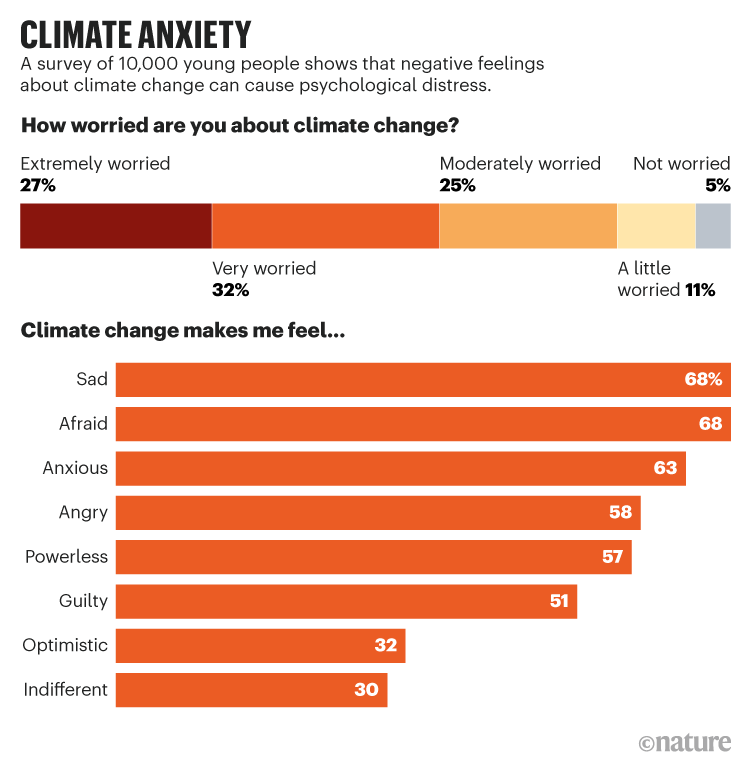
That's A Problem!
Source: https://papers.ssrn.com/sol3/papers.cfm?abstract_id=3918955. For context: Young people’s climate anxiety revealed in landmark survey (Nature, 30 September 2021).
Thursday, September 30, 2021
Mapping with Datawrapper
Datawrapper is just great and now it is even easier to add data & make interactive web-based choropleth maps (see example below): Use our completely redesigned data upload for choropleth maps
Wednesday, September 29, 2021
The Projection Playground
The Projection Playground is fun: look at the world in different projections & you can even adjust the projection parameters to make things even more complicated. Plus you can get the D3 code.
Now: what is this useful for? No idea. For me, there are three challanges related to map projections:
- Make students realize that what (they think) the world looks like is actually just a function of the map projection / parameters.
- Understand the implications of 1).
- For students in my GIS courses: Be able to project GIS data (although that's become less and less important.
Saturday, September 25, 2021
Scatterplot vs. Bivariate Choropleth Map
Same data, different data viz - have a look at http://cartoblography.com/2021/09/24/get-vaccinated/ by Ken Field.
You can create a simple scatterplot to highlight the inverse relationship (here COVID-19 hospitalizations vs. vaccinations) or a bivariate choropleth map to show the spatial pattern(s). Cool!
Friday, September 24, 2021
Dr. Katharine Hayhoe
Dr. Katharine Hayhoe is a great example of how faith and science can live together just fine.
- On Jimmy Kimmel Live (23 September 2021)
- Book: Saving Us - A Climate Scientist's Case for Hope and Healing in a Divided World
Thursday, September 23, 2021
Geospatial Data Science Data and Tools
Geospatial Data Science Data and Tools by the NREL is an amazing compilation of maps and data (and interactive viz) related to sustainable energy.
The Travel Planner
The Travel Planner and Carbon Emissions Calculator is pretty slick and an amazing example of what you can do with Tableau.
Wednesday, September 22, 2021
The St. Louis Map Room
The St. Louis Map Room: a community space for exploring and creating original, interpretive maps of the city. These maps are currently on display throughout the community.
Saturday, September 18, 2021
The Traffic Simulation Game
Seen on Maps Mania: The Traffic Simulation Game
Download and then model traffic anywhere in the world: add bike lanes, sidewalks, etc. Not sure how it all works, but somehow OpenStreetMap is involved.
Wednesday, September 15, 2021
Energy and Human Ambitions on a Finite Planet
Great new open-access OER: Energy and Human Ambitions on a Finite Planet
This book is perhaps the 'update' to the classic book by David MacKay: Sustainable Energy – without the hot air.

Highways & Racism
Great data viz / Story Map: What It Looks Like to Reconnect Black Communities Torn Apart by Highways.
Then, explore: How Decades of Racist Housing Policy Left Neighborhoods Sweltering. This one sits behind the NYT paywall, but you can get the underlying scientific papers:
- Disproportionate exposure to urban heat island intensity across major US cities (Nature Communictions, 25 May 2021).
- The Effects of Historical Housing Policies on Resident Exposure to Intra-Urban Heat: A Study of 108 US Urban Areas (Climate, 2020)
Monday, September 13, 2021
Mapping Open Data Portalls
Mapping the specific location of an open data portal is a bit weird: is it the location of the server (if there even is a specific location) or the location of the data accessible via said portal? And: what about regional or global data sets?
Still, I think the map is cool & the spatial patterns are interesting: A Map of Open Data Portals
Human Development Indices (5.0)
The Human Development Indices (5.0) are now available at the subnational level (e.g. states in the USA). Nice: the data are available for download.
Saturday, September 11, 2021
Friday, September 10, 2021
Wednesday, September 8, 2021
Finland Might Have Solved Nuclear Power’s Biggest Problem
That title is an exaggeration, but at-least Finland has some kind of facility to handle nuclear waste. Is it safe? Sure! But: Is is save for long enough?
Climate Change = More Extremes
It's really not that complicated and here are two quick videos:
- We're making hurricanes stronger (54 seconds)
- Climate-Fueled Disasters (1:54 minutes)
Tuesday, September 7, 2021
OSS and OSH/OSHW
Here's a great paper and some of the associated resources - it's pretty cool what you can do nowadays with open-source software and hardware. That being said: I have seen too many crappy weather stations for one reason or another (see pic below) - making consistemt and high-quality environmental measurements is complex, especially in harsh environments.
- Chan et al. (2021): Low-cost electronic sensors for environmental research: Pitfalls and opportunities
- http://www.freestation.org/home
- King's College London Geocomputation on GitHub

Sunday, September 5, 2021
Unlearning Racism in Geoscience (URGE)
Unlearning Racism in Geoscience (URGE) ran a 16-week program in the Spring of 2021 using a cool 'pod' idea where interested individuals and organization formed pods of 12 people to work-through each of the 8 two-week units. The program is obviously over, but the curriculum remains accessible and it would not be too difficult to modify & run this program 'stand-alone' and include other STEM fields such as Biology or Environmental Science.
Laura Guertin shared her 'pod' experience over on her GeoEd Trek Blog.
Thursday, September 2, 2021
Climate at a Glance
Climate at a Glance (from NOAA) is simple and effective: see the data as a table or chart, then DL for further analysis.

Fires & Smoke
Plenty of maps like that - this one now has the smoke forecast layer: https://livingatlas.arcgis.com/wildfire/#@=-96.003,32.304,4
Cattle & Palm Oil = Deforestation
Great article from NASA: Sizing Up How Agriculture Connects to Deforestation. In-general, deforestation in South America is driven by cattle pastures whereas deforestation in Southeast Asia is driven by palm oil production.
Tuesday, August 31, 2021
Urban Sprawl
Nice and simple web mapping by The Washington Post (a simple comparison between 2001 and 2019): Where America’s developed areas are growing: ‘Way off into the horizon’
Map Posters
Seen on Maps Mania: This app/tool allows you to create your own colorful map as a basic image file - great for playing around with 'mapping' without the need for a cumbersome GIS. Here the focus can be on exploring your own space & place in a more artistic manner.
This may be a great tool to use in a Physical Geography Lab as an entry to the idea that we can indeed quantify spatial relationships - but - we first need to have a connection to the space that we are trying to understand.
Introduction to Modern Statistics
This may be a useful & free book / textbook: Introduction to Modern Statistics
Monday, August 30, 2021
Thursday, June 17, 2021
The Science of Climate Change Explained: Facts, Evidence and Proof
The Science of Climate Change Explained: Facts, Evidence and Proof - Definite answers to the big questions by Julia Rosen for the NYT is great. The first 10 questions are 'narrow' science and the final 2 questions deal with impacts and solutions.
For whatever it's worth: I organized the topic into 21 Big Questions.
Tuesday, June 15, 2021
The Day the Dinosaurs Died
This is a great video of the so-called KT Boundary: The Day the Dinosaurs Died - a play-by-play account of what happend.
Saturday, June 12, 2021
Degrees of Uncertainty
This video is well-worth watching: A Skeptical Look at Climate Science (esepecially the last 9 minutes or so. The choice of title here is unfortunate...it implies exactly the opposite as the filmaker intended.
Thursday, June 10, 2021
Wednesday, June 9, 2021
Misconception of the Month: Talking Climate Models with John Cook
Misconception of the Month: Talking Climate Models with John Cook is a great video, but the title is little 'misleading': the video is not specifically about climate models, but rather about John Cook's FLICC approach to teaching about climate misconceptions.
Tuesday, June 8, 2021
Saturday, June 5, 2021
Richard Little's YouTube Channel
Great stuff here about the local geology of the Connecticut River Valley: Richard Little's YouTube Channel. Here's an example:
What Does a GIS Manager Do?
Sheens Kennard's career pathways and experiences in What Does a GIS Manager Do? are probably not the most-typical, but the video is well-worth watching if you are at all interested in pursuing a GIS career.
Wednesday, June 2, 2021
Wednesday, May 19, 2021
Poverty Maps
Here are two interesting ways to map poverty:
- Which U.S. Counties Have the Most People Living in Poverty? is a classic choropleth map created in Tableau. Look, I like Tableau, but for mapping there are just better options.
- All metro high-poverty neighborhoods looks at change: which neighborhoods are newly poor, persistently poor, deepening poor, or turning around. This map is created in ArcGIS Online.
Tuesday, May 18, 2021
River Runner
River Runner is awesome: drop a raindrop anywhere in the contiguous USA and watch it flow downstream.
Saturday, May 15, 2021
COVID-19 will never go away!
Five reasons why COVID herd immunity is probably impossible is a great article. Take-home message: we will probably have to learn to live with COVID-19 like we have learned to live with the flu. Bummer.
Thursday, May 13, 2021
Friday, May 7, 2021
Thursday, May 6, 2021
Making The Grade?
Making The Grade? is a report how state public school science standards address climate change and comes with neat data viz created in Tableau: States at a Glance
I'm just not sure that Tableau is the way to data viz this...if the spatial patterns are interesting, then use a proper GIS app!

Wednesday, May 5, 2021
STEM Teaching & Open Pedagogy
Karen Cangialosi has some tools and ideas @ https://karencang.net/openped/
Saturday, May 1, 2021
Friday, April 30, 2021
Wednesday, April 28, 2021
Sections in MS PPT
I'm not using MS PPT all that much these days, but here's a nice example of why MS PPT is still better than Google Slides: How to Organize PowerPoint Slides with "Sections"
Friday, April 23, 2021
Tuesday, April 20, 2021
Monday, April 19, 2021
Thursday, April 15, 2021
Wednesday, April 14, 2021
The World’s 25 Largest Lakes, Side by Side
The World’s 25 Largest Lakes, Side by Side is nothing special, but a great visualization. Looking at the shapes of these lakes...it would be great to a) take say all lakes in the USA, b) determine their shape (e.g. roundness, elongation, etc.), and c) correlate that to how they formed (e.g. geologic faults, glacial erosion, etc.) - I wonder if there would be patterns?
Make a Postcard from R
Total nerd-alert here, but fun: use the ggirl R package to turn your chart into a physical postcard that will be mailed to a fellow nerd. Awesome!
Qualitative Data Viz
Open-ended questions are always tricky to visualize, but Ann K. Emery has some good suggestions here: How to Visualize Qualitative Data with Colored Phrases
Tuesday, April 13, 2021
The AT in 3D
I have never quite understood the fascination with the AT...but here's a cool and fun interactive 3D 'map': https://pom-static-backpacker.s3.amazonaws.com/2020/The+River/app/index.html#
Sunday, April 11, 2021
ArcGIS Quick Capture
ArcGIS Quick Capture is a fun app and allows for quick and simple field data collection, for example photographs.
Thursday, April 1, 2021
Latitude / Longitude
There are many ways to figure-out the latitude and longitude for locations, but this one has to be one of the simplest: https://what-two-figures.glitch.me/
Wednesday, March 31, 2021
Mapping Climate Proxy Records
This is great: Mapped: How ‘proxy’ data reveals the climate of the Earth’s distant past. The interactive map is great, but also the background information. Obviously, this type of research is extremely important, after all: the past is the key to the future. That being said, nobody is really interested in this - people want to learn about the climate change impacts on their own lives. I used to include paleoclimatology as a significant part of my Climate Change course, but dropped it in-favor of exploring solutions in more depth.
Monday, March 29, 2021

Saturday, March 27, 2021
The Data Journalism Handbook
The Data Journalism Handbook has been updated: buy the physical copy or get the PDF for free. Awesome.
Wednesday, March 24, 2021
Friday, March 19, 2021
Energy and Human Ambitions on a Finite Planet
Energy and Human Ambitions on a Finite Planet is an excellent new OER textbook about sustainable energy = the updated version of https://www.withouthotair.com/.
Tuesday, March 16, 2021
Sunday, March 14, 2021
Friday, March 12, 2021
Bird Migration Forecast
The Bird migration forecast maps are cool and simple: just a daily static map. Nothing fancy or interactive that would add 'visual junk'.
Texas and Wind Turbines
No, the power outages in Texas were not caused by freezing-up wind turbines - that's a fact, not an opinion. This Fox News lie is a classic red herring: attacking wind turbines instead of what they really want to attack: Joe Biden's climate plan.
- The Insane Lies About The Texas Blackouts is a great video (9:52 minutes). Also check-out the rest of this YouTube channel.
- The Rise Of Wind Power In The U.S. (17:21 minutes) offers some great context.
Tuesday, March 9, 2021
Five questions for better data communications
This is a great post: Five questions for better data communications walks you through a data viz process.
Here's a great quote: I slowly came to realize that I was assigning my audience the tedious task of figuring out for themselves what the takeaways were. My visuals should have been highlighting the interesting things to those seeing them for the first time.
Saturday, March 6, 2021
High Tide Flooding
Also called nuisance flooding or sunny-day flooding - one of the first and most-noticeable impacts of global warming and associated sea-level rise. The High Tide Flooding App is pretty slick and you can look at different high tide flooding probability scenarios through 2100.
Thursday, March 4, 2021
The Gulfstream
Great animation by The New York Times of ocean circulation in the North Atlantic and how it may be impacted by melting of the Greenland Ice Sheet: In the Atlantic Ocean, Subtle Shifts Hint at Dramatic Dangers
Wednesday, March 3, 2021
All Colleges & Universities
The Complete Directory: U.S. Colleges & Universities is a pretty impressive interactive infographic with charts, maps, pop-ups, and more - all rendered in Tableau. And that may be the problem: Tableau is great, but I'm not sure it is suitable for such a large and complex data viz.
Tuesday, March 2, 2021
Sunday, February 28, 2021
QGreenland
QGreenland is a free mapping tool to support interdisciplinary Greenland-focused research, teaching, decision making, and collaboration and combines key datasets into a unified, all-in-one GIS analysis and visualization environment for offline and online use.
Friday, February 26, 2021
NADIR or Oblique?
Earth at a Cute Angle (by Robert Simmon) includes some great examples of oblique satellite images and how they can be more useful (at-times) than the standard flat (or nadir) imagery.
Thursday, February 25, 2021
Wednesday, February 24, 2021
Monday, February 22, 2021
Friday, February 19, 2021
Perserverance
Nice work NASA! You can track Perseverance's Location, explore the Jezero Crater, and of course look at https://mars.nasa.gov/mars2020/.
Tuesday, February 9, 2021
Fun!
An interactive 3D spinning Earth with a time-lapse of the seasons: https://apps.sentinel-hub.com/digital_twin_sandbox/
Monday, February 8, 2021
Commute Time Map
This one is pretty cool: public transport, car, bike, and walk for travel times up to 60 minutes and it computes pretty quickly: https://commutetimemap.com/map
Saturday, February 6, 2021
ArcGIS Field Maps
ArcGIS Field Maps is the new mobile data collection app from Esri - basically replacing the old Collector app. It all seems to work just fine as one would expect, but unfortunately my iPhone is too old to run the app. Here are some resources:
- Try data collection in ArcGIS Field Maps (the full workflow)
- Create a map for data collection in Field Maps (this is a little tedious using feature layers)
- Configure maps for the field (this should be obvious: offline mapping and downloadable map areas)
- Take Your Web Maps Offline with ArcGIS Field Maps (detailed PDF)
- Introducing smart forms in ArcGIS Field Maps (seems cool)
Friday, February 5, 2021
The World Imagery Wayback App
The World Imagery Wayback App is not new, but a fun way to explore satellite images from around the world and the Swipe Mode is great for quick comparisons.
Thursday, February 4, 2021
Desirable Streets
Desirable Streets is a cool project and data viz from the folks at the MIT Senseable City Lab: why and how do people walk longer distances as opposed to the most-direct routes?
Tuesday, February 2, 2021
An Extremely Detailed Map of the 2020 Election
An Extremely Detailed Map of the 2020 Election by the NYT shows the 2020 election results down to the precinct level - good to know who your neighbors voted for!
Thursday, January 28, 2021
Flipgrid
So I tried Flipgrid and here are some thoughts.
- First, to make one, you need to surrender your Google or Microsoft account to Flipgrid. I guess that's okay, but I would preferred a separate account.
- You have to respond by recording a video and that requires you to surrender your Google or Microsoft account. Recording a video is fun and easy for many, but terrifying for others.
- You can then comment on a video by text or another video.
So, I'm not sold. Its cooler than just a Padlet, but the mandatory video part is problematic.
Saturday, January 23, 2021
Thursday, January 21, 2021
Wednesday, January 20, 2021
IPCC: Worlds Apart
IPCC: Worlds Apart is a nice attempt at a scientific storytelling infographic data viz thing. But, it does not work: too much of everything, but at-least they did not also use interactivity.
The COVID-19 Dashboard
Pretty cool data viz: The COVID-19 Dashboard (by informationisbeautiful.net). I like the five side-by-side charts comparing different countries. Obviously, these are absolute values and therefore the larger countries should always stand-out.
The Teacher's Guide to Tech 2021
The Teacher's Guide to Tech 2021 is back and updated for 2021. A pretty good $25 investment, but really this is something that institutions should provide for their faculty. A couple of examples:
- Mote looks great: a Chrome extension to leave voice comments in Google Docs.
- Google Lens is just cool, but also useful for teaching: point it at text and the app will read it for you aloud.
Monday, January 18, 2021
Decolonizing Data Viz
Good article by Stephanie Evergreen: Decolonizing Data Viz. Read and then move-on to Data Feminism by Catherine D'Ignazio and Lauren Klein.
Sunday, January 17, 2021
The net-zero america project
The net-zero america project is basically Princeton's solutions project for clean energy buy 2050 (to go along with the proposals from UC Berkeley, Stanford, etc.). The details differ, but the two take-home messages are consistent:
- This is possible.
- This will require massive scaling-up of clean energy technology.
One aspect here that often goes underappreciated: all these plans basically involve much much more electricity and that will require a massive expansion of our electrical grid. Not just making it into a 'smart grid', but also increasing its capacity by 50 percent or more. And this will create social and environmental issues and damages.
For a critical article of this and other 'climate neutrality solutions take a look at Mediocrity Is The Enemy Of The Solution.
Friday, January 15, 2021
2020 = Hot
It's official now: 2020 tied with 2016 for the hottest year on-record (since 1880). This GIF is just great and shows that a) there is variability from year-to-year and b) that there is an overall warming trend as the annual cycle 'creeps-up' the y-axis.

Friday, January 8, 2021
Warming in your city
Well, at least if your city happens to be in Europe: EDJNet’s analysis looks at temperature data for more than 100,000 European municipalities in 35 countries. Mean values of the 1960s were compared with those of 2009-18, in order to explore the scale of global warming in each local community. Data is drawn from Copernicus and from the European Centre for Medium-Range Weather Forecasts (ECMWF).
Thursday, January 7, 2021
Making Vectors
I'm not sure what to call these things, but they are pretty cool:
- City Roads renders every single road in a given city and you can export as a PNG or SVG. Or put it onto a coffee mug.
- City Railways is the same thing, but - you guessed it - for railways.
- Peak Map draws, well, peaks. Cool.

Tuesday, January 5, 2021
Saturday, January 2, 2021
CDC COVID Data Tracker
The CDC COVID Data Tracker has a lot of great data and data viz - nothing too fancy, but simple and effective. One thing to improve: add a dedicated tab for the data downloads.
Subscribe to:
Posts (Atom)