Nowadays you can differentially-correct your GPS measurements without running your own base station by using the global CORS network - here are a few online options:
Tuesday, December 31, 2013
Monday, December 30, 2013
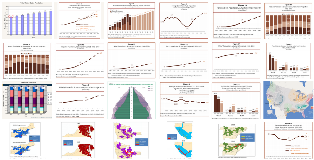
Today vs. 2050
Here is a series of charts visualizing the anticipated demographic changes in the USA over the next 40+ years (via IOTBS).
 |
Blue Marble 2012
Here's is a beautiful mosaic of the Earth from January 2012 based on Suomi NPP images.
 |
| http://www.nasa.gov/images/content/617882main1_VIIRS_4Jan2012-400.jpg |
Rising Cities!
Rising Cities by BigPoint is a (free) urban development and strategy game. Maybe an alternative or complement to SimCity?
 |
| http://www.knowledgegames.net/sites/default/files/images/bigpoint-infographic2.jpg |
Monday, December 23, 2013
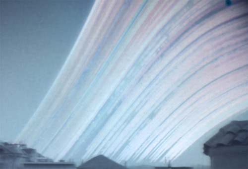
Solargraphs
Seen on IOTBS: solargraphs capture the changing seasonal paths of the Sun across the sky using pinhole photography.
 |
| http://champalicious.com/post/70782347176/12-month-solargraph-winter-solstice-to-winter |
100 Years of Hotness
Nice infographic in the Huffington Post showing the hottest year on-record per state and comparing temperatures in 1913 and 2012 across the U.S.
 |
| http://big.assets.huffingtonpost.com/2013_06_ExtremeTemps.png |
Saturday, December 21, 2013
Want your own drone?
How about the DJI Phantom 2 Vision Personal Drone for $1199. Read the Popular Science review here. Or, get the DJI Phantom 2 and add a Nokia Lumia 1020 set to interval shooting at 3 seconds or so and create 3D terrain models using Structure-From-Motion.
Women's Rights Around The World
This is a well-designed interactive map illustrating women's political rights around the world as a function of time (1893 to 2013). Plus, you can click-on each country to see more demographic information.
Wednesday, December 18, 2013
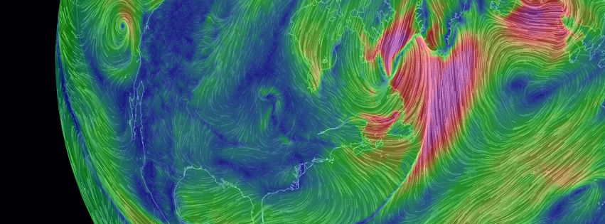
Earth, Wind, and Climate
This is great - a visualization of global weather conditions forecast by supercomputers updated every three hours - you can even select the projection and atmospheric level of interest! We have something similar before in the Wind Map, but that was limited to the United States.
 |
| http://earth.nullschool.net/about.html |
Tuesday, December 17, 2013
Fun!
Here is a fun 3D Paper Globe Template - put that on your tree!
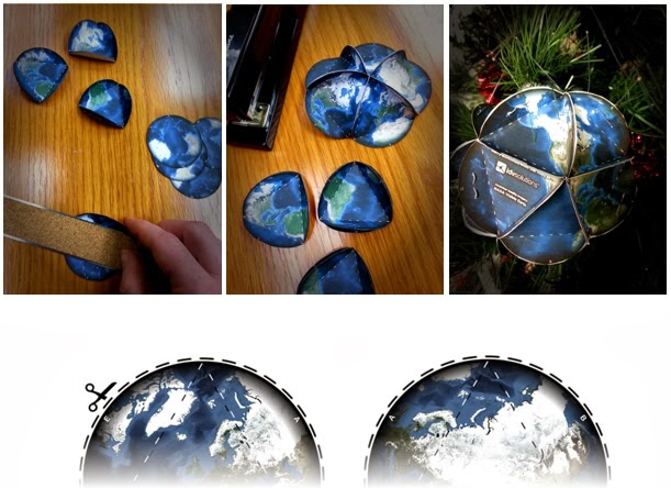 |
| http://uxblog.idvsolutions.com/2013/12/3d-paper-globe-template.html |
Monday, December 16, 2013
3D Printing
Nature ran a nice summary of 3D printing recently - here is a compilation of some of the interesting links mentioned in the article.
- Software for 3D printing: SolidWorks (commerical), ReplicatorG (open-source), Slic3r (open-source), Blender (open-source)
- 3D printing services: Shapeways and Makexyz
- MIT's Fab Central Lab
- MIT OpenCourseWare: How to Make (Almost) Anything
- Need help? Hackerspaces
Saturday, December 14, 2013
Coding!
Yes, sure, we all should be able to write code, aka to write our own computer programs. The hip programming language these days is Python, but that may/will change in the next 10 years. Now what...what programming language should you learn? The obvious answer: it does not matter - what matters are the underlying concepts and structured thinking. So, learn whatever is popular today and be ready for change down the road. Or (gasp!) forget traditional coding, go with something visual, and let someone else worry about how that all looks as 'code'. Here are three examples:
- MIT App Inventor. App Inventor is a cloud-based tool to build apps right in your web browser.
- MIT Scratch. You can 'program' your own interactive stories, games, and animations and share your creations with others in the online community.
- Esri ModelBuilder. Who needs Python when you can automate your workflows with ModelBuilder!
GeoMidpoint
GeoMidpoint is fun: determine the midpoint (or geographic center) between a series of places or determine the place you'll reach by following a bearing for a certain distance.
Geoengineering on the Colbert Report
Fun: Steven Colbert recently talked to David Keith about Geoengineering as Keith was promoting his book A Case For Climate Engineering. Here's the video! Here's a fun introduction to what this is all about. If all that seems rather silly (or insane) to you...that's because it is.
Wednesday, December 11, 2013
216 Feet Sea Level Rise!
Let's assume that all ice on land melted and drained into the oceans - causing 216 feet of sea level rise and with a completely changed geography of the continents as visualized by National Geographic.

NEX-DCP30
The NASA Earth Exchange (NEX) Downscaled Climate Projections (NEX-DCP30) dataset is comprised of downscaled climate scenarios for the conterminous United States that are derived from the General Circulation Model (GCM) runs conducted under the Coupled Model Intercomparison Project Phase 5 (CMIP5) [Taylor et al. 2012] and across the four greenhouse gas emissions scenarios known as Representative Concentration Pathways (RCPs) [Meinshausen et al. 2011] developed for the Fifth Assessment Report of the Intergovernmental Panel on Climate Change (IPCC AR5).
Anyone still awake?
The USGS create the very comprehensive interactive NEX-DCP30 Viewer with maps, graphs, downloadable data tables, and pretty much anything else you can imagine. I suppose the complexity of the issue and the data requires such a complex viewer, but anything that requires studying a (well-designed) tutorial first is probably not going to be all that popular...
Tuesday, December 10, 2013
Sunday, December 8, 2013
Thursday, December 5, 2013
NSA, GPS, and Cellphone Tracking
Nice (and somewhat scary) story in the Washington Post describing how the NSA is tracking cellphone locations around the world - illustrated with an impressive infographic and video. The technology is pretty standard these days (see Find My iPhone app and more), but the scale in terms of geography and data is mind-boggling.
Makeshift Magazine and Infographics
Makeshift is a great print/online magazine covering informal economies with great topics and great illustrations and visualizations. Check out their section on Infographics!
Subscribe to:
Posts (Atom)