Wednesday, December 31, 2014
The Solar System
Here is a fun scale model of the solar system for your computer monitor - just keep on scrolling to the right!
Cambridge (MA)
The GIS website for the City of Cambridge (MA) is about as good as it gets these days:
The Science of Snowflakes
Great video from It's Okay To Be Smart: The Science of Snowflakes (after waiting 15 seconds for the annoying ad to finish).

The Global Language Network
Here is a great project and visualization from the folks at the MIT Media Lab: The Global Language Network. The role and importance of English becomes clear immediately as a connector of people speaking different native languages.
Monday, December 22, 2014
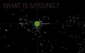
Global View: Climate Change in Perspective
Data viz is going more and more into 3D at the global scale inside your browser: very cool visually and technologically, but not necessarily any more informative. Take Global View: Climate Change in Perspective, for example: what was the point of all this?
Sunday, December 21, 2014
This is Statistics!
Let's be honest: statistics is considered by many of our students as about as interesting as watching C-SPAN and I don't think the current R craze in Higher Education is helping that at all...maybe this can help: This is Statistics
Friday, December 19, 2014

Solstice Streets and the Golden Hour
Two interesting websites/maps here (via Maps Mania):
- Solstice Streets shows you streets that are aligned with sunrise and sunset.
- The Golden Hour shows you day length and sun angle for the year for any location.
Mount Kenya Glaciers
Excellent photography by Simon Norfolk here: Mount Kenya’s Vanishing Glaciers (New York Times Magazine, 18 December 2014).

Thursday, December 18, 2014
Peek and Poke
What could possibly go wrong here? Peek is a gizmo that clips to your smartphone for easy and cheap eye exams. Oto Home by Cellscope turns your smartphone into an otoscope to 'see' if someone has an ear infection.
Wednesday, December 17, 2014
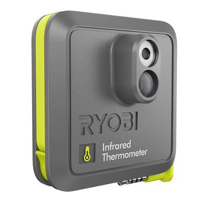
Infrared Thermometer
So you got FLIR ONE for $249.99 (iPhone 5/5s not included) or the Ryobi Phone Works Infrared Thermometer for $49.97.

Tuesday, December 16, 2014
Monday, December 15, 2014
Amherst Public Art Story Map
Amherst Public Art Story Map - a great application of this particular Story Map template (works great on mobile devices).
Living Atlas of the World
Very nice by Esri: The Living Atlas of the World. Many of these maps are accessible without a log-in and therefore quite useful for teaching.
Saturday, December 13, 2014
The World's Ecosystems
Explore the Ecological Tapestry of the World or Explore a Tapestry of World Ecosystems - either way you'll be amazed!
Friday, December 12, 2014
The Brewers
Wired has a nice article about Cindy Brewer - the person behind Color Brewer = the best tool for picking good color schemes. Color Brewer has led to a bunch more 'Brewers' for other map design choices and here's a compilation:

MindMeister
MindMeister is a popular online mind mapping app and offers a free version and reduced-cost versions for education.
Trends and Changepoints
Take the instrumental record and look for trends and changepoints yourself:

- Temperature: Trends and Significance (interactive tool)
- Changepoints in time series
Hipsters!
Young Adults Then and Now is a nice visualization of census data for the Hipster Generation (adults 18 to 34 years old). You can visualize the data as interactive charts, maps, and tables and embed those on websites (see below).
Tuesday, December 9, 2014
Datawrapper
Upload data, make a chart, and share it. Datawrapper is great and the free basic version is very useful.
Monday, December 8, 2014
Adobe After Effects
Adobe After Effects is huge in the animation / motion graphics world and here is a pretty nice basic tutorial from the folks at Video Copilot.
Sunday, December 7, 2014
The Randolph Glacier Inventory 4.0
The Randolph Glacier Inventory 4.0 (1 December 2014) is a global inventory of glacier outlines intended for the estimation of total ice volumes and glacier mass changes at global and large-regional scales.
Landline and Stateline
Landline and Stateline allows our Javascript addicts to create interactive web-based choropleth maps.

Highcharts
Highcharts is a JavaScript charting library written = an easy way of adding interactive charts to websites. Highcharts currently supports line, spline, area, areaspline, column, bar, pie, scatter, angular gauges, arearange, areasplinerange, columnrange, bubble, box plot, error bars, funnel, waterfall and polar chart types. Plus it is free for personal use, education, and non-profits!
Saturday, December 6, 2014
Tools for Web-based Data Viz
Here's a nice viz of data viz tools: Tools and Libraries for Building Web-based Data Visualisations
The History of Web Design
This is great: The History Of Web Design Explained In 9 GIFs. Personally I started with web design ca. 1995 and image maps were cutting-edge back then. Here's the first website I ever created: The Taconite Inlet Lakes Project - A Systems Approach to Paleoclimatology.

Carbon Emissions: past, present, and future
As usual...Carbon emissions: past, present and future – interactive is a great visualization by The Guardian of how CO2 emissions have changed over the last 150 years.
Friday, December 5, 2014
The most unpredictable weather
Interesting analysis by Nate Silver and Reuben Fischer-Baum: Which City Has The Most Unpredictable Weather? The title is, unfortunately, a bit misleading - this study is not really about predictability (as in how well do the weather forecasts match what actually occurred) but rather variability.

Thursday, December 4, 2014
Vertical Farms
This is pretty cool (and scary): how can we create indoor farms so we can grow enough food to feed all people?
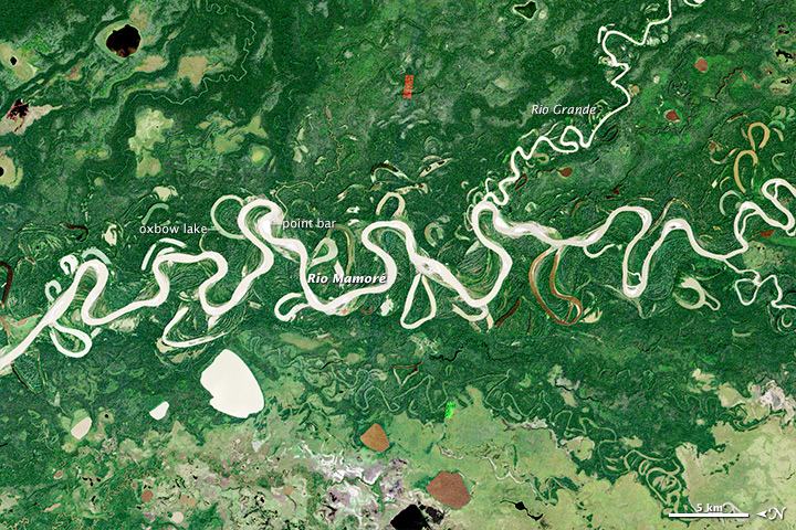
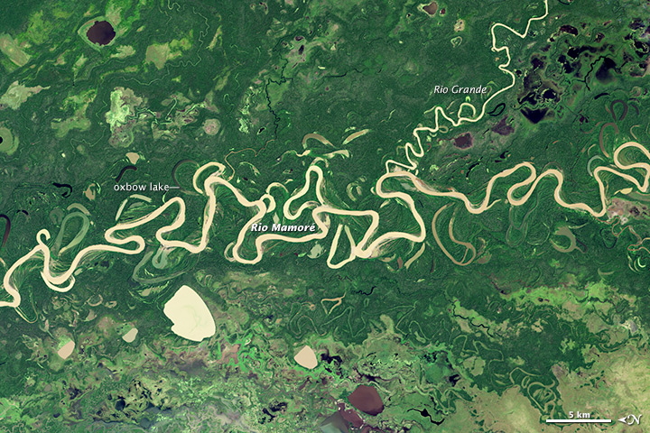
Meandering River
Here is a great image comparison by NASA showing how the course of the Rio Mamore has changed between 1985 (top) and 2014 (bottom). Be sure to look at the image comparison and full-resolution images online!
Wednesday, December 3, 2014
Digital Photography
There are some interesting things out there in terms of digital photography
- Time-Lapse Photography and the Canon Hack Development Kit.
- NIR photography using standard digital cameras using the instruction from Public Lab, Eigen Imaging, or instructables.com.
 |
| http://publiclab.org/wiki/near-infrared-camera |
Monday, December 1, 2014
Open Cities
Open Cities is a project aimed at creating an open data ecosystem for large cities / urban areas in South East Asia as part of the Open Data for Resilience Initiative (OpenDRI). (seen here on Geoawesomeness)

Subscribe to:
Posts (Atom)