- This app / data viz (using R) allows you to compare several colleges and universities side-by-side in terms of student debt, cost, and other variables.
- More mundane (maybe) is the most recent college ranking by the Economist comparing actual vs. expected income after graduation.
Saturday, October 31, 2015
Student Debt and Income
Here are two interesting data viz related to student debt and income:
Food Access Mashup
Here's a simple mashup of data layers relevant to the issue of food access - nothing fancy in terms of analytics, but nevertheless a nice and simple way to tell the story. Maybe more interesting is Community Commons and the online mapping tools included.
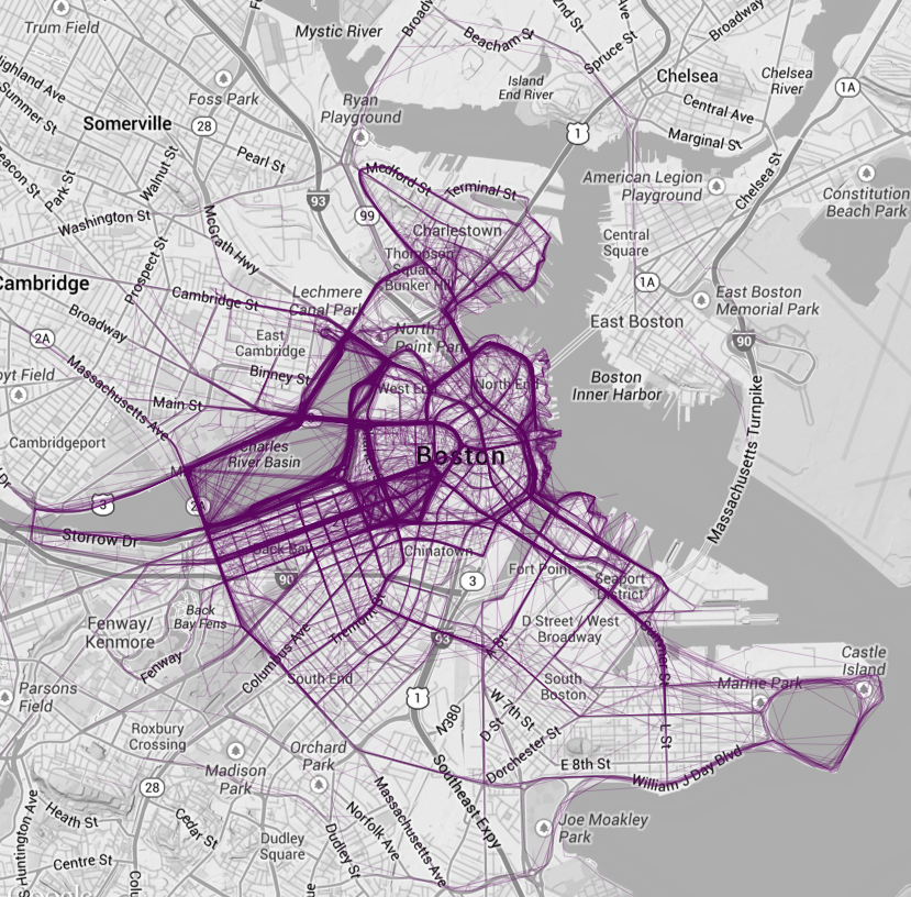
Using CartoDB
CartoDB is one of these hip new online mapping environments and here is a selection of useful resources:
- Using different projections (i.e. no Web Mercator)
- More about projections
- Visualize 2015 Urban Populations with Proportional Symbols (tutorial)
Thursday, October 29, 2015
Mapping Runs
Where People Run in Major Cities is nothing new, but the resultant maps are beautiful. Here's RunKeeper and Strava - these are actually quite useful when looking to discover new areas for trail running and mountain biking.
Of course, you can also have fun with this, for example Running Drawing by Claire Wykoff.
Of course, you can also have fun with this, for example Running Drawing by Claire Wykoff.
Wednesday, October 28, 2015
Refugees in Europe
The flow towards Europe is a pretty amazing map / animation visualizing the origins and destinations of refugees in Europe since 2012. Now combine this detached birds-eye view with a personal narrative illustrated here as a story map in Fleeing Syria for Europe: Safaa's fatal journey and you have a compelling story.
Tuesday, October 27, 2015
Greenland Is Melting Away
Greenland Is Melting Away is nothing new in terms of science, but a great multi-media viz by the New York Times. Here are the direct links to the two videos:
There is also a nice side story about collecting drone footage over the Greenland Ice Sheet at A Drone’s Vantage Point of a Melting Greenland with this video:
Monday, October 26, 2015
Sunday, October 25, 2015
Saturday, October 24, 2015
DSCOVR:EPIC
DSCOVR:EPIC are daily full images of our Earth from space using the EPIC camera flying aboard the Deep Space Climate Observatory (DSCOVR) satellite (read more about it here).
Climate Change is here.
Climate Change is here. is an online special by National Geographic organized into three sections: science, mitigation, and adaptation. As you would expect, the visuals are stunning.
Tuesday, October 20, 2015
Climate Change Calculator
Just in-time for the December UN meeting in Paris comes a nice and simple Climate Change Calculator.
Monday, October 19, 2015
Awesome Data Viz
15 Stunning Data Visualizations is a) a great compilation and b) includes a nice explanation of why a particular data viz is stunning.
The Seasonal Cycle
Nice and simple - just click the Play button and watch the seasons change on County Climate.
Saturday, October 17, 2015
Dropchop
Dropchop.io is a browser-based GIS based on Mapbox and Turf.js (according to Maps Mania). There - that's all I know about it. But it seems pretty cool playing around with it - you can actually perform some pretty sophisticated geospatial analysis.
Friday, October 16, 2015
Global Air Quality in Real-Time
The World Air Quality Index Project provides just that: a global map of air quality in real-time:
Wednesday, October 14, 2015
Sea Level Rise
The folks @ Climate Central are producing some great interactive maps visualizing the impacts of sea level rise on coastal communities in the USA with their Surging Seas analysis. Here is a simplified version as an interactive and embeddable map:
Urban Sprawl Manila 1988 to 2014
NASA produced an interesting image comparison showing urban sprawl around Manila between 1988 and 2014 using Landsat images. Nothing new here, but a nice example of the benefits of a long satellite image archive,
Monday, October 12, 2015
File Conversions
Getting things (i.e. data) from one software to the next used to be much more of an issue...nowadays most software programs have pretty comprehensive import/export options. If all failed - at least for GIS data, there is GPSBabel and now a new online file conversion tool from Golden Software (also free, but requires registration).
Friday, October 9, 2015
Earthquakes in 3D
Nothing really new here, except the earthquake data for the last 100 years is now draped over a 3D globle: One Hundred Years of Seismic Activity. Cool? Yes! Necessary? No!
Thursday, October 8, 2015
Fleeing Syria for Europe
A beautifully-designed and narrated story map: Fleeing Syria for Europe: Safaa's fatal journey
Diabetes and Immigration
Here are two recent interactive data infographics that combine it all: maps, charts, tables, spark lines, etc. - impressive!
But - what's missing: a link to download the data!
Wednesday, October 7, 2015
Urban Density
There is no such thing as a city that has run out of room is a nice and simple data viz by the Washington Post: scroll-down a bit and compare different urban areas around the world.

Rising and Descending Air
Rising and Descending Air
Undercast Timelapse 10-06-15
Good Wednesday morning! Summit intern Adam Gill captured this timelapse footage yesterday afternoon of clouds rising up over the Northern Presidentials, before descending into the Great Gulf and dissipating.
Posted by Mount Washington Observatory on Wednesday, October 7, 2015
Sunday, October 4, 2015
Mapping the USPS
Mapping the USPS Facility Network is pretty disturbing: enter an origin and a destination and see how and where your mail travels as it moves through the USPS network of facilities. I tried, as an example, sending a letter from my home to my office and it traveled 130 miles (compared to the shortest route of 47 miles).
Thursday, October 1, 2015
Subscribe to:
Posts (Atom)