Friday, December 30, 2016
Everything you need to know to start coding web maps
And then there's Part 2: Learn how to code your first web map step by step.
And then there's extra materials, summaries, and source code.
DataMapper Inflight
The (free) DataMapper Inflight app turns a DJI drone into an advanced remote sensing = mapping tool. Now all you need is a drone...

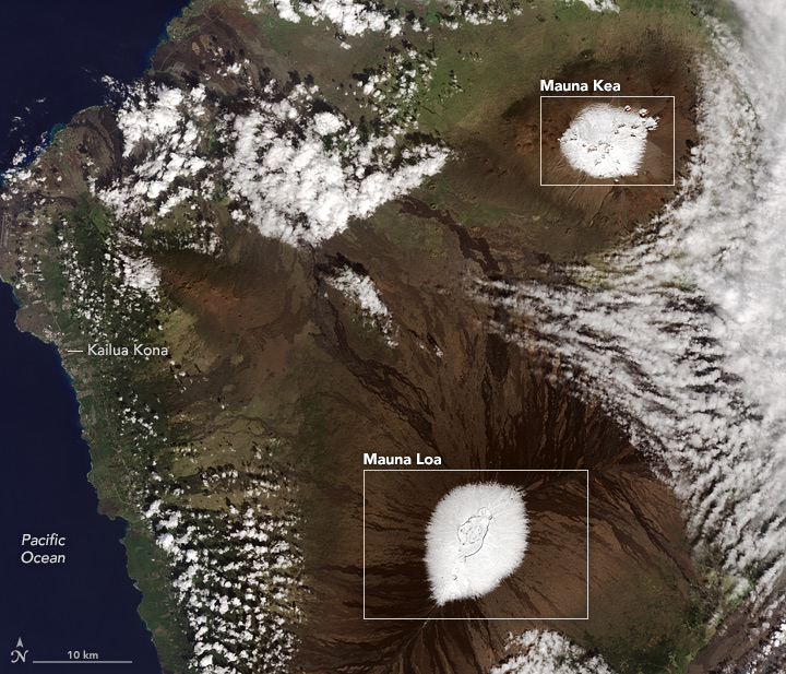
We have Liftoff!
 |
| http://dailyoverview.tumblr.com/post/155120846944/continuing-with-our-favorite-overviews-of-2016 |
Sunday, December 25, 2016

Saturday, December 24, 2016
TED Talks about Maps and Geography
Here is a compilation of the Top 20 most inspiring TED videos about maps and geography. I'll be watching.
Friday, December 23, 2016
The latest on SLR
Michael Oppenheimer and Richard Alley provide some perspective and updated SLR values (Science, 16 December 2016): 184 cm by 2100.
Global Surface Water Explorer
Turns out that there were 2.78 million square km permanent and 0.81 million square km seasonal surface water on Earth in 2015. For more, see the Global Surface Water Explorer (powered by Google Earth Engine).
Wednesday, December 21, 2016
CO2 in the Atmosphere
This new viz of CO2 in the atmosphere is pretty cool, but not all that useful - it lacks any explanation of what we are seeing. More about it here.
Tuesday, December 20, 2016
Climate Change Impacts
Here are several great new websites:
- The U.S. Climate Resilience Toolkit allows you to assess and take action in terms of climate resilience.
- The Climate Explorer provides data and graphs of past, current, and future climate change for any location (Example: Westfield).
- The IMPACT2C web-atlas explores and visualizes the impacts of global warming on tourism, energy, health, water, and more for Europe.
The Probability Cheatsheet
The Probability Cheatsheet is pretty intense, but everything is available on Github. Also nice: the compilation of free data science books.
Sunday, December 18, 2016
How to Talk to a Climate Skeptic
How to Talk to a Climate Skeptic is a comprehensive compilation of the most common arguments 'against' global warming.
Friday, December 16, 2016
World Population Density
This World Population Density map is nicely-done and interactive, displaying population statistics in a pop-up window that adjust to your zoom level.
Thursday, December 15, 2016
Energy, Tectonics, Climate Change, Land Use Change
Teaching earth science to middle school students is challenging for a variety of reasons, so these lesson plans and resources around Energy, Tectonics, Climate Change, Land Use Change should be useful.
The Tectonics module also includes Web GIS investigations and is further discussed in A Curriculum-Linked Professional Development Approach to Support Teachers’ Adoption of Web GIS Tectonics Investigations (Bodzin et al.).
As usual, the authors argue that a) Web GIS is a much better pedagogical tool than 'old' maps or printed worksheets and that b) Web GIS provides an active learning environment as students are able to query and explore hazards near them (as opposed to hazards that they will never experience).
Tuesday, December 13, 2016

Thursday, December 8, 2016
World Population History
World Population History is a rich interactive map starting at 1 CE and ending in 2100. They provide a useful How-To section, Teacher's Resources, and this video:
World Population from Population Education on Vimeo.
World Population from Population Education on Vimeo.
Live Stream Gauges
Live Stream Gauges show real-time stream gauge observations of stage height and discharge as an ArcGIS Online map. Cool, but requires an AGO subscription.
Monday, December 5, 2016
Infrastructure and Electricity
The Washington Post ran a nice article around 6 maps depicting the 'spatial anatomy' of the US infrastructure, including the electrical grid, bridges, pipelines, railroads, airports, and ports/inland waterways. These go nicely with their earlier effort on Mapping how the United States generates its electricity.

ArcGIS and Python
Interesting in the connections between ArcGIS and Python? Programming in ArcGIS with Python – A Beginners Guide is a good place to start.
Friday, December 2, 2016
Nice from Google
Two new apps / tools from Google:
- PhotoScan is a smartphone app that makes it easier to 'scan' documents using your smartphone.
- Data Studio is their new data viz product.
Connectography
Connectography is interesting = how are countries connected? The web map uses Harvard's WorldMap system which is a nice and well-established web mapping platform.
'Mapping' Videos
Video Maps are a new tool to display a YouTube travel video with synchronized Google Maps and Street View. I have seen this before with gps4sport, but that seems to have disappeared.
Thursday, December 1, 2016
Maps into PPT
Yep, you can add editable maps into Microsoft PPT slides - here's a simple tutorial with examples. Or, go big and use ArcGIS Maps for Office.
Tourists vs. Locals
Tourists vs. Locals (or: where people take photos) is another great mapping effort by Eric Fisher. Read more about it here or have a look at Boston.
Four Cool Videos
Here are four fun and useful videos:
- What the Fahrenheit?! by Veritasium tells the story of the Fahrenheit temperature scale.
- Diving Between the Continents by Smarter Every Day dives into the Silfra fracture in Iceland (you can skip the first and last part of the video).
- Earth's History Plays Out On A Football Field 'maps' 4.6 billion years onto 100 yards.
- How Humans Made Malaria So Deadly by MinuteEarth.
Sunday, November 20, 2016
Mapping Nuke Plants
Mapped: The world’s nuclear power plants is a straight-forward interactive web map of what it says it is (and a nice article to go along the map).
Thursday, November 17, 2016
Mapping Every Tree in NYC
Yep, they did that for the New York City Street Tree Map! And: here's London.
Saturday, November 12, 2016
ADC WorldMap Digital Atlas v7.3
Got about $4,000? Then you can purchase the ADC WorldMap Digital Atlas v7.3.
Plotly
Plotly is the beginning of the end for d3 = a simple interface for creating great looking interactive charts. Here's a nice example of what you can do with Plotly - click on the Play with this data! links to look under the hood.
Here's a nice compilation of graphs, charts, and other visualizations created with Plotly in 2015.
Even better: Plotly and R (free online course).
Here's a nice compilation of graphs, charts, and other visualizations created with Plotly in 2015.
Even better: Plotly and R (free online course).
Thursday, November 10, 2016

Sunday, November 6, 2016
Top-19 Geoviz Tools for Web Maps
These Top-Lists are always a bit 'questionable', but he offers a nice compilation at Top 19 geovisualization tools, APIs and libraries that will let you create beautiful web maps.
Tilegrams looks fun!
Tilegrams looks fun!
Sunday, October 30, 2016
Sunday, October 23, 2016
Saturday, October 22, 2016

Treasure Maps
Treasure Maps look like fun (and maybe even useful for teaching) - more about it on Maps Mania.
TanDEM-X DEM
The TanDEM-X DEM appears to be the highest-resolution DEM available for free at 12 m posting. The data seems to be free, but require a proposal - lame.
Friday, October 21, 2016
1850 to 2016
Here's a nice example of a small-multiples infographic design: global temperature changes from 1850 to 2016.


The Global Hunger Index 2016
The Global Hunger Index 2016 combines an interactive map, traditional report, and easily accessible data back to 2006.
The Waldseemueller Map from 1507
Seen on Maps Mania: An interactive version of Martin Waldseemüller's 1507 map 'Universalis Cosmographia' (very cool!).
The US Energy Mapping System
The US Energy Mapping System is a nice interactive map of all kinds energy-related across the country - you can get/download the data for each of the electricity-generating stations or explore/download the data at the state-level.
Tuesday, October 18, 2016
And therein lies the problem.
 |
| http://dotearth.blogs.nytimes.com/2016/10/17/todays-climate-progress-and-tomorrows-climate-challenges/ |
Monday, October 10, 2016
Lecture Capture with YouTube Live Streaming
Interesting: How to Use YouTube Live Streaming for Free Lecture Capture, especially if captures the sound (your lecturing) using the built-in mic adequately.
Sunday, October 9, 2016
Saturday, October 8, 2016
Mental Modeler
Mental Modeler looks great - maybe a combination of concept mapping and a modeling environment such as Stella II - great for collaborative work on 'wicked' problems. More here:
Falling Prices For Clean Energy
6 Charts that Will Make You Optimistic About America’s Clean Energy Future is a nice PR piece from the U.S. Department of Energy.

Friday, October 7, 2016
Tuesday, October 4, 2016
The Rap Guide to Climate Chaos
By Baba Brinkman
- Fossil Fuel Ballers (feat. Aaron Nazrul)
- What's Beef (feat. Bill Nye)
Sunday, October 2, 2016
The US Electric Grid (in real-time)
This is super-cool: U.S. Electric System Operating Data as an interactive map and charts, plus data download. I would appreciate a little tutorial on what is displayed.
Saturday, October 1, 2016
Teaching Climate Change With Models And Games
Bush et al. (2016) provide a nice compilation of models and games one can use when teaching climate change.
The Food Access Research Atlas
The Food Access Research Atlas by the USDA is great for mapping and data access down to the census tract level. It takes a little to get used to the lingo, but that's just the nature of federal data.
Census Data Mapper
The Census Data Mapper is pretty simple and seems to only work at the county level, but it is a quick way to look at census data across the country, grab the data into a MS Excel spreadsheet, and export the map into a PDF.
STEM and GIS in Higher Education
Here we have the perfect combination: STEM and GIS in Higher Education and Esri is all in with a nice Story Map and an associated e-Book.

Thursday, September 29, 2016

Air Pollution Map and Data
Global ambient air pollution by the WHO is the map and you can download the data by city and country as a MS Excel spreadsheet.
Saturday, September 24, 2016
Landsat Thematic Bands Web Mapping Application
Esri's Landsat Thematic Bands Web Mapping Application has been out for a while, but apparently it was enhanced to allow for custom band combinations. Now if it would also allow some basic band-ratios and thresholds, then you could map snow and ice with it!
Thursday, September 22, 2016
Do you see it?
Nice presentation (29:35 minutes) by Cole Nussbaumer Knaflic on using contrast when communicating with data: Do you SEE it? The power of CONTRAST
About Pies
Nice talk (~25 minutes) by Robert Kosara on pie charts: Pie Charts – Unloved, Unstudied, and Misunderstood.
Wednesday, September 21, 2016
Germany's Power Sources
Well, here it is: Power sources in Germany (not all that impressive I think).
Monday, September 19, 2016

Sunday, September 18, 2016
MyShake
Crowd-sourcing global earthquake data using the smartphone app MyShake seems a bit sketchy, but MyShake: Initial Observations from a Global Smartphone Seismic Network was just published in GRL.
Similar approaches have been used for crowd-sourcing air temperature and air pressure data using smartphones.
Similar approaches have been used for crowd-sourcing air temperature and air pressure data using smartphones.
Friday, September 16, 2016
How to Georeference a map and serve it in ArcGIS Online is just that - a nice tutorial on how to do that and quite useful if you have older or rarer topographic maps or aerial photographs. A nice example are these historic USGS maps of New England and New York: high-quality scans, but not really usable in a GIS unless you georeference them.
Mississippi River Watershed
More animations here: The Rivers of the Mississippi Watershed
 |
| http://flowingdata.com/2016/09/16/mississippi-drainage/ |
Thursday, September 15, 2016
Air Pollution Viz for US Cities
What would US cities look like today if the Clean Air Act had not been passed some 40 years ago? Have a look at What If We Never Changed?
Wednesday, September 14, 2016
Baton Rouge Flooding August 2016
Nice use and example of a story map: Baton Rouge Flooding August 2016
iSeeChange
iSeeChange is a crowd-sourcing initiative to document the impacts of global warming = a community-based journal or almanac of weather, climate, and associated real-world changes. Now they partnered with NASA and together released the iSeeChange Tracker iOS app (Android to follow soon).

Tuesday, September 13, 2016

Sunday, September 11, 2016

Saturday, September 10, 2016
Traffic Crashes
Fatal crashes along your route lets you map traffic crashes across the country for different years (2011-2015) as a function of your travel route and contributing factors such as alcohol, speeding, etc.
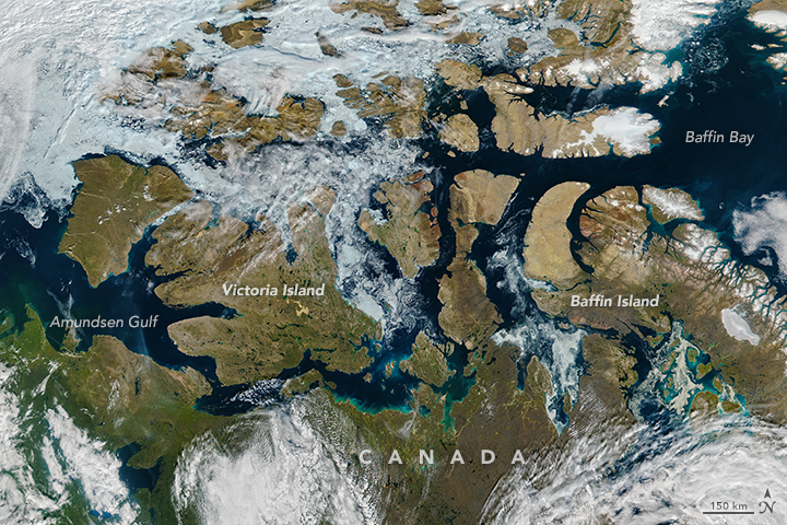
Now that's a braided river!
 |
| http://dailyoverview.tumblr.com/post/150130010474/glacial-melting-and-flooding-occurs-every-year-by |
Facebook Friendships
This is not new and I don't know if that underlying data are updated, but Interactive: Mapping the World's Friendships is really fun to explore.
It would make a great activity for a Cultural Geography class, especially when you compare social media friendships with, for example, migration and immigration patterns. This 3D migration visualization by Google Trends does not visualize actual immigration, but rather Google searches of the word migration in various countries.
Now compare that to actual data and you have a great research project.
Thursday, September 8, 2016
Comma Chameleon
Comma Chameleon is a simple CSV file editor, but I have to admit: I'm not really sure what its great advantage is over say MS Excel or Google Sheet.
Wednesday, September 7, 2016
The Earth Science Literacy Principles
I had seen the Earth Science Literacy Principles, but I was not aware of the corresponding YouTube videos and Teaching Resources. See GeoEd Trek for more!
Boom to Bust
Boom to Bust by Enigma Labs is a well-designed Story Map showing the rise and fall of oil and gas exploration in North Dakota.
Programming Language Network
This is pretty fun: an interactive network map of programming languages and how they are related/connected, also viewable as a function of language paradigm.
Monday, September 5, 2016
Reusable Learning Objects
Reusable Learning Objects (or RLOs) are a new and hip term in the world of online and flipped learning = narrated PowerPoint lectures 'enhanced' with interactive features and assessment tools. Lame.
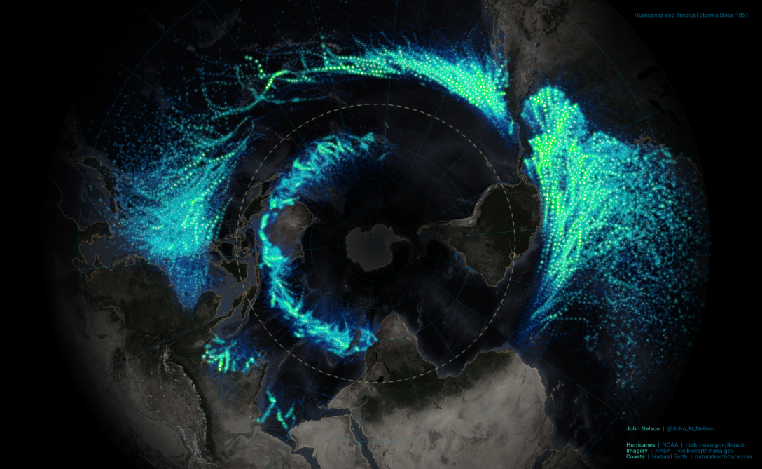
Atlantic Hurricanes 1950-2014
Hurricane and tornado data are very appealing for data viz: you got time, space, strength, etc. and you can viz all that in various ways. The challenge is complexity = how to viz all that in a simple and intuitive way. Atlantic Hurricanes 1950-2014 and Reported Tornadoes from 1950-2015 are both nicely-executed in Tableau.
Saturday, September 3, 2016
Global Forest Watch
Global Forest Watch offers rich interactive maps, country data profiles, and more related to forest loss, fires, commodities, climate, and water.
Friday, September 2, 2016

The Evergreen Data Visualization Academy
I'm a big fan of Stephanie Evergreen and her data viz / MS Excel tutorials. Got $600 per year? Join the The Evergreen Data Visualization Academy!
Wednesday, August 31, 2016

Tuesday, August 30, 2016
Out-Of-State Students
Every college and university loves out-of-state students - they pay much more in tuition and fees and are thus aggressively recruited. The NYT has mapped and analysed these student migration patterns across the country.


Map for Environment
Map for Environment uses OpenStreetMap and citizen activism to monitor environmental destruction 'hidden' from view, for example deforestation, road construction, etc. This is similar to the HOT Team and their mapping efforts in response to natural disasters or political crisis.
Here's an example: Logging Roads in the Congo.
Here's an example: Logging Roads in the Congo.
Sunday, August 28, 2016
Friday, August 26, 2016
Income and Educational Attainment
How Your School District Compares (The Upshot, NYT) is a simple scatter plot of all US school districts: parents' income on the x-axis and the educational attainment on the y-axis. The conclusion is obvious. Search for your school district and compare yourself to the rest of the country.
Energy Flow Charts
These Energy Flow Charts by the LLNL are great (and depressing): we are essentially wasting just under 60 percent of all our energy. Explore them yourself for different years, states, and countries.


Coastlines of Boston
Coastlines of Boston compares 1788, 1898, and 2016 in a simple and clean web map.
Wednesday, August 24, 2016
Explain this to me!
Can you explain something (for example that the ozone hole does not cause global warming) using only the 1,000 most used words in the English language? Try it using Up-Goer Five Text Editor.
Warm Regards
Warm Regards is a nice podcast series about climate and climate change - great for listening in the car or in the gym. Examples:
Better Maps, Tables, and Charts
This is great: animated GIFs and slide decks showing you step-by-step how to make maps, charts, tables look better.


Tuesday, August 23, 2016
Noticing and Wondering
She is a bit full of herself, but her message can be applied across many topics and disciplines.
Monday, August 22, 2016

Mapping Patterns Across Space
UX Patterns for Maps presents a series of examples on how to map spatial patters using maps - very useful and instructive!
Mapping Migrations
Migrations In Motion maps-out how species will (probably) have to migrate due to climate change.
Wednesday, August 17, 2016
Where our food crops come from
Where our food crops come from is a nice interactive map and flow diagram depicting the geographic origins of our food crops.
Cesium
Cesium is an open-source JavaScript library for world-class 3D globes and maps and New York 3D Tiles is a cool demo of its capabilities.
Monday, August 15, 2016
Zugspitze 360
The technology behind Zugspitze 360 is not new, but it is still cool, especially when you know the climb!
Sunday, August 14, 2016
Climate Games
Or (better): role-play simulations about climate change adaptation. The New England Climate Adaptation Project (NECAP) offers science-based role-play simulation for each of their four partner municipalities: Barnstable, Massachusetts; Dover, New Hampshire; Wells, Maine; and Cranston, Rhode Island at https://necap.mit.edu/role-play-simulations.
Saturday, August 13, 2016
Thursday, August 11, 2016
Exporting Graphs from Excel
Sure, copy/paste works great, but what about if you need higher resolution for printing? Exporting Graphs from Excel by Stephanie Evergreen has the answers!
Indoor Mapping: The Met
Indoor mapping is pretty cutting-edge today and The Met Navigator is a nice example. Now all we need to add is a) indoor location tracking and b) augmented reality for a truly immersive experience.
Sunday, August 7, 2016
CalTopo and PDF Quads
Friday, August 5, 2016
Scrollytelling
Scrollytelling is a way to narrate stories (online). Take, for example, the new Esri Story Map Cascade template. Sure, you can include maps, but this template is really less about maps than about other (cool) embedded media. How To Scroll offers some useful tips for effective scrollytelling.
Robert Kosara is not a fan and explain why in The Scrollytelling Scourge. Instead he favors 'The Stepper' layout (example).
Robert Kosara is not a fan and explain why in The Scrollytelling Scourge. Instead he favors 'The Stepper' layout (example).
Tuesday, August 2, 2016
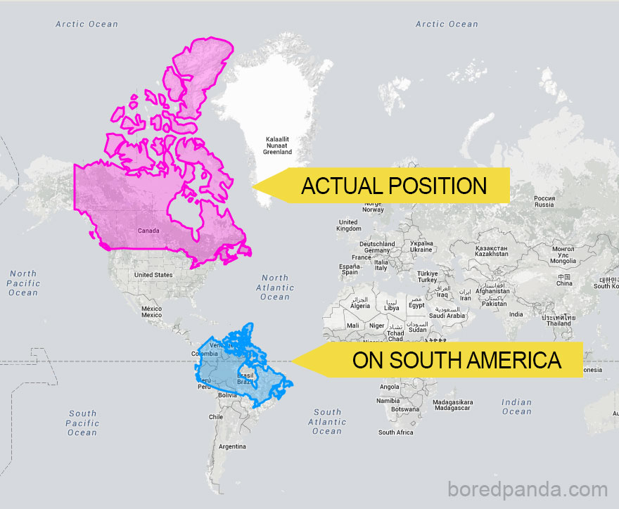
All World Maps Lie
Okay, we know that All World Maps Lie. So Which One Should We Use? The article offers three choices: Winkel Tripel, Gall-Peters, and Dymaxion (see below).


Sunday, July 31, 2016
Saturday, July 30, 2016
Climate Spirals and Climate Lines
Climate Spirals have gotten popular, so here is a nice comparison showing the same data as spiral charts and line charts. More about this here.


Tuesday, July 26, 2016


Monday, July 25, 2016
The NMC (New Media Consortium) Horizon Report 2016 Higher Education Edition is out and identifies six key trends, six significant challenges, and six important developments in ed-tech that are relevant for higher education.
Now, it is important to recognize the sources here: this report is a collaboration between the NMC and EDUCAUSE which are both in-essence lobbying groups promoting the use of ed-tech in teaching and learning. (Related: would this pass the CRAP test?)
Still, these type of reports can be used as a framework to ask: which of these topics are we addressing or discussing @ Westfield State? Below is the table of contents from the report (via Laura Guertin @ GeoEd Trek):
Key Trends Accelerating Technology Adoption in Higher Education
Long-Term Impact Trends (5+ Years)
Advancing Cultures of Innovation
Rethinking How Institutions Work
Mid-Term Impact Trends (3-5 Years)
Redesigning Learning Spaces
Shift to Deeper Learning Approaches
Short-Term Impact Trends (1-2 Years)
Growing Focus on Measuring Learning
Increasing Use of Blended Learning Designs
Significant Challenges Impeding Technology Adoption in Higher Education
Solvable Challenges
Blending Formal and Informal Learning
Improving Digital Literacy
Difficult Challenges
Competing Models of Education
Personalizing Learning
Wicked Challenges
Balancing Our Connected and Unconnected Lives
Keeping Education Relevant
Important Developments in Educational Technology for Higher Education
Time-to-Adoption Horizon (1 Year or less)
Bring Your Own Device (BYOD)
Learning Analytics and Adaptive Learning
Time-to-Adoption Horizon (2-3 Years)
Augmented and Virtual Reality
Makerspaces
Time-to-Adoption Horizon (4-5 Years)
Affective Computing
Robotics
 |
| http://hackeducation.com/2015/12/01/trends |
Saturday, July 23, 2016
Mercator Projection Examples
Nothing too original, but nice examples of how our view of the world is distorted by the Mercator projection. My favorite:

WRI Water Stress and Risk Maps
This is almost too much: a Web GIS with interactive dashboards showing global water risk indicators. All data are available for download and further analysis: very cool! Some additional information about the maps and data are here.
- Aqueduct Water Risk Atlas (WRI)
- The Water Risk Filter (WWF)
Friday, July 22, 2016
Thursday, July 21, 2016

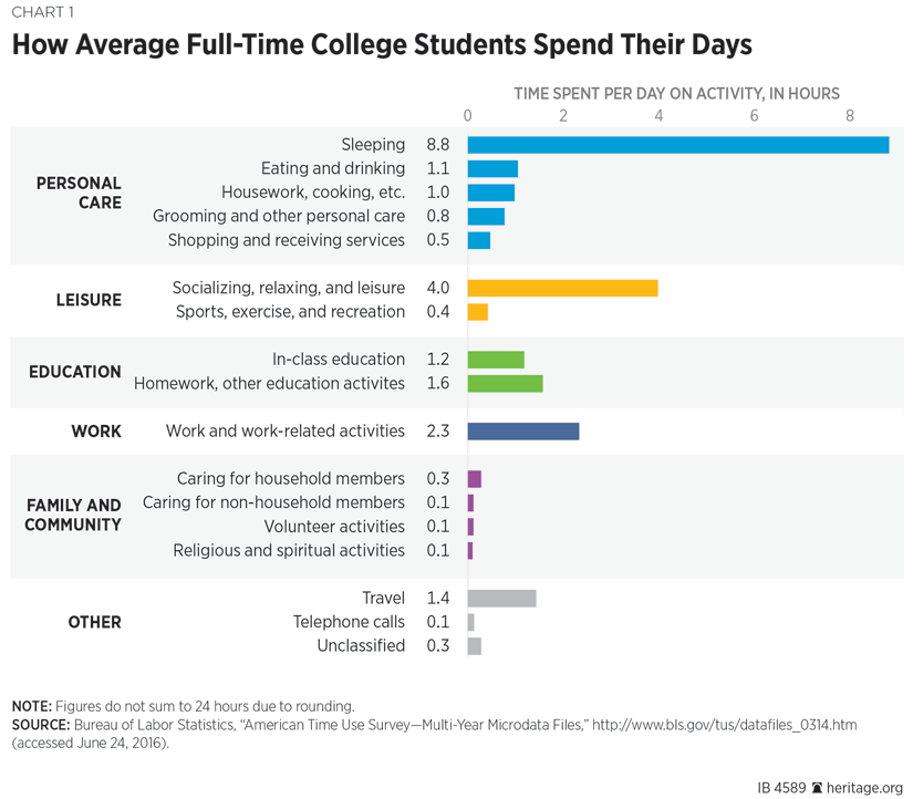
Average Student, Average Day
Details here: Big Debt, Little Study: What Taxpayers Should Know About College Students’ Time Use (consider the source!)

HERE Reality Lens
HERE Reality Lens makes total sense: why just drive around a car to take 360 degree still images when you can also add a LiDAR system / laser ranger finder to generate an instant 3D model = the first step towards Augmented Reality. Read more about it here or try the app for ArcGIS.
 |
| http://geoawesomeness.com/here-reality-lens/ |
Wednesday, July 20, 2016
Pivot Tables in MS Excel & Google Sheets
Pivot tables (and cross tabulation) in MS Excel are great for exploring and analyzing data, but a) people seemed to be scared of them and thus b) nobody uses them.
A great place to start is the nice tutorial Saving Time And Energy With Pivot Tables by Anne K. Emery (also available via Learn Excel: An In-Depth, Thorough Tutorial (With GIFs) in the Intermediate and Advanced Techniques section).

A great place to start is the nice tutorial Saving Time And Energy With Pivot Tables by Anne K. Emery (also available via Learn Excel: An In-Depth, Thorough Tutorial (With GIFs) in the Intermediate and Advanced Techniques section).
Also great: How to get data in the right format with pivot tables. This tutorial shows you how to use pivot tables to reformat tables from 'long' to 'wide' - see the animated GIF below.
Tuesday, July 19, 2016
Time To Choose
Time to Choose is the latest climate change documentary. I don't know anything about it, but here's the announcement / promotion from Popular Science.
Monday, July 18, 2016
The FOSS4G Academic Curriculum
Well, why not? The FOSS4G Academic Curriculum and associated open-source tools are great, but have one major flaw: the world is dominated by Esri products and therefore any responsible academic program has to include them in an appropriate way.
Food Insecurity and Climate Change
Food Insecurity and Climate Change is a well-designed interactive map / modeling scenario to visualize vulnerability to food insecurity around the world based on different emission scenarios, adaption measures, and time horizons.
They provide a nice tutorial, video animation, and you can save and download your maps (see example below).

They provide a nice tutorial, video animation, and you can save and download your maps (see example below).

Saturday, July 16, 2016
The ArcGIS Book
Esri's The ArcGIS Book is a great and free tutorial in 10 chapters - available online and as a PDF document for download.
Now Esri Press came-out with the Instructional Guide for The ArcGIS Book and that makes sense. What does not make sense is to charge $59.99 for it! Come-on Esri: it makes no sense to give-away the tutorial for free and then charge a hefty amount when you want to use it effectively for teaching and learning.

Now Esri Press came-out with the Instructional Guide for The ArcGIS Book and that makes sense. What does not make sense is to charge $59.99 for it! Come-on Esri: it makes no sense to give-away the tutorial for free and then charge a hefty amount when you want to use it effectively for teaching and learning.
The Smithsonian Learning Lab
The Smithsonian Learning Lab looks like an excellent resource to gain entry into the vast collection of, well, the Smithsonian. They provide a well-written Help, Getting Started, and For Teachers section.
Friday, July 15, 2016
Annual Temperature Cycle for the USA
This is simple and elegant and useful for exploring these patterns across time and space: Average maximum temperature from 1979 to 2011
Animated Weather Maps
So, these are NOT new, in-fact I compiled a bunch of them about one year ago at Currents in the Air, Ocean, and Lakes, but here we go:
- It all started with the US wind map by the folks at HINT.FM.
- Then we got earth and that is still one of the best: different atmospheric levels, 2D/3D, and different projections.
- Windyty is all that, but also includes the forecast models.
- VENTUSky is more of the same (albeit in 2D), but includes some additional variables.
- MeteoEarth, finally, seems to be similar to VENTUSky, but in 3D.
Who will win the presidency?
Who will win the presidency? by FiveThirtyEight is about as real-time as it gets...
Five Years of Drought
Five Years of Drought is a nice mapping example and tutorial by John Nelson using data from the US Drought Monitor. Or, play around with the already processed data.

Virtual / Augmented Reality in Education
Sure, both Virtual Reality (VR) and Augmented Reality (AR) are pretty hip topics these days in education...especially in Higher Education with the obvious goal to make online learning more 'realistic' and thus appealing to a greater number of potential 'students' (aka customers). Here are some useful sources related to VR and AR:
Here's the future when AR 'blends' with real reality.
HYPER-REALITY from Keiichi Matsuda on Vimeo.
- Kathy Schrock has a nice compilation and discussion of tools and resources at Virtual Reality in the Classroom and at Augmented and Virtual Reality in the Classroom.
- Audry Watters offers a much more critical view and history at (Marketing) Virtual Reality in Education: A History.
- Still - let's be honest: VR is cool and The Garden as a Story Map and in Virtual Reality is a great example.
- Wearables in Education looks at some of the current tools available.
Finally, Virtual Worlds and Augmented Reality for STEM Labs and teaching (STEM) labs online - that's for many the 'Holy Grail' of online education = finding a way to outsource these resource-intensive science labs for non-science majors that - let's be real - nobody actually cares about.
HYPER-REALITY from Keiichi Matsuda on Vimeo.
Thursday, June 30, 2016
World Births and Deaths, Simulated in Real-Time (Beta)
World Births and Deaths, Simulated in Real-Time (Beta) is pretty neat and nicely illustrates that more people are born than die...hence world population is rising. What's missing is a clear description of the data sources and methods/assumptions underlying this simulation.
Wednesday, June 29, 2016
How to Extract Media from Slide Decks
Who knew - here's how to 'hack' MS PowerPoint: How to Quickly Extract Media from Slide Decks
Tuesday, June 28, 2016
Blistering Future Summers
Blistering Future Summers (embedded below) is a nice way to better understand what global warming will 'feel like' for us. The basic approach is not new, see, for example The Changing Northeast Climate Our Choices, Our Legacy by the Union of Concerned Scientists.
Wednesday, June 22, 2016
Yeah Science!
Good read: Science Education, Millennial Workers, and the Mad Skillz Gap
My favorite quote: The paradox of students feeling confidence but lacking skills may be partly the result of our toxic culture of unearned self-esteem, where effusive praise for mediocre achievements mixes with the haunting dread that some child, somewhere, might not feel like a champion all the time.
My favorite quote: The paradox of students feeling confidence but lacking skills may be partly the result of our toxic culture of unearned self-esteem, where effusive praise for mediocre achievements mixes with the haunting dread that some child, somewhere, might not feel like a champion all the time.
Tuesday, June 21, 2016
The Ultimate Spreadsheet Dashboard
So you have a bunch of spreadsheets in whatever format (MS Excel, Google Sheets, CSV) and now can connect them all and make pretty charts using Spreadsheet Dashboards by Datadeck. See The Ultimate Spreadsheet Dashboard for more information.
60 Years of Urban Change
60 Years of Urban Change is simple and elegant: 1) take the earliest available aerial of a city, 2) take a recent aerial of the same area, and 3) and combine them in a cool slider window - done.
Monday, June 20, 2016
Mapping Cities
Reba et al. (2016) Spatializing 6,000 years of global urbanization from 3700 BC to AD 2000 is great, but even better when mapped in a variety of ways at Watch as the world’s cities are born one-by-one over 6000 years.
Sunday, June 19, 2016
Thursday, June 16, 2016
How Tax Brackets Work
How do tax brackets work? is a great interactive graph: select your state, use the slider to set your total income, and see what happens. Well-done!
Earth From Space
Via Maps Mania: here are three nice ArcGIS Online web maps of photographs taken from the ISS.
Wednesday, June 15, 2016
Global Warming Since 1850
Less 'cool' than the Temperature Spiral, but nicely done (using the same data):
 |
| https://www.reddit.com/user/cavedave |

Monday, June 13, 2016
Sankey Diagram
Acquire’s Sankey Diagram Generator is a fun and useful online tool for creating Sankey Diagrams. I found it helpful to Load an example data set to figure-out some of the terms and nomenclature. How to make a Sankey Diagram explains what they are and how to make them.
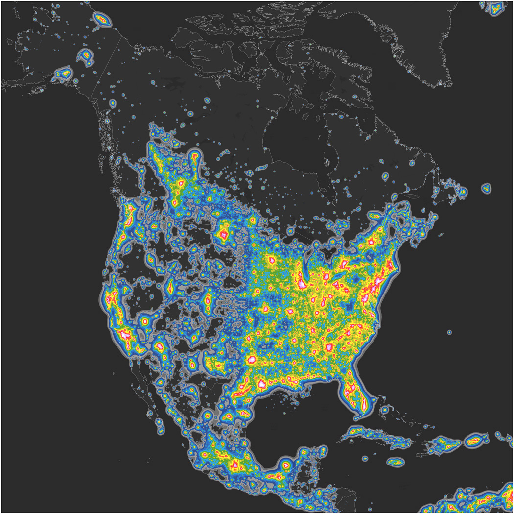
Light Pollution Mapping
Here we have a new paper by Falchi et al. (2016) The new world atlas of artificial night sky brightness and the associated 2D map and 3D globe.

Friday, June 10, 2016
Geological CCS
This idea has been around for a while: can we inject CO2 into the ground and wait for it to turn into calcium carbonate? In other words: mineral carbonization. Of course we can, but this geological process is considered far too slow to be useful for operation CCS as a mitigation strategy.
But, maybe not - at least for localities with suitable geology: Rapid carbon mineralization for permanent disposal of anthropogenic carbon dioxide emissions (Science, 10 June 2016).
Here's the science news version GEO-INJECTION SYSTEM CAN TURN CARBON DIOXIDE INTO STONE and the video.
But, maybe not - at least for localities with suitable geology: Rapid carbon mineralization for permanent disposal of anthropogenic carbon dioxide emissions (Science, 10 June 2016).
Here's the science news version GEO-INJECTION SYSTEM CAN TURN CARBON DIOXIDE INTO STONE and the video.
Turning Carbon Emissions to Stone from Earth Institute on Vimeo.
Who lives where?
'Raw' demographic data does not really tell the story of who actually lives in a particular area. Now we have Esri and CartoDB essentially competing for your attention (and business):
Thursday, June 9, 2016
Learning R
Natan Yau of FlowingData has some of the best tutorials/courses on using R for data visualization. You'll need to become a member, but that should be a very worthwhile investment.


Wednesday, June 8, 2016
How-To: Hurricane Map
How-To: Hurricane Map is a great little tutorial (complete with all the needed data) to make the map below using ArcGIS. Try it!
Tuesday, June 7, 2016

Smarter Every Day
Smarter Every Day is yet another great YouTube channel devoted to exploring science and technology.
Monday, June 6, 2016
The Cat in the Hat Knows a lot about Data Visualization
Brilliant video by Cole Nussbaumer Knaflic. This one is good as well: Declutter Your Data Visualizations
Sunday, June 5, 2016
Khan Academy and the Effectiveness of Science Videos
Khan Academy and the Effectiveness of Science Videos (embedded below, start at 07:00 minutes if you are in a hurry) makes some well-known points regarding learning in-general: it's our misconceptions and preconceptions that get in the way of learning.
The author (Derek Alexander Mueller) also runs a YouTube Channel called Veritasium with great science learning videos, for example:
The author (Derek Alexander Mueller) also runs a YouTube Channel called Veritasium with great science learning videos, for example:
- 13 Misconceptions About Global Warming
- Climate Change is Boring
- Scientific Notation - Explained!
- Scientific Notation - Example
- The Truth About Toilet Swirl - Southern Hemisphere
- The Truth About Toilet Swirl - Northern Hemisphere
- The Truth About Toilet Swirl - Both Hemispheres
- This Will Revolutionize Education
Friday, June 3, 2016
What if we burned all the fossil fuels we have?
This is not a 'new' question and here are some studies and answers:

- The climate response to five trillion tonnes of carbon (Nature Climate Change, May 2016).
- If We Dig Out All Our Fossil Fuels... (New York Times, 8 April 2015).
- The Alberta oil sands and climate (Nature Climate Change, February 2012).

Subscribe to:
Posts (Atom)