Wednesday, April 29, 2015
Monday, April 27, 2015
Learning GIS Programming
Well - students typically don't want to hear it: programming skills are critical if you are seriously thinking of a GIS career. A good place to start is Learning GIS programming: An overview or GIS Programming: Languages breakdown from the folks at Geoawesomeness.

Saturday, April 25, 2015

Friday, April 24, 2015
David Rumsey Map Collection
This is not new, but still very cool: the David Rumsey Map Collection includes 10,000s of historical maps and images and a selection are available georeferenced via Google Maps.
Closer to home, here are the Historic USGS Maps of New England & NY.
Closer to home, here are the Historic USGS Maps of New England & NY.
Odyssey.js by CartoDB
Odyssey.js by CartoDB is a nice way to create story maps - an alternative if you will to Esri Story Maps - give it a try using this tutorial.
Thursday, April 23, 2015
Wednesday, April 22, 2015
The biggest story in the world
The biggest story in the world is - according to The Guardian - global climate change and they are are covering as a series of 12 podcasts:
- Keep it in the ground (for 2 degrees)
- An angle (on divesting)
- The targets (of divesting)
- The risks (of divesting)
- The economics (of the carbon bubble)
Tornadoes: Before and After
Here are three great visualizations of the devastation caused by tornadoes:

Tuesday, April 21, 2015
The word 'classroom' is verboten!
Designing good space for teaching and learning is really not that complicated...How To Design The Googleplex Of Schools
 |
| The Learning Stairs |
Drones are out, Doves are cool!
3-5 m resolution and global coverage every day: Doves by Planet Labs - sign me up for that! Read more about it here.


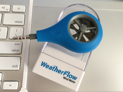
Let's measure wind speed!
Here are three ways that you can measure wind speed with your smart phone:
- Vaavud wind meters
- WeatherFlow Wind Meter
- The Wind Meter app (use the 'volume' of wind on the microphone)

The Bolshaya Talda earthflow (1 April 2015)
Read more about it here: The Bolshaya Talda earthflow in Russia was a mine waste failure (The Landslide Blog, AGU).
Sunday, April 19, 2015
Spaces & Places - Mapping Science
Spaces & Places - Mapping Science is about mapping in the broadest sense: how can we best visualize scientific information? These science maps do not necessarily use traditional geographic coordinate space, but use spatial context and relationships to make data visible. In other words: they are serious infographics.

PLACE
This one has all the buzz words: Place-based Landscape Analysis and Community Engagement (PLACE) - A Community Education Program for Vermont Towns. I don't know if they are still active, but this could be a model / framework to use.
USGS topoView
Saturday, April 18, 2015
A Year of CO2
Same data, different viz: video, interactive 2D map, and interactive 3D map.
A Year of CO2 by NASA (see video below) is a great visualization of how CO2 travels around the globe. We always simplify these processes and assume that CO2 concentrations are constant across the globe as the atmosphere is well-mixed. As with many things in nature - this assumption is both reasonable when looking at the big picture, but incorrect when you look at the details of the atmosphere.
The website linked above includes regional close-ups and you can download the videos in a variety of formats. Or, you can view this as an interactive map (by Oregon State University) that allows you to zoom-in and pan around the world.
Or, watch and explore Earth's CO2 as a 3D animation draped over a 3D interactive globe.
Tuesday, April 14, 2015
Rivers and streamflow
Hydro Hierarchy is pretty cool, especially the connections and interactions between the radial chart and the map.
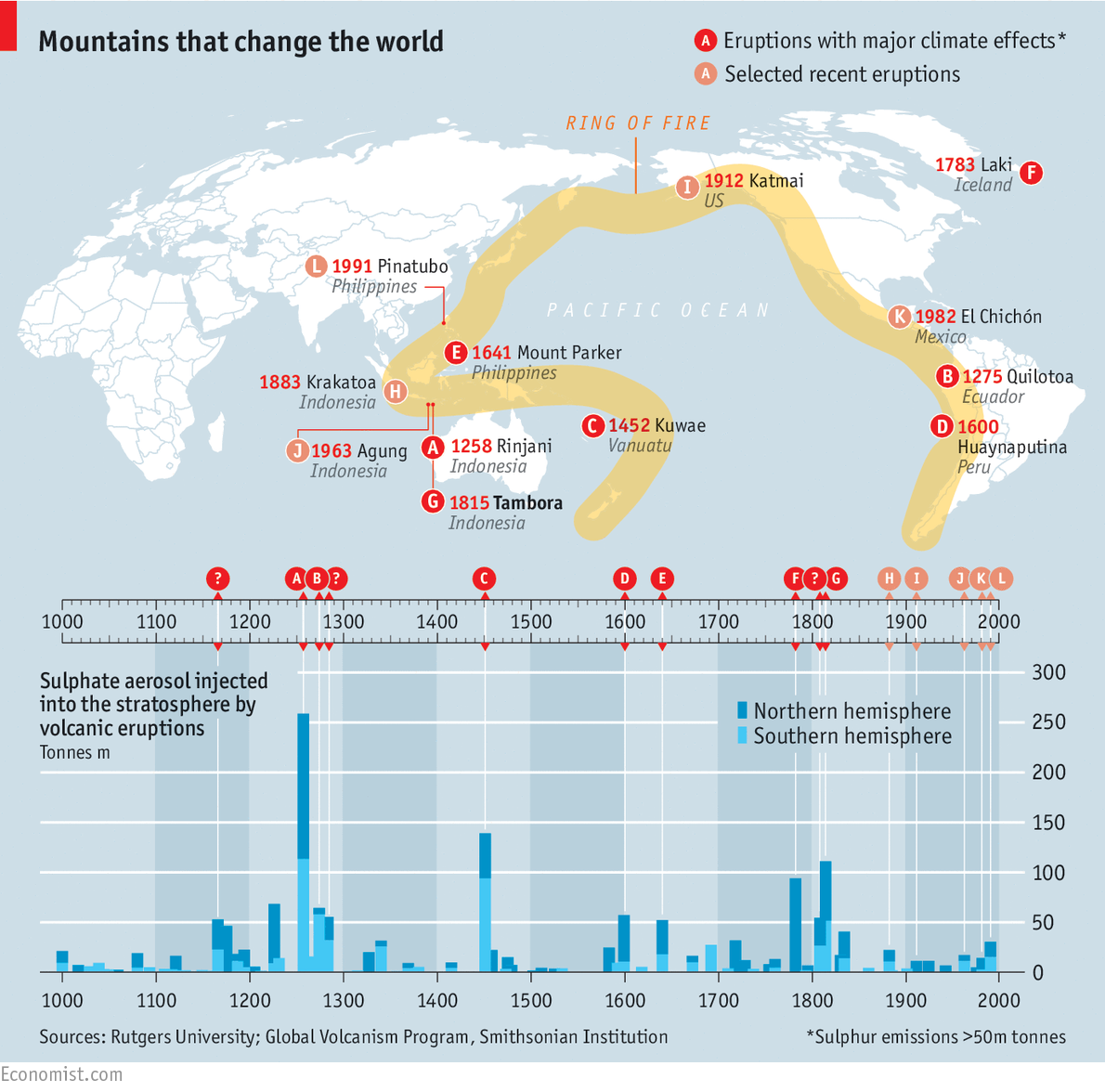
Volcanoes and Climate
The 200th anniversary of the Tambora eruption led to a whole series of articles, visualizations, etc. on the connections between volcanic eruptions and climate change, for example After Tambora (The Economist).
There may be some weird 'motivated reasoning' here: learning about these catastrophic natural events and processes that are out of our control probably makes us feel less responsible for the consequences of our cumulative actions that we do have full control over.
There may be some weird 'motivated reasoning' here: learning about these catastrophic natural events and processes that are out of our control probably makes us feel less responsible for the consequences of our cumulative actions that we do have full control over.
 |
| http://www.economist.com/ |

The drone stole my smartphone!
Google may be developing self-driving cars, but how about a self-flying drone!
Saturday, April 11, 2015
Drone Panoramas
Why not: shoot panoramic scenes from a drone and you get Drone Panoramas. Next: add a LiDAR sensor and/or do SFM to generate 3-D panoramas.
Thursday, April 9, 2015
Energy Literacy
Energy Literacy is a useful resources from the US Department of Energy:
- A series of 8 short videos illustrating 7 essential energy principles
- Lesson plans and other materials for educators
- Energy 101 course framework
- Energy 101 videos
- Energy Education Toolbox (more resources for education)
Wednesday, April 8, 2015
Food and Water
Create your own dinner (or breakfast, or lunch) and see how much water was used in producing your food: Food Water Footprint (LA Times)
The Yale Climate Opinion Maps
The Yale Climate Opinion Maps is basically the open-access version of their forthcoming paper in Nature Climate Change. If you don't like their mapping or data viz: download the data and try it yourself!
 |
| http://environment.yale.edu/climate-communication/ |
Tuesday, April 7, 2015
Monday, April 6, 2015
Augmented Reality Sandbox
Looking for a fun project? How about building yourself an augmented reality sandbox! This would be great for teaching the concept of topography and contour lines.
- Augmented Reality Sandbox by Oliver Kreylos at UC Davis
- Instructions
Free GIS Data
It's difficult to keep these compilations current and up-to-date, but here are two good ones:
- Free GIS Data by Robin Wilson
- GIS Data Repository by Karen Payne
Saturday, April 4, 2015

Mount Everest
Scaling Mount Everest is a nice infographic that lets you climb the mountain (from bottom to top or vice versa) on your screen. Two similar approaches for visualizing depth or height: How Big Is Space and Journey to the Centre of the Earth.
Thursday, April 2, 2015
To PPT or Not?
This is one of these classic debates: should you provide your lecture slides to your students? The advantages are obvious, but so are the potential problems. Well, here we have a paper: Worthington and Levasseur (2015) To provide or not to provide course PowerPoint slides? The impact of instructor-provided slides upon student attendance and performance. Interestingly, they found no impact on class attendance, but an adverse impact on exam performance - presumably since the availability of the lecture slides led to decreased emphasis on note-taking during class.
I want it all!
And - for $60 per year - you can get Amazon Cloud Drive Unlimited Everything and to get you hooked you get 3-months for free. Time to throw-out these external hard disks!

Wednesday, April 1, 2015
Mapping CO2 Emissions
This map is quite interesting: Where carbon emissions are greatest is essentially a map of population density, urbanization, and industrialization, but even the major oceanic shipping routes are visible!

Subscribe to:
Posts (Atom)