An assortment of fun and useful things found somewhere in the cloud.
Wednesday, September 30, 2015
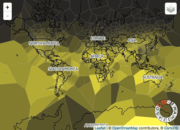
Wikipedia's Climate Data on an Interactive Map
This map/visualization was quite popular this week: Wikipedia's Climate Data on an Interactive Map. I still think these Voronoi maps are ugly and the map seems a bit wonky - I can't figure-out the month wheel. The animated GIFs are fun:
No comments:
Post a Comment