Interesting Stuff Online
An assortment of fun and useful things found somewhere in the cloud.
Thursday, December 20, 2018
Housing and Income
Esri created two nice web maps / apps looking into housing across in the country in terms of a) availability and b) affordability:
Affording the American Dream?
(simple web map)
Affording the American Dream?
(immersive Story Map
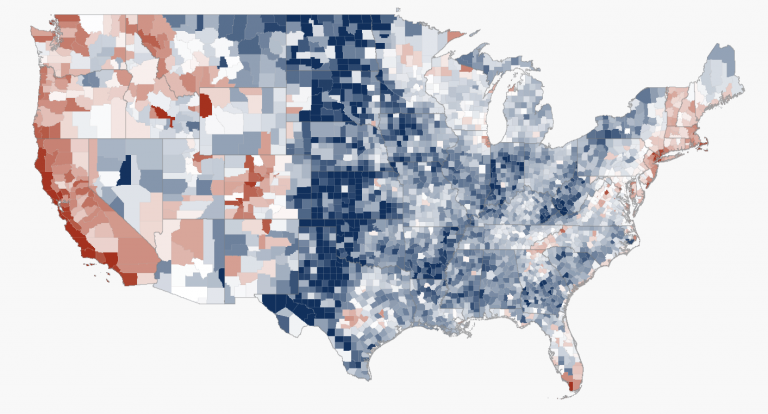
The map
below is more simplistic: the blues show higher housing affordability and reds show lower housing affordability.
Esri
No comments:
Post a Comment
Newer Post
Older Post
Home
Subscribe to:
Post Comments (Atom)
No comments:
Post a Comment