This GIF is pretty cool (source):
And then there is: Real Country Sizes Shown on Mercator Projection
Sunday, December 23, 2018
Friday, December 21, 2018
The Fourth National Climate Assessment
In case we needed more data and evidence:
- NCA4 - Volume I (Science)
- NCA4 - Volume II (Impacts, Risks, Adaptation)
The whole things presented as an Esri Story Map (also embedded below): Hot Numbers.
Thursday, December 20, 2018
Housing and Income
Esri created two nice web maps / apps looking into housing across in the country in terms of a) availability and b) affordability:
- Affording the American Dream? (simple web map)
- Affording the American Dream? (immersive Story Map
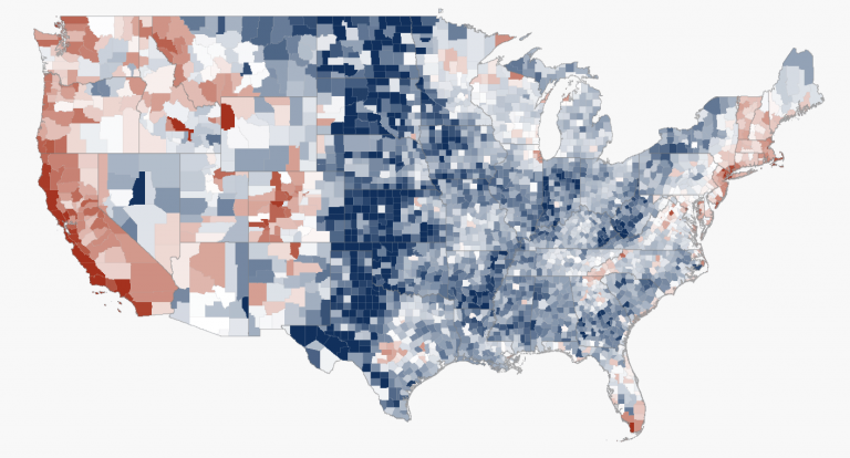
The map below is more simplistic: the blues show higher housing affordability and reds show lower housing affordability.
 |
| Esri |
Tuesday, December 18, 2018
2013-2017 AHR Map
2013-17 Top Ancestry or Hispanic or Racial Group with AA Estimate Multimap by Census Tract
Zoom-in: this is fascinating!
Zoom-in: this is fascinating!
The Equal Earth Wall Map
The Equal Earth Wall Map is for schools, organizations, or anyone who needs a map showing countries and continents at their true sizes relative to each other. Africa appears 14 times larger than Greenland as it actually is.
Sunday, December 16, 2018
The Red Cross/Crescent Climate Centre - Games
Who knew: The Red Cross/Crescent provides a series of excellent games and instructional resources to learn about climate change and its impacts @ https://climatecentre.org/resources-games/games.
Thursday, December 13, 2018
Wednesday, December 5, 2018
So warm werden die Sommer
So warm werden die Sommer is similar to 1001 Blistering Future Summers, but global (which is great) and in German (which is not great).
Tuesday, December 4, 2018
Subscribe to:
Comments (Atom)
