Nothing new, but worth watching: map projections, choosing the right map, etc.
Wednesday, August 31, 2016
Tuesday, August 30, 2016
Out-Of-State Students
Every college and university loves out-of-state students - they pay much more in tuition and fees and are thus aggressively recruited. The NYT has mapped and analysed these student migration patterns across the country.
Map for Environment
Map for Environment uses OpenStreetMap and citizen activism to monitor environmental destruction 'hidden' from view, for example deforestation, road construction, etc. This is similar to the HOT Team and their mapping efforts in response to natural disasters or political crisis.
Here's an example: Logging Roads in the Congo.
Here's an example: Logging Roads in the Congo.
Sunday, August 28, 2016
Friday, August 26, 2016
Income and Educational Attainment
How Your School District Compares (The Upshot, NYT) is a simple scatter plot of all US school districts: parents' income on the x-axis and the educational attainment on the y-axis. The conclusion is obvious. Search for your school district and compare yourself to the rest of the country.
Energy Flow Charts
These Energy Flow Charts by the LLNL are great (and depressing): we are essentially wasting just under 60 percent of all our energy. Explore them yourself for different years, states, and countries.
Coastlines of Boston
Coastlines of Boston compares 1788, 1898, and 2016 in a simple and clean web map.
Wednesday, August 24, 2016
Explain this to me!
Can you explain something (for example that the ozone hole does not cause global warming) using only the 1,000 most used words in the English language? Try it using Up-Goer Five Text Editor.
Warm Regards
Warm Regards is a nice podcast series about climate and climate change - great for listening in the car or in the gym. Examples:
Better Maps, Tables, and Charts
This is great: animated GIFs and slide decks showing you step-by-step how to make maps, charts, tables look better.
Tuesday, August 23, 2016
Noticing and Wondering
She is a bit full of herself, but her message can be applied across many topics and disciplines.
Monday, August 22, 2016
Mapping Patterns Across Space
UX Patterns for Maps presents a series of examples on how to map spatial patters using maps - very useful and instructive!
Mapping Migrations
Migrations In Motion maps-out how species will (probably) have to migrate due to climate change.
Wednesday, August 17, 2016
Where our food crops come from
Where our food crops come from is a nice interactive map and flow diagram depicting the geographic origins of our food crops.
Cesium
Cesium is an open-source JavaScript library for world-class 3D globes and maps and New York 3D Tiles is a cool demo of its capabilities.
Monday, August 15, 2016
Zugspitze 360
The technology behind Zugspitze 360 is not new, but it is still cool, especially when you know the climb!
Sunday, August 14, 2016
Climate Games
Or (better): role-play simulations about climate change adaptation. The New England Climate Adaptation Project (NECAP) offers science-based role-play simulation for each of their four partner municipalities: Barnstable, Massachusetts; Dover, New Hampshire; Wells, Maine; and Cranston, Rhode Island at https://necap.mit.edu/role-play-simulations.
Saturday, August 13, 2016
Thursday, August 11, 2016
Exporting Graphs from Excel
Sure, copy/paste works great, but what about if you need higher resolution for printing? Exporting Graphs from Excel by Stephanie Evergreen has the answers!
Indoor Mapping: The Met
Indoor mapping is pretty cutting-edge today and The Met Navigator is a nice example. Now all we need to add is a) indoor location tracking and b) augmented reality for a truly immersive experience.
Sunday, August 7, 2016
CalTopo and PDF Quads
Friday, August 5, 2016
More Scrollytelling
Want to do some scrollytelling? Here are three options:
Scrollytelling
Scrollytelling is a way to narrate stories (online). Take, for example, the new Esri Story Map Cascade template. Sure, you can include maps, but this template is really less about maps than about other (cool) embedded media. How To Scroll offers some useful tips for effective scrollytelling.
Robert Kosara is not a fan and explain why in The Scrollytelling Scourge. Instead he favors 'The Stepper' layout (example).
Robert Kosara is not a fan and explain why in The Scrollytelling Scourge. Instead he favors 'The Stepper' layout (example).
Tuesday, August 2, 2016
All World Maps Lie
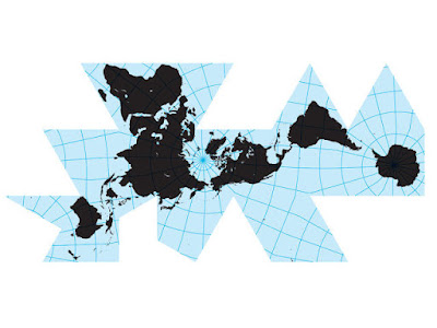
Okay, we know that All World Maps Lie. So Which One Should We Use? The article offers three choices: Winkel Tripel, Gall-Peters, and Dymaxion (see below).


Subscribe to:
Comments (Atom)


