Sunday, March 29, 2015
Mapping your Email!
Immersion by MIT will map your Email connections for you - have a look at the demo (pretty cool!). Now here's the real question: will anyone actually do this and hand-over their Email to these three dudes from MIT?
Gloucester Harbor
Here is a great example of a detailed sonar (i.e. underwater) DEM spy-glassed underneath a regular bathymetric map with a series of place marker for places of interest: Gloucester Harbor
Saturday, March 28, 2015
Rivers Dams 1800 to 2002
This is a very nice presentation by the folks from CartoDB: Mapping the spread of dams in the US. Also included is a map of dams per state, maps in major watersheds, and a risk assessment map for all dams.
North Dakota Inverted!
Very cool from TheUpshot: What North Dakota Would Look Like if Its Oil Drilling Lines Were Aboveground
Superfund Sites
How close are you to a Superfund site is a simple and effective interactive web map. The interactive charts and graphics below are also quite interesting.
Urban Trees
Street trees in urban environments are a popular topics these days in urban planning and development and the NYT produced Nine Cities That Love Trees - tree maps for New York City, Philadelphia, Austin, Detroit, Washington D.C., Baltimore, Portland, Tampa, and Pittsburgh.
China's Supercaves
The title is typical 'sensational' for National Geographic, but the 3-D laserscanning technology and storymap visualization used are very impressive: China's Supercaves
Friday, March 27, 2015
Reasons For The Seasons
I'll be honest - I can't figure-out what to do with this: Reasons For The Seasons is a Google Earth KML animation, presumably to learn about the reasons for the seasons.
Thursday, March 26, 2015
Earth Quiz
Earth Quiz is pretty cool: you can become a teacher and add your own sites, questions, hints, and media.
The Future of Visualization
This is pretty interesting:
Sunday, March 22, 2015
Landsat 8 on AWS and more
Landsat and Amazon were in the mapping news this week as the USGS and NASA are now making Landsat 8 data freely-available to anyone via the Amazon Cloud. Here's more from Jill Clark at Spatial Reserves: Landsat 8 Data Now Available on Amazon AWS - looks like the actual spectral bands are available, plus the metadata.
Here are two interesting Landsat 8 maps (via Maps Mania):
Here are two interesting Landsat 8 maps (via Maps Mania):
- Landsat 8 creates a complete mosaic of the Earth every 16 days. Of course that does not mean that the image that your are interested in is actually usable - clouds are always an issue.
- Landsat live is as close as you can get to a real-time picture of the entire Earth. Again, as before, your place of interest may be under clouds...just wait 16 days!
Saturday, March 21, 2015
NASA Vital Signs of the Planet
NASA Vital Signs of the Planet is a nice and concise website around the facts of climate change: evidence, cause, effects, consensus, vital signs, and FAQ.
Thursday, March 19, 2015
Data.gov
Data.gov is the home of the U.S. Governments' open data and pretty cool. For example, consider the Aquifers dataset with all the download options and excellent metadata. You can even open the data directly into Plotly and CartoDB.
Wednesday, March 18, 2015
Mapping with MS Excel
This was just a matter of time...Esri Maps for Office has been around for a while and now we have Power Map Preview for Excel 2013 from Microsoft. Aleks Buczkowski has a quick little tutorial over at Geoawesomeness.
Tuesday, March 17, 2015
Twine 2.0
Twine 2.0 is an "open-source tool for telling interactive, nonlinear stories" aka story games. Anastasia Salter has a post over on ProfHacker Making Story Games with Twine 2.0 and Dan Cox has nice Twine 2.0 Tutorial series on YouTube.
Wind History Map
Wind History is an interesting visualization of the prevailing wind speeds and directions at stations across the United States from 2006 to 2010. Here, for example, is KBOS (Boston Logan International).
QGIS Demo
Nothing fancy here, just a nice mapping demo using QGIS:
Saturday, March 14, 2015
Science Mapping
Nature has a nice article by Mark Zastrow Data visualization: Science on the map as part of their Toolbox section featuring scientific software, app, and online tools. The focus is perhaps too much on TileMill and CartoDB, but still a worthwhile read.
Zaption
With Zaption you can edit and annotate online videos to make them more of a higher-order learning experience (read a review here). A campus license for 200 faculty and 6,000 students runs $5,731. Of course, there are other free options such as Vidbolt and VideoANT that do the same thing but without the built-in learning analytics.
ViziCities
ViziCities is (yet another...) 3D urban visualization platform and free and open source and global. Get the pre-release on Github!
Cool Maps!
Labels:
ArcGIS Online,
Cities,
Esri,
Food,
Maps,
Planning,
Web Mapping
Tuesday, March 10, 2015
25 Maps that will change...
We've seen these maps and compilations before, but still fun to watch for 2:50 minutes:
It's hot out west!
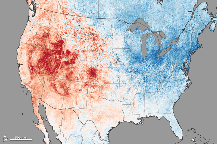
This will become a real issue for the folks in Nevada, California, etc. this summer...lack of snow, lack of water, fire, etc. More here from NASA.
Monday, March 9, 2015
Sunday, March 8, 2015
Friday, March 6, 2015
Remote Sensing Teaching Materials
This may be useful: The FIS Project (teaching materials for problem-based learning using remote sensing - more information).
EdGIS
EdGIS is a free website with free geotools for teaching and learning, for example:
More here: Tech-Enabled Field Studies
FAOSTAT
FAOSTAT is the Statistical Division of the Food and Agriculture Organization of the United Nations: data, interactive graphs, and maps - a great resource!
QGIS
That's nothing new - QGIS is a very capable open-source alternative to Esri - actually, in practice, probably the only realistic way to avoid Esri products as MapWindow seems to be stalling these days.
- Full QGIS Training Manual (includes PostgreSQL and PostGIS) - also available in print.
- QGIS Uncovered (excellent 25-part video tutorial by Steven Bernard)
Thursday, March 5, 2015
Natural Graphics
Natural Graphics produces Natural Scene Designer - a 3D mapping program. It's pretty inexpensive and they also sell the necessary DEM data.
indiemapper and Natural Earth
Free mapping tools and data: indiemapper is a simple and free tool to make maps inside your browser and Natural Earth provides excellent public domain vector and raster data. Plus, consider this compilation of free GIS data for all 50 US States.
Hail in the US
US Hail an animated heat map showing the distribution of hail across the USA between 1955 and 2013 - very cool and using all the currently hip tools.
Tuesday, March 3, 2015
Monday, March 2, 2015
Subscribe to:
Comments (Atom)


