Two noteworthy things about this one: 1) uses a global data set and 2) can show you very localized cities - not just the big ones.
Tuesday, July 16, 2024
Climate Twins (again)
Here's another Climate Twins web app: What will climate feel like in 60 years?
UHI + Global Warming Map
Nice web app showing the UHI + Global Warming across 65 U.S. cities at the block group level:
- Urban Heat Hot Spots in 65 Cities.
- Details and more information (+ the data) here: https://www.climatecentral.org/climate-matters/urban-heat-islands-2024
Friday, July 12, 2024
Thursday, July 11, 2024
The John Snow Map
The first 'modern' map perhaps, depicting the spatial relationship between cholera cases & drinking water supply in 1854 in London. Here are two great ways to explore it:
The interactive web app is nice, but also an example of how much more data viz and data storytelling you can do with an Esri Story Map.
SAR Imagery from Sentinel-1
SAR 'imagery' is great, but very different from the imagery that we are used to seeing from digital cameras or satellites. Now Esri offers us the Sentinel-1 Explorer to let us see the SAR data - cool!
Tuesday, July 9, 2024
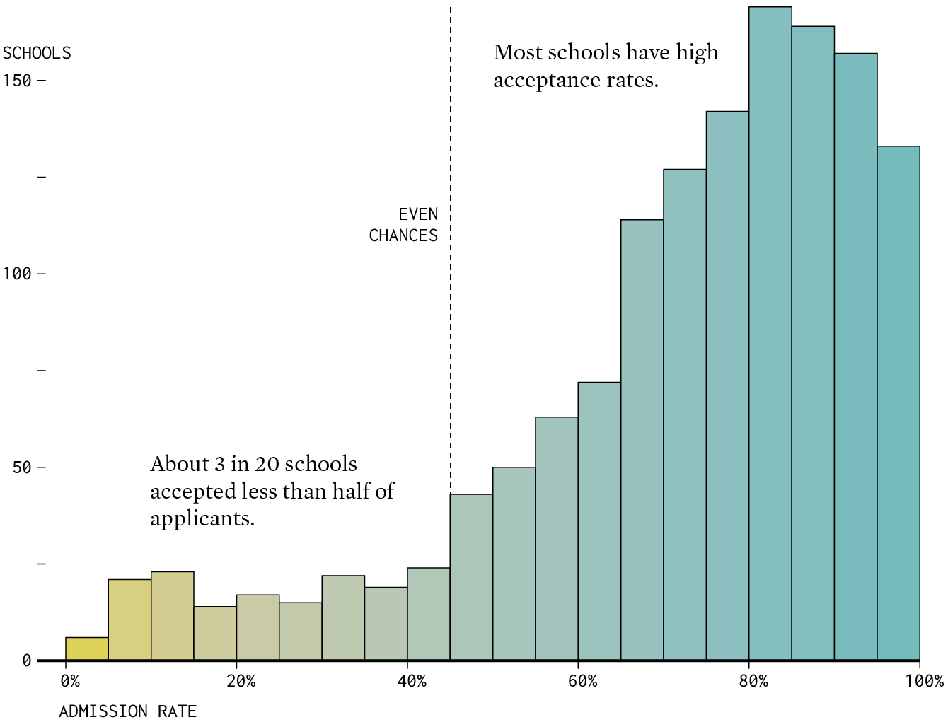
College Admission Rates
Nice data viz from Flowing Data: College Admission Rates for Where You Went to School. Here's the data in-case you want to try your own data viz: https://collegescorecard.ed.gov/data/.
2050 Ecosystems Projections
From Esri: We have developed a set of global layers at 1 km resolution for projections of terrestrial ecosystems in 2050 and compared them to today’s ecosystems to learn what could change.
Thursday, July 4, 2024
The National Risk Map (by FEMA)
This web map is great @ https://hazards.fema.gov/nri/map
- Show the different types of risks and their associated costs.
- Show by country or by census tract.
- Show vulerabilty & resilience.
- Nice data download option @ https://hazards.fema.gov/nri/data-resources
But, FEMA - please: your color ramps are terrible!
Wednesday, July 3, 2024
Monday, July 1, 2024
Subscribe to:
Comments (Atom)


