Friday, July 31, 2020
Thursday, July 30, 2020
How risky do you like it?
This is pretty interesting: COVID-19 Event Risk Assessment Planning Tool. Here you can adjust your 'event' size and then see, county-by-county, the probability that a COVID-19 positive individual will attend. Let's see: for Westfield State (assume 1,000 people in Hampden County) we get 96 percent or higher.
Wednesday, July 29, 2020
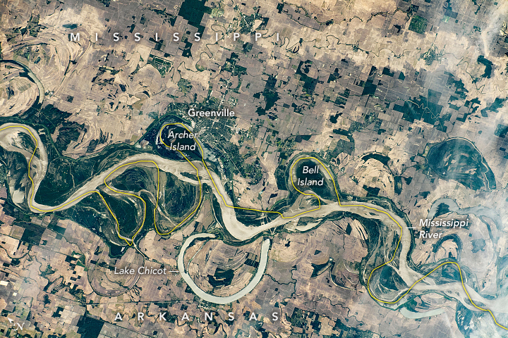
13,000 years or earlier?
I find this scientific question fascinating: when did people reach the Americas? 13,000 years ago is the 'accepted' date, based on the opening of a land passage between the Cordilleran and Laurentide Ice Sheets. But that date is not as certain as it may sound, plus the formation of an ice-free corridor does not mean people immediately followed it. Then there's the idea that people traveling via boats along the shore maybe as early as 16,000 years ago.
Below a map from Source 1 below showing the current evidence - interesting!
Below a map from Source 1 below showing the current evidence - interesting!
- Evidence grows that peopling of the Americas began more than 20,000 years ago (Nature, 222 July 2020).
- Tools suggest people reached Americas early (Science, 24 July 2020)
Tuesday, July 28, 2020
The USA: Locals vs Tourists
Or, rather, by attractions listed on Tripadvisor and split between what Local vs Tourists think of these attractions: Travel-Like-A-Local.
Monday, July 27, 2020
ArcGIS Experience Builder
Imagine a story map and a web app combined themselves somehow and you get the ArcGIS Experience Builder (I think). Details are a bit fuzzy, but there are several tutorials to get you started: Try ArcGIS Experience Builder.
NCSE Climate Change Summits
The NCSE Climate Change Summits are well-designed role-playing games. The 2019 edition revolved around dam renovation and the 2020 edition is called: How would you use $100,000 to mitigate climate change?
Sunday, July 26, 2020
Two good videos on nuclear energy
Here are two short videos worth watching:
Look, here's the thing about nukes and energy: a) tell me how you are going to finance it to make it affordable and b) tell me what you are going to do with the waste. Then you will realize that there much better options already available.
Thursday, July 23, 2020
UN FAO Data Portal
Have a look: https://data.apps.fao.org/
I'm just not into these map-based (or now 3D) search interfaces: too complicated, too slow, too much. Give me a nice scrollable list and a well-developed text-based search tool.
I'm just not into these map-based (or now 3D) search interfaces: too complicated, too slow, too much. Give me a nice scrollable list and a well-developed text-based search tool.
Wednesday, July 22, 2020
Monday, July 20, 2020
Thursday, July 16, 2020
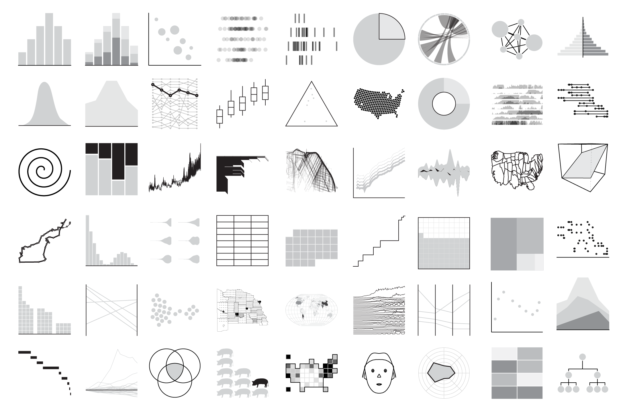
Chart Chooser / Chart Types
FlowingData cataloged all the chart types - not really a chart chooser, but a nice way to find information and resources about specific chart types: Cataloging All the Charts
Flooding
Two great interactive data viz related to flooding:
- How is flooding affecting your community? gives all kinds of cool embedded maps comparing flood risk in 2020, 2035, and 2050. Many you can embed in your website or create an animated GIF (see below).
- Flood Factor is simple: just enter your address and see your flood risk.
Land Cover: Yesterday, Today, and Tomorrow
And - finally - here is a nice compilation of land cover data as part of Esri's Living Atlas of the World:
- 1992 - 2018 (measured)
- 2050 (predicted)
The SDGs Today
Nice website (sponsored by Esri): The SDGs Today @ http://sdgstoday.org/. Here you can see and download the data related to the 17 SDGs.
Related to that: Esri also compiled the ArcGIS Living Atlas Indicators of the Planet (same basic idea).
Related to that: Esri also compiled the ArcGIS Living Atlas Indicators of the Planet (same basic idea).
Wednesday, July 15, 2020
Monday, July 13, 2020
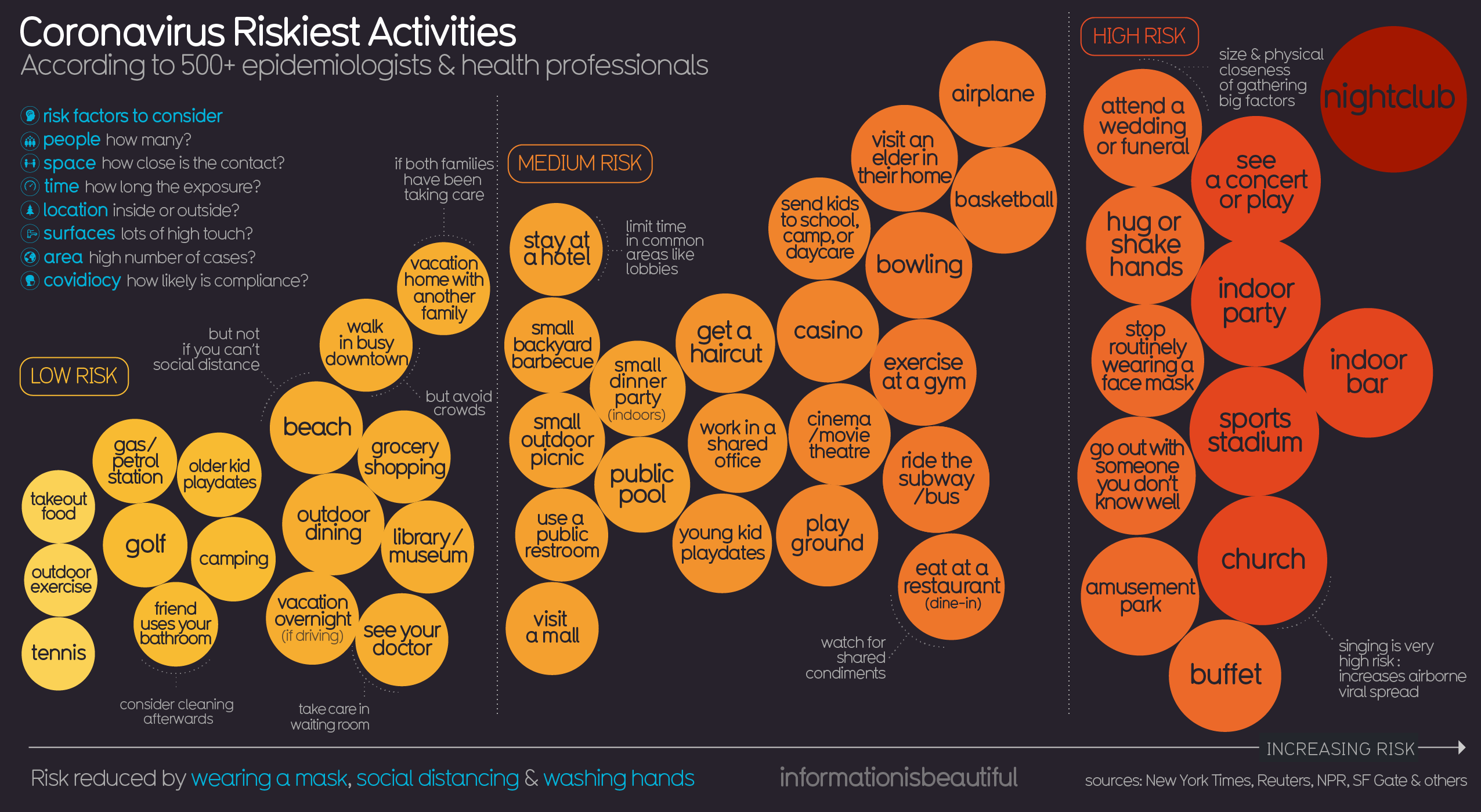
Risky Business!
I'm not an expert, but I think I would put 'going to school' somewhere in the orange zone of this chart. For context, here's the xkcd version: https://xkcd.com/2333/
 |
| https://informationisbeautiful.net/ |
Saturday, July 11, 2020
Wishful Thinking vs Science
This is pretty good, especially the COVID-19 section starting ~2:00-minutes.
Anti-Racism Pedagogy
This is not my expertise, but here are some useful resources:
- Robin DiAngelo: How 'white fragility' supports racism and how whites can stop it. At the end of this interview she gives white people five specific tasks.
- Take the 21-Day Racial Equity Habit Building Challenge
- Read the Me and White Supremacy Workbook
- Why White Students Need Multicultural and Social Justice Education
Geography Games
Seen on Maps Mania: How Well Do You Know the World?
Honestly, Guess Where? is just dumb and not useful in any way: recognizing a capital city based on a Google Maps close-up is just silly and has nothing to do with geographic knowledge or insights. This is in-essence the 21st-century version of memorizing river names and has nothing to do with what we think of as the 'geographic perspective'. At least show the satellite image and scale bar - that way you can begin to use deductive reasoning and practice 'thinking like a geographer'.
Honestly, Guess Where? is just dumb and not useful in any way: recognizing a capital city based on a Google Maps close-up is just silly and has nothing to do with geographic knowledge or insights. This is in-essence the 21st-century version of memorizing river names and has nothing to do with what we think of as the 'geographic perspective'. At least show the satellite image and scale bar - that way you can begin to use deductive reasoning and practice 'thinking like a geographer'.
Friday, July 10, 2020
Boston's Black Heritage Trail
Boston's Black Heritage Trail is a really nice 'story map', created in Tableau.
But, I'm torn. On one hand it shows-off what you can do with Tableau in terms of geography-based mapping and data viz, but on the other hand this would look so much better, especially on smartphones, using a tool such as Esri Story Maps that is specifically-designed for such a purpose.
But, I'm torn. On one hand it shows-off what you can do with Tableau in terms of geography-based mapping and data viz, but on the other hand this would look so much better, especially on smartphones, using a tool such as Esri Story Maps that is specifically-designed for such a purpose.
21 Arguments
It's not that complicated: The 21 best arguments for wearing a mask
 |
| https://www.lavision.de/en/news/2020/4302/ |
Thursday, July 9, 2020
The 2020 Environmental Performance Index
The 2020 Environmental Performance Index, a scorecard ranking 180 countries on how well they are managing natural resources, pursuing sustainability, and protecting public health.
Got it? Like any global metric, this is not perfect, but rather offers a general view on which countries are best dealing with environmental issues.
Got it? Like any global metric, this is not perfect, but rather offers a general view on which countries are best dealing with environmental issues.
Wednesday, July 8, 2020
This really says it all
Great side-by-side maps showing climate and energy views of Democrats and Republicans. Great work as always from the Yale Forum on Climate Change Communication (includes the data and the survey questions): Democratic and Republican Views of Climate Change (2018)
Tuesday, July 7, 2020
Cranky Uncle vs. Climate Change
This sounds great: Cranky Uncle vs. Climate Change. There's a book, game app, and more. Here's a review on the NCSE website. Even better: the Cranky Uncle cartoons available as PPT slides!
And then we have the complete compilation of Myths, Facts, and Fallacies - all matched by a great video. Well-done!
 |
| https://crankyuncle.com/book/ |
 |
| https://crankyuncle.com/book/ |
Monday, July 6, 2020
Friday, July 3, 2020
Wednesday, July 1, 2020
Subscribe to:
Comments (Atom)


