Tuesday, February 27, 2018
R Markdown
Getting Started with R Markdown is a nice tutorial to get started.
Sunday, February 25, 2018
AR, VR, and MR in the classroom
Kathy Schrock has compiled a lot of great resources:
- Augmented, Virtual, and Mixed Reality in the Classroom
- Augmented reality (AR) in the classroom
- Also: Augmented reality for STEM learning: A systematic review (Computers and Education, 2018)
This video is a great example of what will be: Hyper-Reality (it gets really good at the 2-minute mark).
Fixed Broadband Deployment
Fixed Broadband Deployment (by the FCC) is a nice web map that offers all kinds of options, including nice data downloading.
Friday, February 23, 2018
How Machines Learn
One part of AI is machine learning, where the machine derives expertise (= algorithms) from experience based on training data. And that's where Big Data comes-in: if the training data are indeed 'big', then our AI can learn from many many data points (aka circumstances) and that makes the AI algorithms more and more useful.
Here's one catch: since the training data are not the same, AI algorithms are not reproducible as they train themselves using the ever-growing 'big' training data.
Here's one catch: since the training data are not the same, AI algorithms are not reproducible as they train themselves using the ever-growing 'big' training data.
Wednesday, February 21, 2018
Northwestern University Knight Lab
Northwestern University Knight Lab is a community of designers, developers, students, and educators working on experiments designed to push journalism into new spaces.
There you have it. In-practice this means some great open-source tools for data viz:
There you have it. In-practice this means some great open-source tools for data viz:
Labels:
3D,
apps,
AR,
Data,
Infographics,
JavaScript,
Software,
Story Maps,
VR
Monday, February 19, 2018
SCAM & FLICC
Found this here: The Franklin Institute hosts Science and Storytelling speaker
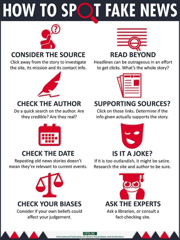
Related: How to Spot Fake News
Related: How to Spot Fake News
Sunday, February 18, 2018
Starving the Beast
This should be a 'fun' movie: Starving the Beast or how the right is trying to sabotage public higher education.
Esri Demographics
Esri shared a couple of very nice ways to look at the changing demographics of the United States:
- The Demographics and Statistics Atlas is a nice story map with embedded story maps.
- The Tapestry Segmentation app.
OpenAerialMap (OAM)
OpenAerialMap (OAM) is a set of tools for searching, sharing, and using openly licensed satellite and unmanned aerial vehicle (UAV) imagery.
Sure - looks good. Let's hope people will use it!
Sure - looks good. Let's hope people will use it!
There’s a chart for that
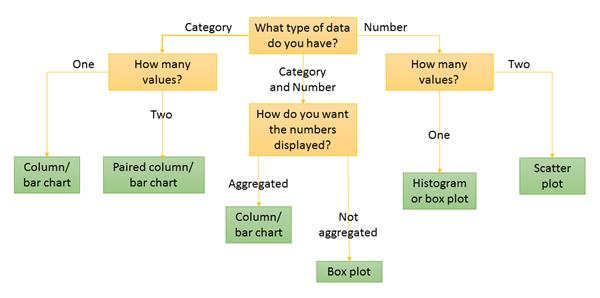
Esri is promoting their new Insights for ArcGIS product, here with a nice series on charts and how to best use them.
Slack and MatterMost
Slack is pretty hip right now and also popular among scientists as a collaboration tool. MatterMost is an open-source alternative.
There is really nothing / not much that these tools do that you can't do with Email, but there is just too much crap these days on Email and people are looking for more-focused collaboration alternatives.
There is really nothing / not much that these tools do that you can't do with Email, but there is just too much crap these days on Email and people are looking for more-focused collaboration alternatives.
Wednesday, February 14, 2018
The Carstenz Glacier
The Carstenz Glacier used to be one of the largest ice masses on Papua New Guinea on the Puncak Java massif. NASA has a nice comparison between 1988 and 2017.
 |
| November 1988 |
 |
| December 2017 |
Typefaces for Maps
Here is a useful compilation of useful typefaces for maps as well as other uses (e.g. presentations, reports, etc.): Cartographers' Preferred Typefaces.
Sunday, February 11, 2018
NOAA Data Snapshots
NOAA Data Snapshots is simple and you can download the maps as simple graphic files - very convenient!
Friday, February 9, 2018
Live, Interactive, Open-Source, and Open-Access Figures
Yep, that's a thing and an important one in science and Jeffrey Perkel has written a couple of nice articles about this in Nature:
- Data visualization tools drive interactivity and reproducibility in online publishing (Nature 1 February 2018)
- Interactive figures address data reproducibility (Nature Jobs Blog 20 October 2017)
Wednesday, February 7, 2018
Shifting Population Centers
Here are two nice web maps that illustrate the westward-shift of population across the USA:
Both use different web mapping tools - here a more simple approach (e.g. animated GIF or video) would be nice to include as well.
Tuesday, February 6, 2018
Accessing and Using Lidar Data from The National Map
Accessing and Using Lidar Data from The National Map is a great little tutorial to a) Lidar, b) the National Map, and c) ArcGIS Pro.
Speaking of ArcGIS Pro: Esri, are you really sure that this will run faster then ArcGIS Desktop? Maybe in-theory, but not in-practice on my computer. In other words: using ArcGIS Pro is an exercise in patience and waiting.
Speaking of ArcGIS Pro: Esri, are you really sure that this will run faster then ArcGIS Desktop? Maybe in-theory, but not in-practice on my computer. In other words: using ArcGIS Pro is an exercise in patience and waiting.
How to talk to an ostrich
How to talk to an ostrich is a video series by Richard Alley that 'answers' some of the most common misconceptions about the reality of global warming. Some are pretty good, some are pretty bad, but all are useful for teaching.
That being said: I'm not sure people will be too interested in watching and learning if first insult and belittle them by calling them ostriches. Is that effective communication?
That being said: I'm not sure people will be too interested in watching and learning if first insult and belittle them by calling them ostriches. Is that effective communication?
Sunday, February 4, 2018
NASA WorldView
NASA WorldView is great for exploring MODIS images (and many more types of data) over time: quick, easy, and you can download the images or quick JPGs. As often the case, the website can be overwhelming die to its design and amount of available data.
Here's something much quicker and simpler: Global MODIS for the last 7 days - nothing more - just a quick way to see what the earth looked like from space last week
Here's something much quicker and simpler: Global MODIS for the last 7 days - nothing more - just a quick way to see what the earth looked like from space last week
Saturday, February 3, 2018
Planet Labs and Planet Explorer Beta
Planet Labs runs a fleet of little CubeSats and Planet Explorer Beta is their free tool for viewing their data. The 1-month mosaics are pretty nice, you can easily save a screen image, measure distances/areas, and upload KML, shapefiles, etc.
Beyond that it gets a little more murky: the daily images don't seem to show (or maybe it is just slow?) and it is not clear how one could obtain the actual image for proper analysis. They offer an Education and Research Program and so it should be possible to get at the data.
McCabe et al. (2017, Water Resources Research) discuss some interesting applications of the Planet Labs CubeSat data in hydrology.
Flourish
Flourish is a new interactive data viz tool, similar in many ways to Datawrapper. People like Andy Kirk seem to like it. The catch, of course, is price: is the free version able to do what you need it to do? If yes = great! If no = pay or learn an open-source tool.
Along those lines: have a look at RAWGraphs.
Along those lines: have a look at RAWGraphs.
Labels:
d3,
Data,
Infographics,
Information,
Tableau
Friday, February 2, 2018
Subscribe to:
Comments (Atom)


