Sunday, November 30, 2014
Saturday, November 29, 2014
Global Weirding
This is nicely done: Global Weirding illustrates the impacts of Global Warming until 2100 and you can choose your future (do nothing, so something, or all hands on deck).
The PDE
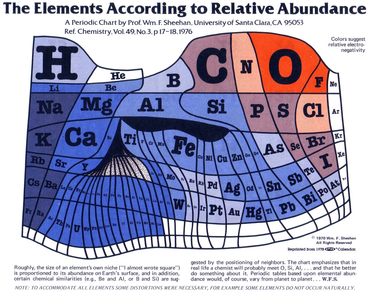
This 'new' Periodic Table of Elements is the high-tech interactive version of the classic one below.
SimCity
Going back in time with the 'old' SimCity game in 2-D using Micropolis.JS or 3-D using 3D City - fun! (found on Maps Mania)
 |
| http://googlemapsmania.blogspot.com/2014/11/old-school-sim-city.html |
Thursday, November 27, 2014
Google Charts
Pretty cool stuff from Google - Google Charts. We all know the built-in ones that come with Google Sheets, but this goes much further and uses Javascript. Here are two examples:
- Motion Charts (the simplified version of Gapminder)
- Geochart
You just got Charted!
Quick, simple, and almost real-time: copy a weblink to a .csv file or Google Spreadsheet and Charted makes you a chart - that's all.
Thanksgiving Dinner Geography
This is a nice example of a Story Map by Esri: Where Did Your Thanksgiving Dinner Come From?
Wednesday, November 26, 2014
Monday, November 24, 2014
Frankenplace
Very fun: Frankenplace creates interactive heat maps based on geotagged Wikipedia entries, for example glacier. Somehow there is a teachable moment in all this!
Friday, November 21, 2014
Coal and Geothermal
Here are two nice interactive infographics: How the world uses coal and Mapping Geothermal Heat Flow and Existing Plants.
Thursday, November 20, 2014
Lake Effect Snow
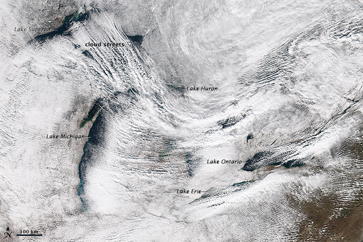
Buffalo and much of Upstate NY got buried by on 18 November 2014. NASA put out this great satellite image (see below) and this YouTube video shows what it looked like in Buffalo as the walls of snow were coming-in off the lake.
Wednesday, November 19, 2014
Every Satellite Out There!
This is great: This is every active satellite orbiting earth is just what is claims it is - an infographic showing the 1,200 or so active satellites in orbit around the Earth.
Saturday, November 15, 2014
Food Viz
Here are two excellent infographics/data viz related to food:
Solar Path
Simple and elegant: Solar Path
This would be even better for teaching if you could enter a latitude and longitude
This would be even better for teaching if you could enter a latitude and longitude
Teaching Geology with iPads
Using iPads (or tablets in-general) for teaching 'outside' is nothing new and they are the perfect field data collection device. Crowdsourcing Digital Maps Using Citizen Geologists is just another example focused on collecting real geological data as part of a field course.
Another great example is Treworgy (In the Trenches, October 2013) and I have compiled more examples on my 'other' blog: Apps for Outdoor Labs and Fieldwork and Tablets for Outdoor Labs and Fieldwork.
Another great example is Treworgy (In the Trenches, October 2013) and I have compiled more examples on my 'other' blog: Apps for Outdoor Labs and Fieldwork and Tablets for Outdoor Labs and Fieldwork.
 |
| http://woostergeologists.scotblogs.wooster.edu/ |
Thursday, November 13, 2014
Likert-Scales
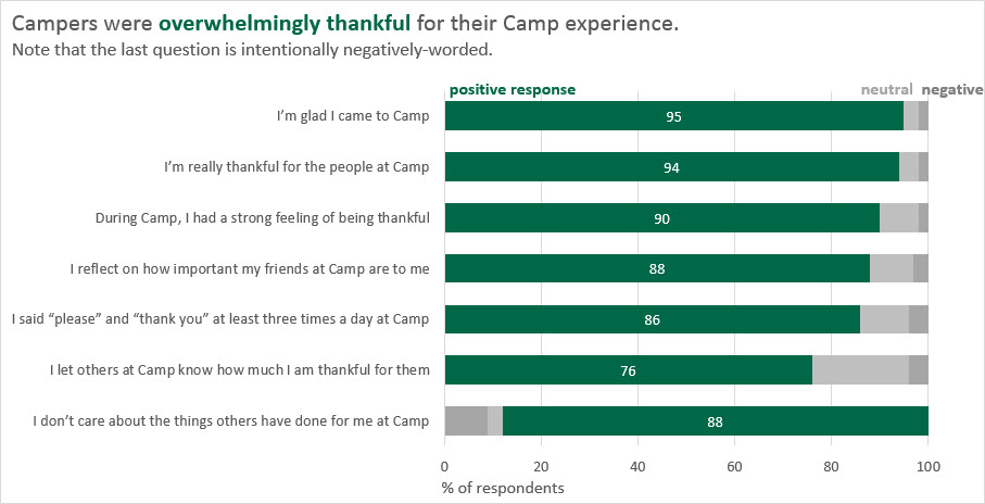
Great suggestions by Stephanie Evergreen for visualizing Likert-Scale data - typical for for what we get from online surveys.
 |
| http://stephanieevergreen.com/aggregated-stacked-bars/ |
Mýrdalsjökull (Iceland) 1986 to 2014
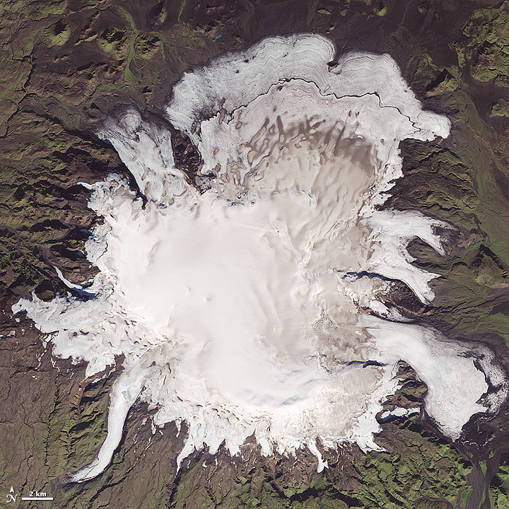
Excellent image comparison for Mýrdalsjökull (Iceland) 1986 (Landsat 5) to 2014 (Landsat 8).
I suspect we'll be seeing more of those...this is a classic case were data availability is driving science: there is nothing particular interesting about the time period between 1986 and 2014 except the mid- to late-1980s is when Landsat 5 became available.
I suspect we'll be seeing more of those...this is a classic case were data availability is driving science: there is nothing particular interesting about the time period between 1986 and 2014 except the mid- to late-1980s is when Landsat 5 became available.
 |
| 20 September 2014 |
Monday, November 10, 2014
Into Thick Air
Into Thick Air is a fun 'spoof' on what is considered by many as the ultimate mountaineering (and financial) challenge - The Seven Summits. Now, find these seven high points of the US heartland on this map: Mountains and Hills of the United States.
Sunday, November 9, 2014
Software for Infographics
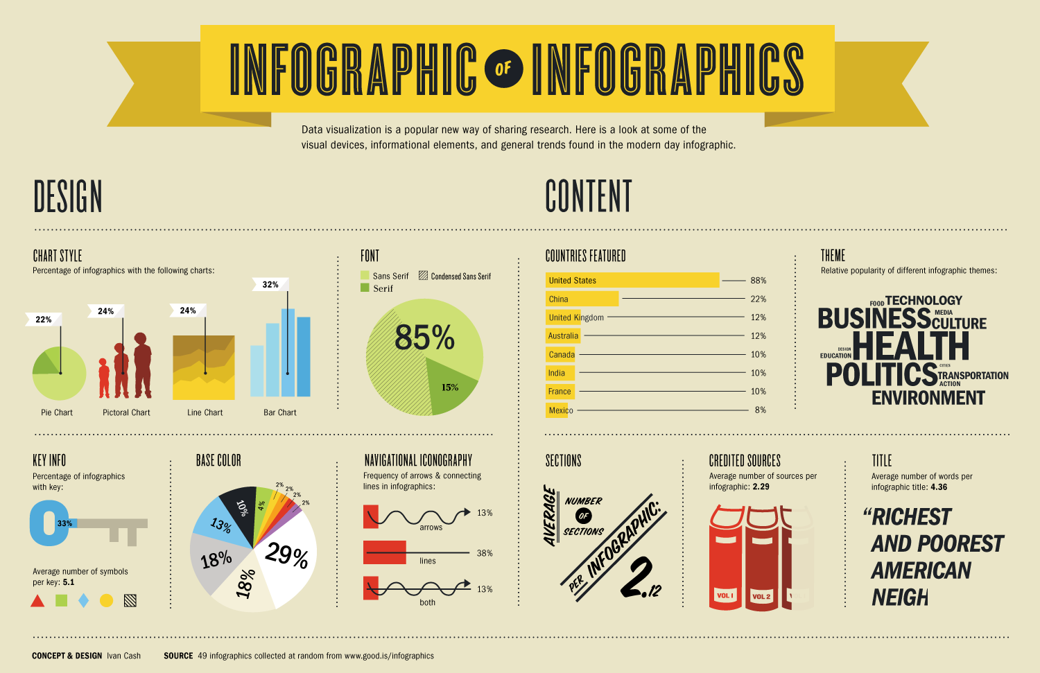
This type of compilation is hopeless, incomplete, and outdated...nevertheless...here's my compilation of Infographic Tools, Apps, and Software. Need more? How about Andy Kirk's 273 Datz Viz Resources (nicely categorized as well!). Or, Kathy Schrock's compilation of tools, links, and resources.
 |
| http://www.schrockguide.net/ |
import.io and infogr.am
This is interesting: you can use import.io to scrape data from web pages and then make infographic thereof in infogr.am - the video below shows an example.
Now they released a new tool called import.io Magic: simply paste a URL into the search box and Get Data.
More videos from Infogr.am.
Webinar: Data visualisation from A to Z with Infogr.am and Import.io from Infogr.am on Vimeo.
Now they released a new tool called import.io Magic: simply paste a URL into the search box and Get Data.
More videos from Infogr.am.
Webinar: Data visualisation from A to Z with Infogr.am and Import.io from Infogr.am on Vimeo.
Saturday, November 8, 2014
Are you in Congress?
Well, not literally - but in terms of your basic demographic characteristics? Have a look at Are you reflected in the new Congress? by The Guardian.
The ACE Climate Assembly
The ACE Climate Assembly is a high school entertainment education program about climate change and sounds a bit like the Climate Reality Presentation associated with Al Gore. Still, this is a question of scale: how can you deliver the science of climate change across the country in way that is engaging and reliable?
- Request your ACE Assembly
- Flora et al. (2014): Evaluation of a national high school entertainment education program: The Alliance for Climate Education
Thursday, November 6, 2014
3D Printing to Teach Physical Geography
This sounds excessive...but how about using a 3D printer as a teaching tool in a Physical Geography lab to teach and learn about topography. That would be cool, especially if we could go from a topographic cross-section to a printed 3D model in 2 hours.
- Horowitz and Schultz (2014), Printing Space: Using 3D Printing of Digital Terrain Models in Geosciences Education and Research. Journal of Geoscience Education, 62(1), 138-145.
- Here are the MakerBot Replicators (that even sounds cool!)
- Geoscience education, meet 3D printing (Laura Guertin, 5 November 2014)
Wednesday, November 5, 2014
Clouds and Citizen Science
This is a great example of citizen science: ground-truthing NASA satellite images for clouds.
How to make an animated GIF
This seems a little complicated, but here's how to make a seamless looped GIF in Photoshop by Tabletop Whale. Below is my own attempt at an animated GIF: the Quelccaya Ice Cap in 1998.
Monday, November 3, 2014
mugs pays once
That used to be it: you either used latitude and longitude or street addresses to define the position of something (of course there are 100s other coordinate systems as well...). But now we have what3words and Google Open Location Code!
Saturday, November 1, 2014
Subscribe to:
Comments (Atom)

/cdn2.vox-cdn.com/uploads/chorus_asset/file/2435104/same-sex_marriage_marijuana_legalization.0.png)

