or whatever Smart Gizmo you have! This is more than just FaceTime or Skype - with these apps you can actually talk to more than one person. I'm not sure how the video feed from say 4 different people will look on 4 inch screen, but worth a try!
Saturday, September 28, 2013
Thursday, September 26, 2013
Landsat 8 in Photoshop
This is a great tutorial: how to use Landsat 8 scenes in Adobe Photoshop. That's not really GIS or Remote Sensing, but a great way to create impressive visuals.
Wednesday, September 25, 2013
Posting and Sharing ArcGIS Online Maps
There are four way to share an ArcGIS Online map using a blog or a website: 1) the ArcGIS Online map viewer link, 2) the ArcGIS Explorer Online link, 3) the embedded map, and 4) the Web Application link.
ArcGIS Online map viewer link: Westfield State Buildings
ArcGIS Online Explorer link: Westfield State Buildings
Web Application Link: Westfield State Buildings
View Larger Map
ArcGIS Online map viewer link: Westfield State Buildings
ArcGIS Online Explorer link: Westfield State Buildings
Web Application Link: Westfield State Buildings
View Larger Map
Tuesday, September 24, 2013
Saturday, September 21, 2013
The IPCC
With the IPCC AR5 coming out soon, Nature produced a nice video and infographic about the IPCC and its history.
Teaching with Twitter
This is nothing new - teaching with Twitter has been around for years now. Here is an example of an (apparent?) success story: Creating scientists in 140 characters.
Another success here: Monica Rankin at UT Dallas teaching a history class with Twitter. Watch the video or read the report.
Another success here: Monica Rankin at UT Dallas teaching a history class with Twitter. Watch the video or read the report.
ArcGIS 10.2
I'm getting ready to to upgrade to ArcGIS 10.2 - here are some useful links:
Friday, September 20, 2013
Colorado Flooding From Space
NASA put out these two Landsat 8 images showing the South Platte River in normal flow conditions (29 June 2013) and in flood condition (17 September 2013). Be sure to click-on the VIEW IMAGE COMPARISON button to see both images fade into one another as you move the slider.
- NASA Floods in Colorado (20 September 2013)
Inequality in the USA
Here are a series of animated GIFs showing economic inequality across the USA between 1977 and 2012. I admit: I don't understand these coefficients...so let's just assumes these economists know what they are doing. And, it that case, inequality certainly increased. But this is also a good example of the dangers of maps - sure the colors change towards more inequality, but that visual impression is also a function of map design, color choices, statistical classification systems, and break points.
 |
| http://i.imgur.com/EPa5zrO.gif |
Wednesday, September 18, 2013
Colorado Flooding and UAVs
Interesting story about the use of UAVs in assistance of the flooding in Colorado - sure seems like the perfect application of this technology
 |
Census Reporter
Here are three ways to get to census data. Most would agree that American FactFinder is rather complex and not easy to use. Then we have CensusReporter (still in beta) - which hopefully will be much easier to navigate. Finally there is Social Explorer - my favorite: very easy to use, map interface, all census data for all times. The free edition is nice, but the professional version includes much more data (luckily Westfield State has a subscription via the library). Otherwise: get yourself a free 30-day trial and scrape the data!
 |
| http://www.gsd.harvard.edu/gis/manual/census_getdata/images/factfinder_workflow.jpg |
Tuesday, September 17, 2013
Educational Jargon Generator
I knew it - that's how these assessment - outcomes things get written: with the Educational Jargon Generator!
EarthPorn
The name (thanks reddit...) is unfortunate, but there is nothing inappropriate as far as the content: just spectacular photographs posted by users and thus updated constantly.
MS Excel Art
That seems like an oxymoron - but maybe not! Have a look at Tatsuo Horiuchi's work! Now this would be even better had he not just used the autoshapes, but actual cell values and manipulations - shown as charts. Here's a nice video of his work: The Michelangelo of Microsoft Excel.
USGS Flood Mapper
Yet another nice example of a rich and interactive web map: the USGS Flood Inundation Mapper. It's almost getting to be too much these days...so many ways to look at data and to perhaps download data.
Monday, September 16, 2013
Europe 1000 AD - Today
This is quite nice (especially the music). But: why not add the date line or something?
Saturday, September 14, 2013
Randolph Glacier Inventory (RGI) Version 3.2
New release of the Randolph Glacier Inventory (RGI) - now Version 3.2. It features improved accuracy of glacier outlines in many places, notably Alaska (more recent source imagery) and South America (source imagery with less seasonal snow), filling of some gaps (for example in the tropics and in Burma), and
correction of errors in a number of places.
correction of errors in a number of places.
Wednesday, September 11, 2013
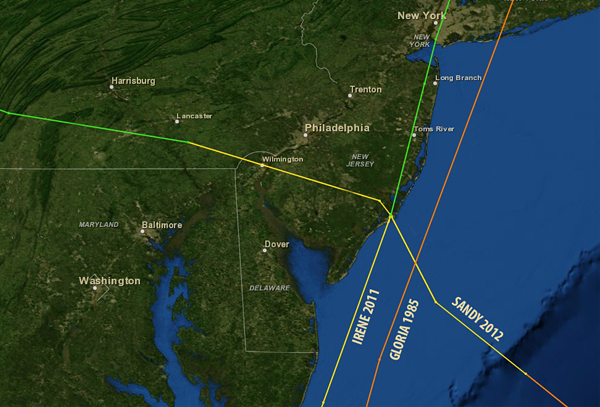
NOAA Historical Hurricane Tracks
From NOAA: The NOAA Historical Hurricane Tracker allows users to search by place name, storm name or year, or latitude
and longitude points. With the search results, users can generate a map
showing the track of the storm or storms accompanied by a table of
related information.
Tuesday, September 10, 2013
The Last Mile
This is interesting (although don't quite understand the maps and underlying data): an open-source web map for visualizing the logistics of selected mega-cites around the world. Have a look yourself!
- The Last Mile
- MITs Megacity Logistics Lab
- MIT press release: In The World: Mapping the logistics of megacities
Connection
How do you effectively tell a story? In my life that's usually about science, particularly about global warming, its impacts, and what we can and should do about. Randy Olson wrote a great book to help us scientists with just that called Don't be Such a Scientist. Now he's back with a new book Connection - Hollywood Storytelling meets Scientific Thinking. Plus, there is the Connection Storymaker app for Android and iOS.
Monday, September 9, 2013
Bullet Journal
So you sit in a lecture and are supposed to take notes - how do you best do that? There are a bunch of established note-taking systems, but here's a new one: Bullet Journal. This one is interesting in its simplicity: no fancy gizmo or app is needed...just a piece of paper (although it may work better with a notebook).
The Rise of Machines
UAVs are all the rage right now...even for delivering pizza. Here's an interesting and somewhat critical article about the reality and future (?) of these unmanned autonomous systems.
- The Rise of the [Geospatial] Machines Part 1: The Future with Unmanned Aerial Systems (UAS)
Inequality is Real!
This is a nicely-illustrated animated infographic narrated by former Secretary of Labor Robert Reich.
Saturday, September 7, 2013
Diversity and (Gender) Bias in GIS
Or rather: the new world of geo-things in general.
Friday, September 6, 2013
Forecast Lines
Super-cool: Forecast Lines shows you the different forecast from the different forecast models. There is also an iOS version.
Thursday, September 5, 2013
The Automated Teaching Machine
Robots, Kafka, Rocketship, Dreambox, and ENGKEY - this all sounds like MOOCs to me! See for yourself: A Graphic Introduction to the End of Human Teachers.
Google Earth Tour Builder
Here's something new from Google: Tour Builder. Still in beta, so expect the unexpected! This seems to be Google's response to Esri's Storytelling with Maps.
Survey Monkey vs. Google Forms
Google Forms is a nice alternative to Survey Monkey - the results run right into a Google Spreadsheet. I admit: I have not used it 'for real', but it is not limited in terms of questions and responses as the free version of Survey Monkey.
The Age of Cities
Or, rather of buildings in a city - viewed as choropleth maps you get an idea of how the city developed over time.
- Brooklyn
- The Netherlands (all of it!)
- Chicago
Wednesday, September 4, 2013
Maps of Protest
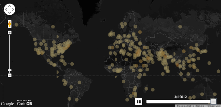
John Bieler created this global view of protest starting in 1979 based on the GDELT data. Read about the limitations of those data on his blog and explore his recent maps of protests in Egypt.
Monday, September 2, 2013
Subscribe to:
Comments (Atom)


