
Saturday, May 31, 2014
Urban Sprawl
Here are some incredible examples of urban sprawl as captured by the Landsat family of satellites since 1972. Here, for example, is Las Vegas.

Visible vs. Infrared Landsat 8
Here's a great example: the left image is based on the visible bands, right images uses two of the infrared bands on Landsat 8 - which one is more useful for fire fighters?


Friday, May 30, 2014
Climate Change Videos
So you have 50 minutes or so and want to show a video about climate change - here are some options:
- Earth: The Operators' Manual (53:43 minutes)
- Powering The Planet (53:41 minutes)
- Energy Quest USA (53:41 minutes)
- Climate of Doubt (53:50 minutes)
- Do The Math (44:52 minutes)
- Years of Living Dangerously (59:10 minutes)


The Weather Bike
This is a fun project to do with students: mount a Kestrel gizmo on a bike and use to measure cool-air pooling or urban heat islands.


UAV Mapping of Himalayan Glaciers
Here's another UAV glacier-mapping example: Immerzeel et al. (2014). As they correctly point-out UAV imagery can be the missing link between point measurements and space-based sensors. The video below is an overview of their research (look for the UAV at about 4:00 minutes).
Thursday, May 29, 2014
Wednesday, May 28, 2014
College Degrees and Majors
Ben Schmidt is doing some great interactive visualizations using D3 - here are two of them:
When in doubt - use science!
Excellent video demonstrating all kinds of things: earth rotation, Coriolis effect, and more using a Foucault pendulum. More about it at Wired Science.
AGO for Organization free for K-12
Looks like Esri finally woke-up and is making their ArcGIS Online for Organization subscriptions free for all K-12 schools as part of the ConnectED initiative. That's a good thing and a nice alternative to using Google Earth. Not sure how they will handle the user name and password administration for the students - from personal experience I can tell you that can be a big issue and inconvenience. Here's some more information:
Tuesday, May 27, 2014
Libre Map Project
I'm not really sure who and what they are, but Libre Map hosts an impressive array of GIS data for the United States, including detailed topographic maps and TIGER/Line files.
Monday, May 26, 2014
Mapping El Cap Geology
This is mapping, but different: The Geologic Map of El Cap, Yosemite Valley, California
Saturday, May 24, 2014
Biking and Running
Strava has created a global map showing where people are biking and running (using Strava). Obviously that's only a sample as not everybody a) tracks himself/herself and b) does not use Strava to do so. Still, the patterns are great and you can clearly see the local mountain bike hot spots.
Here's the RunKeeper version via Mapbox.
Here's the RunKeeper version via Mapbox.


Need to learn d3.js?
Edward Tufte considers d3.js the best data visualization tool out there - ever!
- How about five more reasons to learn D3!
- O'Reilly 3-hour video tutorial by Scott Murray ($59.99)
Friday, May 23, 2014
Journey Through Time
Travel back in time through Switzerland with this awesome seamless mosaic (in space and time) of Swiss topographic map: Journey Through Time. Hello USGS - how about something like this for the USA?
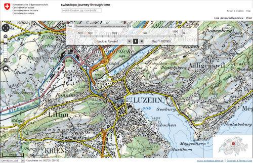 |
| http://mapdesign.icaci.org/wp-content/uploads/2014/05/MapCarte143_swisstopo.png |
Income vs. Cost of Living
These numbers are startling, but expected: how much are you really making when you consider your income vs. the cost of living?
Thursday, May 22, 2014
Interactive Maps on Pinterest
Here's a great way to waste a lot of time: browse the 1000+ interactive web maps on Pinterest.
Wednesday, May 21, 2014
Visualizing Politics in the U.S.
Here are two great visualization / infographics (I'm not really sure what to call them) of what goes on (or not) in the US Congress.
- Legislative Explorer
- Clear Congress Project (reminds me of Gapminder)
Monday, May 19, 2014
It's not that complicated!
Very funny and very true - the science of climate change is settled. Now, let's debate what we should do about it.
Wednesday, May 14, 2014

Climate Apps
Here are two compilations of apps related to climate and climate change:
- Ten Great Climate Apps (30 November 2012 by Sara Peach)
- Climate Science? There's an App For That (11 January 2011 by Alana Range)
NASA Climate Games
This is pretty fun: NASA Climate Kids has a bunch of fun and educational games around issues of climate change.
 Hat Tip: Casual Climate Drama
Tuesday, May 13, 2014
MAGIC Map Mash-Ups
The folks at UConn-MAGIC have created a series of great Google-based mash-ups showing historical data for Connecticut, for example:
Sunday, May 11, 2014
MS Excel
What can I say about MS Excel - I already posted how you can create GIS maps with MS Excel or how to create art with MS Excel - here's a useful add-on:
- Peltier Tech Chart Utility - for $79 you get some great custom chart types and formatting options for MS Excel.
Have a look at John Nelson's clever Excel Hack Map - I have seen something similar from folks working with gridded climate data.
Saturday, May 10, 2014
Thursday, May 8, 2014

Wednesday, May 7, 2014
The National Climate Assessment
Well - this is about as official as it gets: the 2014 U.S. National Climate Assessment. The website is pretty fancy and a tad confusing to navigate, but you can download the report and its pieces from the Downloads page.


Street View, but different!
Point & Click Street View is the good old Google Street View, but with more mellow point-and-click navigation controls. Give it a try, I like it!
Sunday, May 4, 2014
Saturday, May 3, 2014
Friday, May 2, 2014
3D Drone Mapping
So you have a drone / UAV (or any kind of aerial / satellite imagery) and Melown Maps can turn your imagery into 3D maps.

Thursday, May 1, 2014
Tweeting the Obvious!
Mapping sunrise - this is further proof that most tweets are statements of the obvious and thus (largely) irrelevant: here we have an animated map of sunrise traveling around the Earth and tweets with the word 'sunrise' in them.